Introducing Book Look – with Kate Barraclough
Book Look will be our new feature where we invite designers and book industry figures to talk about a particular book that has caught their eye.
This week we asked Kate Barraclough, winner of last year’s Young Designer Award, to tell us about a book that has inspired her.
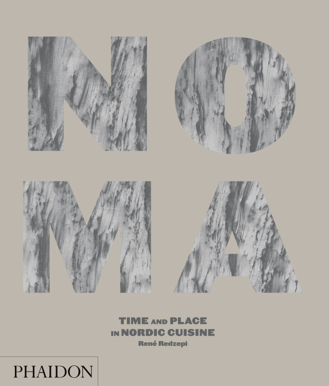
My latest purchase is a stunner: NOMA: Time and Place in Nordic Cuisine, published by Phaidon, designed by Studio Frith. It is a cookbook that celebrates the philosophy and creativity of chef René Redzepi and his Copenhagen restaurant, NOMA, which this year was recognised for the fourth time as the Best Restaurant in the World at the S. Pellegrino World’s 50 Best Restaurants awards.
This book is an award winner too, for photography, styling and design. The production techniques are flawless, with every element so carefully considered. I can’t even begin to imagine what sort of budget they were working with to produce such a book, let alone the hours it must have taken to craft it.
The construction of the book is a work of art. It is a large-format linen-covered hardback with 368 pages. The cover is so simple and yet so effective. The faintest of greys is printed on light grey linen and debossed to create an effect like granite or marble. It’s such a wonderfully tactile cover and it stands out amongst other cookbooks.
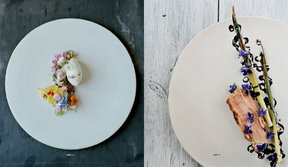
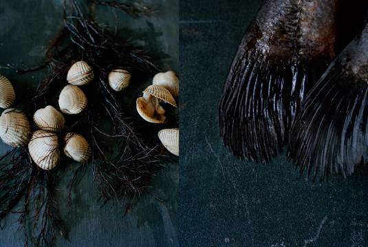
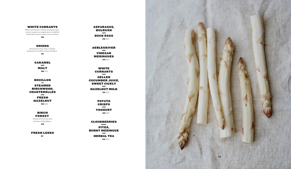
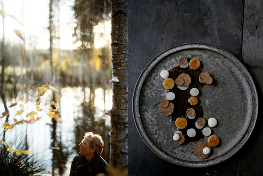
The layout plays with the traditional structure of a cookbook. The photos are the hero, with 200-odd pages of images run continuously in the middle of the book. The images have a true Nordic appeal. They are dark, earthy and dramatic shots, showcasing not only the food but the suppliers and local ingredients as well. The thick paper stock adds to the impact, giving a physical weight to the book.
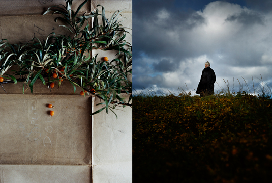
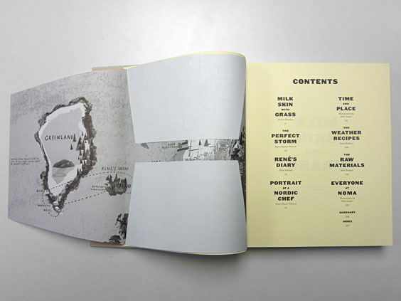
The introduction, recipe text and endmatter quietly compliment the photo section. Simple, elegant type design lets page after page of black text not seem boring. The use of various coloured stock helps you navigate through different sections of the text, with lightweight, almost newsprint-like paper adding another textural element. I love the touch of the fold-out map at the front, by Hannah Warren, which is as much a beautiful illustration as it is a guide to where the local produce is sourced.
It is a cookbook that will never make it near my kitchen, notwithstanding the fact that I probably could not construct even one of the recipes within it, but because it’s just far too beautiful for that!