Mary Egan Publishing Award for Best Typography 2017
Finalist
Designer: Tim Donaldson and Amanda Gaskin, Sea Change Studio
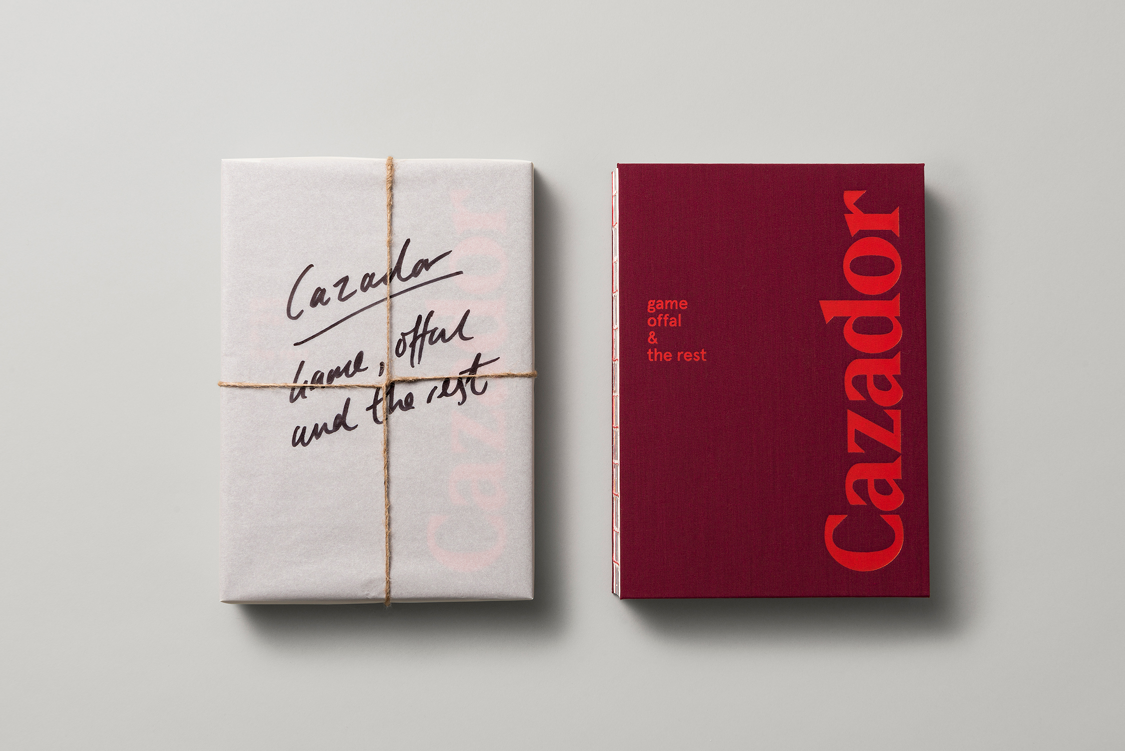
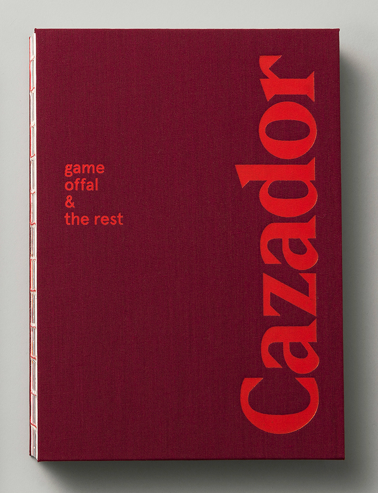
Title: Cazador — game, offal & the rest
Publisher: Cazador
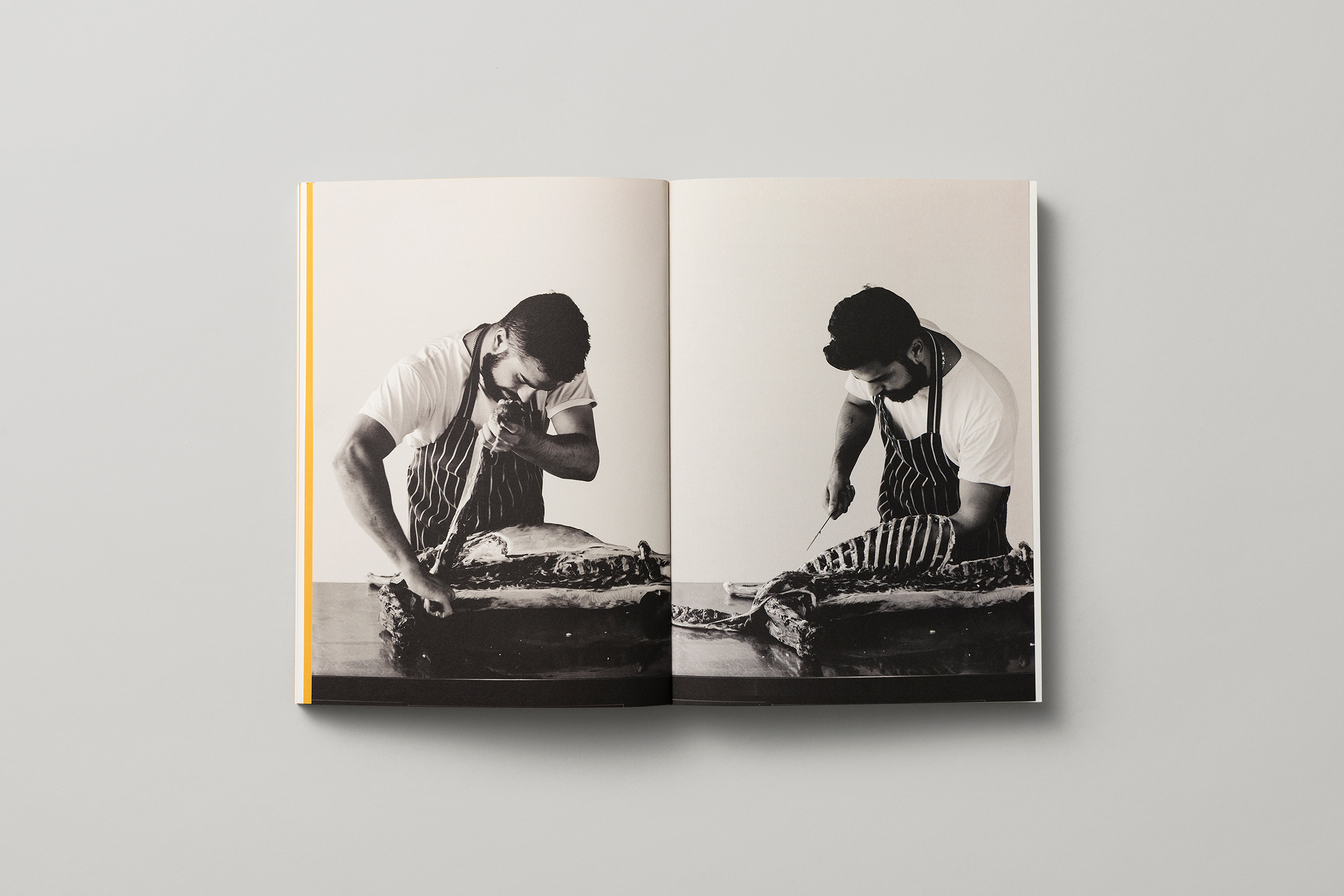
Format: 240 x 170mm, 248pp, exposed and thread sewn to reflect the raw stripped back aesthetic of the food and interior, and make it feel like it could be an old field guide with spine ripped off. Burgundy linen was used as a reference to the old table-cloths used in the restaurant. FSG stock used.
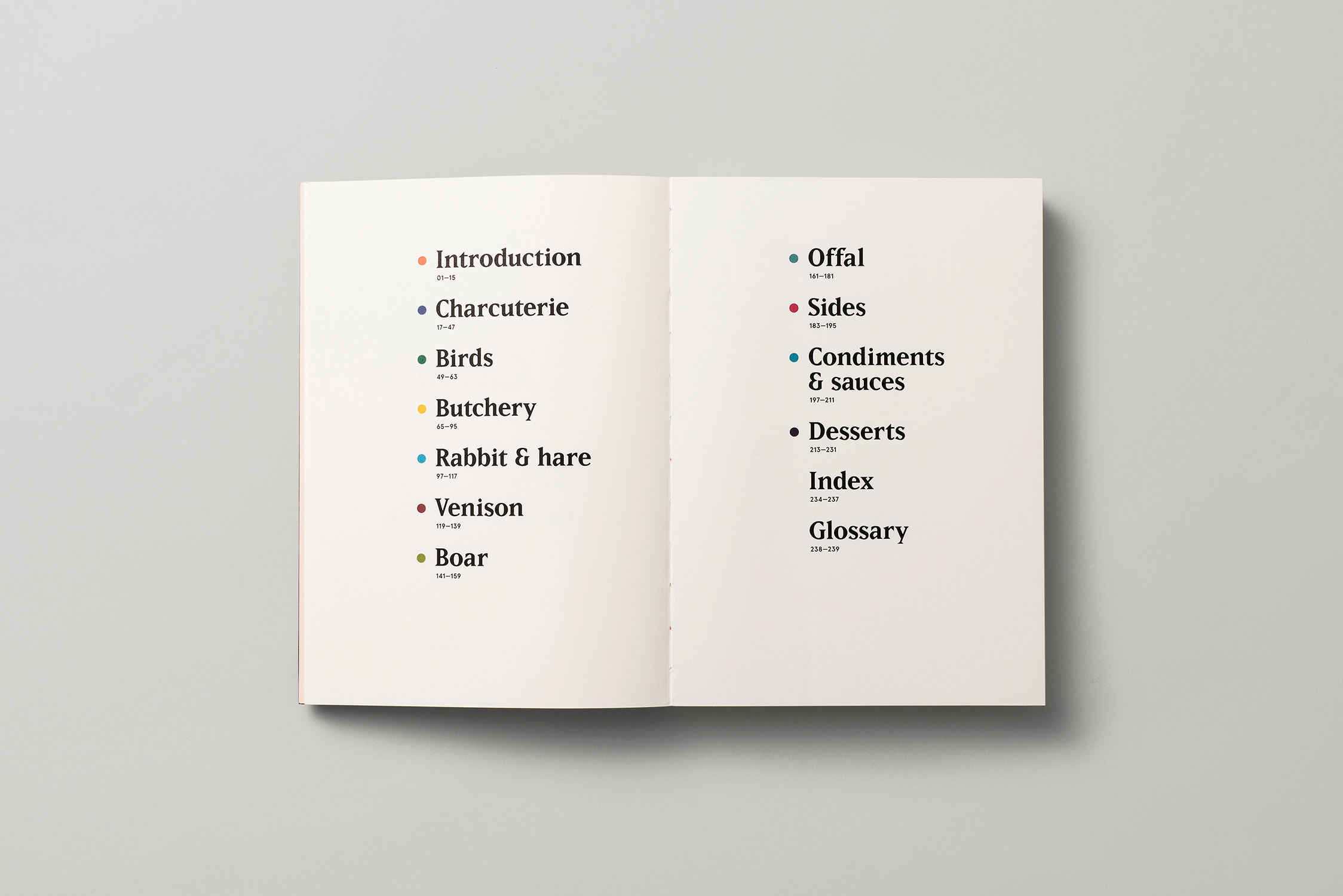
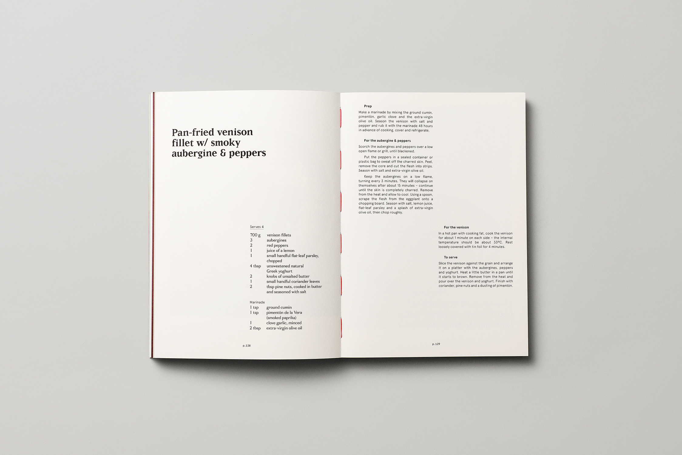
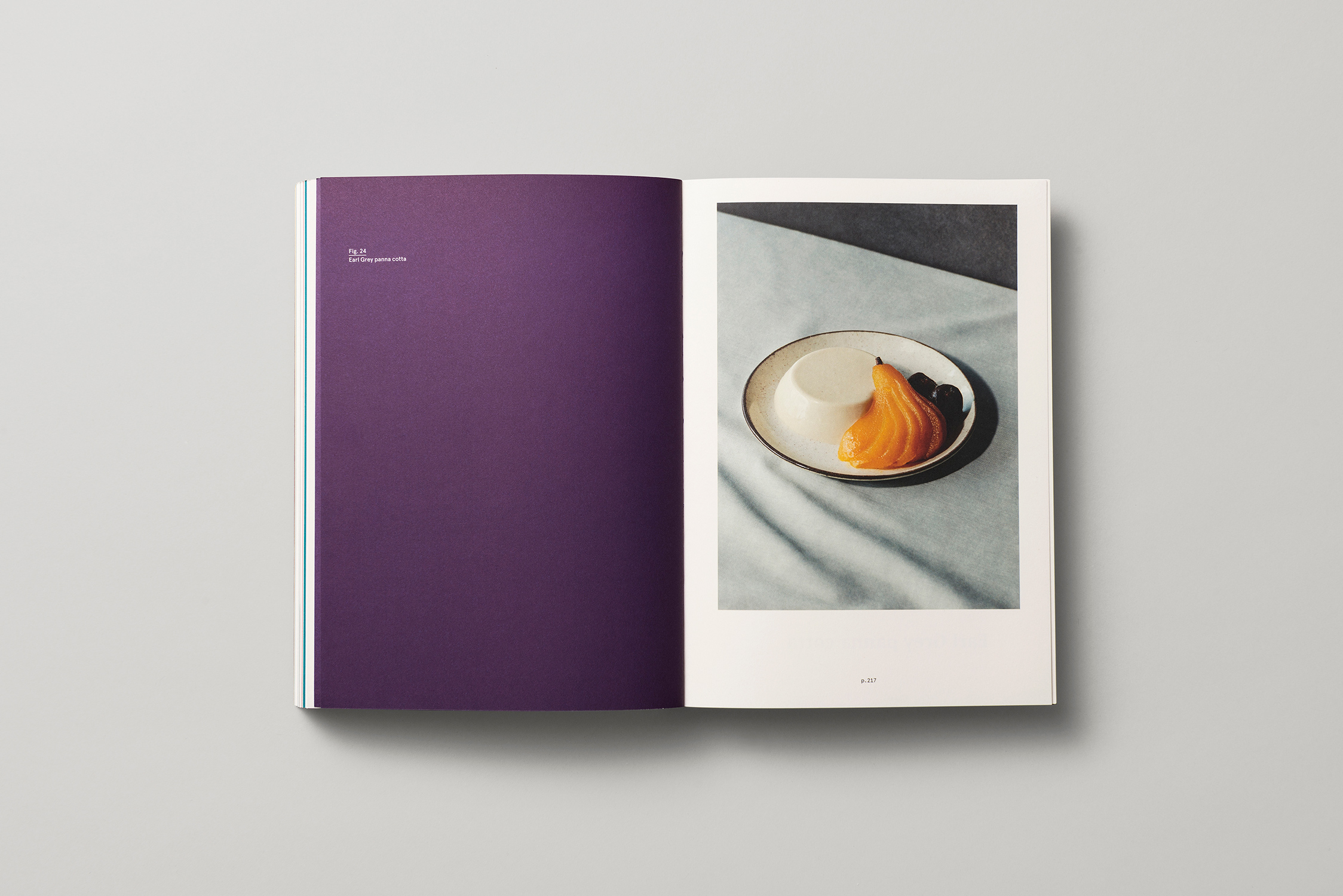
Typography: Display typeface is Matrix Bold (variable type sizes and leading). Supporting typefaces are Apercu: Light, Regular, Medium, Bold, Mono (variable type sizes and leading), Fortescue Regular (variable type sizes and leading). The overall typographic design references field guides and art catalogues in showcasing the game and recipes in all their glory. The display typeface Matrix, is a forgotten serif typeface, that reflects the raw, stripped back aesthetic of the food and restaurant. The use of a flexible broken grid means every single recipe has a unique typographic layout. This is to reflect that each recipe is deeply personal and unique to the Cazadors.
Judges’ Comments Contemporary typography meets a very traditional approach to cooking, and acknowledges the decade when it all started the 1980s. Time-honoured butchery techniques and family recipes are energised by strong hierarchy of recipe names and changes of position on the page. The hero type face bears the signs of being carved as if touched by the chef’s knives. It also seems to summon up Persian history and the Farsi handwriting from the old recipe books of the founders.