
HarperCollins Publishers Award for Best Cover 2023
Finalist
 Designer: Megan van Staden
Title: Lāuga: Understanding Samoan oratory
Publisher: Te Papa Press
Format: 198 x 129mm, 336pp, hardback.
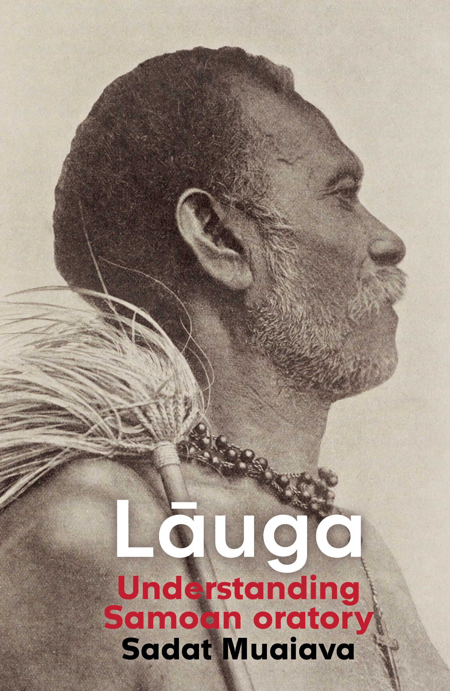
Typography: Cover: Churchward Isabella medium and bold. The font Churchward Isabella is designed by Joseph Churchward who is a Samoan typeface designer, which influenced our decision to use his beautiful geometric and bold font for the cover. The book was intended to be structured as a lāuga and therefore the fue on the back cover is repeated across the section openers. The glossy red was inspired by the deep red of the ‘ulafala (pandanus key necklace), commonly worn by orators, and from a particular necklace in Te Papa’s collection featured in the book.
“Modern but timeless, reflecting a keepsake, something to be passed on and handed down. We wanted a powerful image of a tulāfale chief with a fue (orator whisk). The image of Tofā Sauni of Tufulele. ‘Upolu – a central figure in the recorded history of Samoan culture – was an early choice for the cover, and we wanted to show a fue in full on the back. The colour palette should draw on significant objects featured in the book.”
Judges’ comments The judges appreciated the simplicity in design of this book. Its stony colours speak to the historical photographic images, and the pop of red helps set this cover out as a contemporary one, but in a style that will endure. The typography treats the image with respect, with the head (tapu) left clear. A wonderful example of understated, careful design. The white, red and black colours are effectively combined with debossing and a spot gloss. The red of the spine wraps onto the back cover sitting translucently, and partially, over an image of a fue (orator’s whisk), effectively holding the text and barcode. A very carefully and subtly handled piece of design.


