Mary Egan Publishing Award for
Best Typography 2015
Highly Commended 2015
Designer Emma Hayes
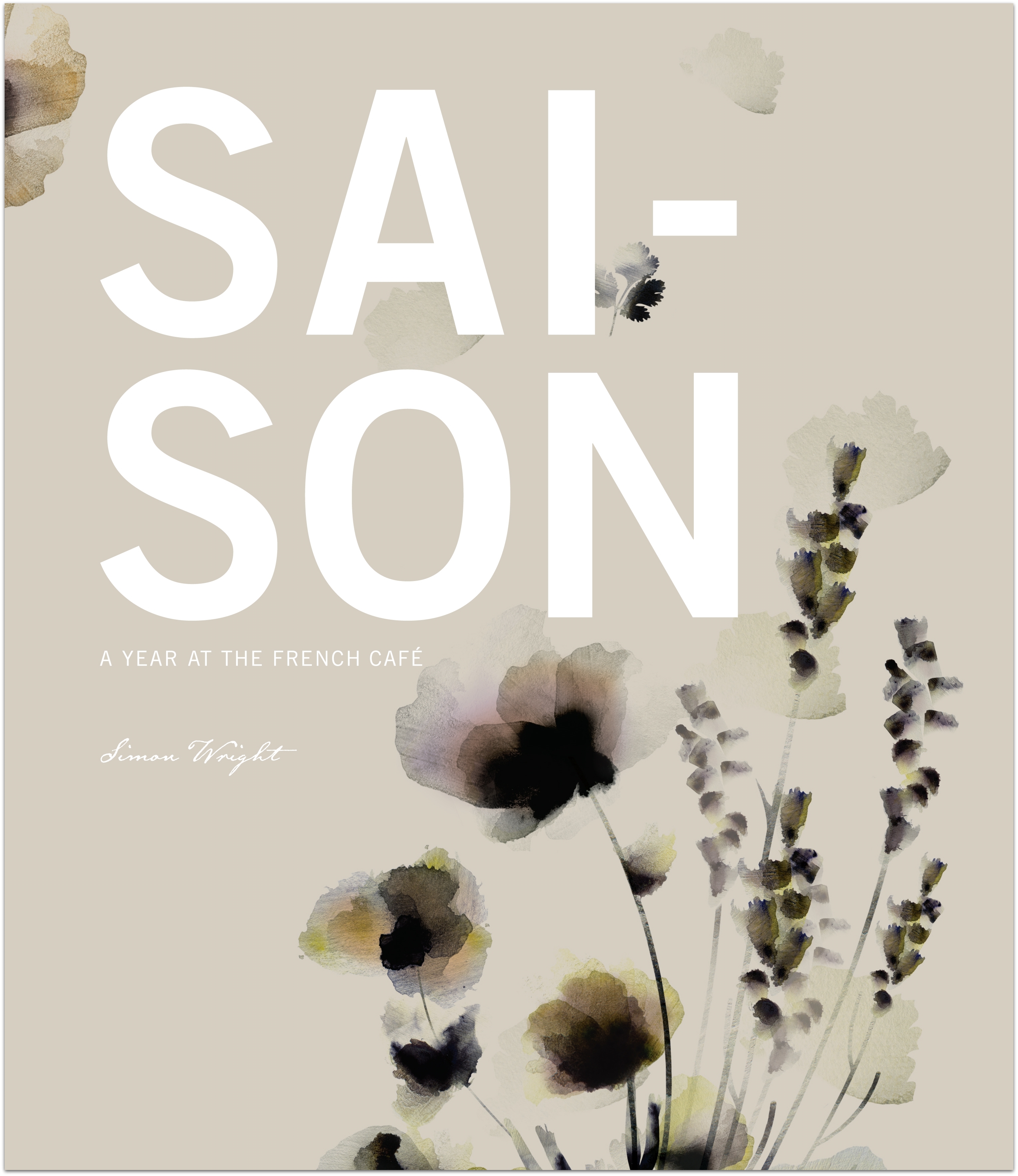
Title Saison: A Year at the French Café by Simon Wright
Publisher Random House New Zealand
Format 290 x 250mm, 304pp, section sewn, PLC in slipcase. Text stock 157gsm matt art and 120gsm woodfree plus die cut tip ins on Wibalin Natural. Case 4 colour printed JHT cloth. Slipcase printed 4 colour on Wibalin Buckram plus spot UV varnish.
Judges’ Comments First impressions mean a lot and Saison makes a cracking first impression. The bold sans serif title against the beautifully delicate silk printed floral image shows confidence right from the start. The food style and photography highlights the refined nature of these recipes and the interior design reflects this appropriately, using a mix of hand drawn and san serif typefaces to achieve a balance between flair and restraint, as displayed in the beautiful photographs. The typography is subtle but never subservient. Menu usability appeared well considered, with some confusion around the page numbering the only possible negative.