Allen & Unwin
Award for Best Commercial Book for Adults 2023
Finalist
 Designer: Megan van Staden
Title: Straight Up
Publisher: Allen & Unwin
Format: 234 x 153mm, 320pp plus 8pp colour photo insert, paperback, perfect bound.
Typography: The main body font is Tiempos 10/16, with Radion A used for the display headings and cover. The internal design is direct, modern and conveys a sense of energy that is right for Ruby, this powerhouse sportswoman.
Tiempos is a lovely chunky easy-to-read serif font, which appeals to a broad audience, reflecting Ruby’s approachable voice. It complements Radion A, a clear and bold font with a subtle edge. Megan wanted a serif with enough ink density to balance out the boldness of Radion A, allowing her to utilise nice large drop caps.
Radion A used on the cover is geometric and bold, a modern Futura with a bit of personality to reflect Ruby’s voice. It also reflects her Samoan heritage.
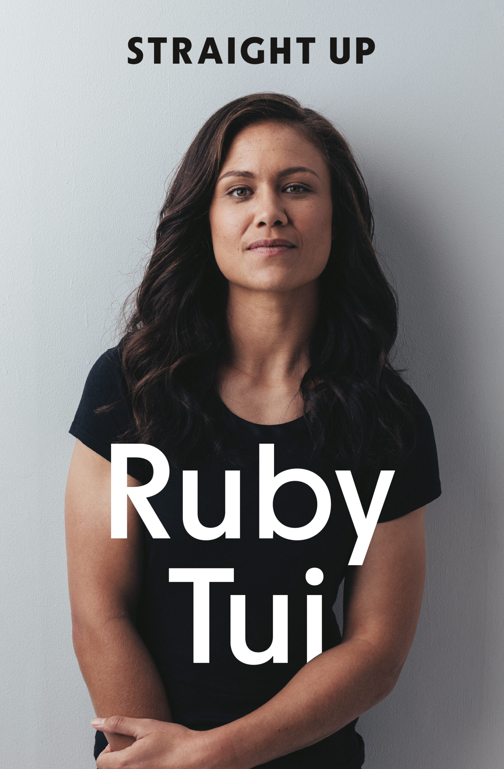
“I wanted the cover to convey Ruby Tui’s strength and vulnerability — we wanted a direct, beautiful and honest portrait of her. Photographer Nic Staveley took many excellent shots and we narrowed it down to a handful of great images. We initially liked the idea of a closeup shot of Ruby’s face. Still, once we saw the image of her leaning against the wall with her chin slightly tilted we knew that was ‘the one’ — it manages to convey emotional intensity, beauty, pride, strength, humility and quiet joy. That image, the bold cover font and the title Straight Up let you know you’re in for a powerful read.
Judges’ comments The book cover matches the punchy title, showing a softer side of an epic rugby player. Ruby’s Training Bag tips are boldly displayed at the end of each chapter to allow takeaways from inspired readers. The chapter title font matching these takeaways add for clear and consistent reading. It’s not a new idea to put a stripped back image of a well-known figure on a biography, but this works. The choice to highlight Ruby’s name over the title is smart and I enjoy the playful integration of the title slotting into Ruby’s arm.
Like the title of this book everything about the design, photography and production of this book is straight up. It’s an effective design aimed at the commercial market using the popularity of its subject to reach its readers.