Allen & Unwin
Award for Best Commercial Book for Adults 2023
Finalist
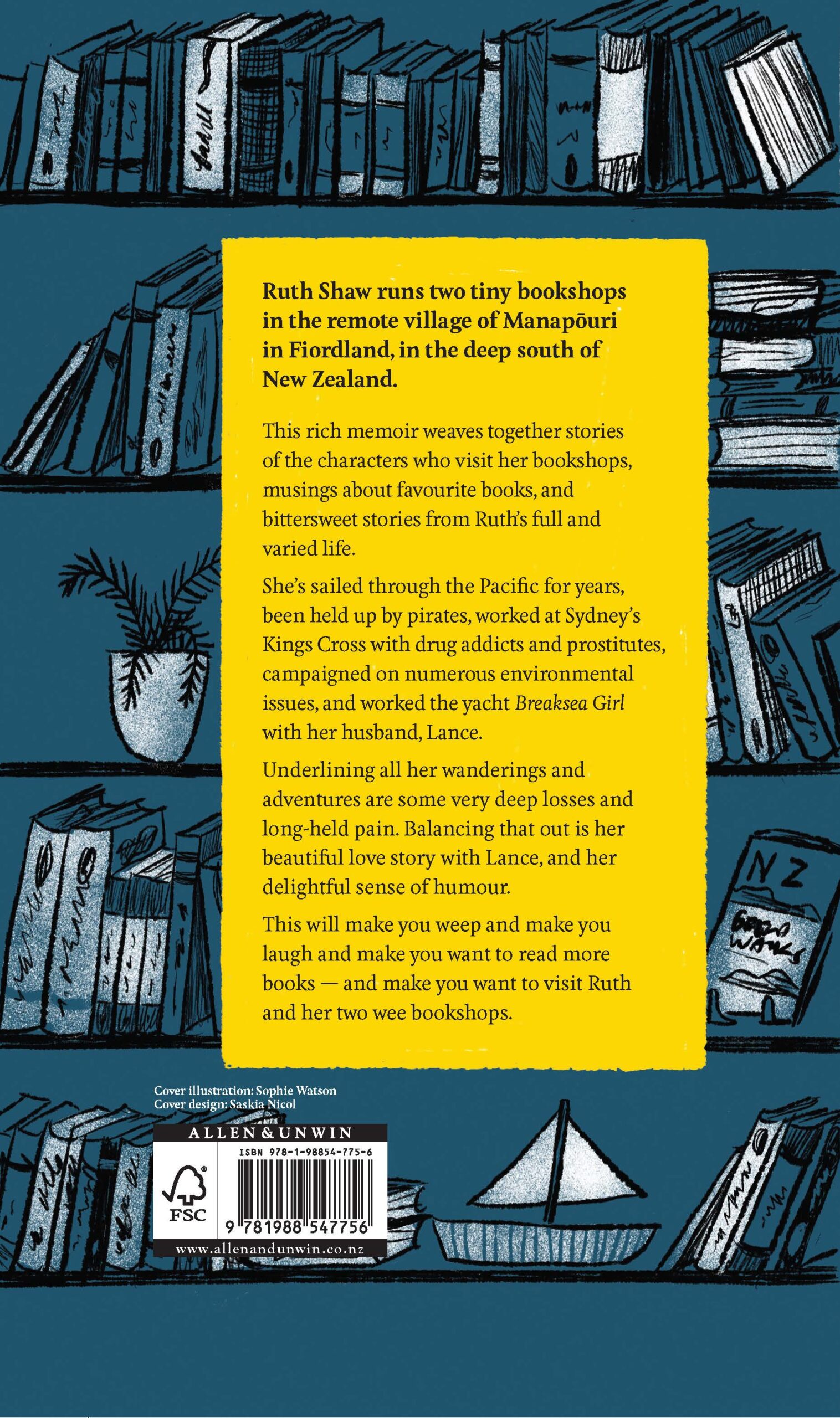
 Designer: Saskia Nicol with illustration by Sophie Watson
Title: The Bookseller at the End of the World
Publisher: Allen & Unwin
Format: 216 x 135mm, 320pp plus 8pp colour photo insert, hardback, round-backed spine, perfect bound, 4c x 1c endpapers, head & tail bands, Wibalin printed 4 colour on case with machine varnish.
Typography: The main body font is set in Feijoa medium by New Zealand type designer Kris Sowersby. Feijoa was chosen for its functionality yet humanistic qualitites and warmth appropriate for the tone of Ruth Shaw’s story owing to its gently curving straights and rounded corners. The main narrative is interspersed with stories from the bookshop. These required a different typographical treatment as they sit outside the main storyline. Saskia chose National, a sans-serif typeface designed by New Zealander Kris Sowersby of Klim Type Foundry.
“Ruth Shaw has had a full, adventurous, tragic, redemptive life so she had a great story to tell, plus she runs three tiny bookshops in a very small town. This didn’t fit the conventional publishing model for a memoir, so we wanted to create something special with the design. The hardback Demy format has a charming ‘gift’ feel to it and we wanted to have an illustrated cover. I was keen to get across the feeling of remoteness inherent in Ruth’s location (Manapōuri, Fiordland) and the romance associated with the small bookshops. Saskia and I loved Sophie Watson’s illustrations and thought her style would be perfect for this book. Saskia created scamps as inspiration and Sophie gave us several options, with the final cover developing out of this process.”
Judges’ comments The package of The Bookseller at the End of the World is an expertise example of a product that is desirable enough to successfully sell an unknown author. The front cover demonstrates a nod to isolation. Delightful endpapers give more prominence to the highlight colour of egg yolk yellow. The choice to produce this as a textured hardback adds to the gift-like nature of the book. Clear headings and variations in font give ease for the reader.
This book has a wonderfully compelling cover illustration, fun, friendly endpapers and large, easy-to-read typography set at a sensible line length. It’s a well-crafted book in nicely balanced format.