Mary Egan Publishing Award for Best Typography 2019
Finalist
Designer: Aaron Beehre
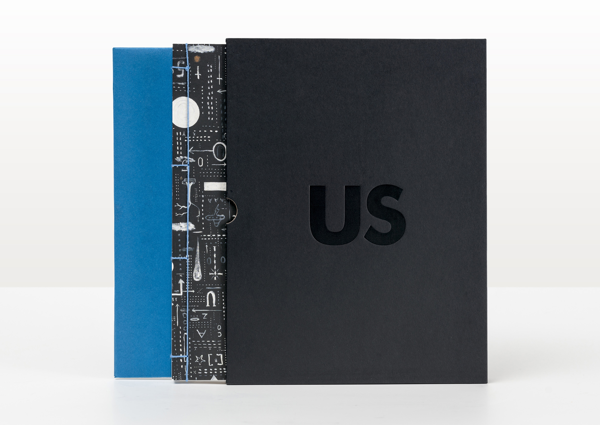
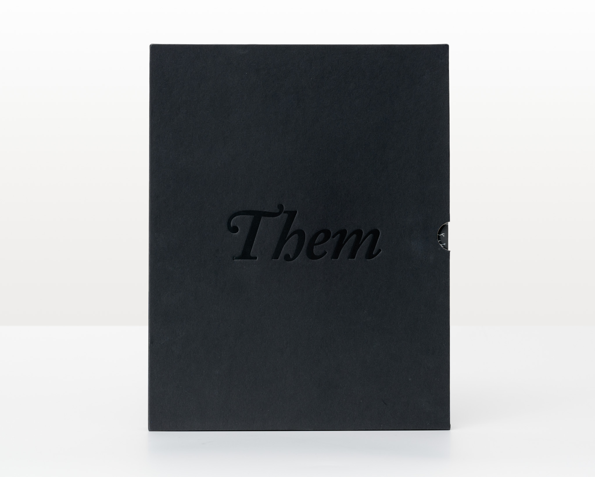
Title: Us v Them: Tony de Lautour (collector’s edition)
Publisher: Christchurch Art Gallery Te Puna o Waiwhetū
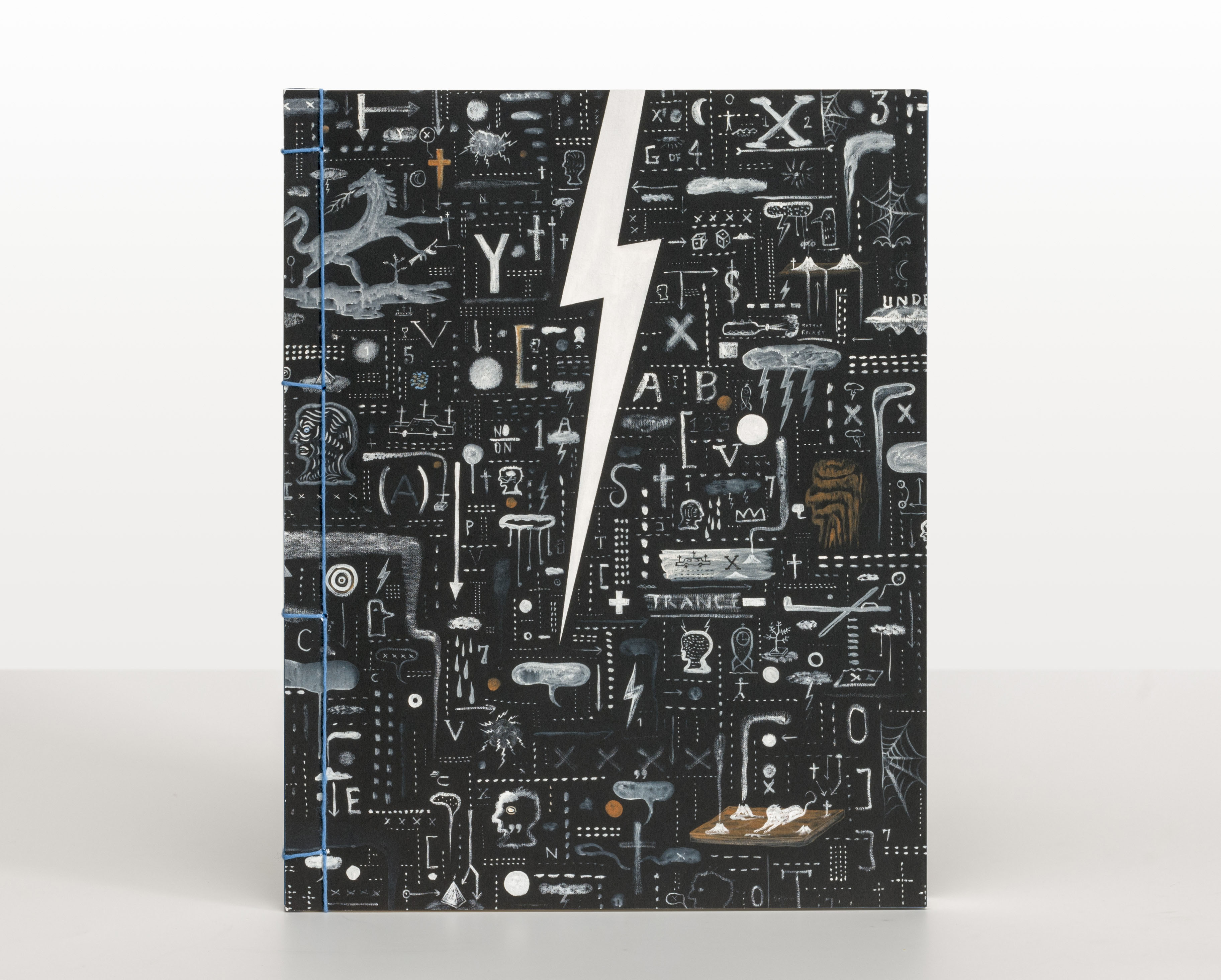
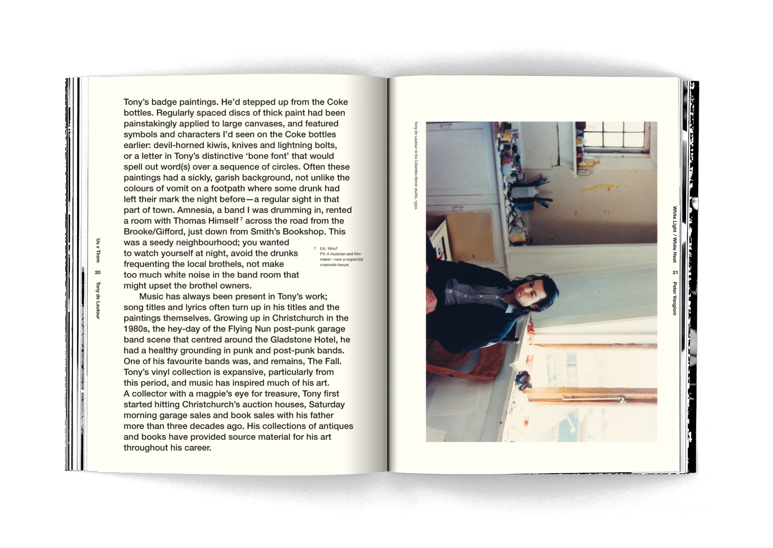
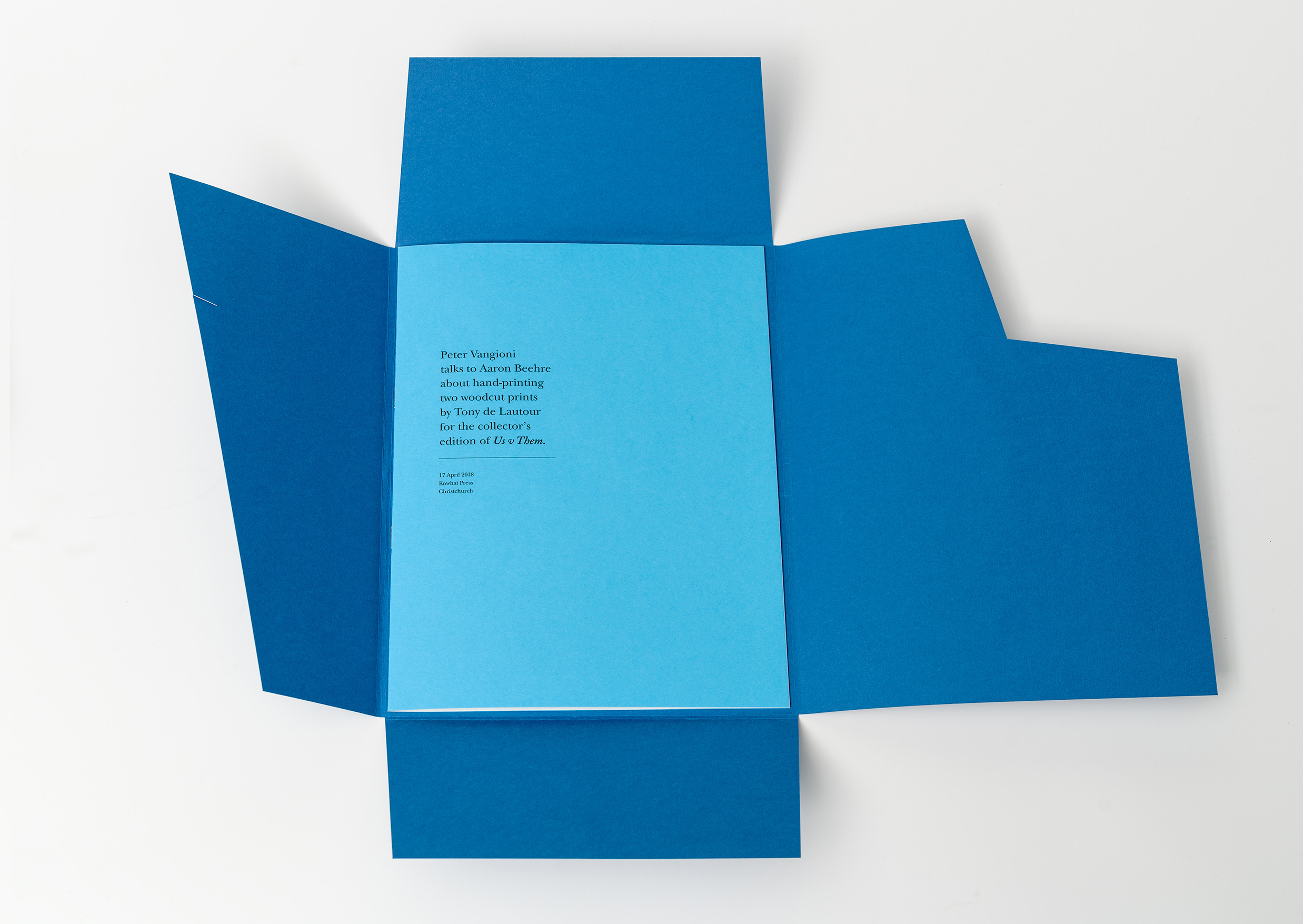
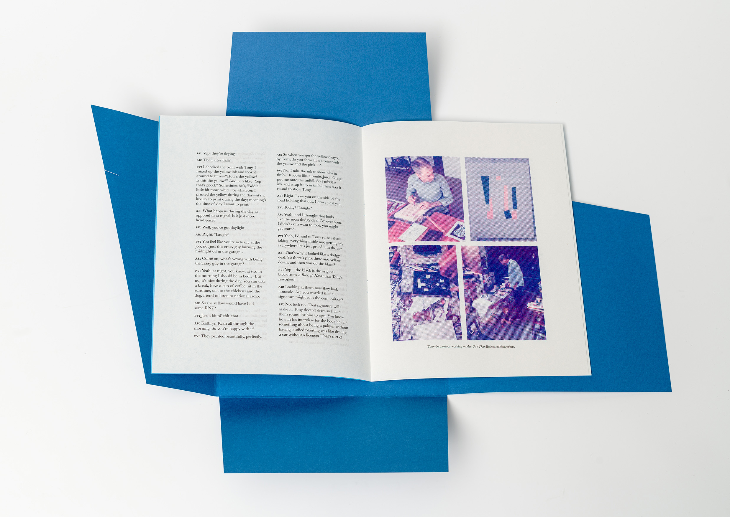
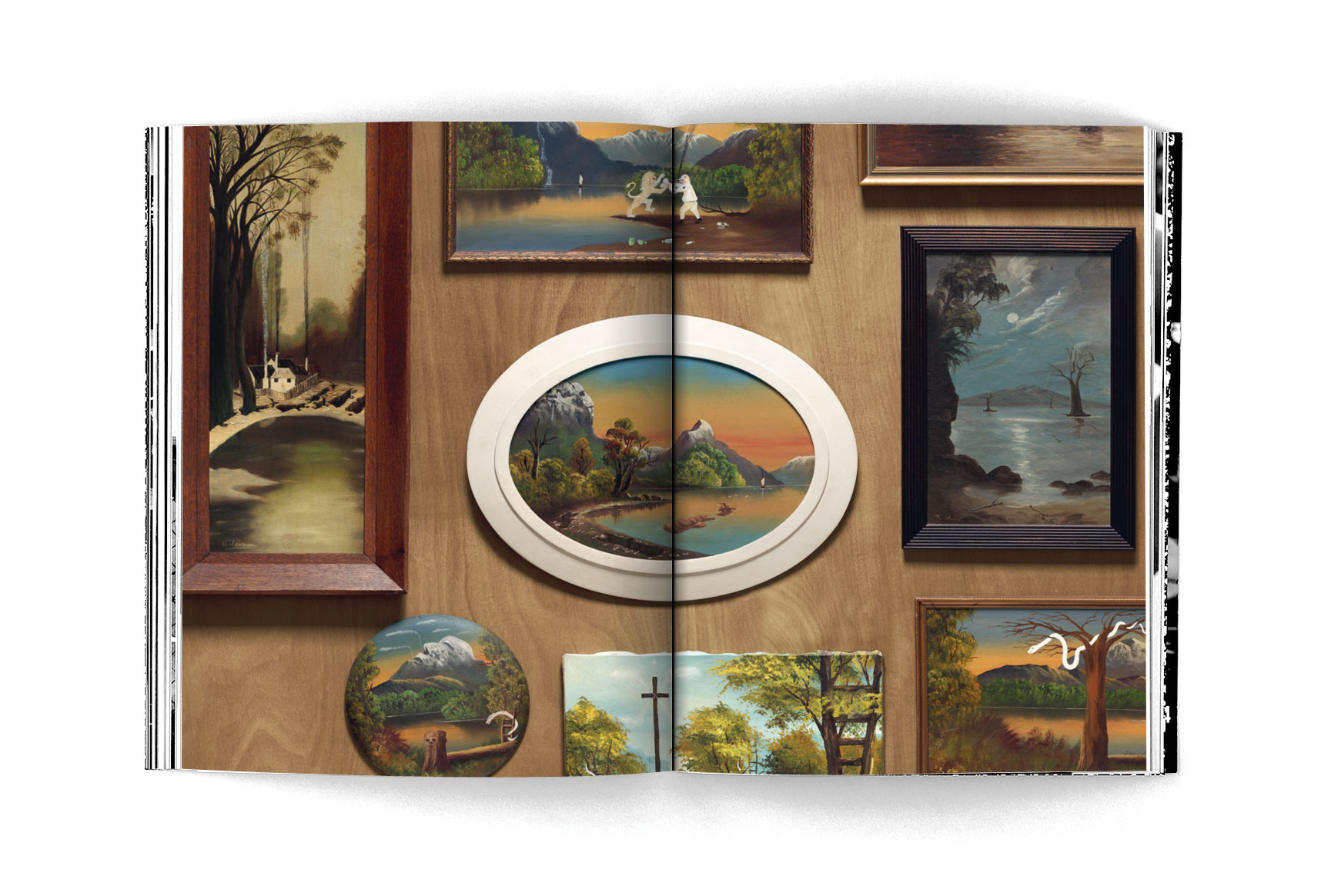
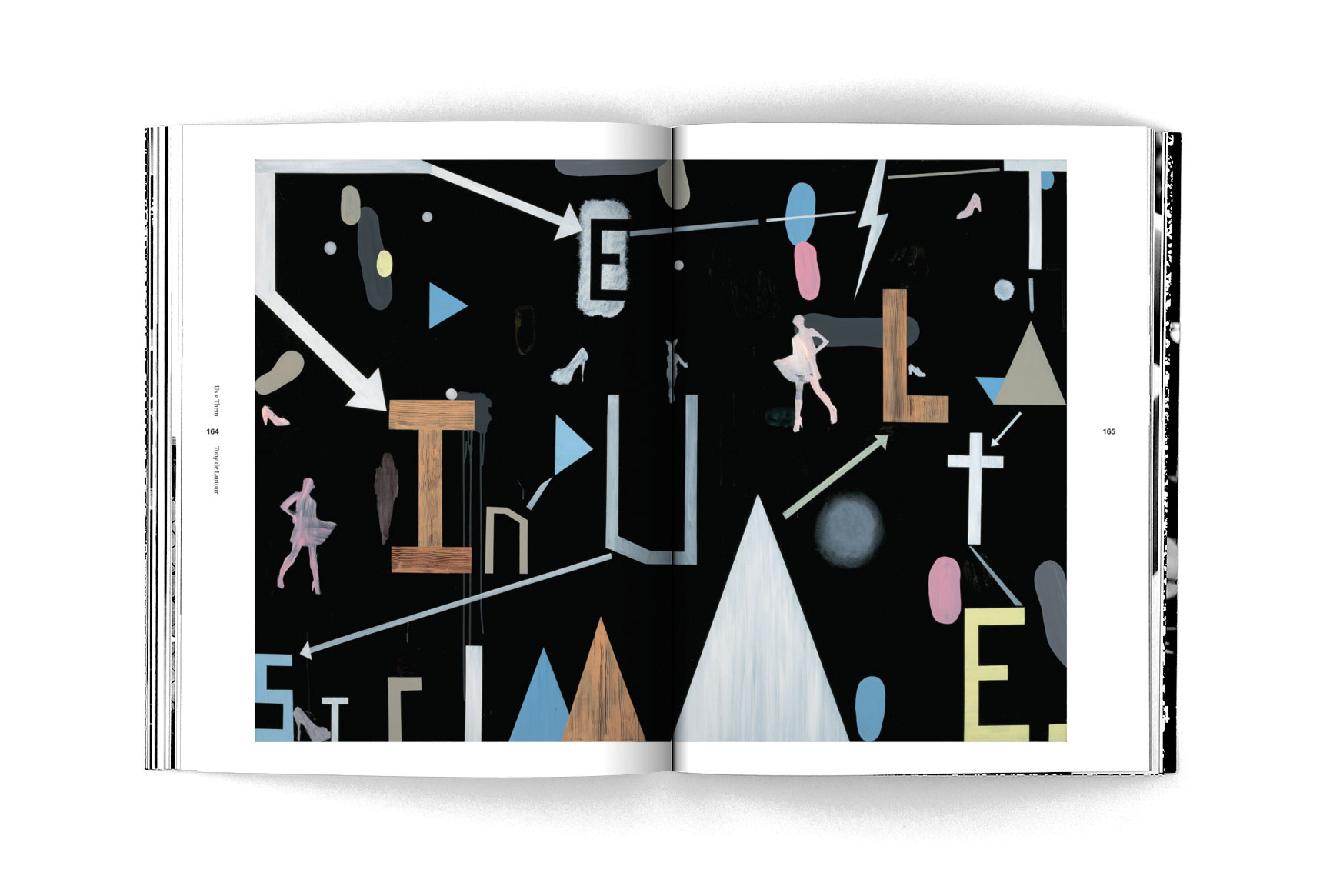
Format: 270 x 212mm, 224pp with two gatefolds, soft cover with Japanese-style stab-binding. Uncoated paperstock was used in the first half of the book to suit the grunginess of Tony de Lautour’s early practice. Smooth art paper in the second half gave serious weight to the artist’s later, more formal canvases.
The cover is the same uncoated stock used on the inside, but folded over for added strength.
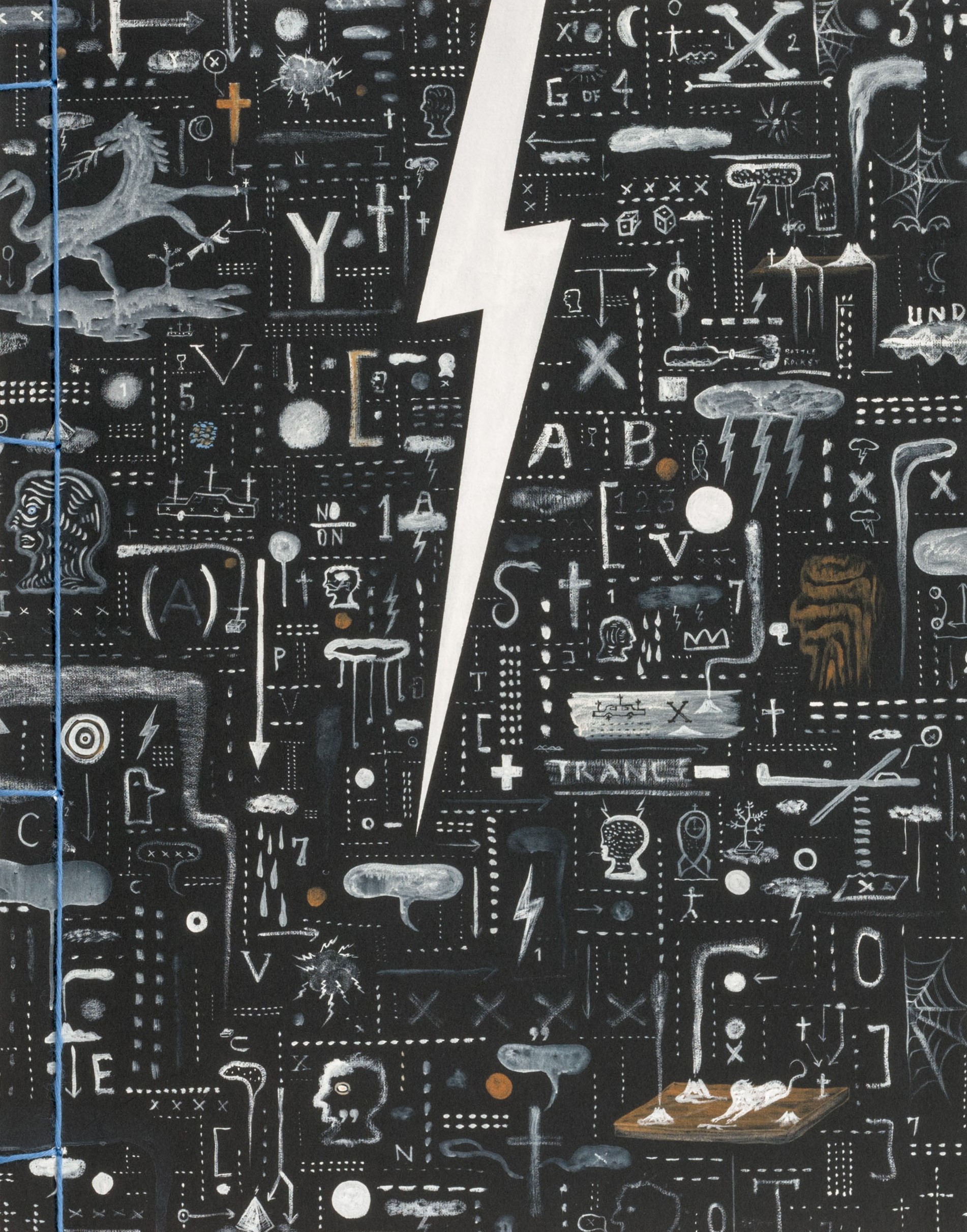
The book is held together with pale blue cotton thread – intended as a careful, elegant feature that contrasts with the textured, chaotic cover and creates a sense of a lifetime’s folio of works collected together.
The exposed edges of the book block reveal the artist’s name and his signature lightning bolt emblem along the spine.
Typography: National and Newzald in various sizes and leading. The publication begins with a text set in a bold oversized treatment of Helvetica to present a visceral and personal account of the content, followed by a more elegant treatment of the final essays set in Newzald. The large captions and quotes set in both italic serif and sans-serif take their cue from de Lautour’s artwork which is photographed in two quite distinct styles within the publication.
Judges’ comments: “There’s a complexity to this book and a rawness to the art and its placement on the page. The split of Us v Them, making a distinction between earlier and later stages of Tony de Lautour’s work, is the underlying structure of the book. The typographic choices underscore this, from the bold brash setting of the essays in the first half (see the inclusive placement of footnotes beside the content), to the more restrained, classical-like, use of serif text in the latter half of the book. Acting wonderfully as punctuation throughout are the punchy centre aligned quotes.”
“I commend the care and craft and attention to detail that has gone into producing this package. An obvious joy of typography and nuanced, detailed design.”
“Attentive, detailed design. Images are prioritised and complimented by bold fonts and there are great page layouts throughout.”
“Has to compete with so many vibrant and lively artworks. The scale of typography throughout has to hold its own in the breaks between the works. It works well across the different demands — interview, essay, captions — always enough interest and craft but not overpowering the artworks.”