Scholastic New Zealand Award
for Best Children’s Book 2021
Finalist
Designer: Katie Kerr
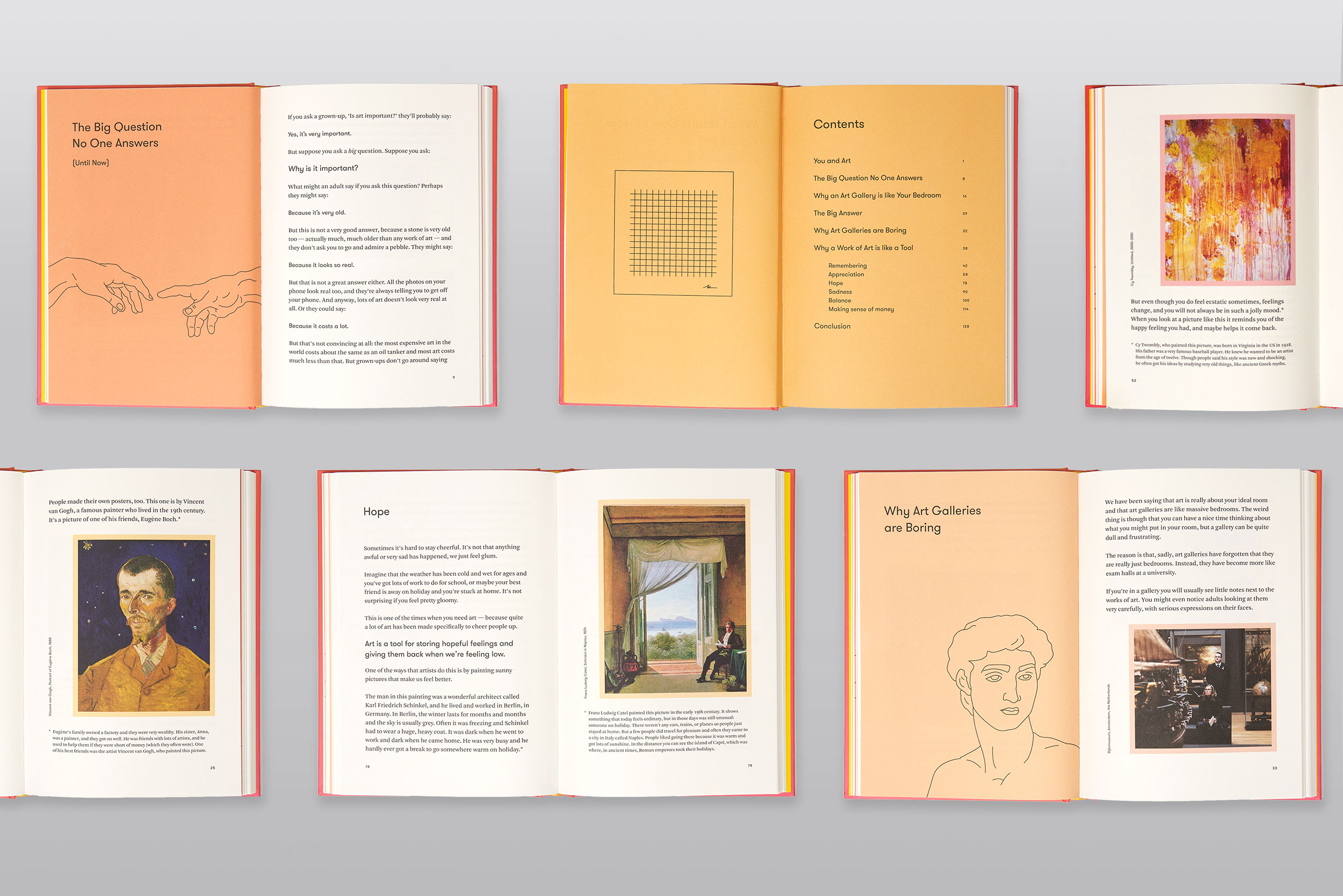
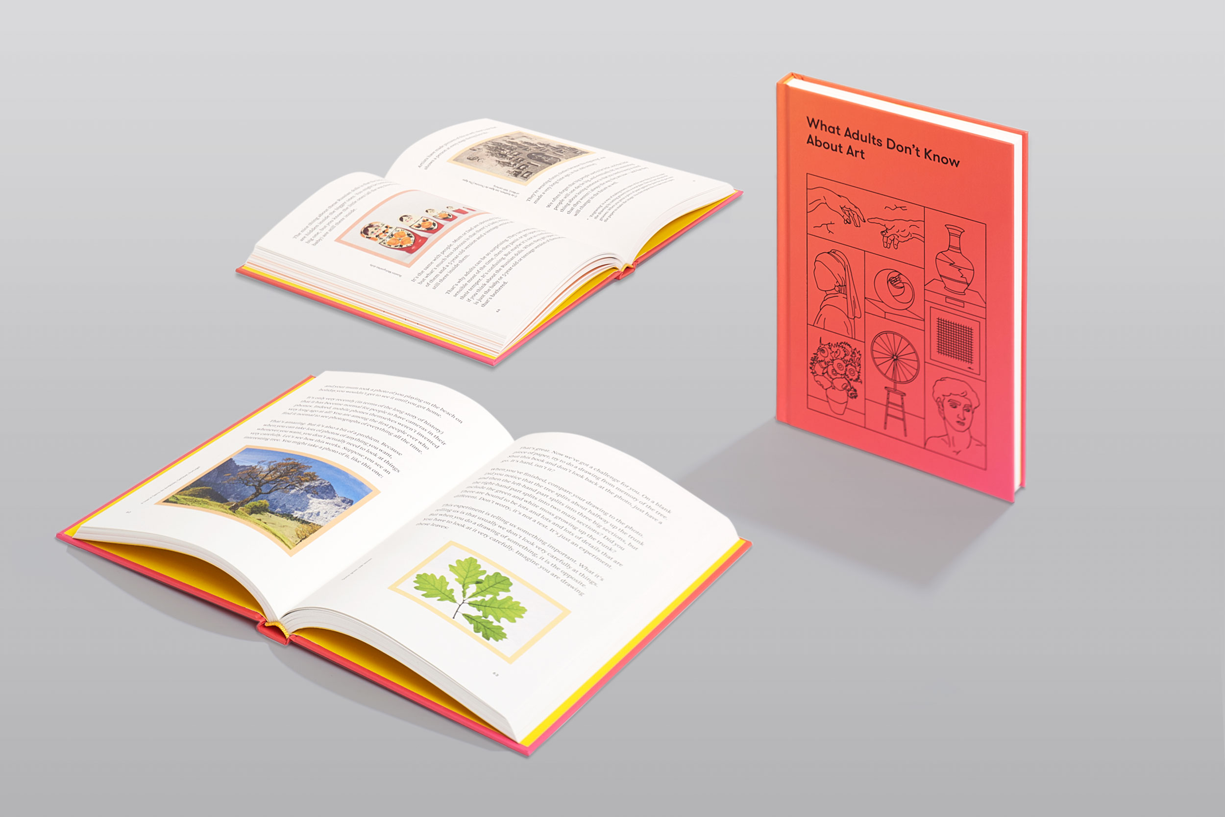
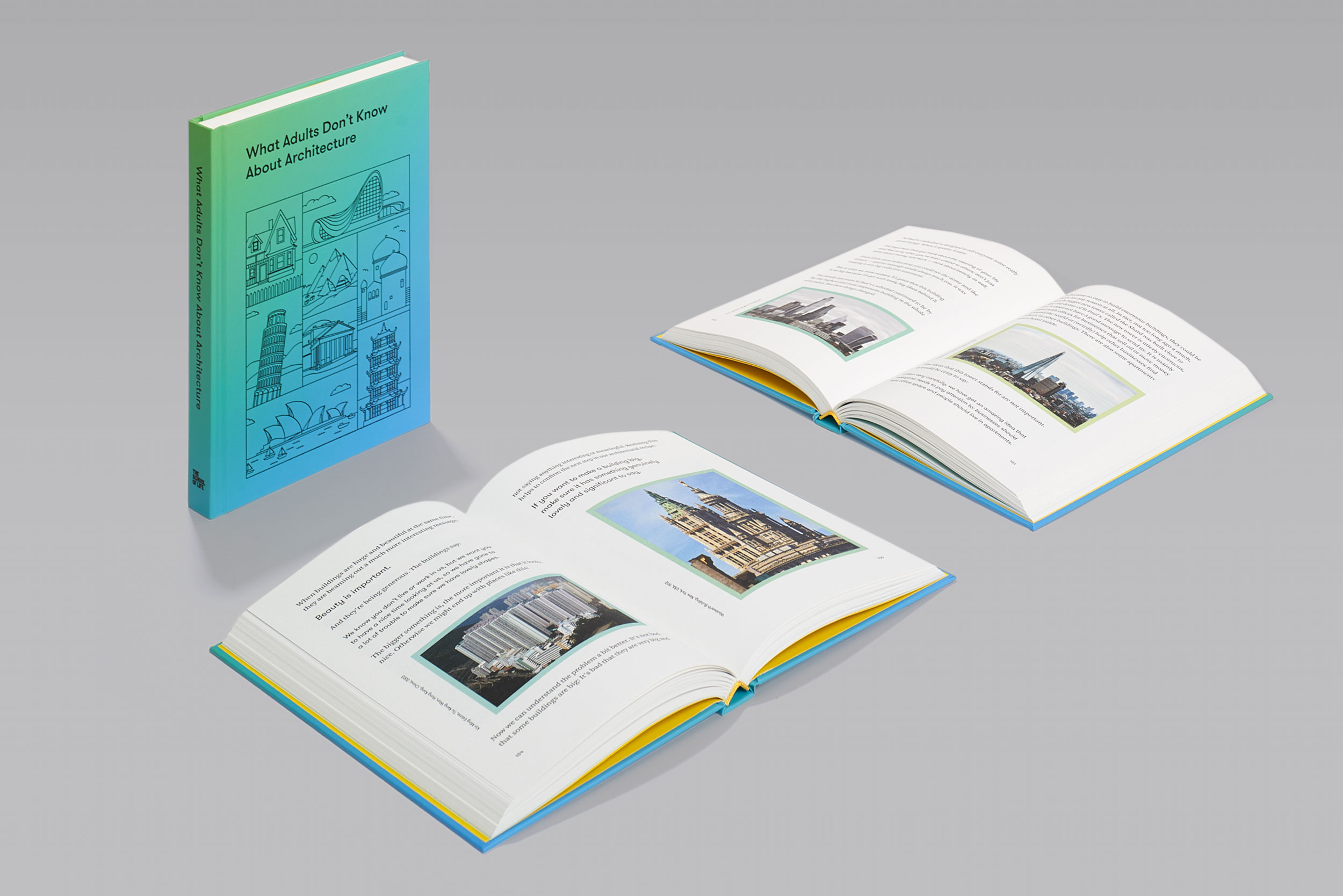
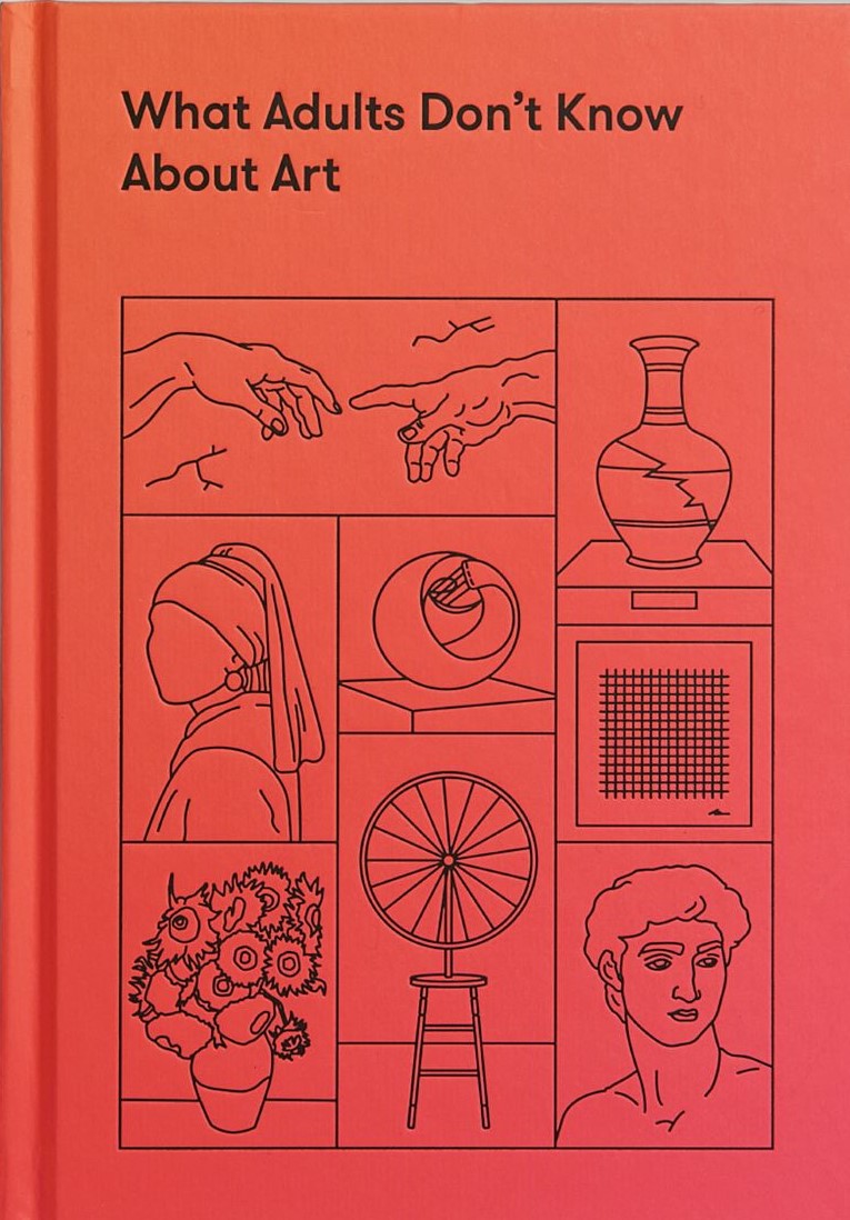
Title: What Adults Don’t Know About Art/Architecture
Publisher: The School of Life
Format: 222 x 155mm, 153pp (Art) and 185pp (Architecture), case bound. Durable laminate hardcover with debossed type and illustrations. The binding is section-sewn with a yellow headband and yellow endpapers to align with The School of Life brand.
The design outcome was conceived from discussions around creating a “Ways of Seeing” (by John Berger, 1972) for children. Like Berger’s seminal art book, the images are integrated into the narrative, so that the reader has a streamlined experience of consuming text and image. We recognised that the topic could be quite dry for the intended audience of 9–12 year olds, so the design counters any dullness with fluctuating type sizes, brightly coloured frames and illustrated chapter titles.
Judges’ comments With minimalist design and clever use of borders to draw readers’ eyes to the visuals, these informative books make engaging reading out of seemingly mundane subject matter. The pull quotes and titles draw us in, stoking our curiosity and making these informational books real page-turners.