Pearson Award for Best Educational Book
Shortlist 2009
Designer Marie Low and Esther Chua (interior), Marie Low (cover) Designer Book Design Ltd (interior), Brenda Cantell (cover) Designer Meredith Biberstein

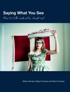
Title Saying What You See: How to Talk and Write about Art by Alison Annals, Abby Cunnane and Sam Cunnane
Publisher Pearson
Format 240mm x 186mm, 120pp, paperback
Judges’ comments Marie Low and Esther Chua had a complex array of information to convey. In this case, the final result – with its clever incorporation of highlighter text and yellow Post-it notes to indicate important sections – shows that real originality can be achieved despite limitations. The design is well structured, fresh and uses devices that help the reader develop strategies for analysing the material. One senses a keen dialogue between authors and designers, and the design is an integral component of the book. It was a clear winner.

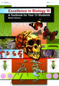
Title Excellence in Biology III: A Textbook for Year 13 Students by Martin Hanson
Publisher Cengage Learning
Format 298mm x 215mm, 168pp, paperback
Judges’ comments Excellence in Biology III is the sort of book that design students fear. It has to combine a basic text with additional extension sections and a myriad of charts, illustrations and captions, and still maintain a sense of coherence. The designers were not unduly original here, but they nevertheless achieve an intelligent and effective design that displays superb attention to detail. The difficulty involved in achieving this level of clarity out of such a morass of information cannot be underestimated.

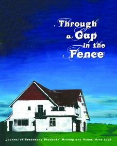
Title Through a Gap in the Fence: Journal of Secondary Students’ Writing and Visual Arts 2008
Publisher Learning Media
Format 260mm x 210mm, 52pp, saddle-stapled
Judges’ comments Meredith Biberstein had to deal with fragmented raw material when she created a digest of the best secondary students’ art and writing in Through a Gap in the Fence. The cover does not fully represent the typographic treatment of the text inside, but the overall effect is contemporary, clever and creates a dynamic framework for the diverse work it deals with.


