
This week’s Book Look is with Anna Brown, a book designer and design educator. She is a senior lecturer at Massey University’s School of Design and director of Open Lab, its in-house design studio.
This collection of books was commissioned in 2006 by the Institut Français, an organisation set up by the French Ministry of Foreign Affairs. The Institut Français was established to promote French culture and, in particular, to promote books written in French. I picked them up when my daughter was, briefly, attempting to learn French at the Alliance Française at the age of five – she is now eleven. They were free and they were beautiful! Every week I would look forward to sitting in the waiting room and devouring the next edition.
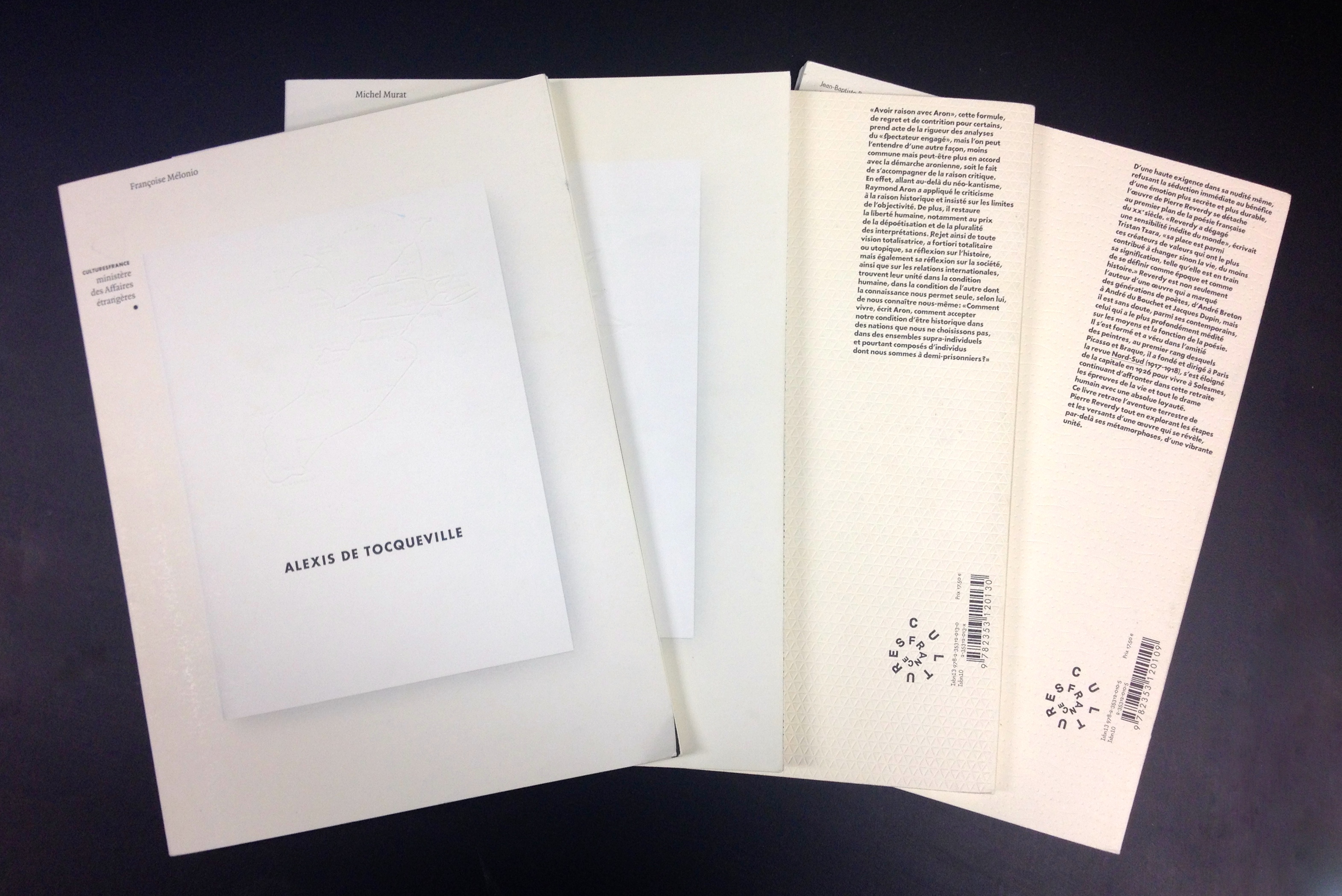
It is testament to how much I love these books that when I was asked to provide one photo I had to provide at least five, that the once beautiful and crisp cream covers are now covered in fingerprints, and that even now, six years on, I still open them and enjoy the skill and wistful playfulness with which they were designed.
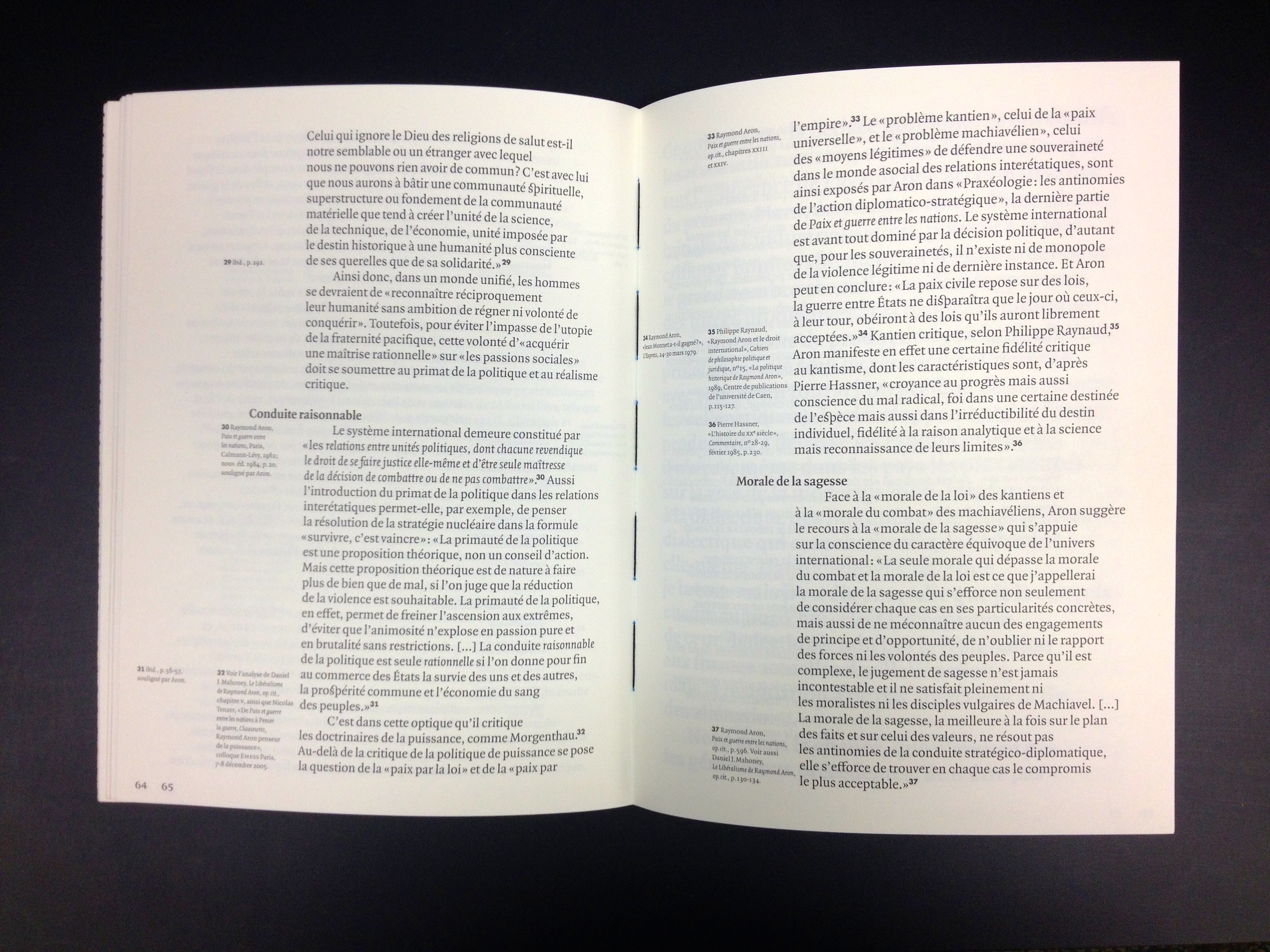
The four editions I chanced upon are written about Julien Gracq, a novelist; Raymond Aron, a philosopher; Alexis de Tocqueville, a 19th-century political thinker and historian; and Pierre Reverdy, a poet. They are designed by SpMillot (Philippe Millot), a designer based in Paris with Éditions Take Five.
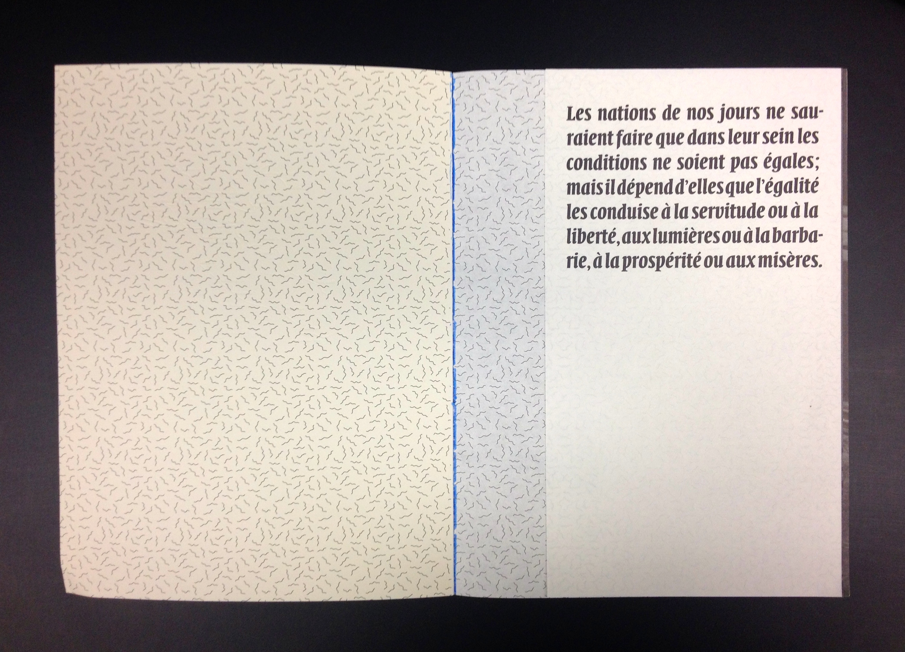
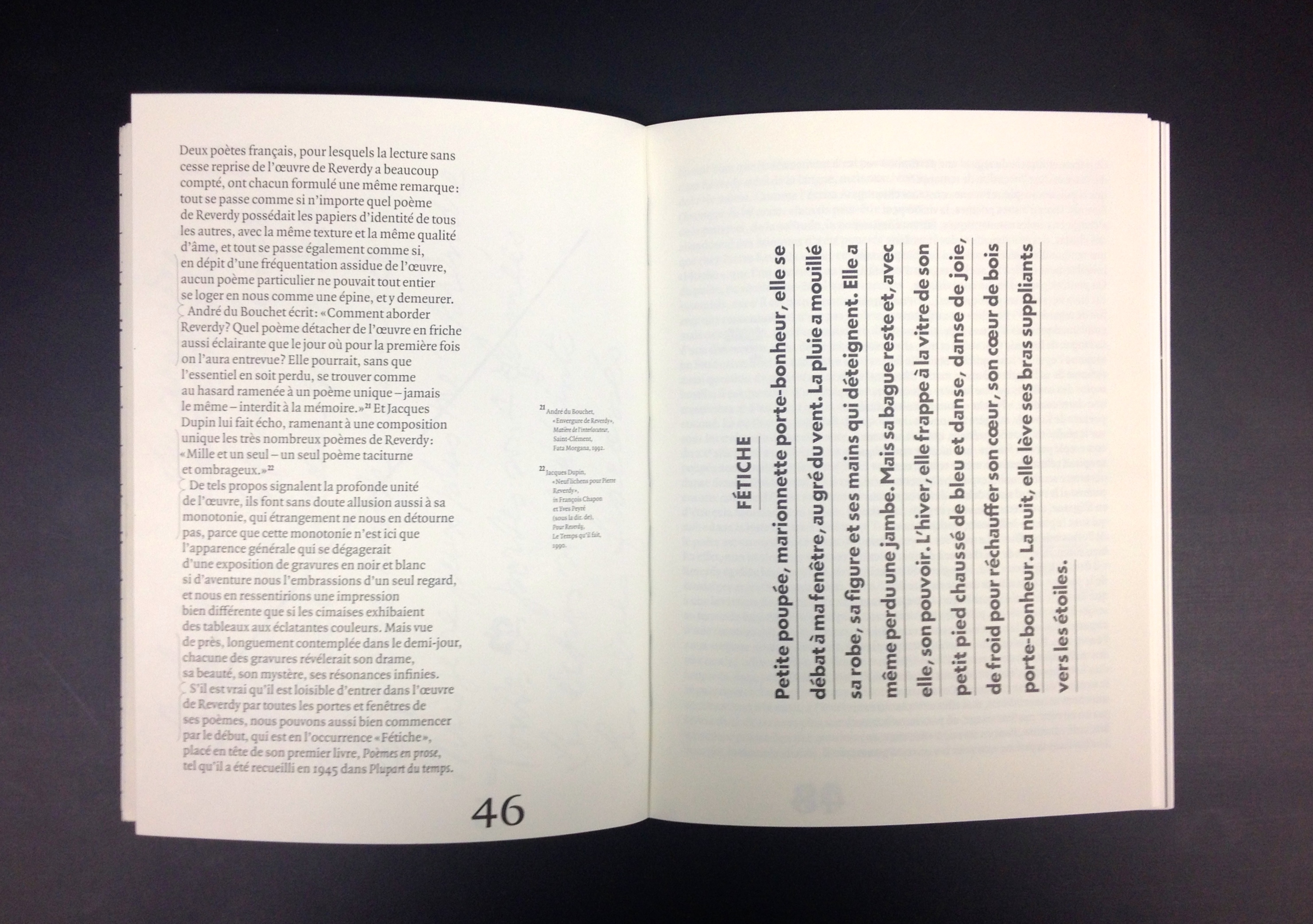
These books are typeset in Quadraat (serif and sans serif) with a smattering of Futura Bold. Every edition uses these typefaces, but each does so in a novel way. The way Millot uses the grid is expert, but it is in his whimsical use of Quadraat that you really get the sense that he is flexing his typographic muscles. He uses drop caps in one edition and large folios in another. Footnotes bring the page to life and timelines allow Millot to change the reading condition from portrait to landscape.
Each edition is printed on a smooth cream stock in varying weights for the text pages and the pictorial pages (reminiscent of Munken Pure paper). Each utilises an elaborate and distinctive pattern, but only occasionally – in the single gatefold at the front of the book and debossing on the back cover. The books are stitched with black thread and bound with blue adhesive, and have an embossed symbol on the front cover. While this sounds like it might be overkill, each book has the feeling that it was generated with a light touch, and the result is beautiful.
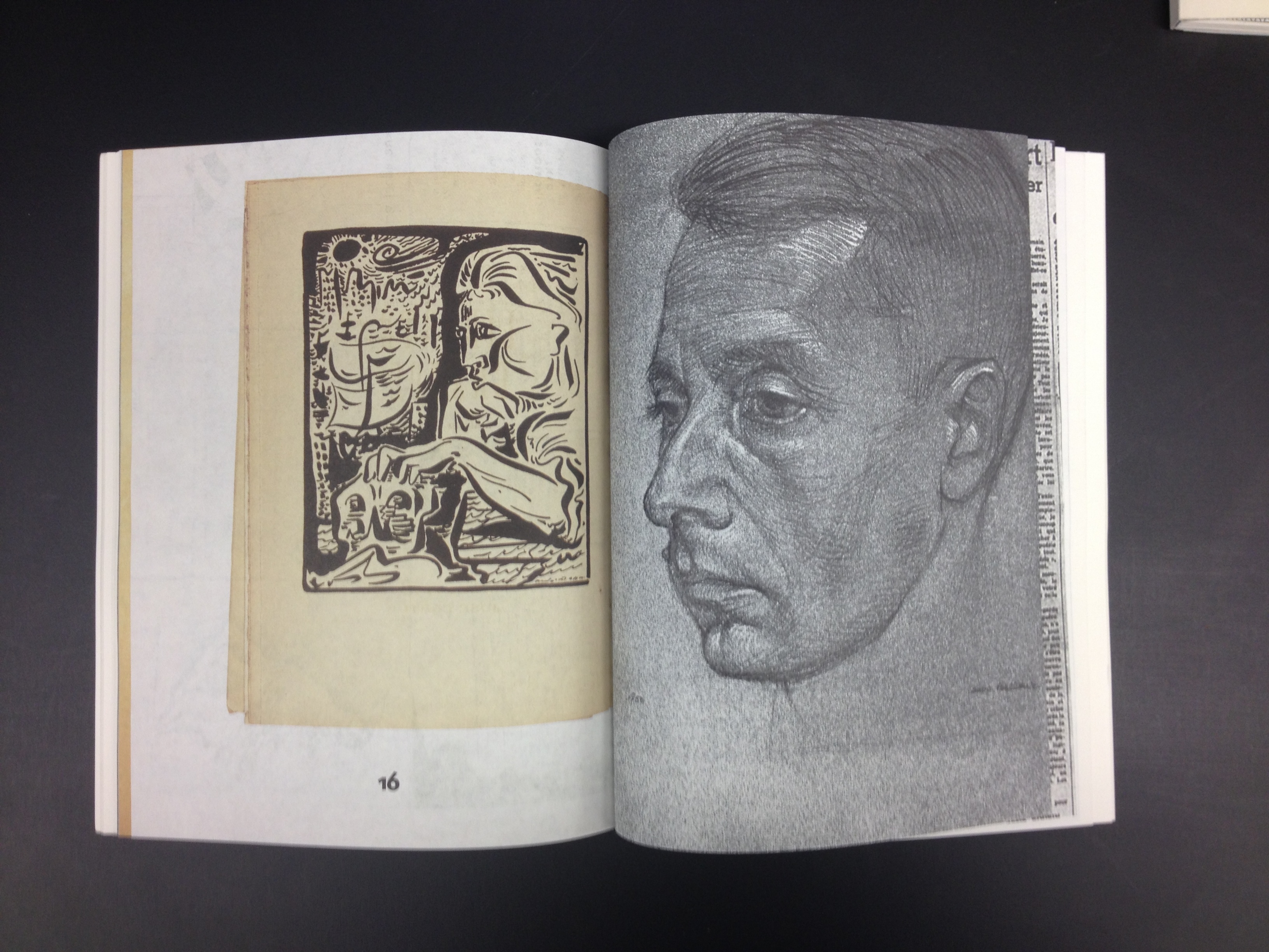
But ultimately, for me, what ties it all together is that these are beautiful books about books, with images of older editions to be found within the pages. Each one is a love affair with books – one the reader and designer clearly share.
