2021 Gerard Reid Award for Best Book
Sponsored by Nielsen Book
Winner
Designers: Arch MacDonnell, Alistair McCready, Dean Foster, Jane MacDonnell, Inhouse Design.
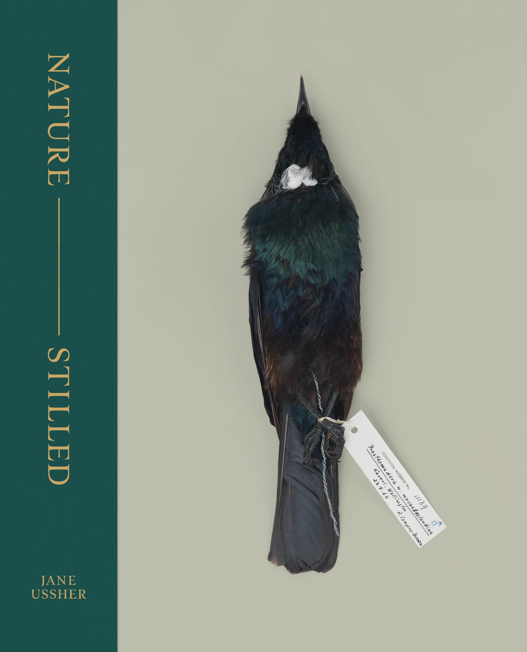
Title: Nature—Stilled
Publisher: Te Papa Press
Format: 350 x 202mm, 4368pp, quarter-bound hardback.
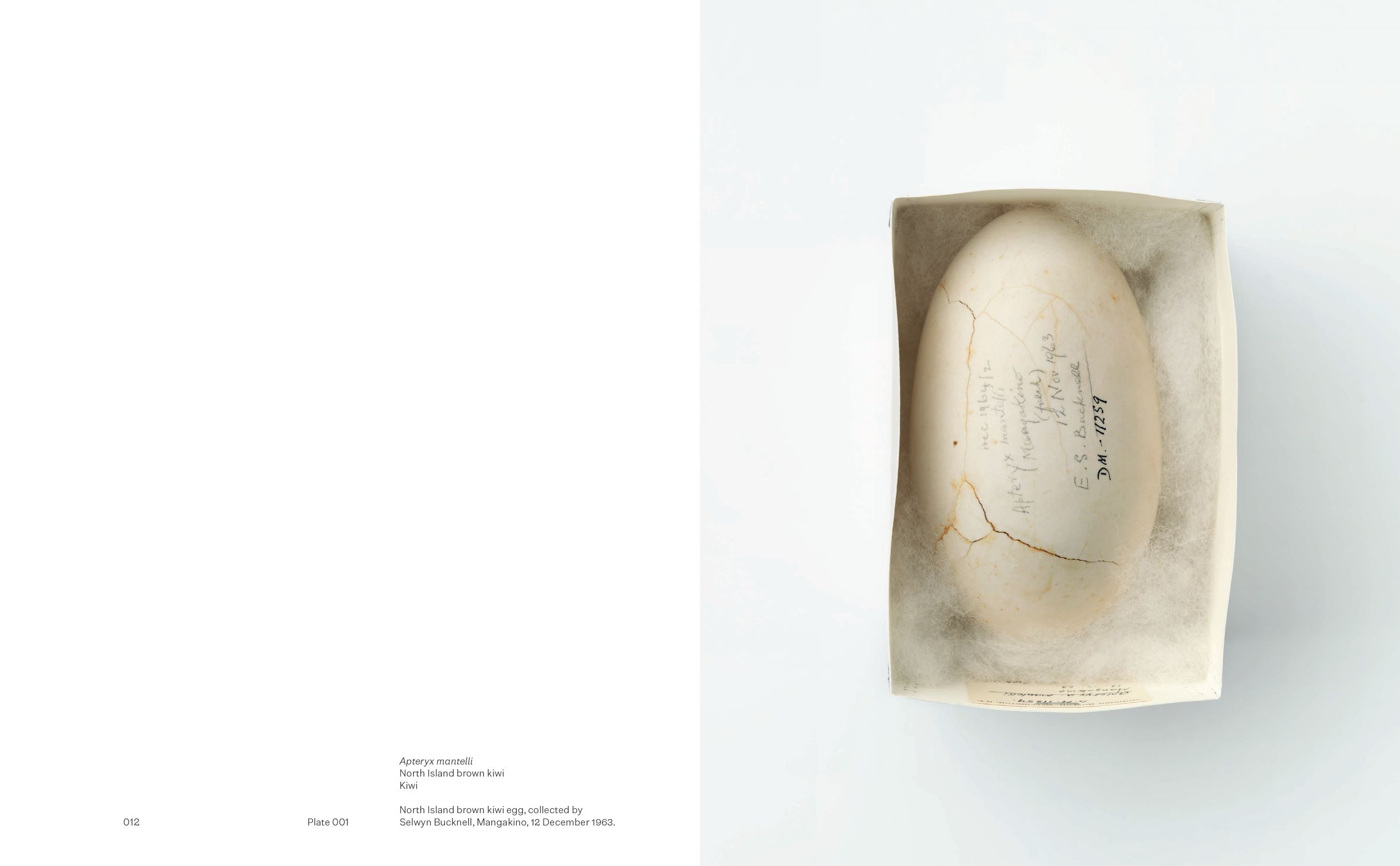
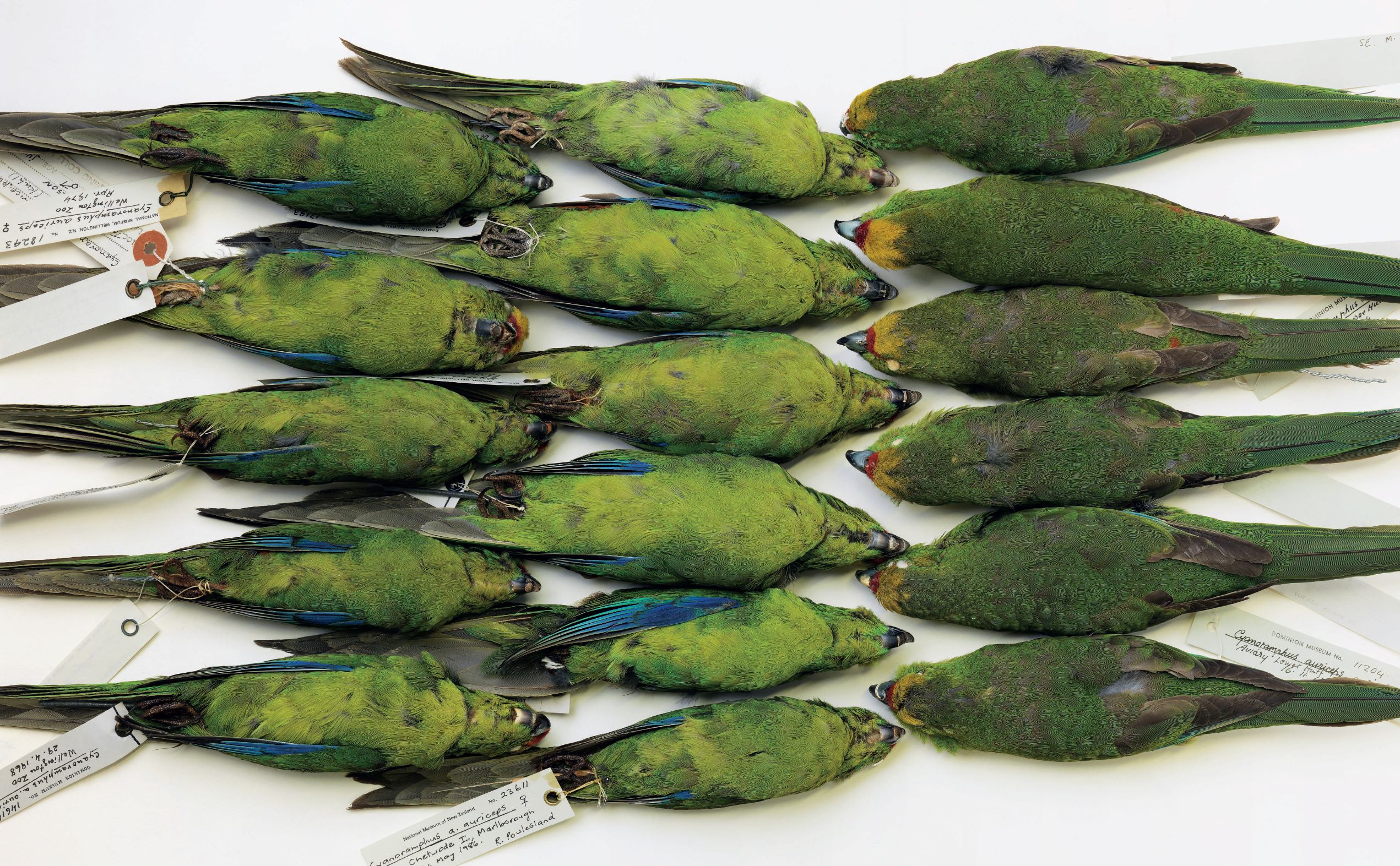
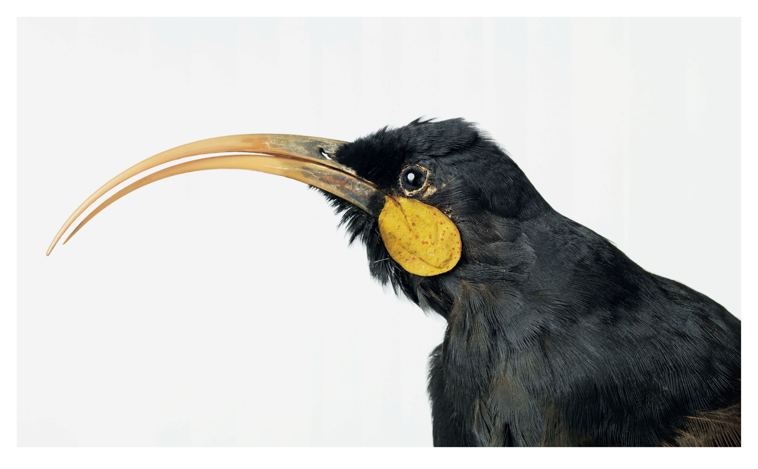
Photographer Jane Ussher spent several weeks in Te Papa’s natural history collection storage areas capturing images of insects, fish, molluscs and botanical specimens. Despite the images being provided in obvious catalogue groupings, a bold move was made to reject this categorisation using a colour wheel to inform a chromatic plate sequence for the 157 images. The images were blurred to the point of abstraction to where the most essential colour could be distilled. Each image then became a colour swatch that could be assigned a value and placed within a colour wheel. Colour hues became a unique and consciously arbitrary way to navigate the natural world and curate the collection within the book’s interior pages. Rhythm is always critical in reader experience, the colour and scale of plates set an intentionally slow pace of movement. The grid is flexible to accommodate the varied proportions of the imagery throughout. Compositions have generous margins allowing each plate room to breathe.
Typography: Two custom fonts were used throughout, Pukeahu for the headlines and Still Sans, which was used for the body copy text. Both designed by Alistair McCready.
Nature—Stilled features two custom typefaces designed specifically for this publication; the display typeface, Pukeahu, is inspired by the foundation stone of the Dominion Museum (where many of the objects were once housed) and the body copy (Still sans) draws on type-centric ephemera from yesteryear’s museum catalogues. The text is easily read, and the forms robust, despite appearing delicate on the page.
Still Sans was specifically created for the publication Nature—Stilled by the book’s designers. The typeface draws on typographic ephemera from museum catalogues, resulting in a combination of old and new that suits the book’s amalgam of old-world museological atmosphere combined with a formal and spacious text grid.
The typeface is spread over six styles — thin, light, and regular with accompanying true italics. Given the numeral heavy nature of the book, both proportional and tabular, along with ¾ height numbers, were added to aid textural clarity. Intended for use below 12pt, the defining details of Still Sans are mainly found within the lower case. Peaked terminals and drastic ink traps mean the anatomy of each character is deceptively traditional while collectively offering a smooth texture on the printed page. A stiff, neo-grotesque nature is broken by moments of awkwardness, especially within the numeral sets where conservative treatment is tossed aside for more quirky, disobedient strokes. The design is both assured and humble — rooted in history yet contemporary in output.
Judges’ comments Beautifully done. This book shows immaculate production and sensitivity for Jane Ussher’s careful yet expressive photography and the overall subject. This is balanced with the designers’ own spirit and attitude in the typography, colour palette and materials, including the quietly radical chromatic-plate ordering that results in unexpected interspecies juxtapositions (at one point: crab, zebra, trout, moths, lichen and beetle). Respectful and joyful collaboration is evident across the project: between publisher, editors, photographer, curators, technicians and the designers. Subtle but defining details like the tonalities across animal subjects, photo backdrops, the quarter-bound linen stock, two-toned marker ribbons and marbled endpapers all match the attention to typography throughout. The cover display type is ultimately revealed to be derived from the Dominion Museum foundation stone, and the body text is set in an additional typeface designed specifically for the book – in the three different weights with italics, no less. If method acting involves a sincere performance through in-depth and lived research that identifies emotionally with the given subject, this is method designing. Stunning.