Te Herenga Waka University Press
Award for Best Typography 2023
Finalist
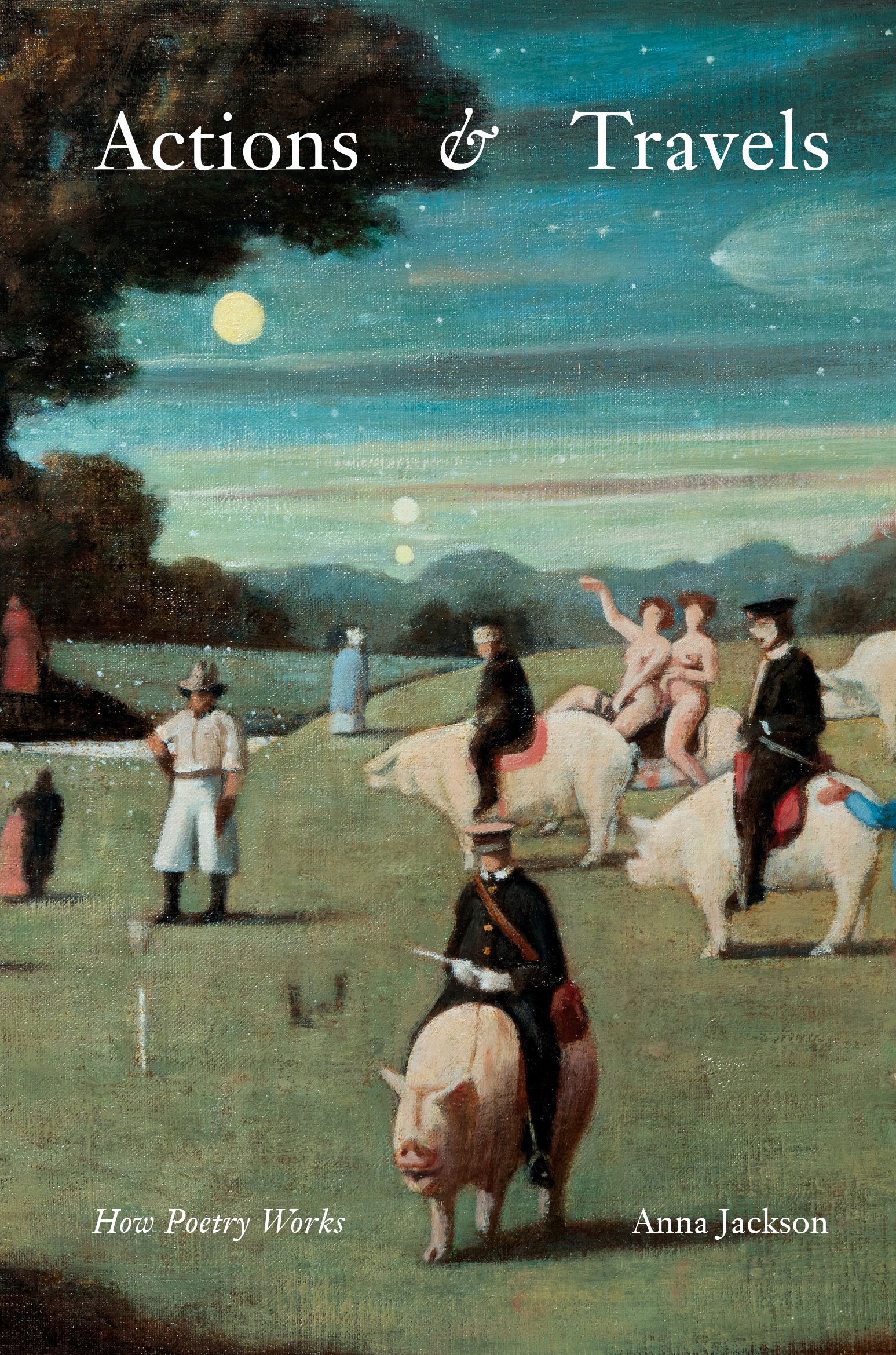
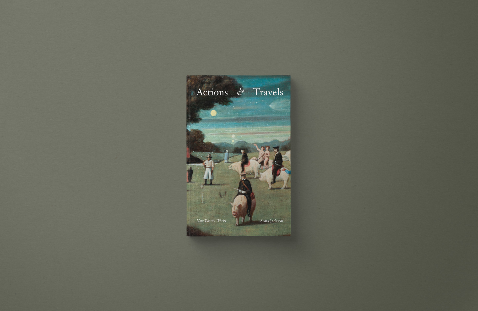
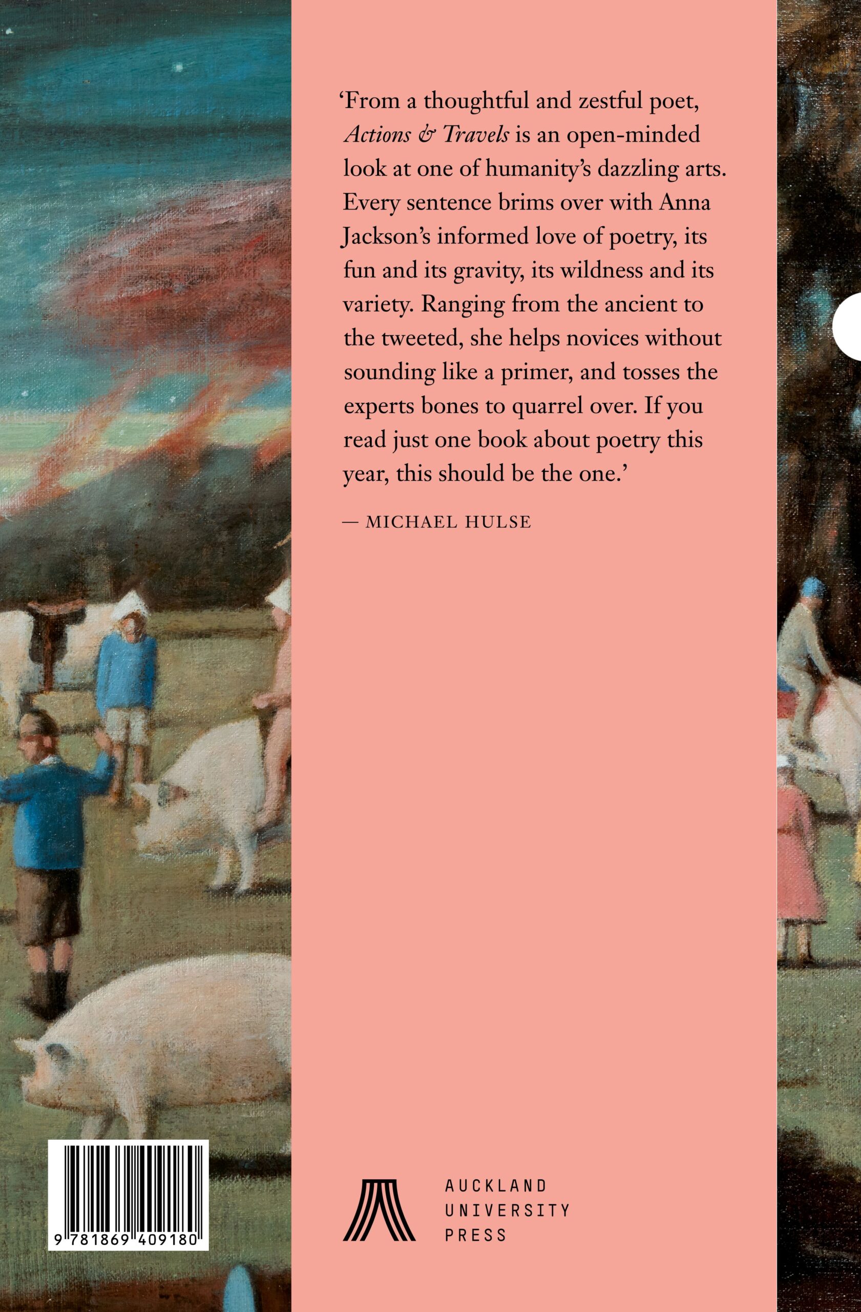
Designer: Katie Kerr, Studio Katie Kerr, cover artwork: Richard McWhannell, photograph by Stephen Goodenough
Title: Actions & Travels: How Poetry Works
Publisher: Auckland University Press
Format: 198 x 130mm, 312pp, paperback. Cover printed 5c + waterbase matt varnish x 1c on a textured 300gsm FSC Hyacinth Super White. Text on 80 gsm Ivoprint Creamy paper FSC.
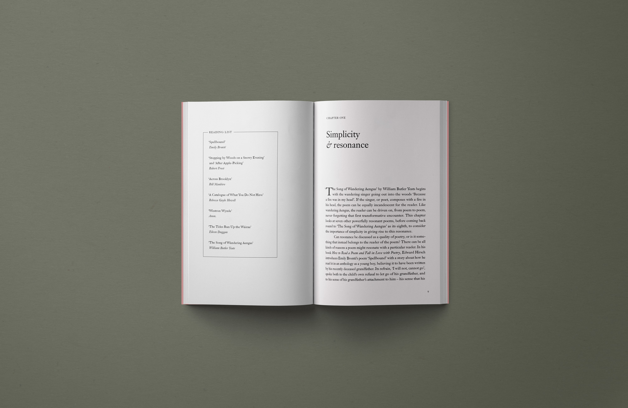
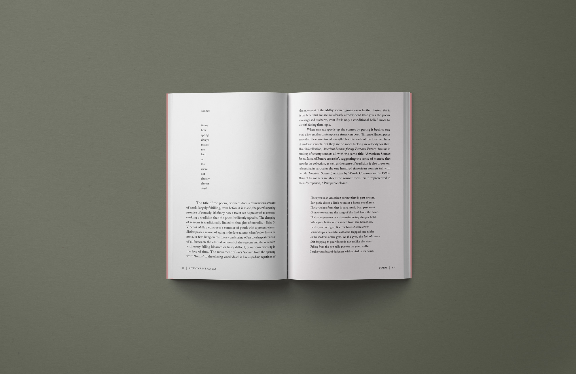
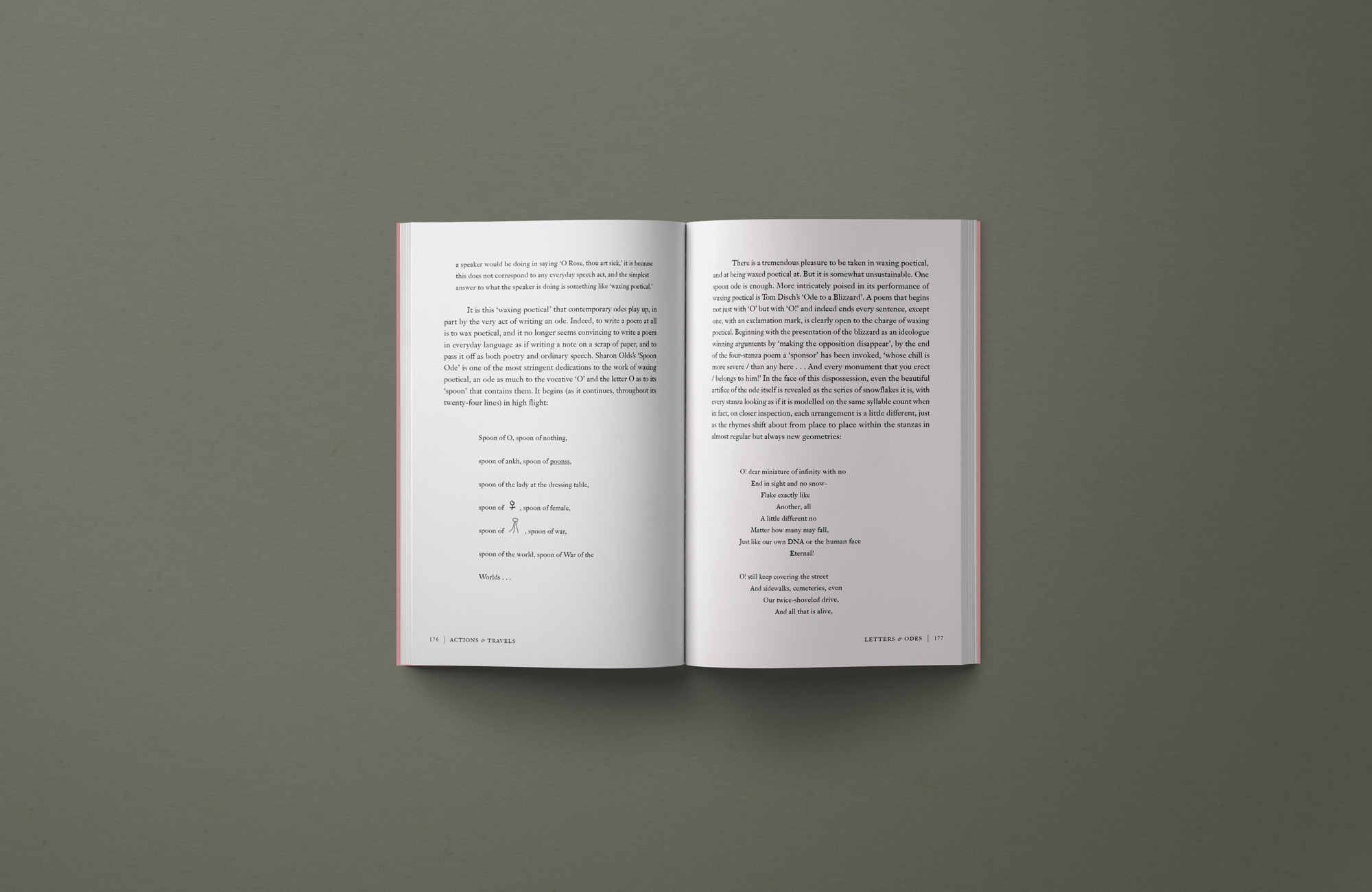
Typography: The publication uses variations of the typeface Janson, designed by D. Stempel AG in 1985 and released by Linotype. We were quite taken by the beautiful italic ampersand, which is used in the book title and in various chapter titles. The ampersand was also re-formed into a decorative symbol for section breaks.
“The typographic challenge was to integrate a large number of poems — all with various styles, formats and typographic quirks — seamlessly into an explanatory body of text. This required strong attention to spacing, particularly indentations and breaks, as well as a focus on particular characters, such as emojis and doodles, that are integrated into certain poems.
The vision for the book was a readable, pretty paperback with a touch of adventure and humour like many of the poems within. A cover with a slightly busy image or painting (reflecting actions and travels), suggesting the whole thing should be a bit fun. Something that told its own story, much in the way a poem does.”
Judges’ comments This refined and elegant little book has an intriguing cover image, and sophisticated typography that walks a happy line between ‘elegant and traditional’ and ‘contemporary and playful’. On the cover the title type is justified to great effect. The wide spacing between word and ampersand provides a visual anchor for the subtitle and author credit below. The title then unexpectedly turns sideways on the half-title page. Returning to more familiar ground, all of the text elements feel that they are just the right size on the page, with the placement, tracking and kerning handled with care and consistency to produce an easy-to-read text and even colour throughout. Highlighting those special italic ampersands on the section pages is a treat for every type-lover!