Te Papa Press
Award for Best Typography 2026
Finalist
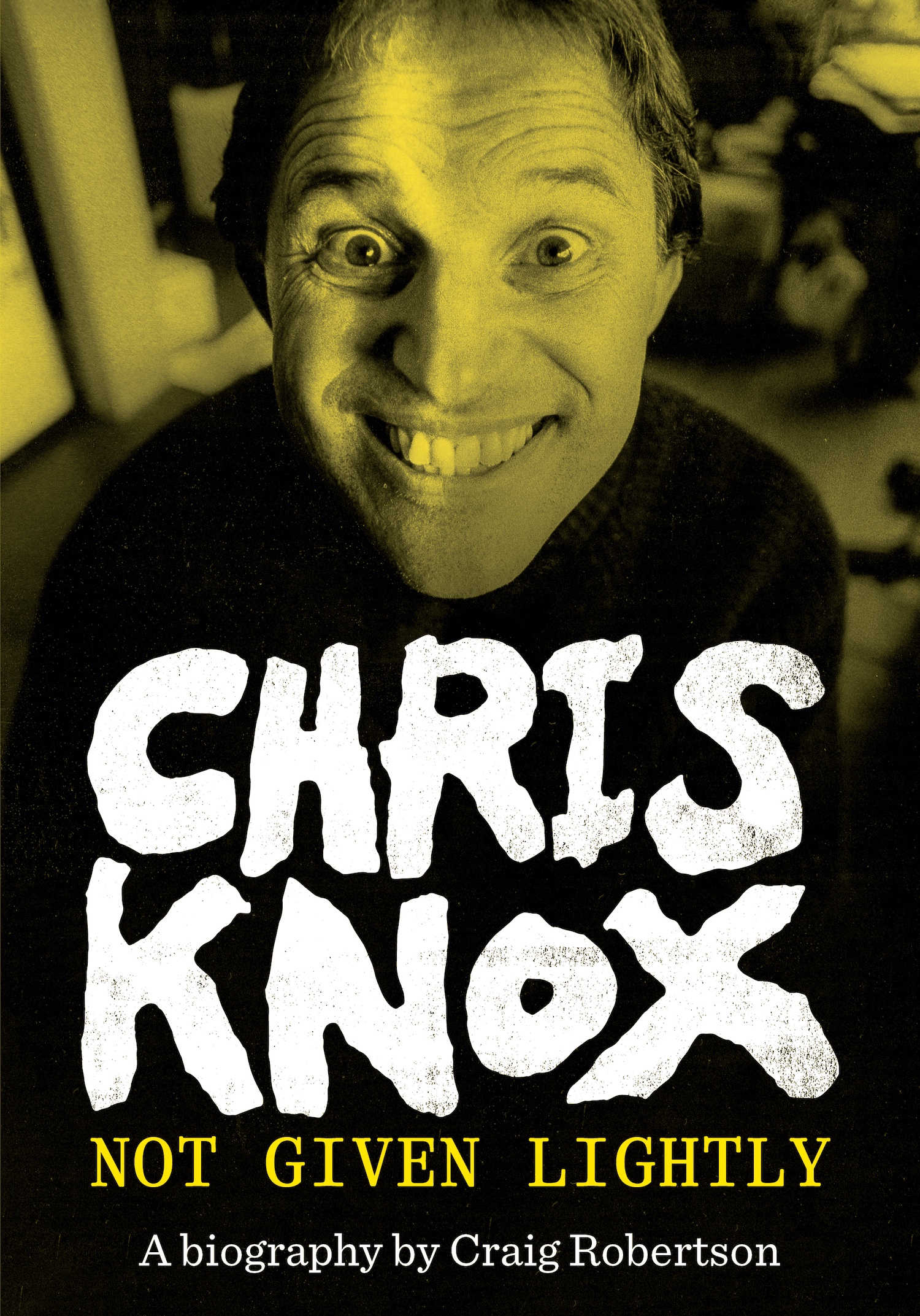
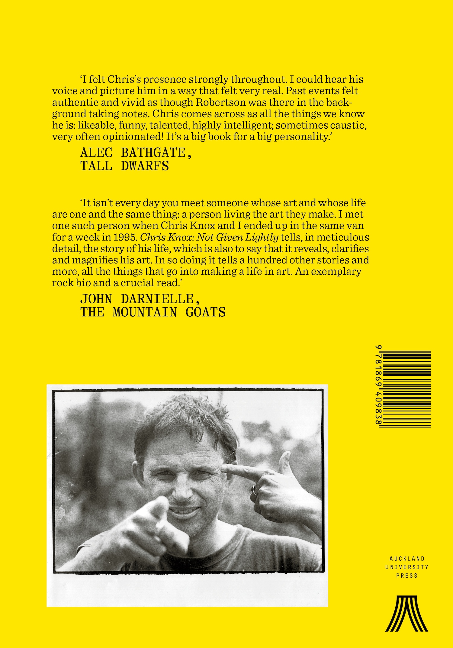
Designers: Alan Deare (Cover & Interiors) & Dave McDonald (Interiors), Area Design
Title: Chris Knox: Not Given Lightly
Publisher: Auckland University Press
Format: 230 x 160 mm, 464pp, flexibind on Kraft paper board, jacket printed 2 colour on Wibalin paper with an overall gloss UV varnish, text printed on creamy uncoated, grey paper and gloss art paper.
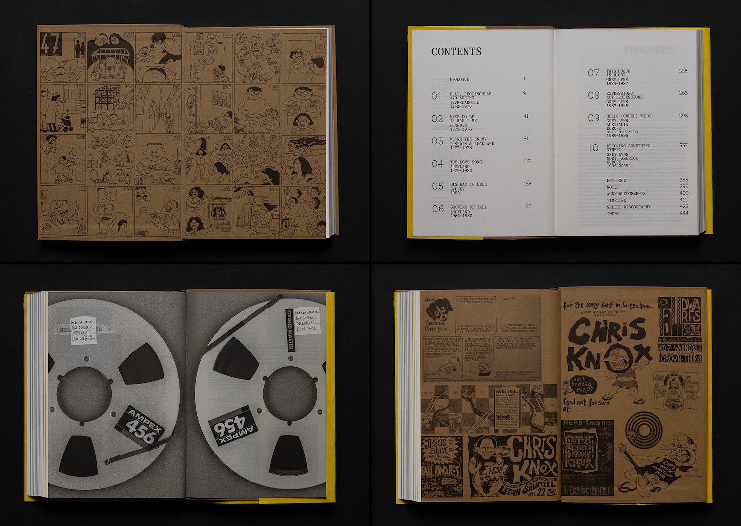
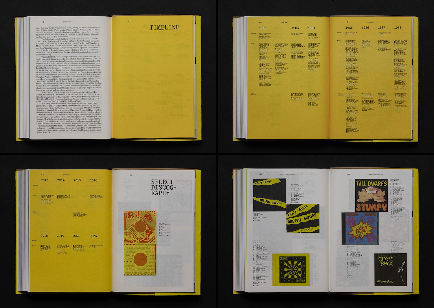
The selective raw/low-grade and glossy stock choices act as a playful and delightfully unexpected counterpoint to the cleaner, minimal conventions of biography design and create a chaotic rhythm throughout the folios. They suggest Knox’s ‘handcrafted craziness’, a taking-control-of-the-means-ofproduction DIY approach to poster making, music packaging, film making and recording.
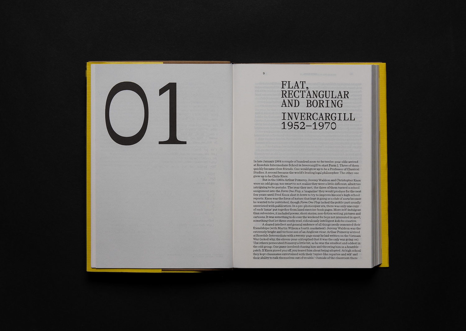
Typography: Chapter Numbers: GT Alpina 287.5pt
Headings: GT Alpina Typewriter 33.8pt / 29.5pt leading
Body: Sentinel 10.2pt / 11.8pt leading
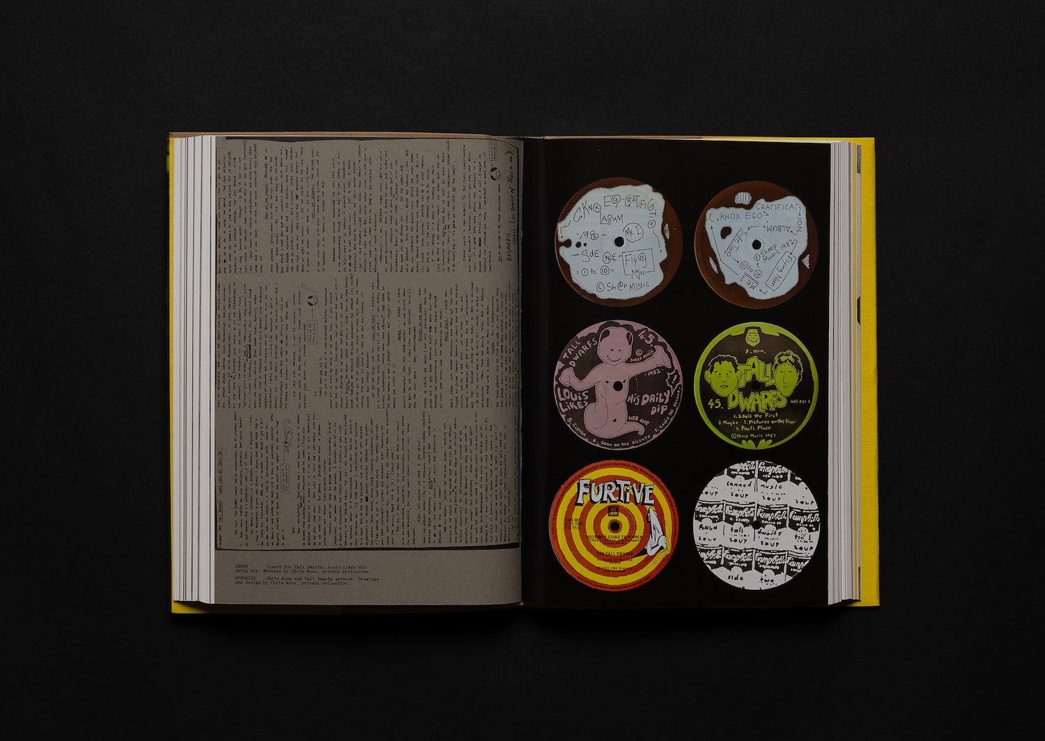
Captions: GT Alpina Typewriter 6pt / 5.9pt leading
Endmatter: Neue Haas Grotesk 6.5pt / 7.867pt leading
The chapters and end matter have a no-fuss utility to the typography, while the unpredictable monotype serif captioning reflects more of Knox’s personality and his use of the typewriter in his album design in the early years. The captions are set in an unruly way – uneven, jammed-in and rotated – lending an anarchic, idiosyncratic component to the plate sections.
Publisher’s Brief:
“To produce a rock biography where one can become immersed in the narrative and get lost in the story, with a parallel visual story being told through separate image sections to capture the visual richness and dynamism of Knox the musician and the artist.”
Judges’ Comments:
“This typography brings a punk sensibility through contrast and playful rule breaking. The use of a refined serif typeface feels almost like a punk rocker wearing a tie – traditional, but in a bold and unconventional way. The white hand-drawn distressed cover typography against black – accompanied by the yellow toned cover image – is really impactful. Despite the smaller scale of the publication, the typography creates strong moments through scale, with oversized section numbers on dividers, to captions that move with an anarchic energy that reflects the subject matter. It is a confident and expressive typographic system that balances control with rebellion.”