
HarperCollins Publishers Award for Best Cover 2026
Finalist
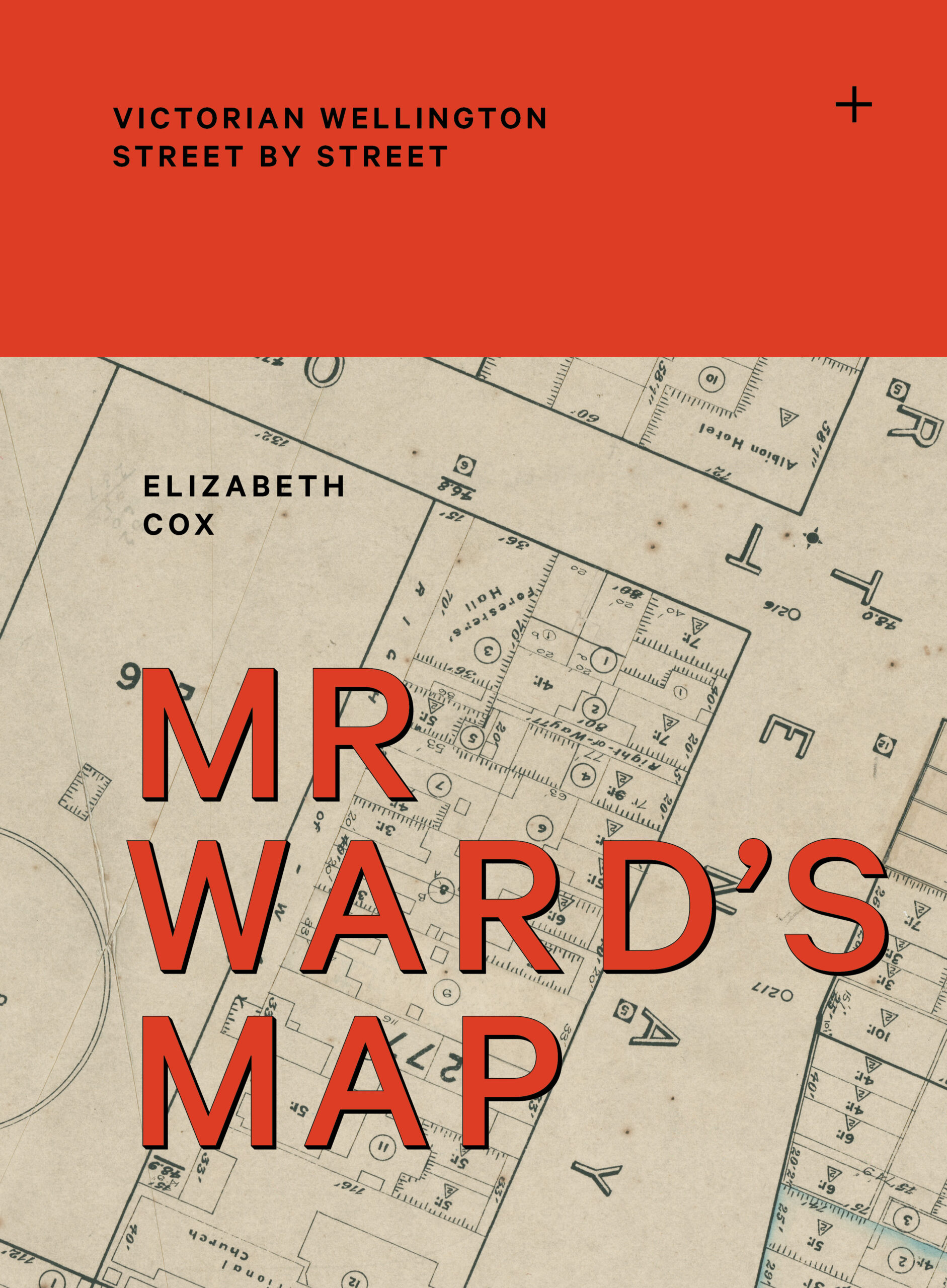 Designer: Jo Bailey
Title: Mr Ward’s Map: Victorian Wellington street by street
Publisher: Massey University Press
Format: 315 x 230 mm, 560pp, hardback + jacket. The case is Sakura book cloth #5410 with screenprint.
Through the research process, and after a visit to the archives to see the original maps up close, it was absolutely clear that the size of the map sheets was critically important for a reader to appreciate.
Typography: Klim’s Calibre (with adjustments in Illustrator to add a corresponding shadow) is used for the main tracked caps titles (50pt on 50pt leading), supported by Founders Grotesk Extra Condensed in the map title pages.
The typography mirrors the dust jacket and a couple of abstracted map features (the cross that shows how sheets interact, and the compass) and on the rear is the sheet layout pattern to give a hint of this motif that’s used inside as a navigation tool. The red was inspired by some of the pen mark-ups on the maps.
Publisher’s Brief:
“The design brief came after an initial conversation between designer and publisher, but was fairly open, targeting ‘Those interested in architecture and social history, Wellingtonians, map-lovers’. The design approach needed to be ‘crisp and clean’ to ‘help people navigate what is a very large and complex map’. Included with the brief were notes from author Elizabeth Cox on matching up tiny sections of the map with historical photos of actual buildings. The brief noted ‘This might be something that is worth pursuing’.”
Judges’ Comments:
“This cover creates a memorable experience through its interactive French fold jacket, which unfolds into a map and encourages discovery. Great choice of colour and typography. The coloured type overlaid across the map works cohesively with the red cloth cover. The bold red book cloth feels special and appropriate to the scale and grandeur of the publication. The relationship between the jacket typography and the black type underneath creates a subtle shadow effect, while the simple all-black screen print adds impact through restraint.”