Te Papa Press
Award for Best Typography 2025
Finalist
 Designer: Kalee Jackson
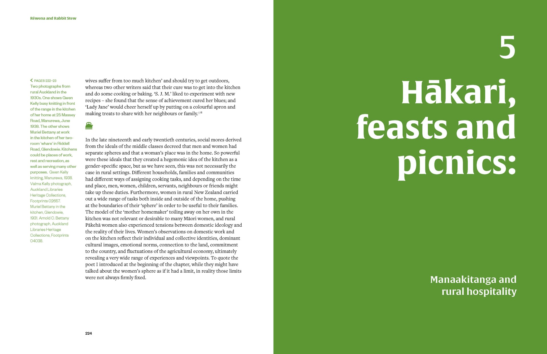
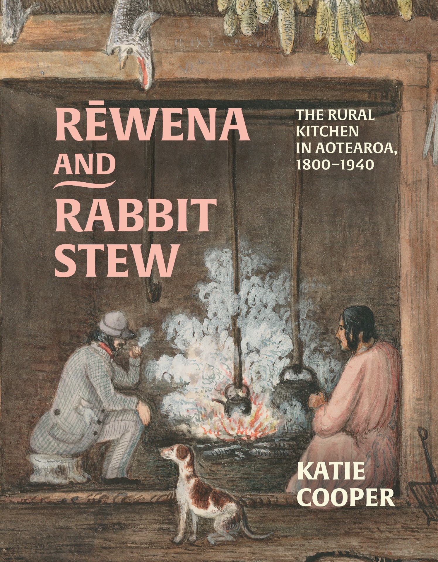
Title: Rēwena and Rabbit Stew: The Rural Kitchen in Aotearoa, 1800–1940
Publisher: Auckland University Press
Format: 240 x 185mm, 344pp, paperback with flaps, section sewn. Cover printed 4c x 1c on 300gsm uncoated art card with matt lamination and spot UV over type. Text 5c throughout on 100gsm Yulong Pure.
Typography: Headings: Alverata Bold
Body text: Freight text pro book
Quotes, Captions, Notes & Index: Founders Grotesk
The font Alverata, used for the headings, was inspired by Victorian food packaging and cookbook lettering. This inscriptional serif typeface was designed by Dutch type designer Gerard Unger. It draws inspiration from Romanesque capitals and movements in the arts and design of the twentieth and twenty-first centuries. Freight Text by Joshua Darden is a humanist serif typeface, chosen for the body text for its warmth and friendliness. It performs well in large blocks of text. Founders Grotesk by Kris Sowersby, used across the feature text elements, is a contemporary amalgamation of classic grotesques from the early twentieth century. It reads well at small sizes and appears contemporary while remaining period-appropriate. The book’s layout is based on a flexible four-column grid, which is applied throughout to maintain visual consistency while allowing variation.
Publisher’s Brief
“The brief was for a medium-format illustrated history title, with images running through text and plenty of breathing room. It could use colour to bring the book and the historical images to life, in order to create a vibrant finish that was evocative of the period, setting and home life, without looking too dreary or dated. It needed to feel intimate and warm, evocative of the kitchen but not to be confused with a recipe book.”