Te Papa Press
Award for Best Typography 2026
Winner
Designers: Shaun Naufahu & Giordano Zatta (Alt Group)
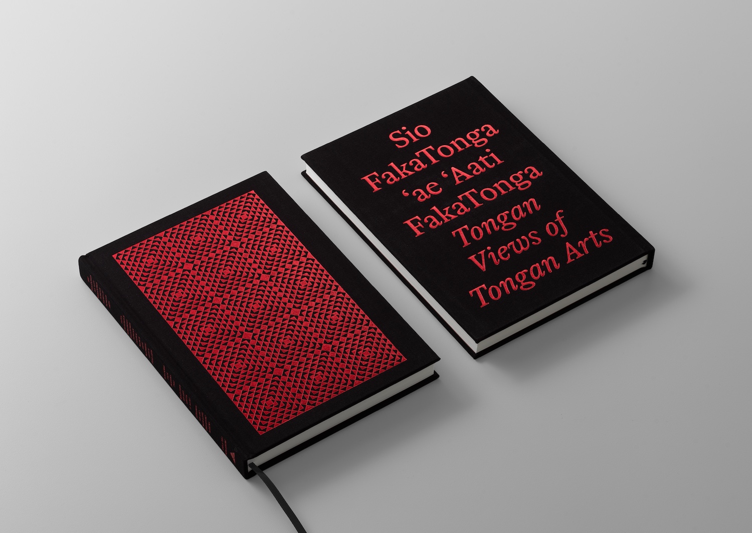
Title: Sio fakaTonga ‘ae ‘Aati fakaTonga: Tongan Views of Tongan Arts
Publisher: Kula-ʻUli Publishing
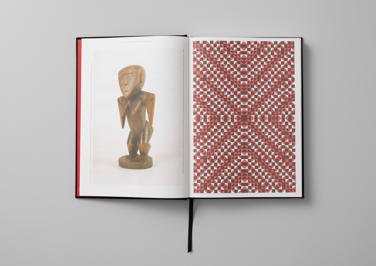
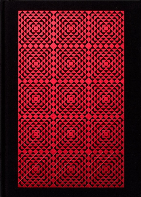
Format: 275 x 195 mm, 300pp, fully-cased, section-sewn. Black cloth hardcover with significant red-foil coverage across front, back, and spine.
Typography: Herbik Regular, by Daniel Veneklaas
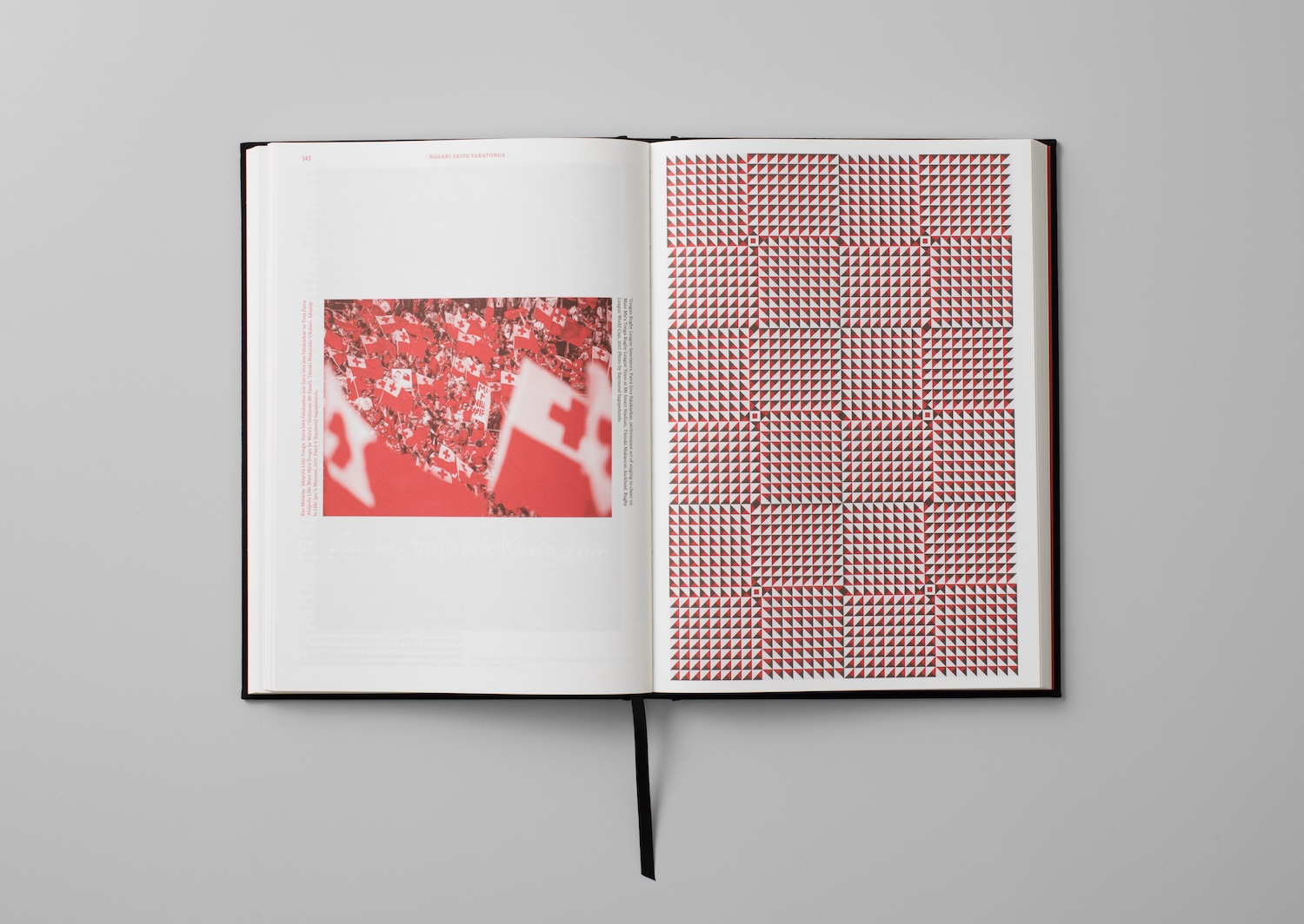
The book is produced in two spot colours, the red (PMS 3517 U) and brown (PMS 4659 U). The brown is utilised as a lighter alternative to a solid K black, as to maintain an ideal and pleasant grey value throughout.
Judges’ Comments
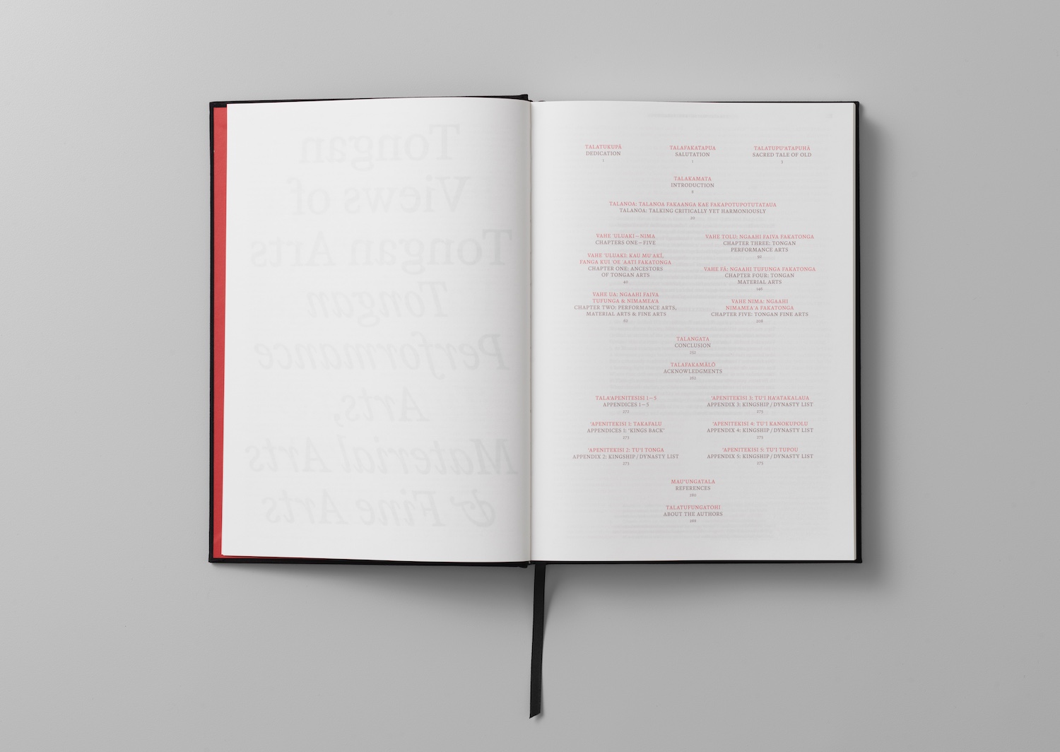
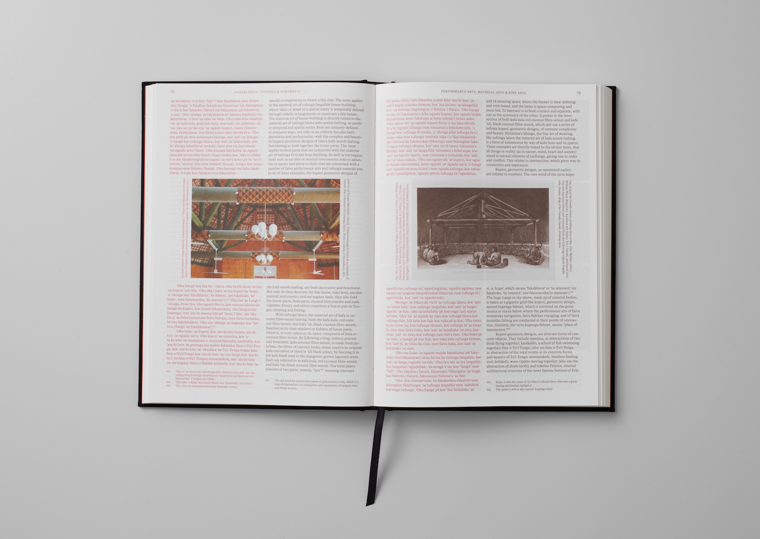
“A distinctive approach to the challenge of bilingual book design, resolved without privileging either language. The decision to distinguish Tongan in red and English in brown is both elegant and considered, with each colour carrying equal visual weight and hierarchy. Equally effective is the choice to duplicate shared front and back matter rather than subordinate one language beneath the other, creating an uninterrupted reading experience for both audiences.
There is a real sense of the amount of consideration that has gone into maintaining continuity and flow throughout. While the multi-column layouts initially appear dense, the colour-coded navigation quickly becomes intuitive, resulting in a publication that is both highly legible and thoughtfully resolved. The spine is really impactful and it’s a bold move to put the title of the book, on the back cover.
A stunning book.”