2026 HACHETTE AOTEAROA NEW ZEALAND
EMERGING DESIGNER AWARD
Thomas Cumming
 Thomas Cumming is an Ōtautahi born, Te Whanganui-a-Tara based, designer. He graduated with a Bachelor of Design from Toi Rauwhārangi College of Creative Arts at Massey University in 2021 and went on to complete a Master’s of Design in 2025. His design practice exists between wayfinding and printed matter, with the common thread of user experience bridging the two. Typographically led, his work is rigorous yet playful, with a strong sense of curiosity at the centre of it. With a particular interest in the ‘artists’ book’, or bookwork, he commonly approaches book design as a tool to ask questions — questions of: why this content; why this format and these materials; why this reading experience?
These qualities have led him to the fringes of book design, creating work that touches on both commercial and experimental, that is typographic, photographic, artistic, sometimes wearable or sculptural; to design books that behave as they should and books that do not.
Judges’ Comments:
“We were struck by the strong typographical nature of Thomas’s work. These are ambitious and are a beautifully crafted collection of hand bound books he created as part of a very cohesive series with a strong personal design identity.”
Publisher: Self-published
Design Contribution: Designer all (plus author and fabricator)
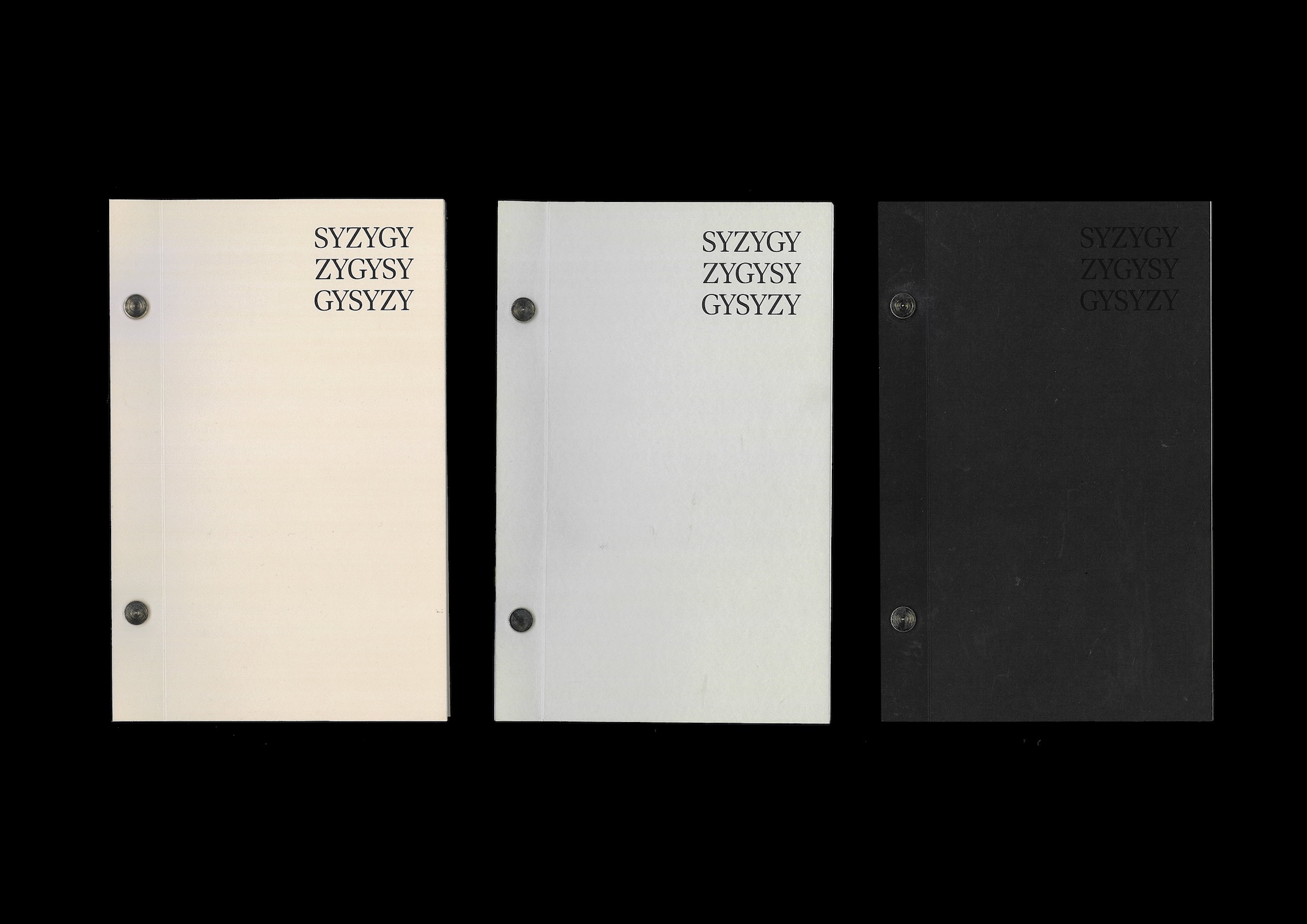
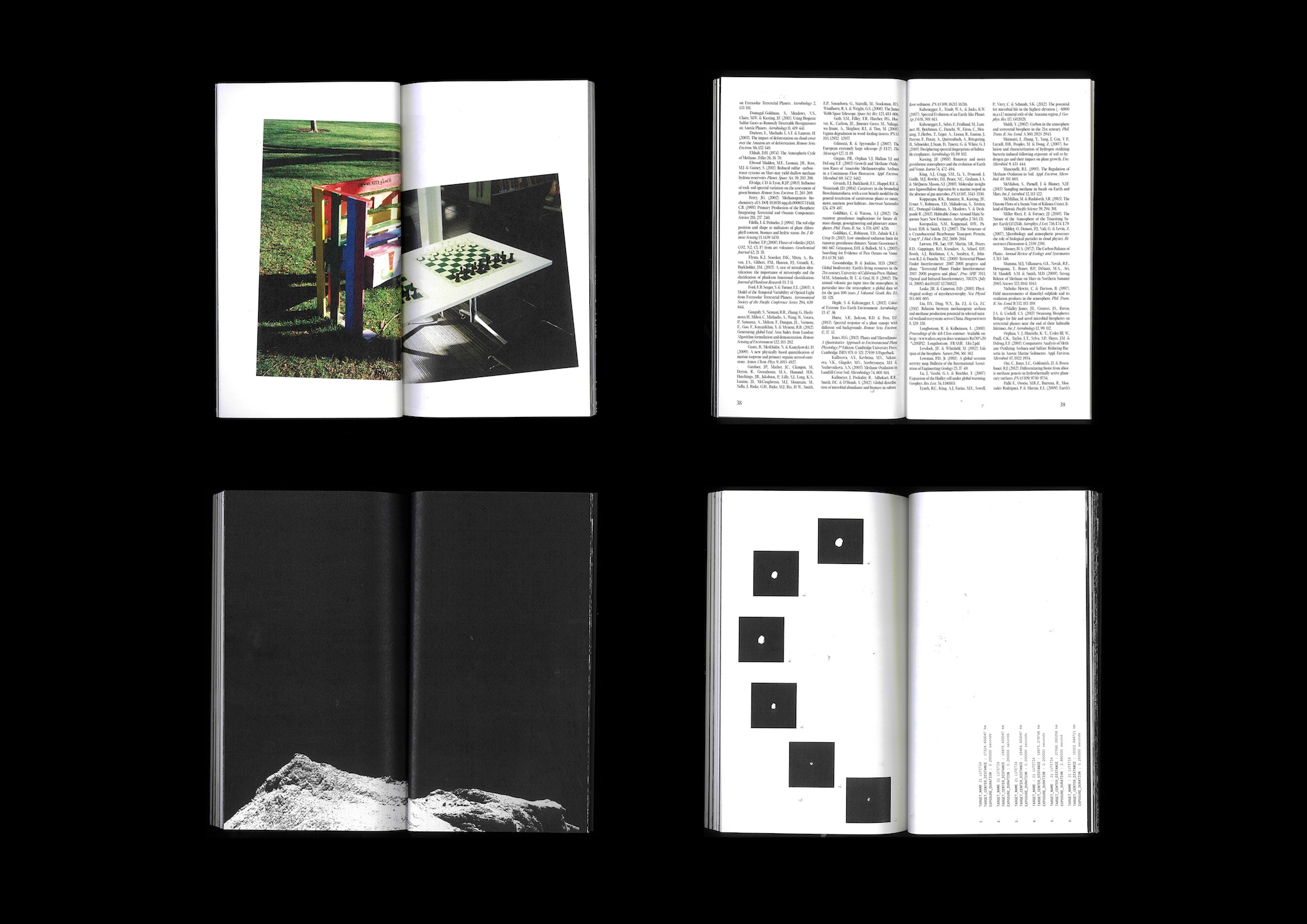
Design Statement: New words are one of my many muses. During my Master of Design research I learned the word ‘syzygy’ and I couldn’t help but marvel at its definition and spelling. In its most basic use, ‘syzygy’ refers to a pair of connected or corresponding things; in Astronomy however, it specifically refers to a conjunction or opposition, especially of the moon with the sun. This can be understood as an alignment between three or more opposing celestial bodies.
SYZYGY is a bookwork triptych set on a scale between authorship and curation, and explores my memory of my childhood library, a scientific paper regarding the degrading biosignatures on Earth due to the Sun’s eventual envelopment, and a fictional dystopian future depicting humankind’s interstellar last library. This scale references the three celestial bodies of Earth, the Sun, and the comet 67P/Churyumov–Gerasimenko; with the content of each bookwork moving from the past, to the present and the potential future.
The length of each bookwork was considered: SY’s middling length, not forgotten nor remembered, is an embodiment of a hazy memory; ZY’s fleeting 40 pages are a glimpse at Earth’s inevitable fate; and GY’s extended page count mimics the long voyage discussed in the book’s text. The materials used reinforce the narrative: the gradient of Colourplan paper used for the covers matching the scale of time; Chicago screws offer a binding solution that accommodates the three varying lengths of publications and maintains cohesion with the overall theme.
Publisher: Self-published
Design Contribution:Designer all (plus author and fabricator)
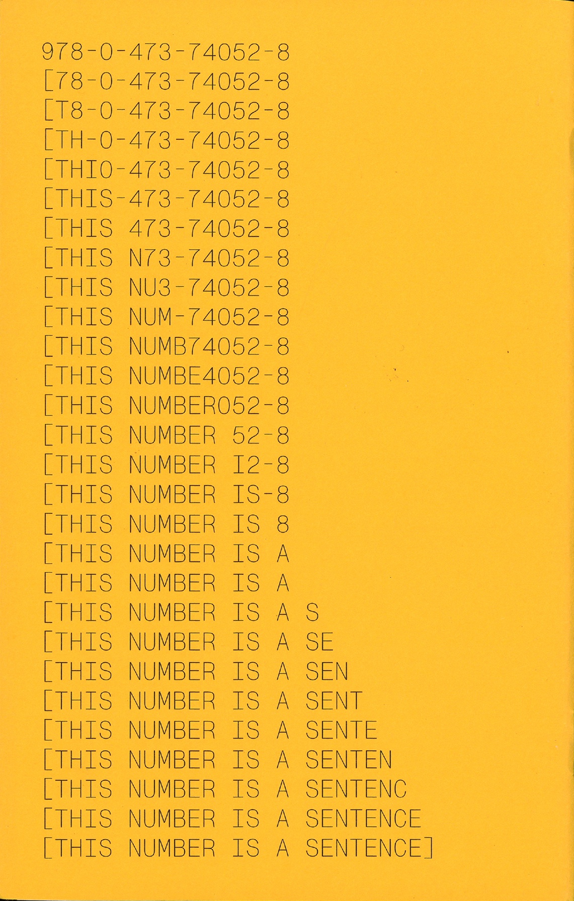
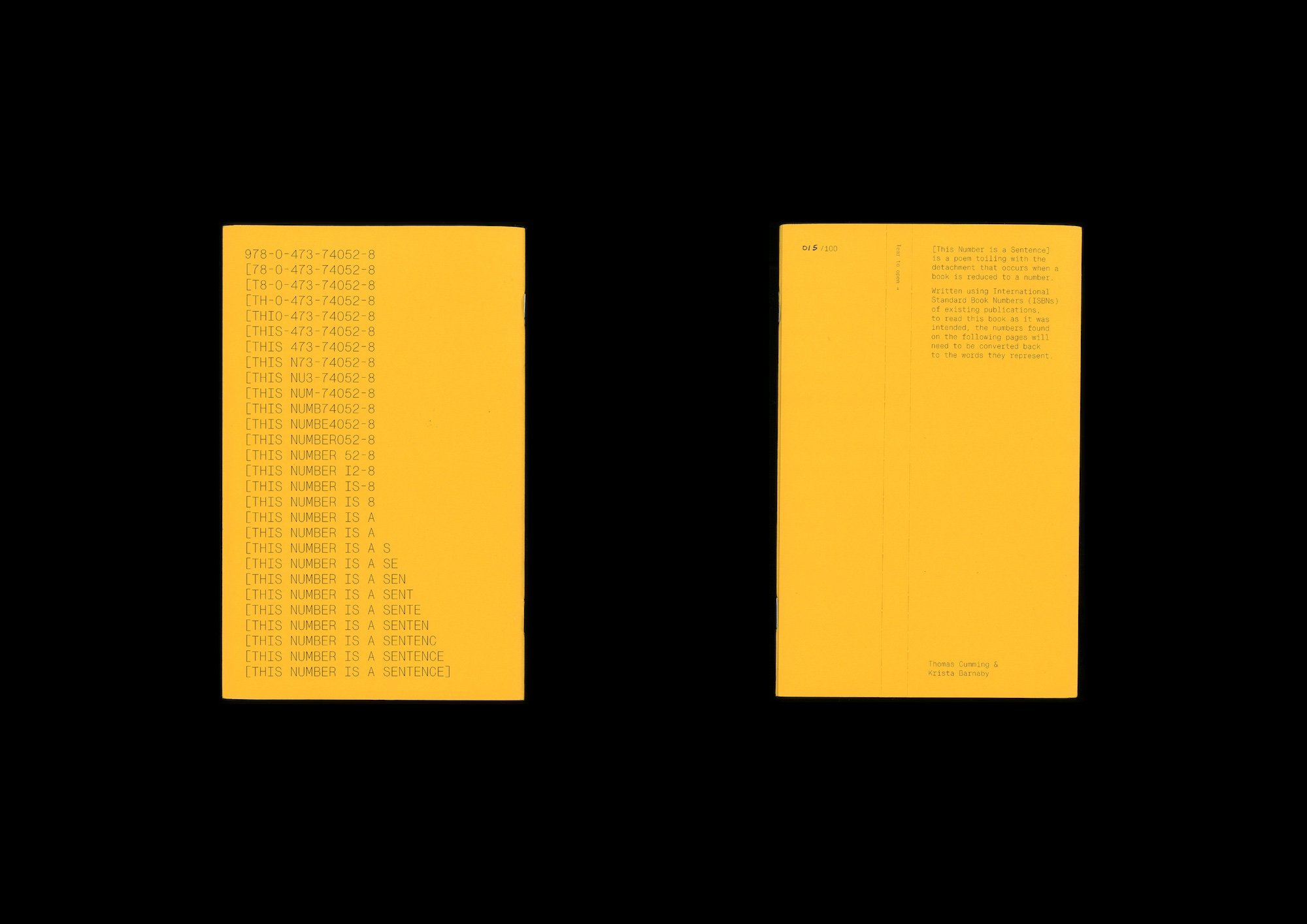
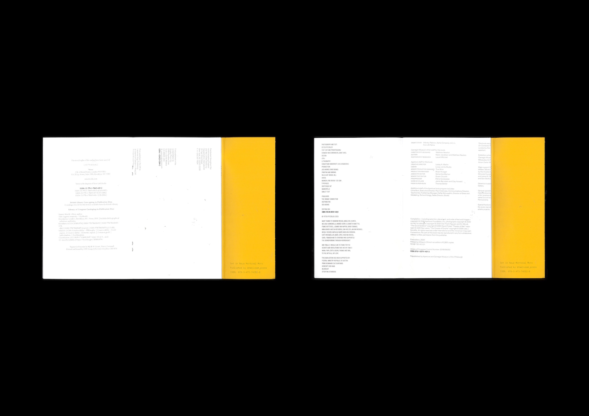
Design Statement: This is an ‘artists’ book’. This is true not because it is written here but because [This Number is a Sentence] has been assigned an International Standard Book Numbers (ISBNs) and has been published in a print run of 100 copies.
There are many definitions for the term artists’ book. Broadly, it refers to the structure and format of a book when used to convey artistic expression, rather than merely acting as a container for content. When artists’ book scholar Clive Phillpot served as the Director of the Library at the Museum of Modern Art in New York, he employed the constraint that an artists’ book must be published in a print run over 100 for it to be accepted into the museum’s collection, citing that this trait displayed ‘that the artist was committed to the multiplication and potentially wide distribution of their work, [that the artist] was committed to the Gutenberg revolution, and not to artificial scarcity’.
The notion of ISBNs and the act of true ‘publication’ are rigid in their implication: a book is only a book if it exists via these two aspects.
There will only ever be 100 copies of this publication, which is just enough for it to exist, supposedly.
Written using ISBNs of existing publications, to read [This Number is a Sentence] as it was intended, the numbers found within the publication will need to be converted back to the words they represent. By including not just the ISBNs but the full colophon of each book (or at least most of it) a wider context is illustrated; the reader is reminded that although the bookwork is toying with the hyperbolic representation of the books by only using their ISBNs, these are real books, that they exist outside of this single number. It is a reminder that publishing is the dissemination of knowledge, the amplification of it, however that is done.
The nature of the publications material and finishing choices reference the realm of the zine, leveraging the counterculture’s ideals that the act of self-publishing is anti-establishment and anti-institutionalised knowledge.
The sealed bookwork contrasts these ideals, creating an instance of forced engagement; to tear open the bookwork, to release the knowledge within — symbolically and literally representative of books other than this one — is to engage with the notion of anti-instituationalised knowledge.
Publisher: Self-published
Design Contribution:Designer all (plus author and fabricator)
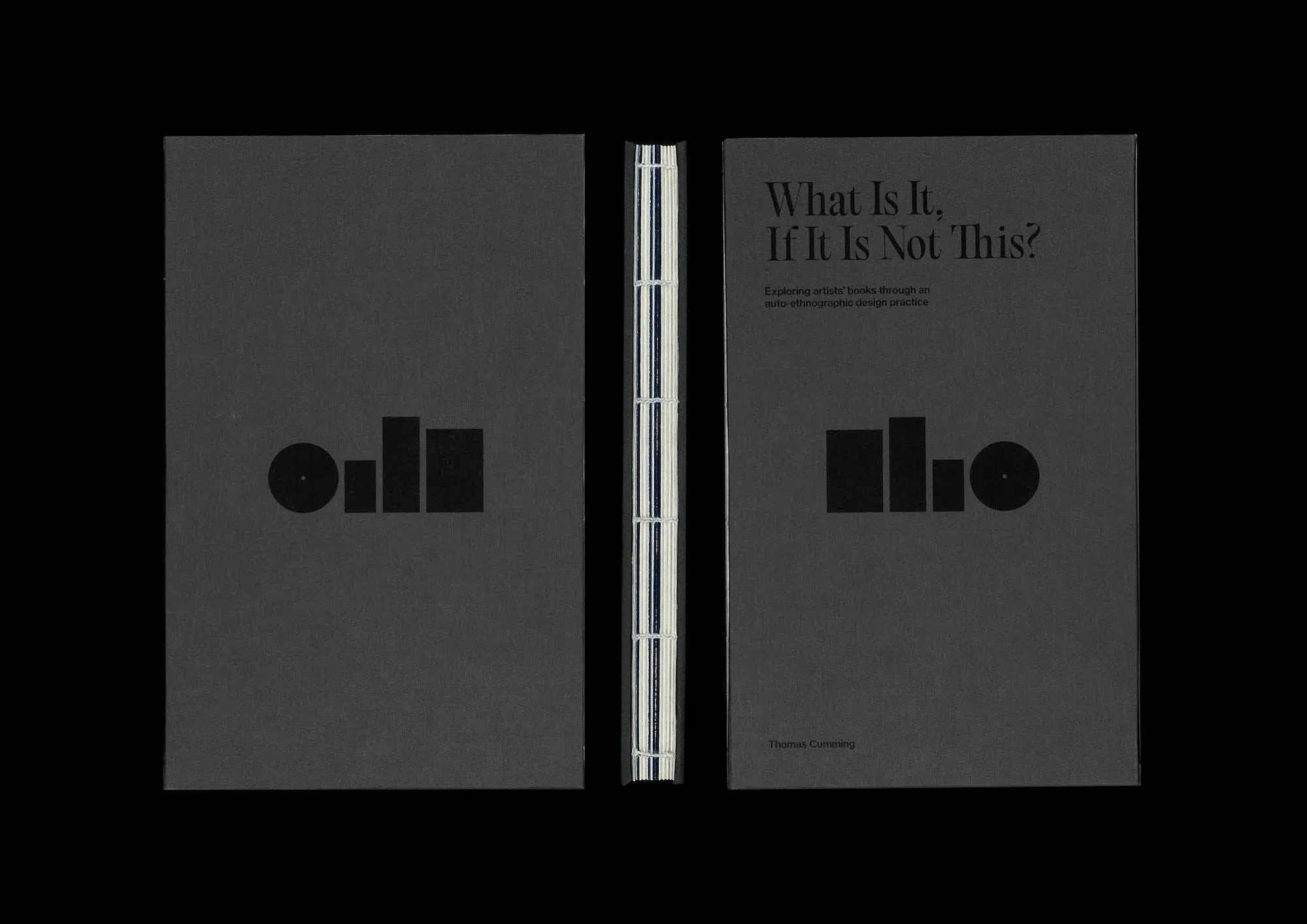
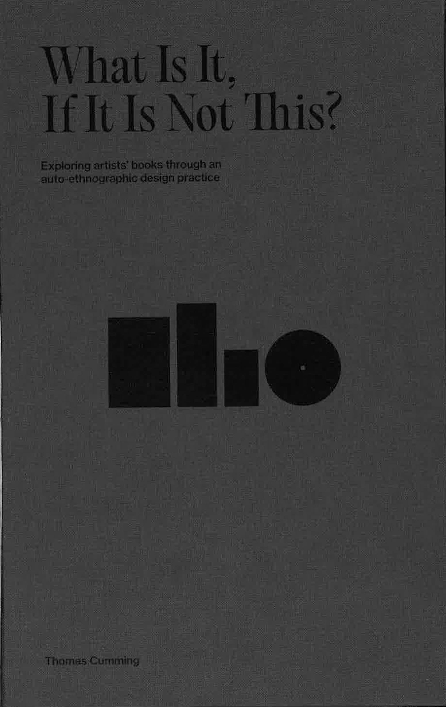
Design Statement: What Is It, If It Is Not This? Is the culmination of 12 months worth of dedicated research for a Master’s of Design submission, incorporating prior research and bookmaking practice.
What Is It, If It Is Not This? explores the ‘artists’ book’ landscape, and my position within it. As a contemporary practice, the development of ‘artists’ books’ encompasses a wide range of material qualities and conventions, resulting in many and varied book and ‘book-like’ formats. However, there is a significant dissonance regarding the terminology used to describe such work, and, as a book designer with an interest in experimental publications, I’ve found myself producing work that could be considered a part of this practice.
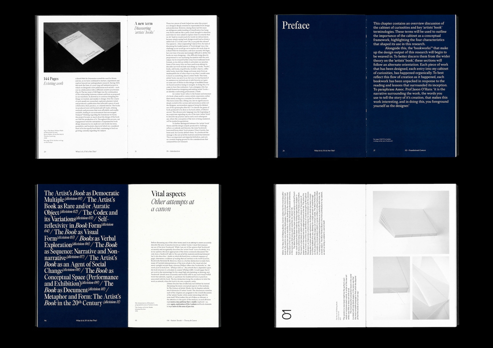
A key component of this publication was creating a system that allowed for the weaving of the many ‘bookwork’ sections into the main narrative of text; the research conducted was organic in the way it moved from academic research to creative making or vice-versa. Implementing a secondary grid structure and set of typefaces was one layer but the inclusion of a second orientation housed this alternate layout in a very clear manner.
Contrasting styles reinforce this thinking — serif against sans serif — two displays that carry very different characteristics. Research being represented by Pangram Pangram’s Editorial Old’s tight, structured and rigorous qualities; making being represented by Charlotte Rohde’s NewEdge666’s more fluid, bleeding, amorphous and intuitive aspects. The two styles are implemented fervently, with captions and images drawn from research finding their way into the bookwork sections where needed, styled to delineate their academic background.
Within the use of the two grid structure system, there is a variant layout among the research chapters of the book. The literature review sections make use of a wider, stepped column arrangement in a representation of the fragmented nature of the different view points of the referenced academics.
To capture modes of traditional bookbinding while feeling contemporary in its execution, the publication has been bound with an exposed spine and its covers have been constructed using Brillianta Calandre book cloth.