
Mary Egan Publishing Award for Best Typography
Shortlist 2013
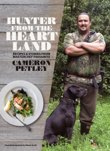 | Designer Alan Deare (Area Design) Title Hunter from the Heartland: Recipes and Stories from Masterchef Favourite Cameron Petley by Cameron Petley, photography by Kieran Scott Publisher Random House Format 240 x 175mm, 192pp, paperback, matt lamination with spot UV Judges' Comments Alan Deare, a bit of a veteran of this award, sensitively portrays Cameron Petley’s personality and character in Hunter from the Heartland. The combination of typefaces, the composition, the textured paper – we loved it all! The woodblock-style type works well, thick and thin, chunky but delicate, and really enhances this book. Combined with Eames Century Modern to portray Petley’s voice, the book feels balanced and calm. |
|
 | Designer Greg Simpson, (Greg Simpson Design) Title An Indescribable Beauty: Letters Home to Germany from Wellington, New Zealand 1859 and 1862 by Friedrich August Krull Publisher Awa Press Format 180 x 170mm, 144pp, hardback, quarterbound, uncoated cover with spot UV Font Set in Black Knight FLF, Mrs Eaves XL 11/13 point Judges' Comments Greg Simpson’s use of blackletter for a historical text, but with a modern twist, really has turned what could have been a predictable non-fiction design into a treasure. We love this handsome little volume, with its hardback quarterbound cover and uncoated thick stock. We particularly loved the simplicity of it, and the dainty placement of the photos throughout. |
|
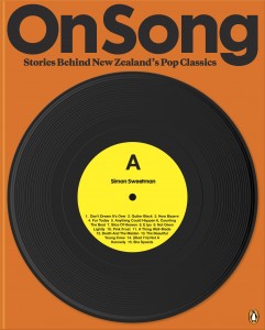 | Designer Alan Deare (Area Design) Title On Song: Stories Behind New Zealand’s Pop Classics by Simon Sweetman Publisher Penguin Group Format 260 x 210mm, 240pp, hardback, section sewn, head and tail bands Font Set in Galaxie Copernicus Medium 8.5/11.2 with artist pull quotes in heavy italic 10/12pt and headings in Cg Futura Maxi Bd Judges' Comments The bold design of On Song really captures the subject and draws in the reader with its reference to popular culture. Alan says, ‘We went for a boldness and simplicity, the killer hook and the repetition.’ The use of Futura works with its bolder weights and geometric forms such as the ‘o’, which references the record. |
|
