HarperCollins Publishers Award for Best Cover 2019
Finalist
Designer: Laura Cibilich,
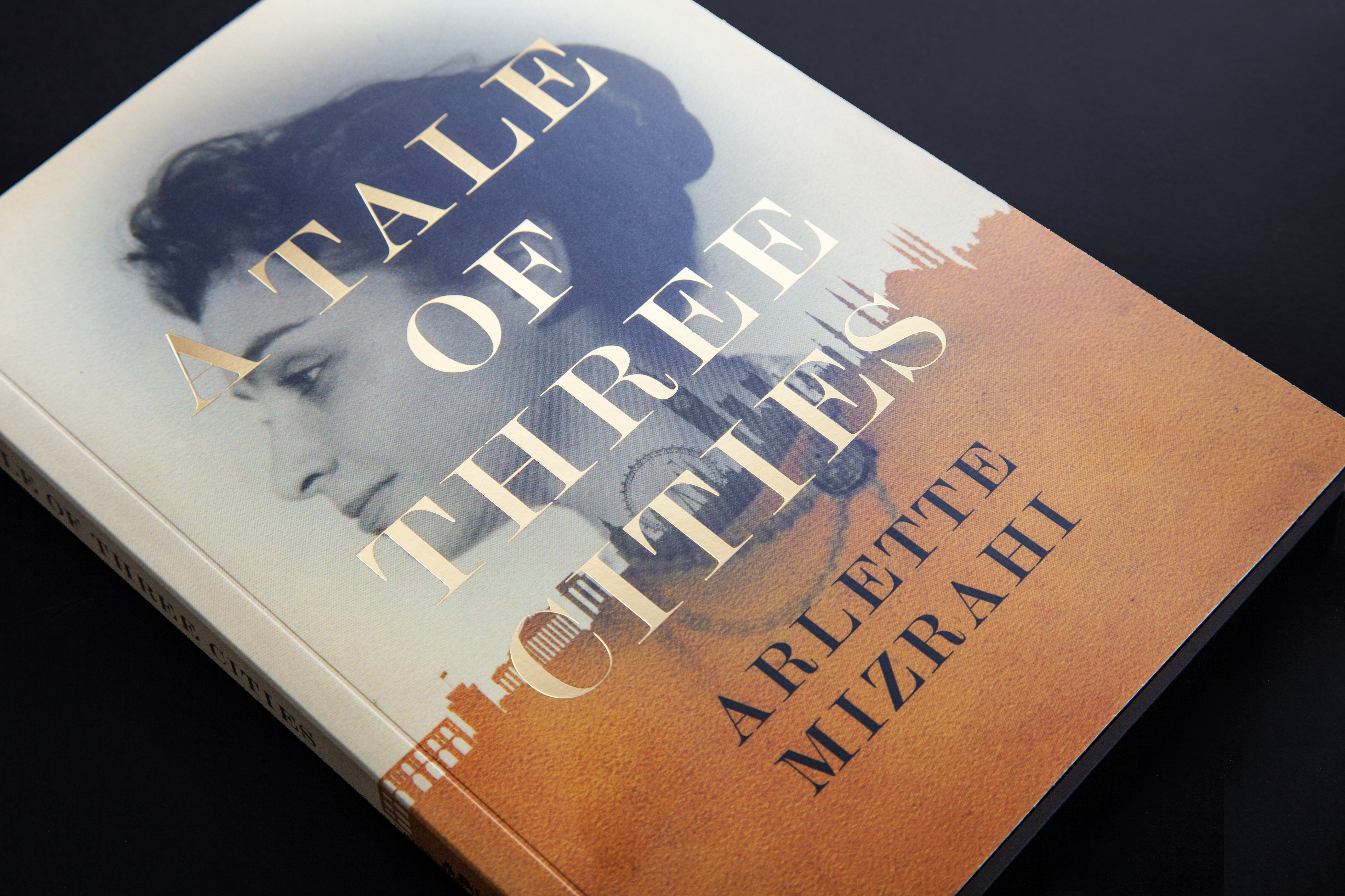
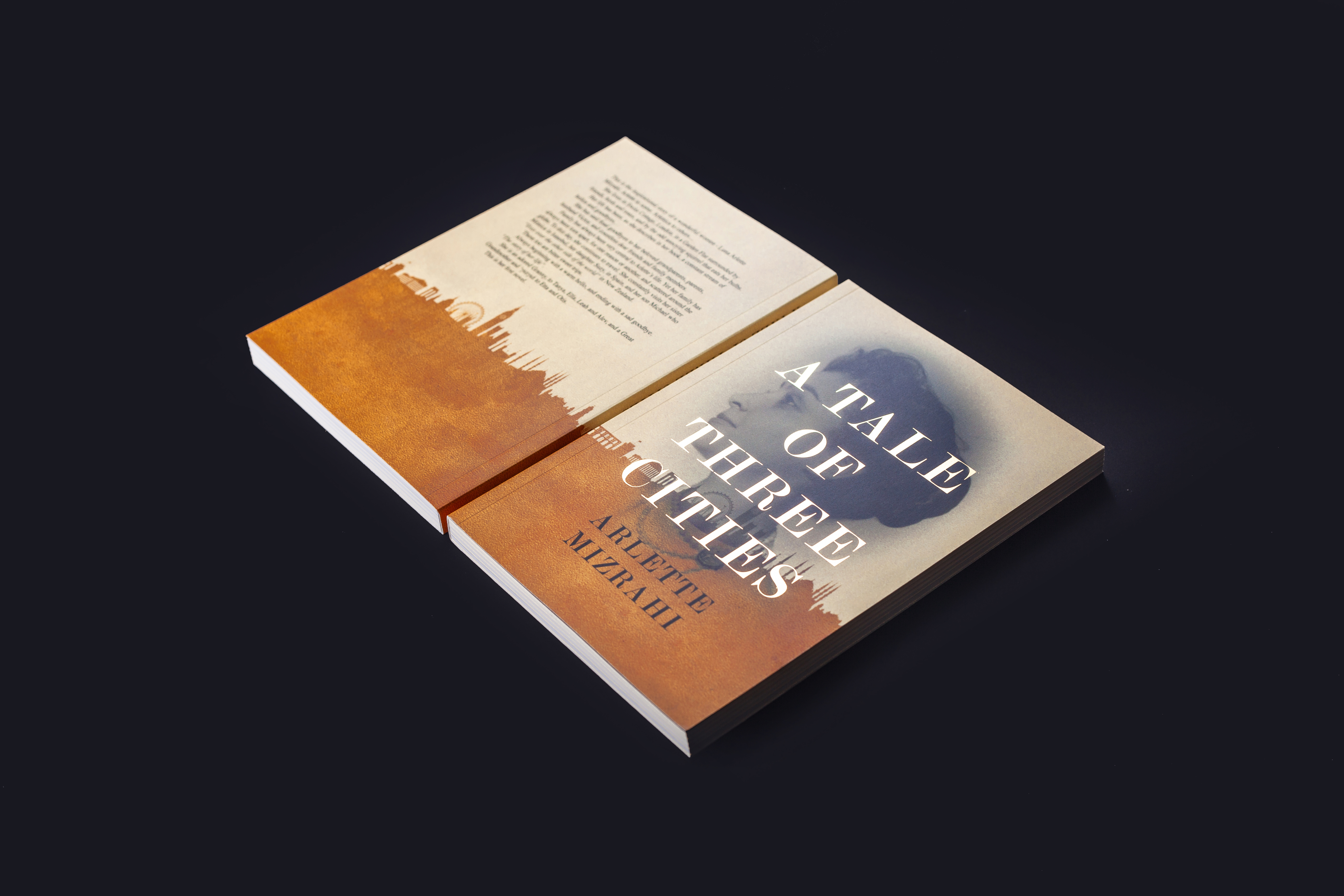
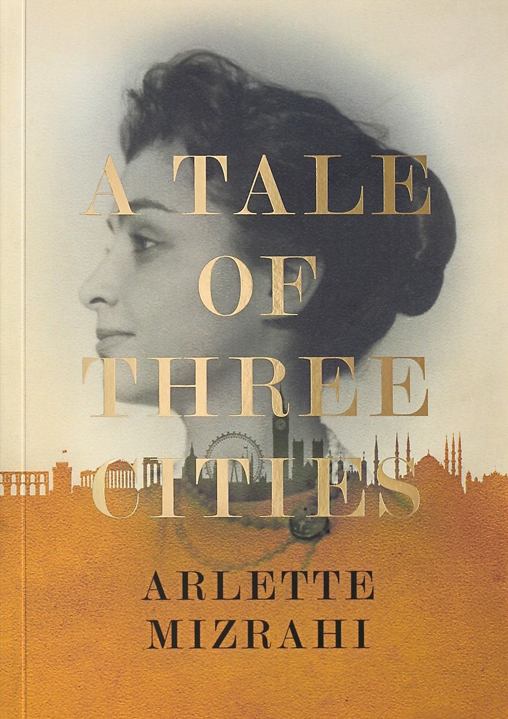
Title: A Tale of Three Cities
Publisher: RUN
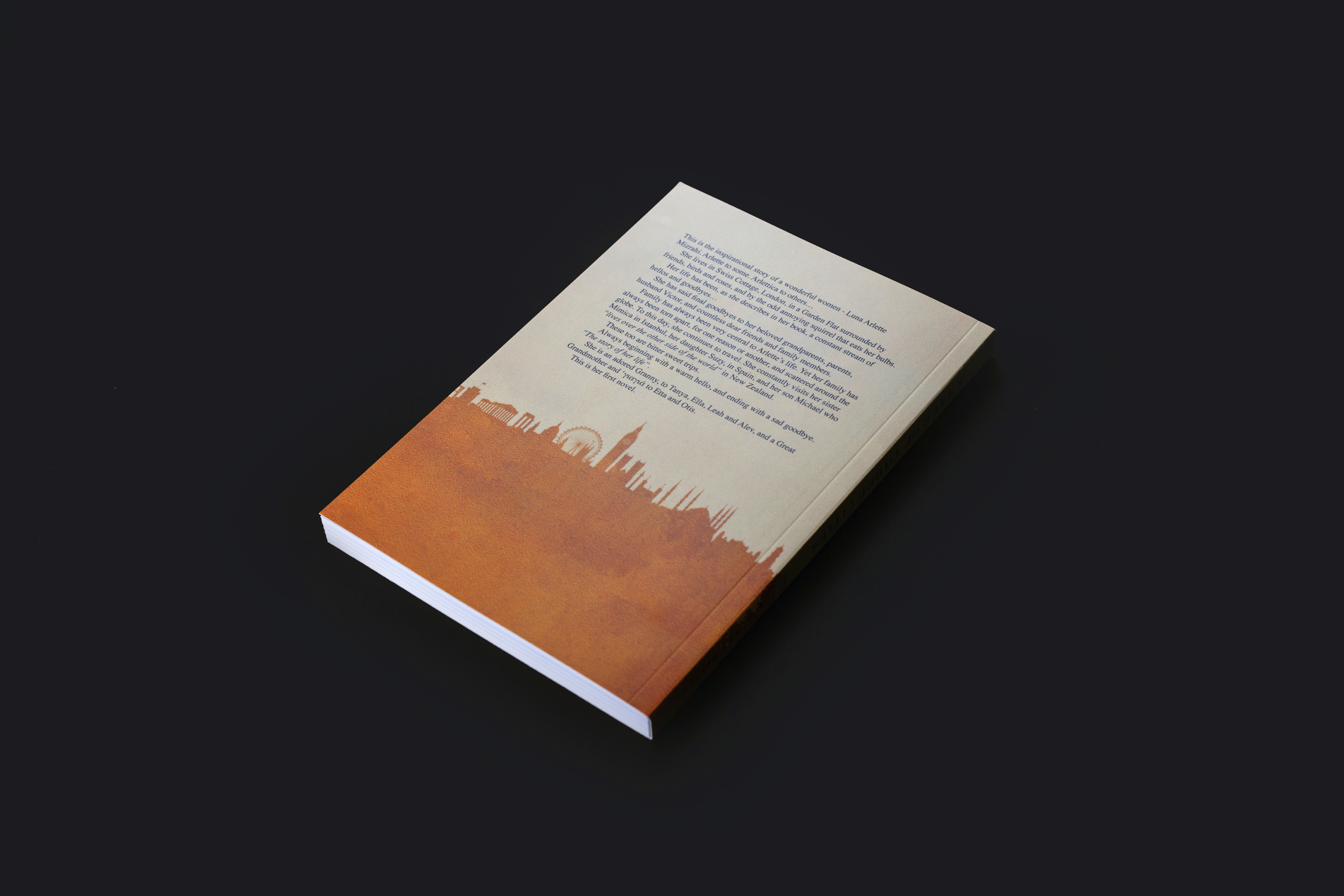
Format: 210 x 148mm, 192 pages perfect bound. Gold foil on cover and spine.
Typography: Cover font: Modern No. 20
Judges’ comments: “A clever, classic looking cover. The use of gold foil brings the title to the reader’s attention, and the interplay of multiple layers of imagery does a wonderful job of evoking the historical nature of the book, whilst also lending an evocative storytelling approach to a biographically themed book. The wistful look in the woman’s eye, married with the sepia hued palette gives it a nostalgic romanticism.”
“The gaze of the cover star looks left, disconnected from the viewer, looking against the usual forward left to right reading flow, though ‘contentedly’ smiling and looking back as if upon a life lived. The merged skyline silhouette illustration of three cities – one assumes Athens, London and Istanbul — and the scale works well — it’s there but not overstated. The stacked typographic treatment of the title however seems slightly open and oversized, or perhaps not large enough. There is a tension that the line lengths of the title break beyond the face of the female image. It creates an interesting tension, but doesn’t quite feel convincing. It might have gone through several iterations to judge the scale but the layering doesn’t convince me that it is quite right. The leading seems a little too open, whilst the gold foil block has to be a large point size to allow the successful application of the foil around the thins of the type face (Modern No 20). Such a shame the designer was not afforded more space for colophon. One assumes it is a self-published work. There is no barcode so no clutter. It would be interesting to see if POS barcode etc applied as stickers to the back cover vacant area of illustration at the foot of the back cover.”