1010 Printing Award for Best Cookbook 2019
Winner
Designers: Floor van Lierop, This is Them
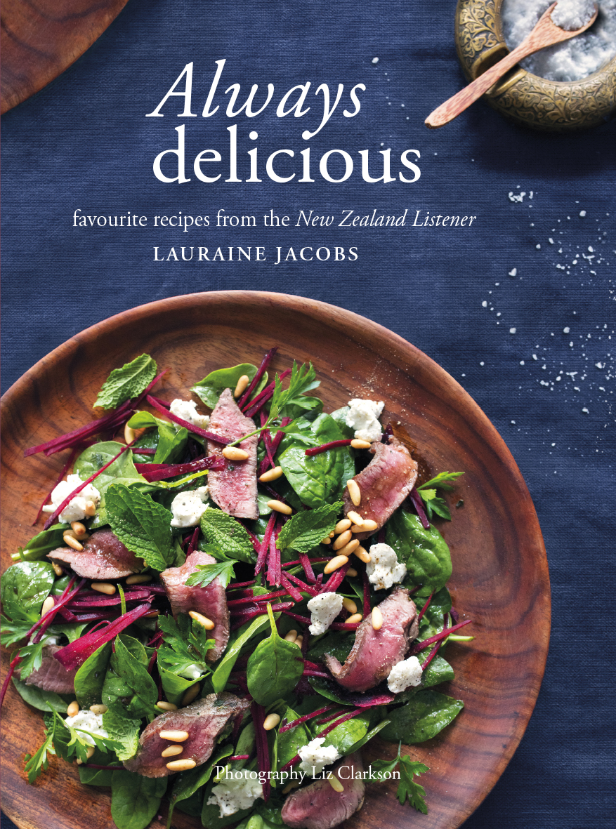
Title: Always Delicious: Favourite Recipes from the New Zealand Listener
Publisher: Potton & Burton
Format: 254 x 185mm, 236pp, PLC hardback
Typography: Bodytext: Adobe Garamond Pro regular, size 9.5pt, leading 12pt.
Headers: Adobe Garamond Pro bold, size 13pt, leading 15.6pt, uppercase.
Section pages
Headers: Adobe Garamond Pro bold, size 13pt, leading 15.6pt, uppercase.
Titles: Adobe Garamond Pro italic, size 24pt, single line.
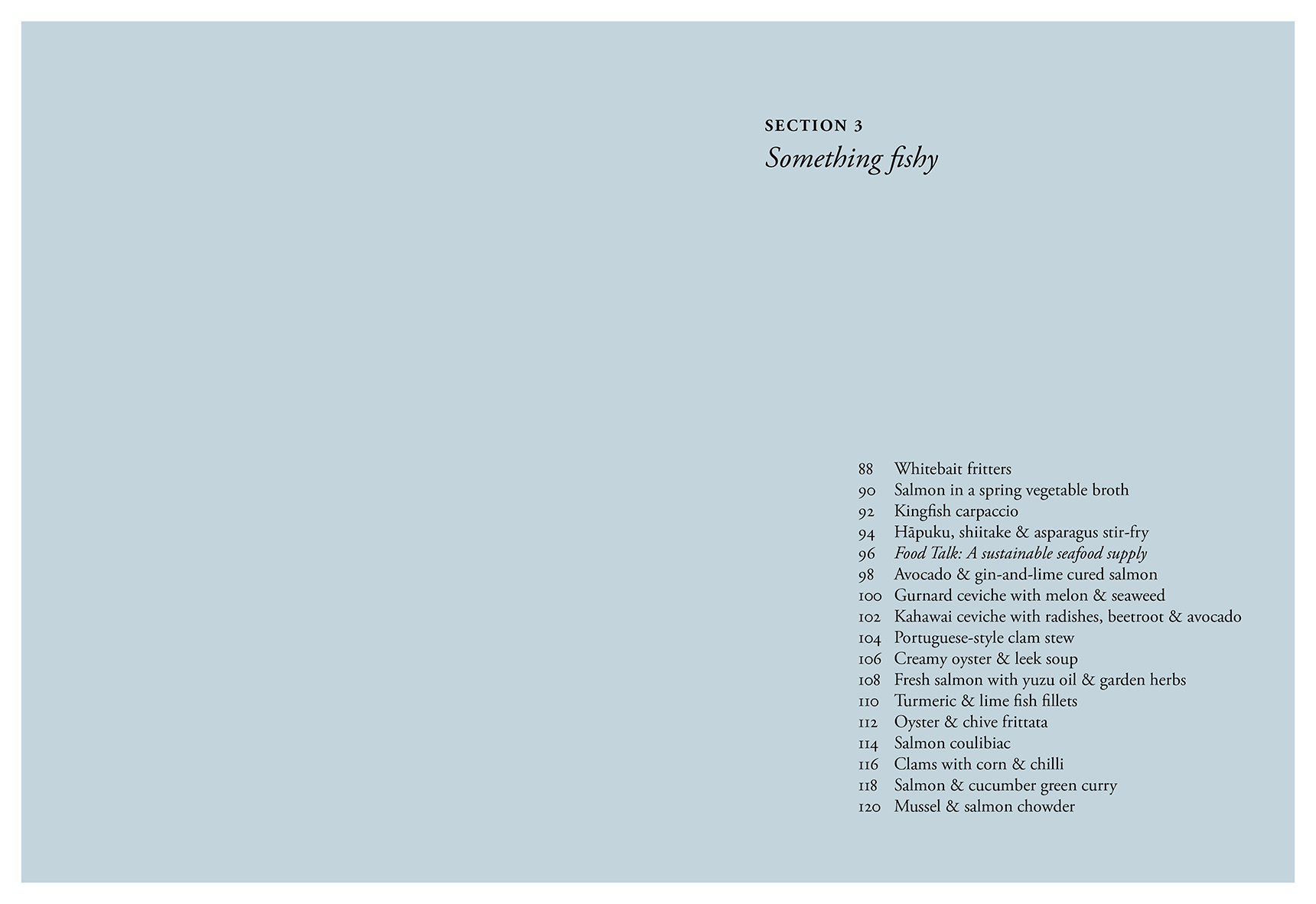
Contents: Adobe Garamond Pro regular, size 14pt, leading 16.8pt.
Recipe pages
Intro: Adobe Garamond Pro regular, size 11pt, leading 12pt.
Title: Adobe Garamond Pro regular, size 25pt, leading 23pt, sentence case.
Serves & suggestions text: Adobe Garamond Pro regular, size 6pt, leading 10pt, uppercase.
Ingredients: Adobe Garamond Pro regular, size 10pt, leading 12pt.
Bodytext: Adobe Garamond Pro regular, size 9.5pt, leading 12pt.
Footer: Adobe Garamond Pro regular, size 6pt, uppercase.
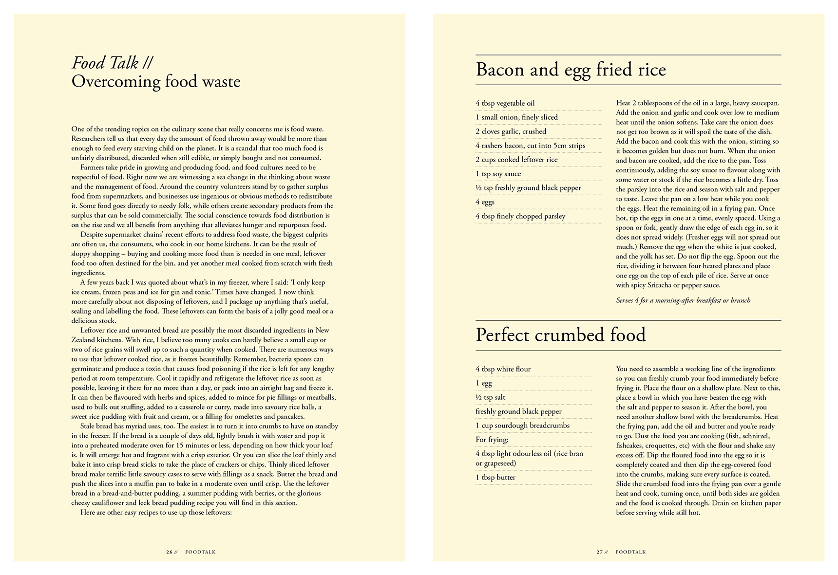
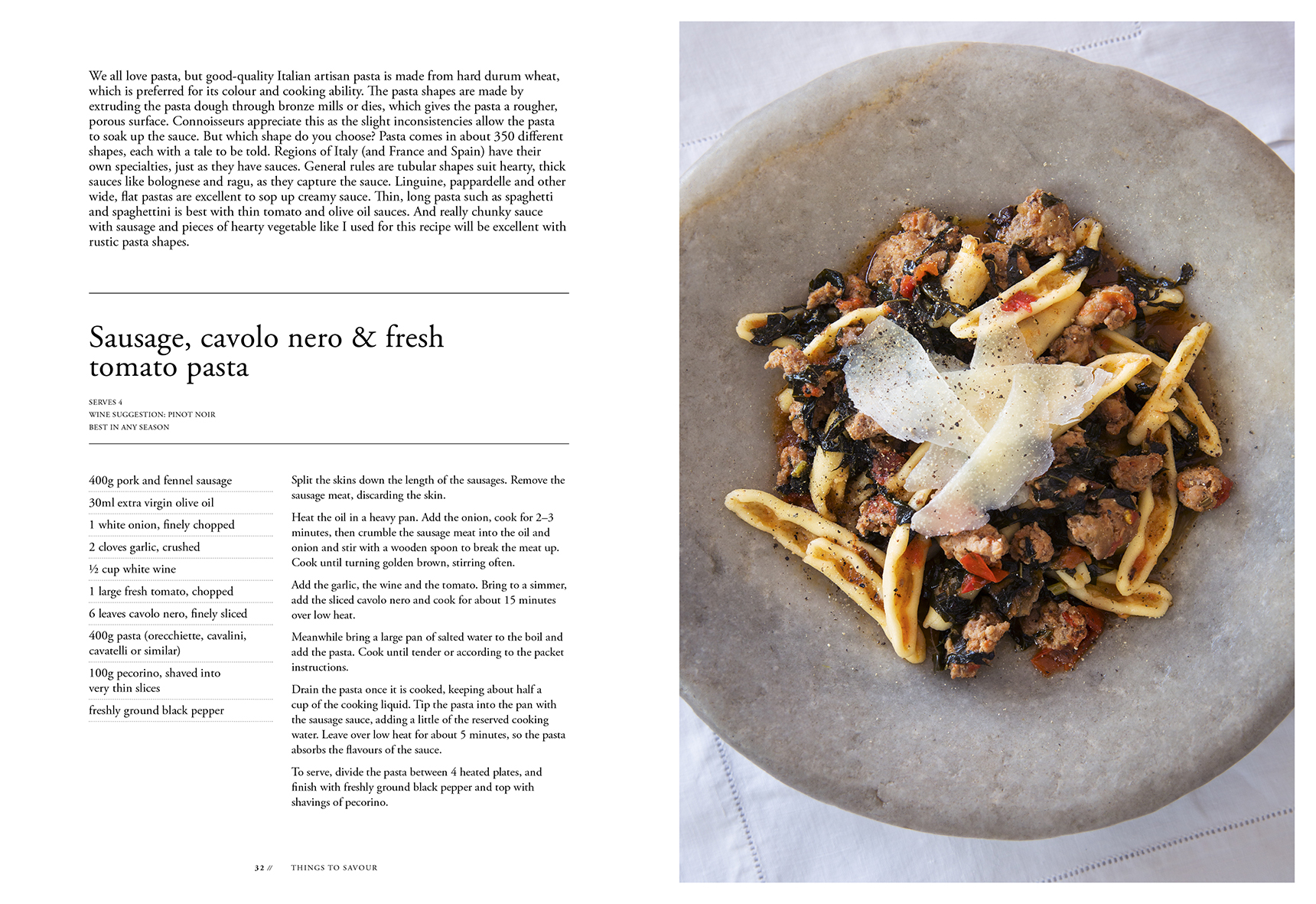
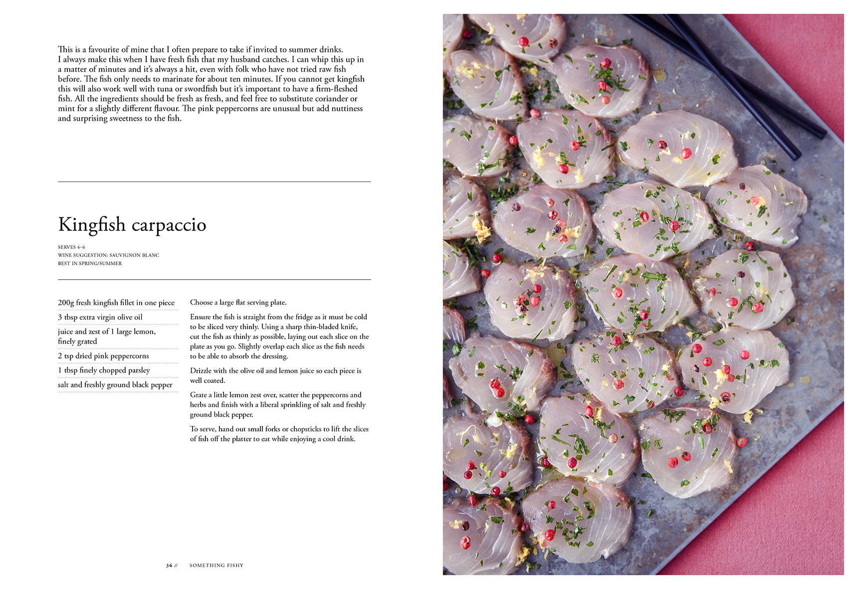
The entire book is set using just one classic typeface: Adobe Garamond Pro. It’s easy to forget that you don’t always need multiple font families to create an attractive and intuitive visual hierarchy – a lot can be achieved through the use of various font sizes, weights, and styles of one well-designed font family.
Judges’ Comments “This book bursts with colour. The zing of the food photography is paired with crisp typography in detail — to match the wine pairing for many recipes. The beetroot spine and deep blue end papers, lime green ribbon oh so perfectly shipped from production on the limes of page 31. The recipe description leading is possibly slightly snug but handles the volume of text well. And the horizontal lines consistently organise the eye.”
“Simple spacious design. Easy to follow instructions. Simple use of text, central footers and page numbers – a nice variation.”
“Simple, clean, easy to follow layout of recipes. Very user friendly with a practical format/design to actually use in the kitchen. Sections are easy to find, well thought out and presented. I like the restrained little intro to each recipe (you don’t have to wade through someone’s life story to get to the recipe!). A great index.”
“A classic and understated example of cookbook design. The photography has an earthy warmth, with deep rich shadows, and a glow of colour that makes the food comforting and inviting. The section break usage of calming muted colours is subtle, and again understated. Typographically, it shows restraint in using one type family across the book, utilising weight and scale to differentiate types of information. It’s also a nice touch to run the recipe name through the middle of the page, breaking up content in a useful way.”