Mary Egan Publishing Award for Best Typography 2019
Finalist
Designers: Aaron Beehre with Raquel Joseph, Emma Kevern and Ryan Patrick
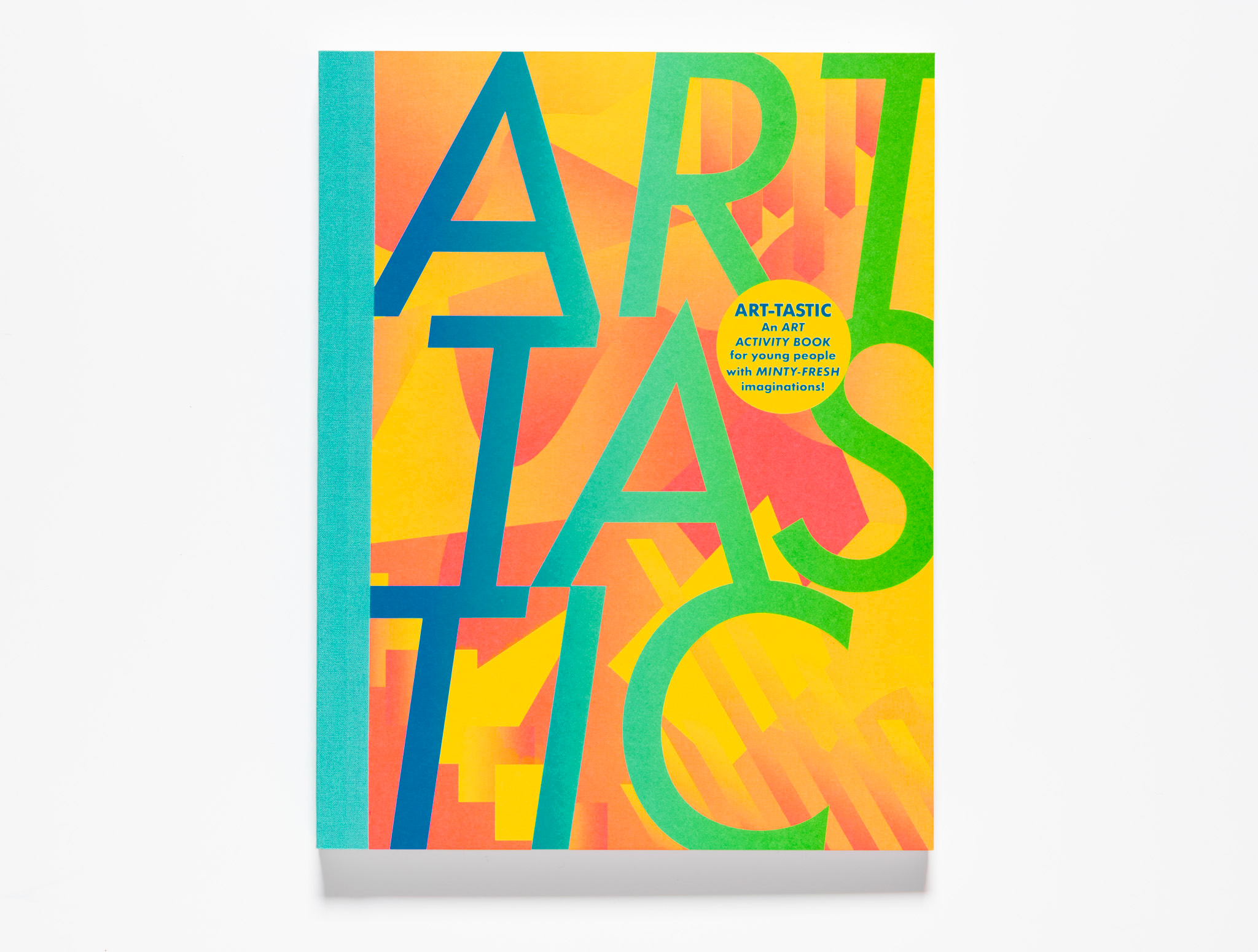
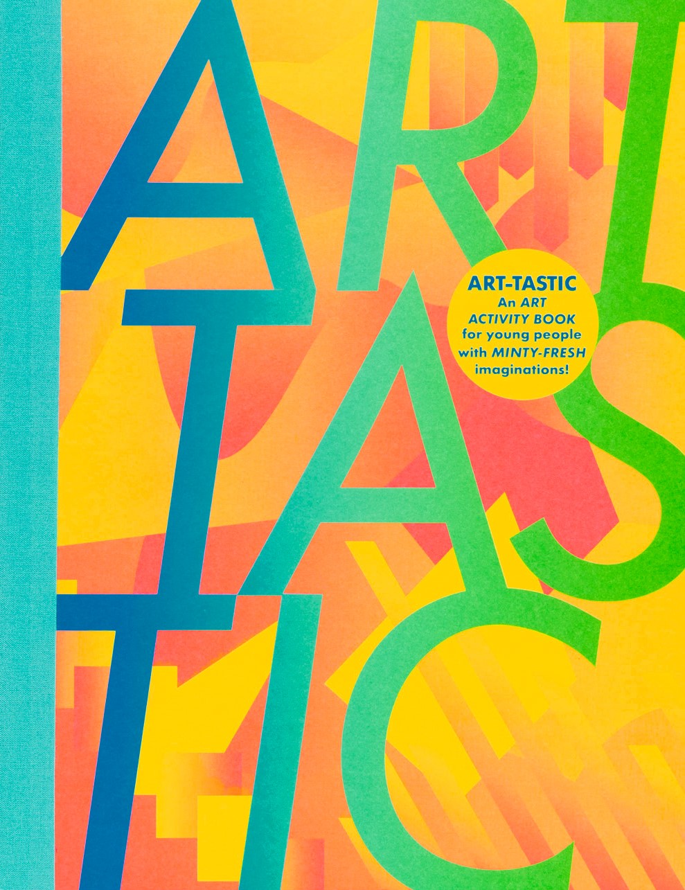
Title: ART-TASTIC
Publisher: Christchurch Art Gallery Te Puna o Waiwhetū
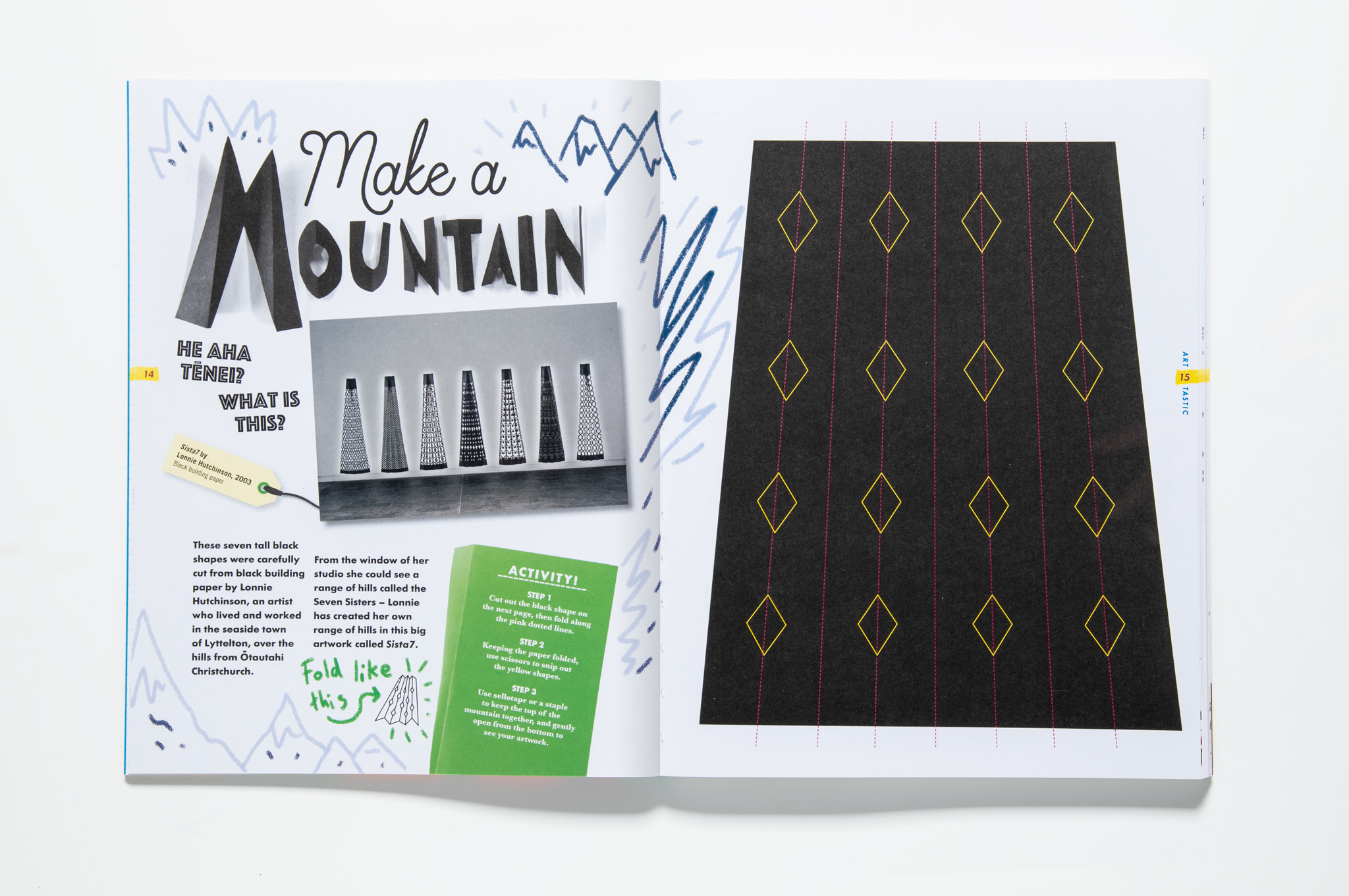
Format: 297 x 230mm, 108pp, hard case with cloth quarter-binding. No board on spine so that book opens out flat. Good quality uncoated stock so that artwork images are reproduced with colour accuracy – and kids can still draw all over the pages. Exposed board edges and cloth quarter-binding to look like an art workbook.
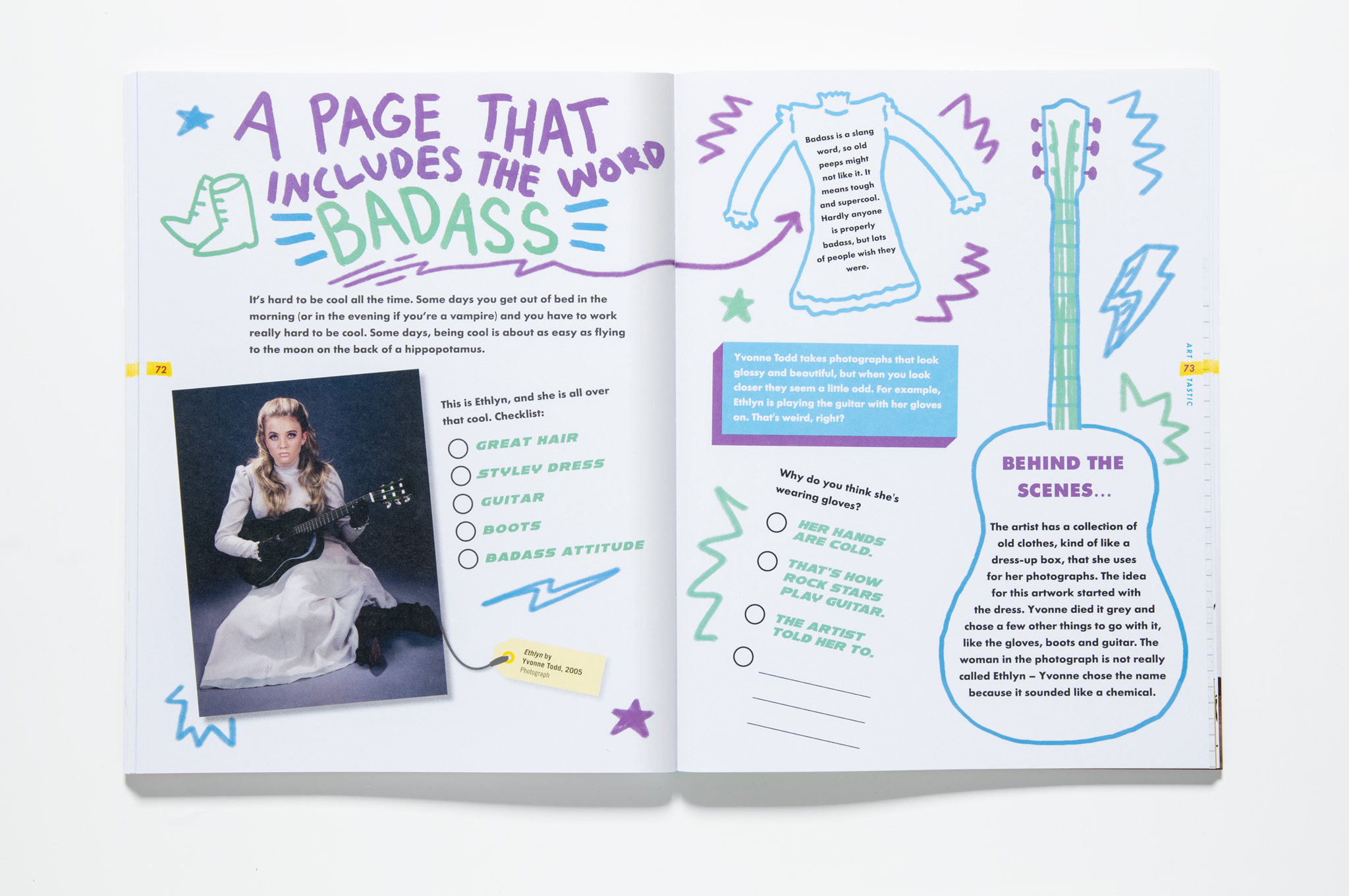
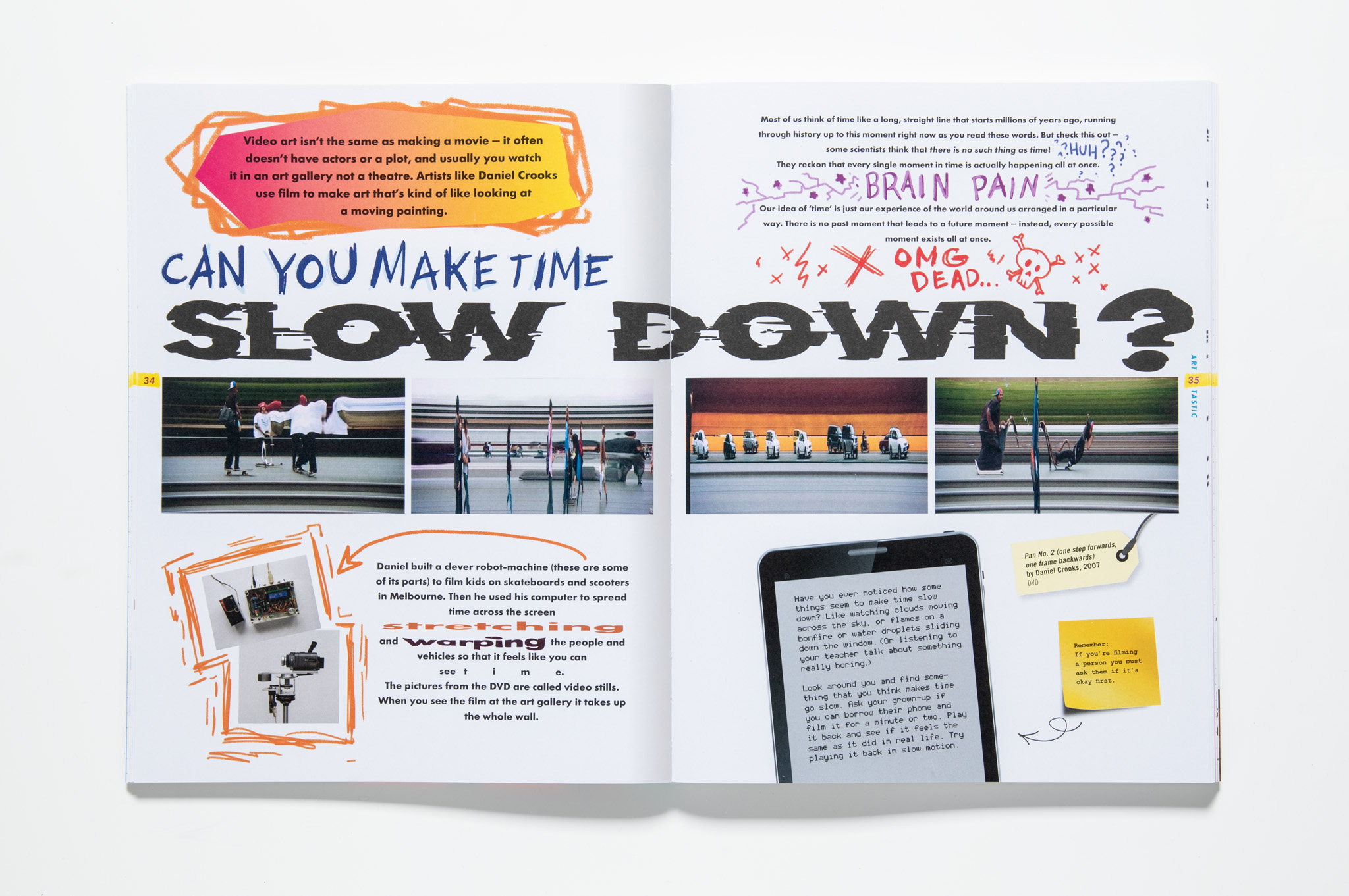
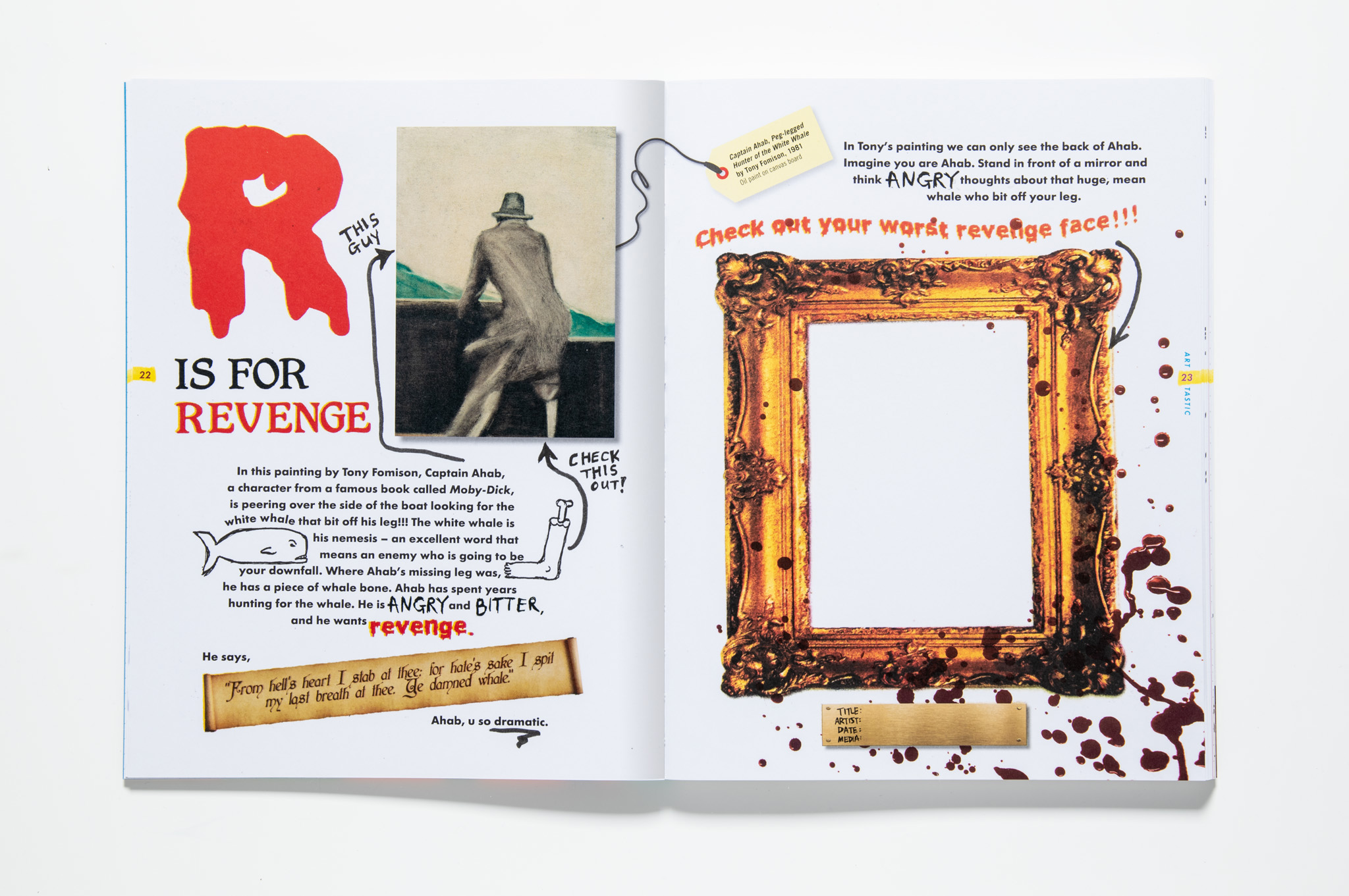
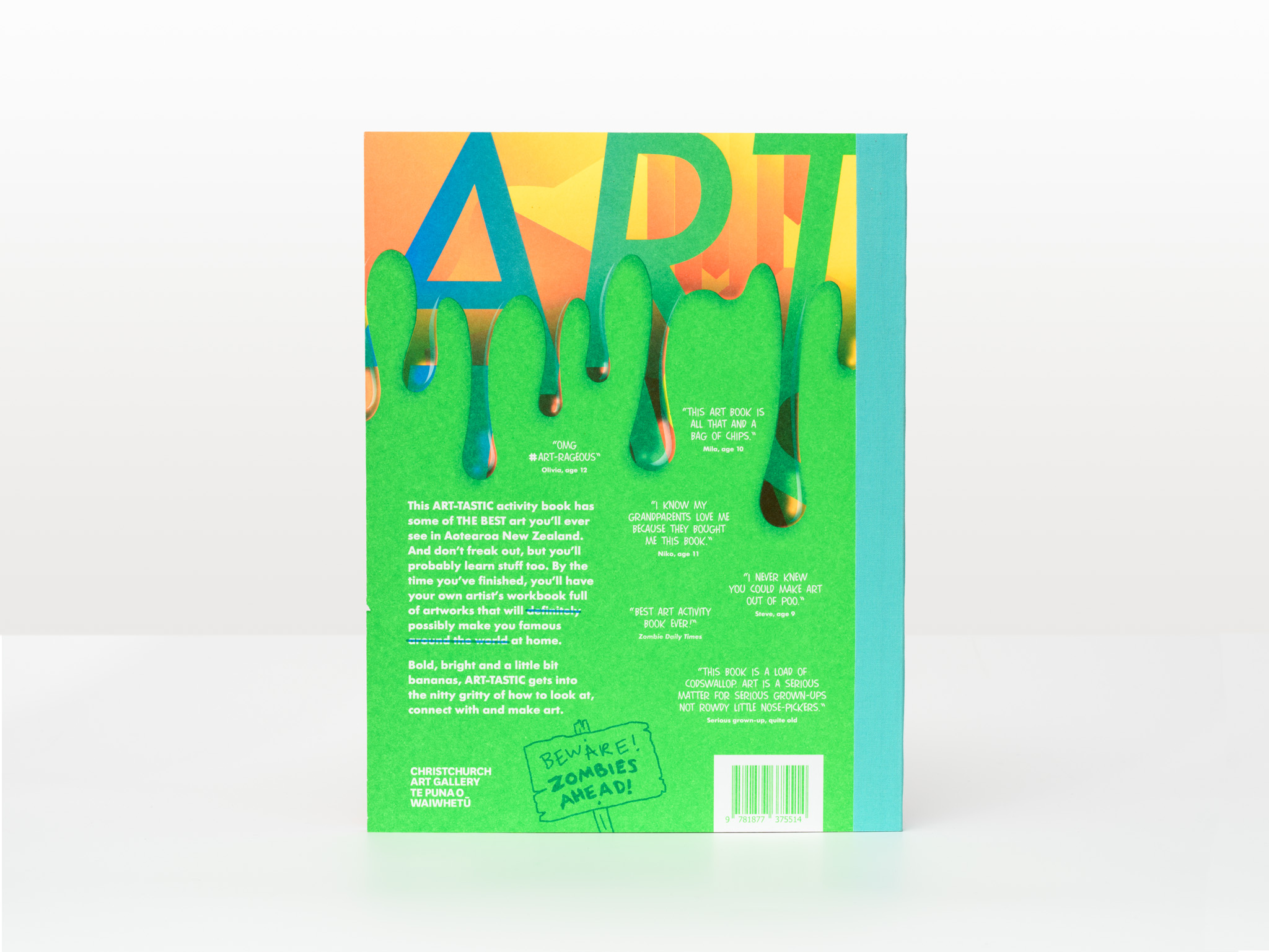
Typography: Principal typeface: Futura. This book is full of type crimes and is all the better for it. The cover is printed in a mix of neon inks blended in a glorious split-fountain of textures and shapes. The interior is an assault on good-taste with a mix of zombies, vomit and poo splatters and typefaces to match. Futura tries to hold it all together but it is overrun with hand-drawn and bastardised versions of font families too varied to list.
Judges’ comments: “Vernacular typography is the name of the game in ART-TASTIC, with different typographic choices responding to each piece of content. A seam of consistency is carried throughout in the typographic choice for the body text, as well as the labelling of art pieces, and “sticky note” asides. A typographic explosion of grand proportions!”
“A popping beauty of a book! It’s so busy visually but rather than becoming a mess it sustains itself.”
“A huge amount of typography involved throughout this publication. Each page uses different fonts – successfully responding to unique content at every turn. It sometimes feels that the typography gives way to page design”
“Such a mammoth task, and throughout all the energy it hangs together, despite several contributing designers. The typographic choices that accompany the diversity of content stick just to the right side of cliché and are successfully age appropriate.”