PANZ
Award for Best Typography 2021
Winner
Designers: Arch MacDonnell and Alexandra Turner, Inhouse Design
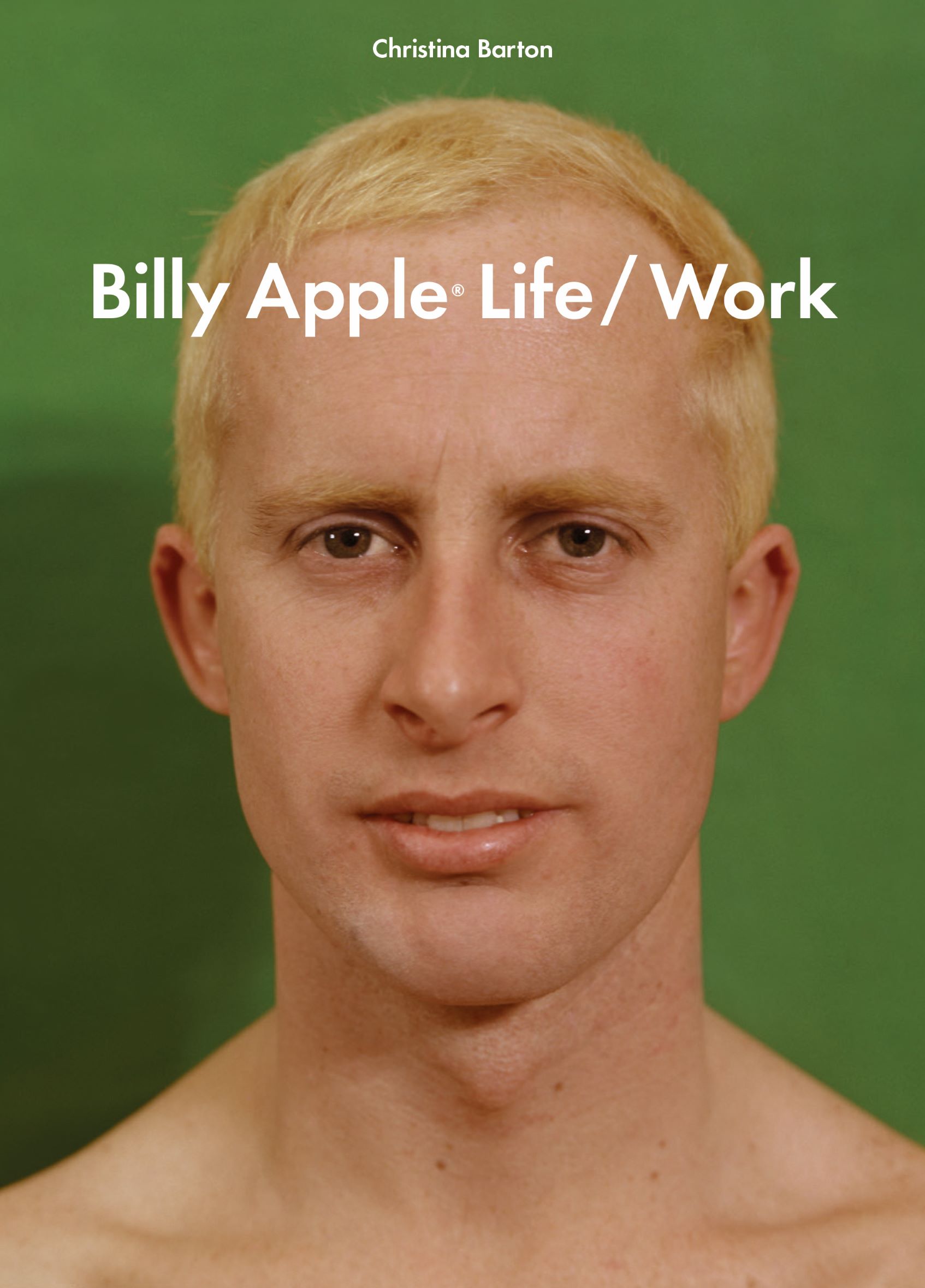
Title: Billy Apple®: Life/Work
Publisher: Auckland University Press
Format: 240 x 170mm, 400pp, hardback.
Case: PLC-wrapped 2mm box board, bookblock flush with case; French-folded jacket on gloss artpaper plus matt lamination; Internals printed 5c (4c + PMS spot red) on 120gsm IKPP Woodfree with overall machine varnishing.
Typography: Headings: Futura Demi 24pt, Futura Book 24pt
Futura is a geometric sans-serif typeface designed by Paul Renner and released in 1927. It is based on geometric shapes, especially the circle, similar in spirit to the Bauhaus design style of the period. An appropriate headline font for Billy as Futura Bold Condensed has featured in many Apple works and is a defining feature of his text-based works.
Body text, notes & captions: Untitled Sans
Untitled Sans is a plain, neo-grotesk sans-serif. It is intentionally ‘plain’ – devoid of character with an air of neutrality. It is very evenly weighted, giving large blocks of text a clear and crisp tone. Delightfully easy to read.
Judges’ comments An in-depth, illustrated academic essay on NZ artist Billy Apple that uses intelligent and considered design throughout. There is a strong rationale for all design decisions. The cover is a clever visual pun that features front and rear portraits of Billy Apple as artwork, and also introduces the green and red primary colourway through the two halves of the book. Does the green apple ripen to red in old age? This is an ode to Futura (Apple’s signature typeface) and Untitled Sans, with complex hierarchies and levels of information. Extensive red numbered footnotes are dispersed in the marginalia to accompany the main essay. Well-staged pull quotes and image spreads also add visual interest. Chronological green and red chapter openers are nicely handled with full-page artist portraits and blocks of colour. Pink-coloured pages demarcate the end matter. The exhibition timeline is nicely set. This book has high production values and is beautifully printed and lavishly illustrated with excellent craft and care. Perfectly executed. It’s a pleasurable book to hold and read.