
Sabrina Malcolm is an illustrator and graphic designer with a background in botany and geology. Her illustrations have appeared in scientific publications, issues of School Journal, and picture books.
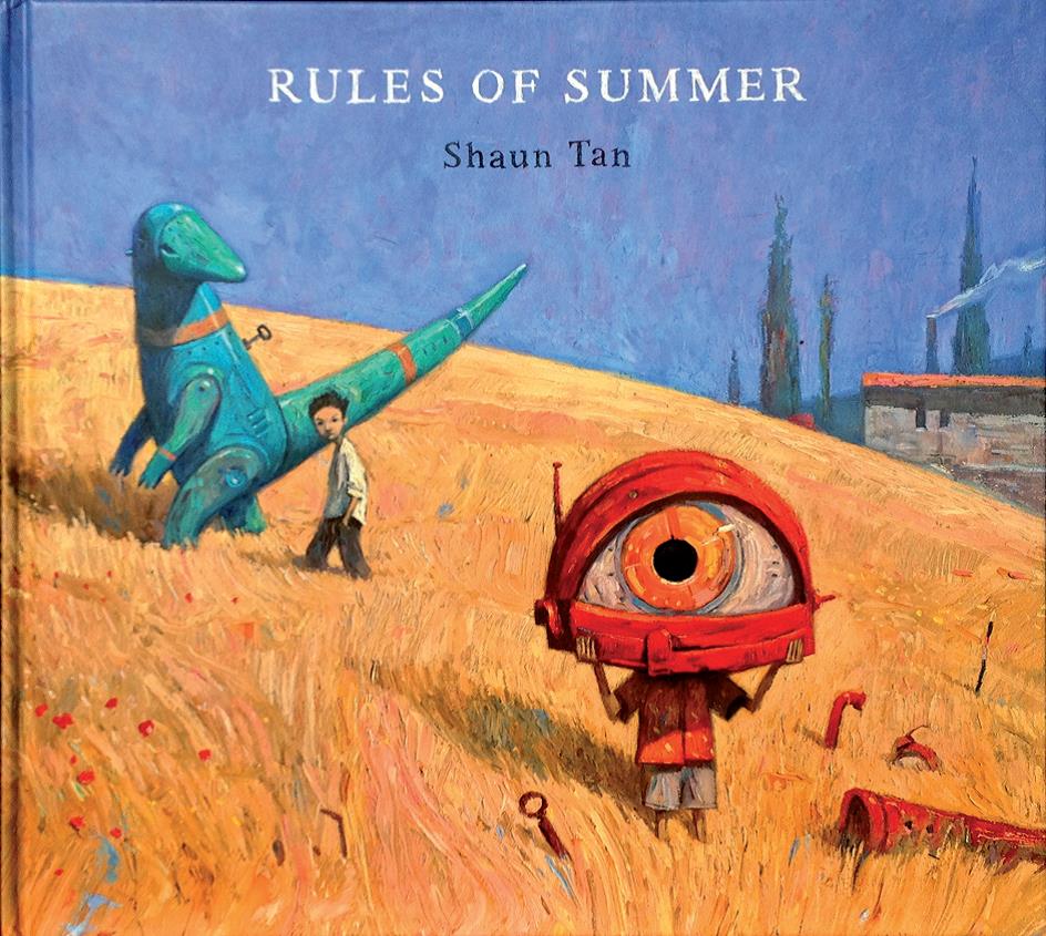
Shaun Tan’s Rules of Summer hooked me on the first glimpse.
It was the cover that did it – its sumptuous colours and textures, the strange mechanical creations, the two kids, and the question they all prompted: what is going on here?
The version I have is hardcover. It’s big, 305 x 275mm, in a format that’s just on the landscape side of square, and there’s something very pleasing about its size and shape.
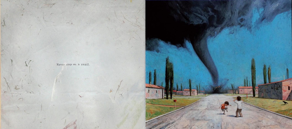
The page layout is simple. On most of the spreads, the right page has a single large illustration that bleeds off the edges, while the left, which carries the words, is spacious and understated.
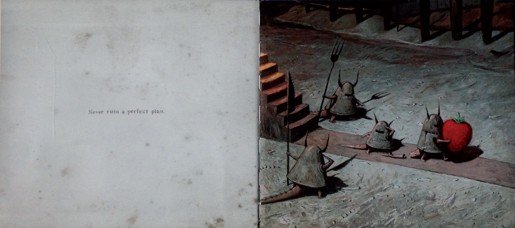
Each of these spreads has just one short sentence, corresponding to a rule of summer. The text, which is hand-rendered, is centred in the surrounding space. The natural imperfections of the hand-lettering add an unsophisticated, vulnerable quality to the narrative, reinforcing the bewildered frustration often shown by the smaller boy – who has spent his summer learning these apparently arbitrary rules.
Shaun Tan’s glorious colours, and the skilful way he uses them to direct the eye, are always the first thing to draw me in. But I also love the complex and exciting textures, the high drama of the variations in light and shade, and the absorbing atmospheric effects.
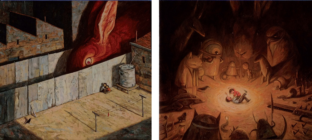
Rules of Summer has an otherworldly, dream-like feel to it, and an ambiguous quality to the narrative. Shaun Tan wrote recently that the ambiguity is deliberate: ‘… anything an artist or author has to say about intention is taken as a kind of authoritative meaning – and taken far too seriously! – when really an audience’s own imagination should flow as freely as possible, at times even against the current of a creator’s own thinking.’
The generous space of the text pages seems like a visual invitation to the reader to let his or her imagination ‘flow freely’ as the author suggests. On those pages, the only illustrations are delicate blots, lightly scribbled marks, and washes; they echo the mood of the facing illustration while counterbalancing its enticing colours and textures.
At the story’s climax, the words disappear for several spreads, and the illustrations cover both pages and become gradually more sinister. It is only when rescue is at hand that the written narrative returns. The last pages revert progressively to vivid summer colours, and then to a warm nostalgic palette that, with the two-word final sentence, makes a perfect ending.
In the last few days I have re-read some of my other beloved Shaun Tan books, including The Lost Thing, The Bird King and Other Sketches, Tales from Outer Suburbia and The Arrival. All but one are designed solely by the author/illustrator – Tales from Outer Suburbia is co-designed with Inari Kiuru, who created the typography. There is a long list of things to admire: the whimsical endpaper doodles, the superb illustrations, the unique and all-encompassing world of each book, the sometimes poignant humour and, of course, the design skill that combines them all into such beguiling objects.
