PANZ
Award for Best Typography 2020
Winner
Designer: Alan Deare, Area Design
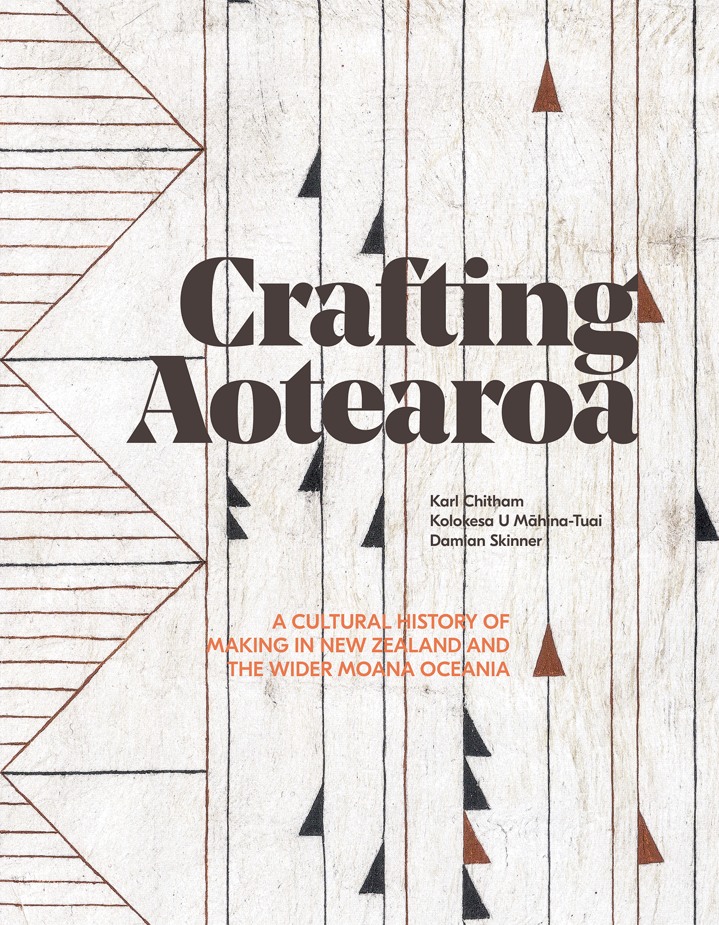
Title: Crafting Aotearoa
Publisher: Te Papa Press
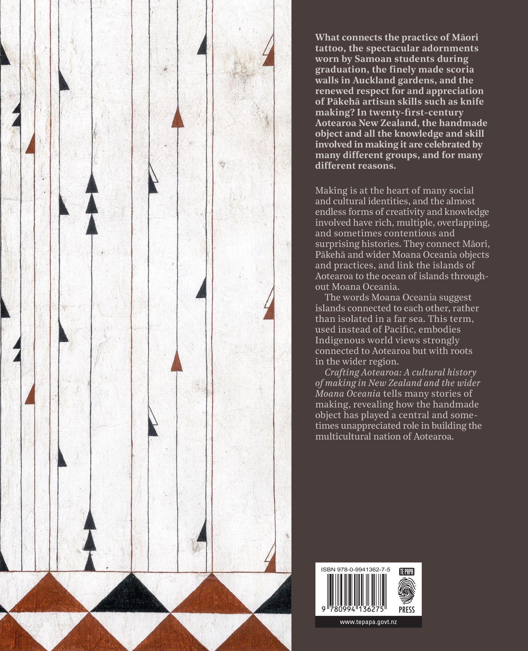
Format: 265 x 215mm, 464pp, hardback. The cover image is a bespoke aute, which was made by contributor Nikau Hindin. Elements of the case have been debossed to emphasise the line detail on the barkcloth.
Typography: Fonts used: Noe Display, Noe Text, GT Eesti Pro Display and Hermes
The entire publishing team wanted Crafting Aotearoa to become the go-to reference source for Māori and wider Moana Oceania craft made in a post-colonial context. Each chapter of the book contains multiple narratives — often concurrently running body text, a glossary explaining Māori and Pacific terminology, extended captions and sidebars from over 60 different expert contributors. Managing this level of content requires a grid that is simultaneously fluid and organised, along with a palette of typefaces and weights to clearly delineate each voice. We took inspiration from formal grid and reference systems from the Swiss tradition and we also liked the museological reference that comes with these organisational considerations. From a production point of view, this approach also democratised a range of imagery from many different sources to create a cohesive approach. At the same time as dealing with these issues we wanted each spread to feel unique and dynamic — to do justice to the diverse range of craft objects. With the tension of a page-specific glossary and extended captions flowing dynamically with the body text (and side bars) the interplay between content, space and imagery was an intriguing moving target on every spread!
Judges’ Comments What an achievement! The typographic choices and pairings are brilliant. The chiselled serif used for display headings captures the idea of carved works of art whilst the modern mono-spaced serif used for the side-bar break out text shows a clever balance to the body copy throughout. The variety of text and typefaces is complex but handled effortlessly to smoothly navigate the reader through the diverse content. The attention to detail of the captions and how the typography is paced and set alongside the imagery is first-class. The judges did have one critique — whilst the folios are obviously a deliberate design decision to be tight to the trim, for some of us this was a little too uncomfortable and a distraction from an otherwise monumental typographic triumph.