Mary Egan Publishing Award for Best Typography 2017
Finalist
Designer: Katrina Duncan, Auckland University Press (interior), Neil Pardington, Base Two (cover)
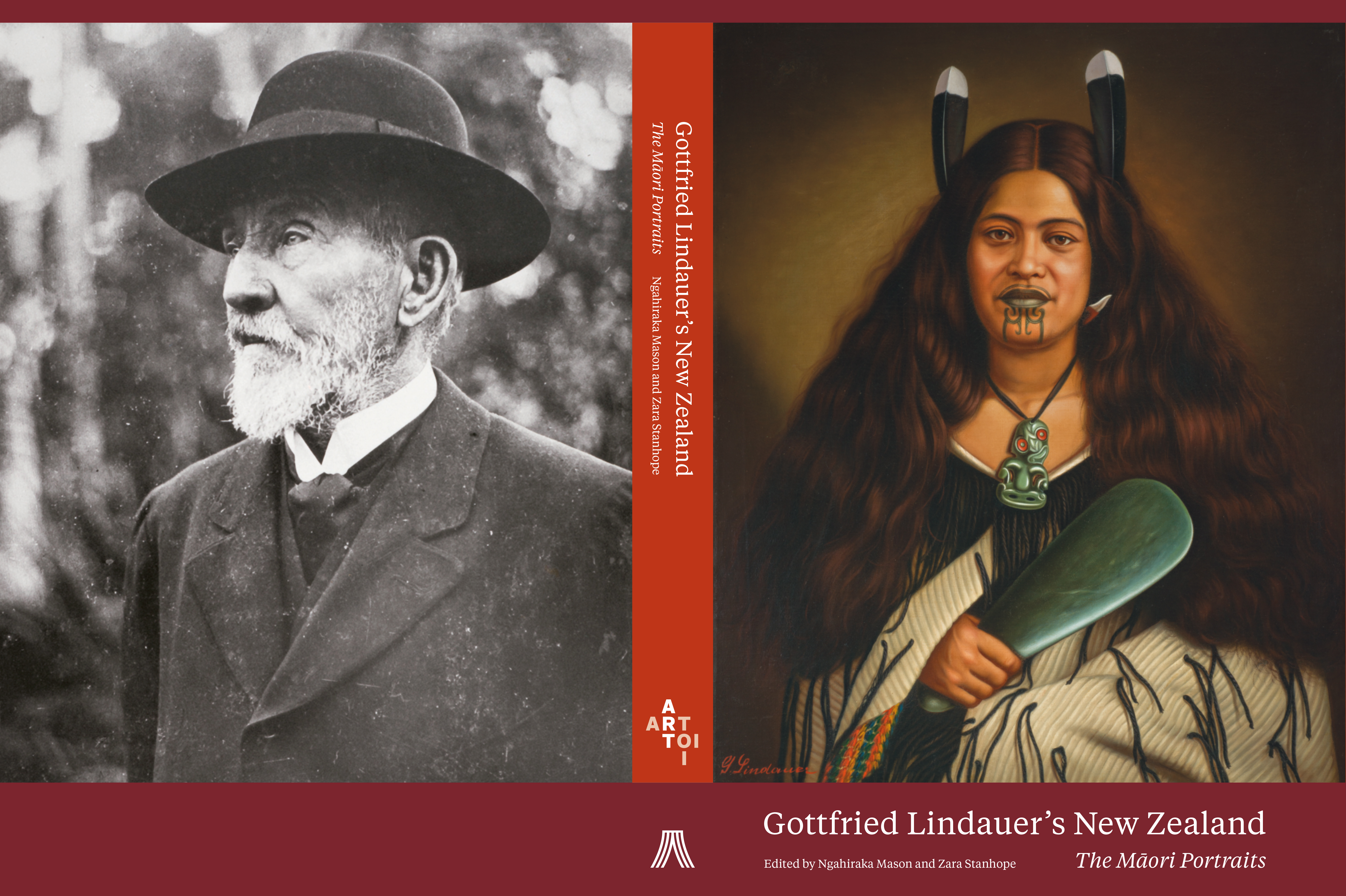
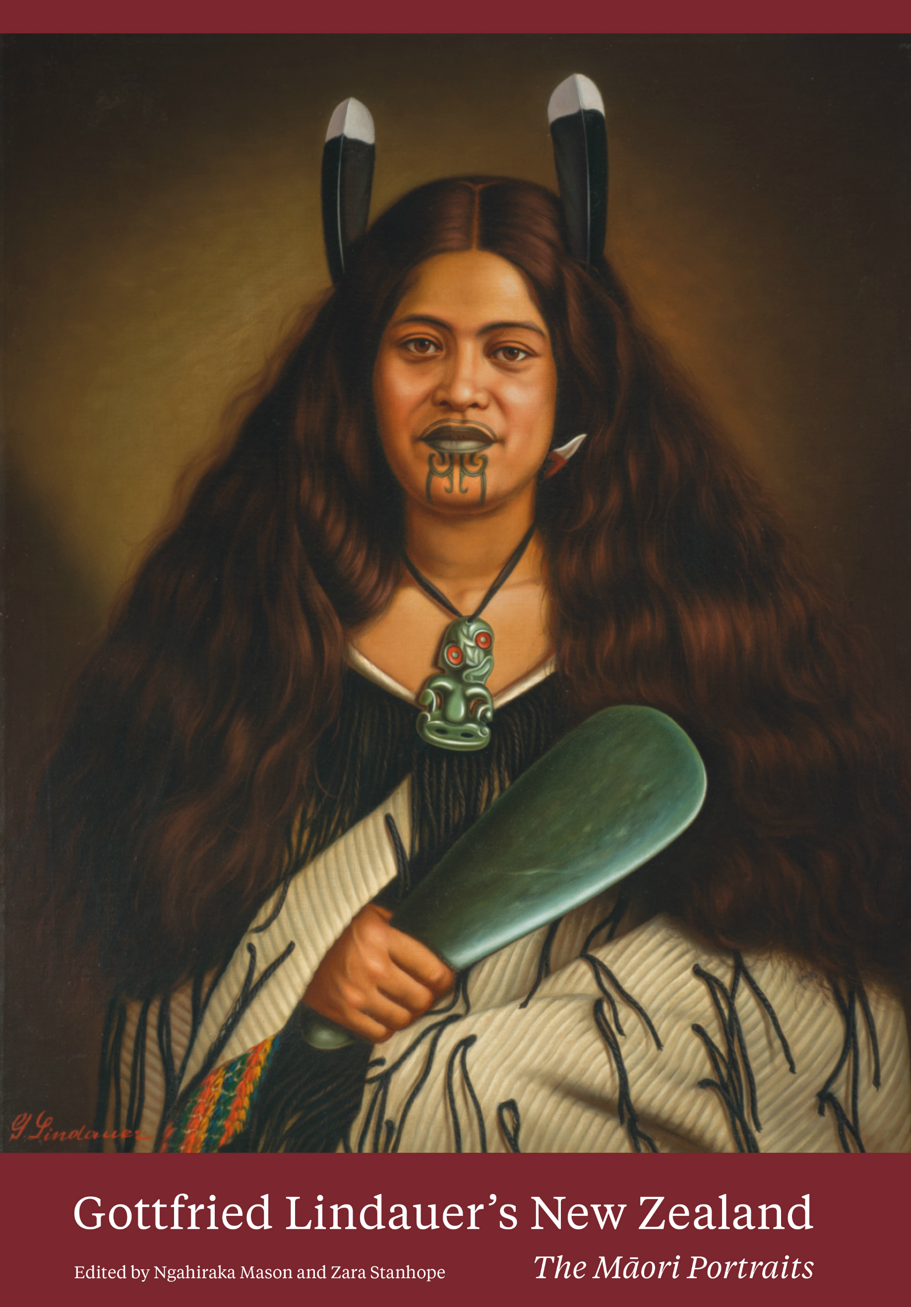
Title: Gottfried Lindauer’s New Zealand: The Māori Portraits
Publisher: Auckland University Press
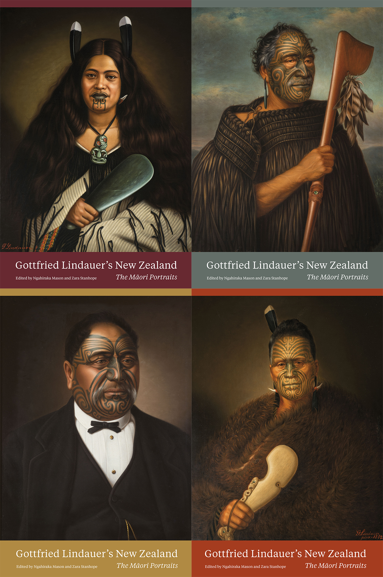
Format: 310 x 206mm, 284pp, hardback, section-sewn with head & tail bands. Two paper stocks: Munken Pure for the essay sections, and 157gsm Hi-Q matt art with spot varnish for the plates. French-folded jacket, and endpapers printed with gold metallic ink on both sides. There are four different dust jackets with portraits representing different iwi.
Typography: Cover and internals set in Tiempos, body text 8/14pt.
Judges’ Comments Any art book with academic tendencies or at least that tends towards that audience, inherits many typographic prerequisites and this book delivers across footnotes, plate numbers, parenthesis, captions, glossary and through to acknowledgements. And not a macron is out of place. The typography clearly recognises that the subject is serious, and the integrity of the text and its duty to the portraits and story behind them is paramount. Some might consider the body text point size small, but it would seem to have been determined by the longest copy length of the accompanying essays and works back from there. The typography has to speak with a voice of quiet, assured, informed authority. It does.