Edify Award for Best Educational Book 2018
Finalist
Designer: Janet Hunt
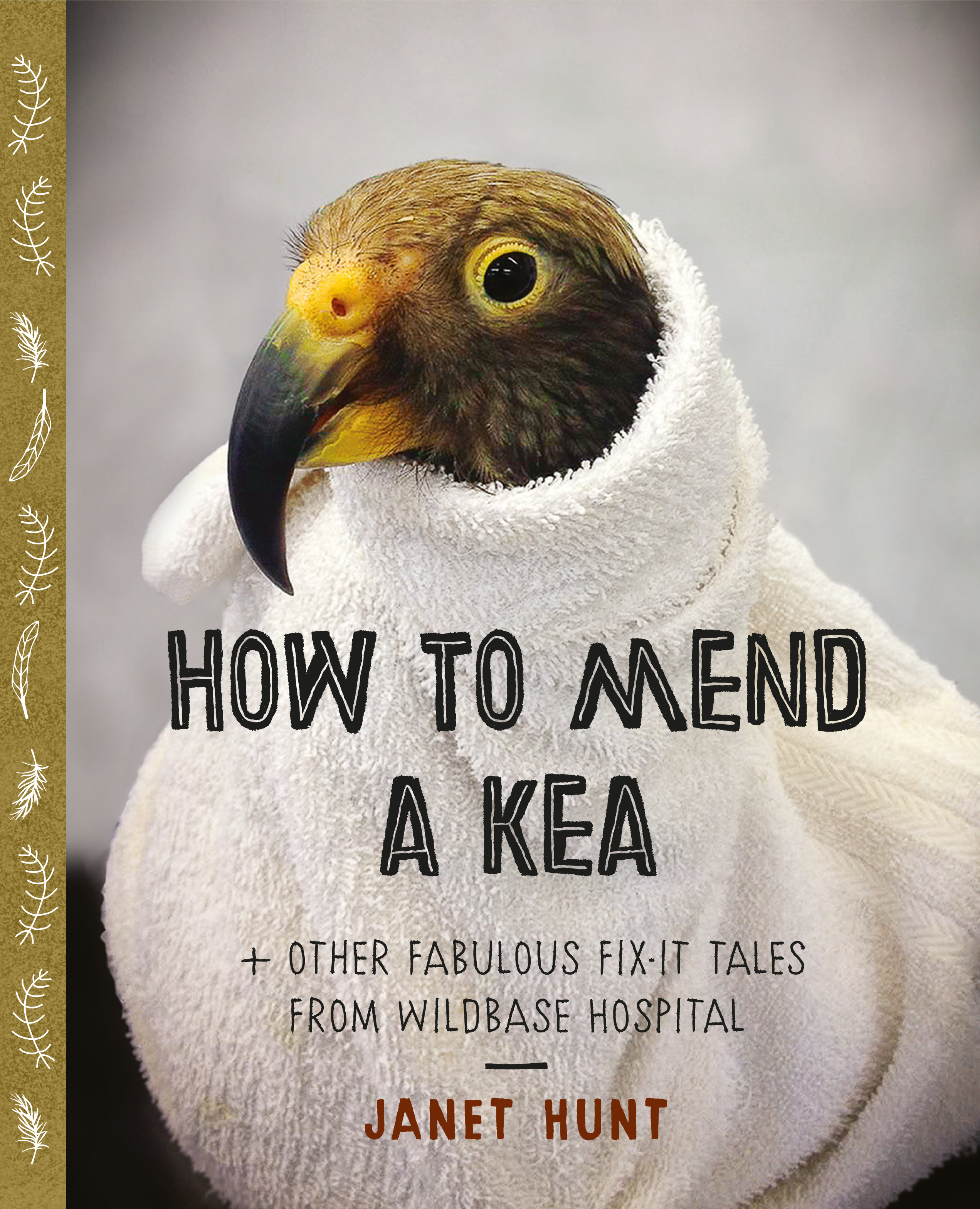
Title: How to Mend a Kea
Publisher: Massey University Press
Format: 260 x 215mm, 64pp, limpbound with flaps. A matt paper with a ‘stippled’ background was used. The cover has a faux quarter bind and the extended flaps provide additional strength and rigidity.
Typography: Body text is Karmina Regular 10.5/15pt; captions are Calibre Regular 9.5/15pt and the main headings are Chronic Regular 32/30pt (lesser headings are a variation on that).
The design was a collaboration with both publisher and designer wanting the book to be beautiful and precious and instructional. Karina, the serif body font and Calibre, a clean sans serif caption font, were selected for high legibility and readability as well as to complement and contrast. They are counterbalanced by Chronic in different weights for headings with a handcrafted feel for greater liveliness and contemporaneity.
The use of matt paper with a ‘stippled’ background both appealed in itself and is a point of difference from high gloss printing.
The cover has a faux quarter bind that continues the sense of traditional, beautiful and precious, with decorative elements drawn and modified from the font Rainier Ornaments. The extended flaps are not only a great place to hold things but provide additional strength and rigidity. The format inside has a main running column balanced with sidebars to provide additional snippets.
Judges’ Comments: The author/designer clearly possesses many, many skills. The clear main text setting, pull quotes and side bars sit comfortably and in an orderly fashion, as if a commentary to the Kea’s mending. The pace at which the reader is guided through the content makes it an easy page turner and adds to the hunger for learning. This is a great balance between field guide and engaging classroom study aid.