Scholastic New Zealand Award
for Best Children’s Book 2019
Finalist
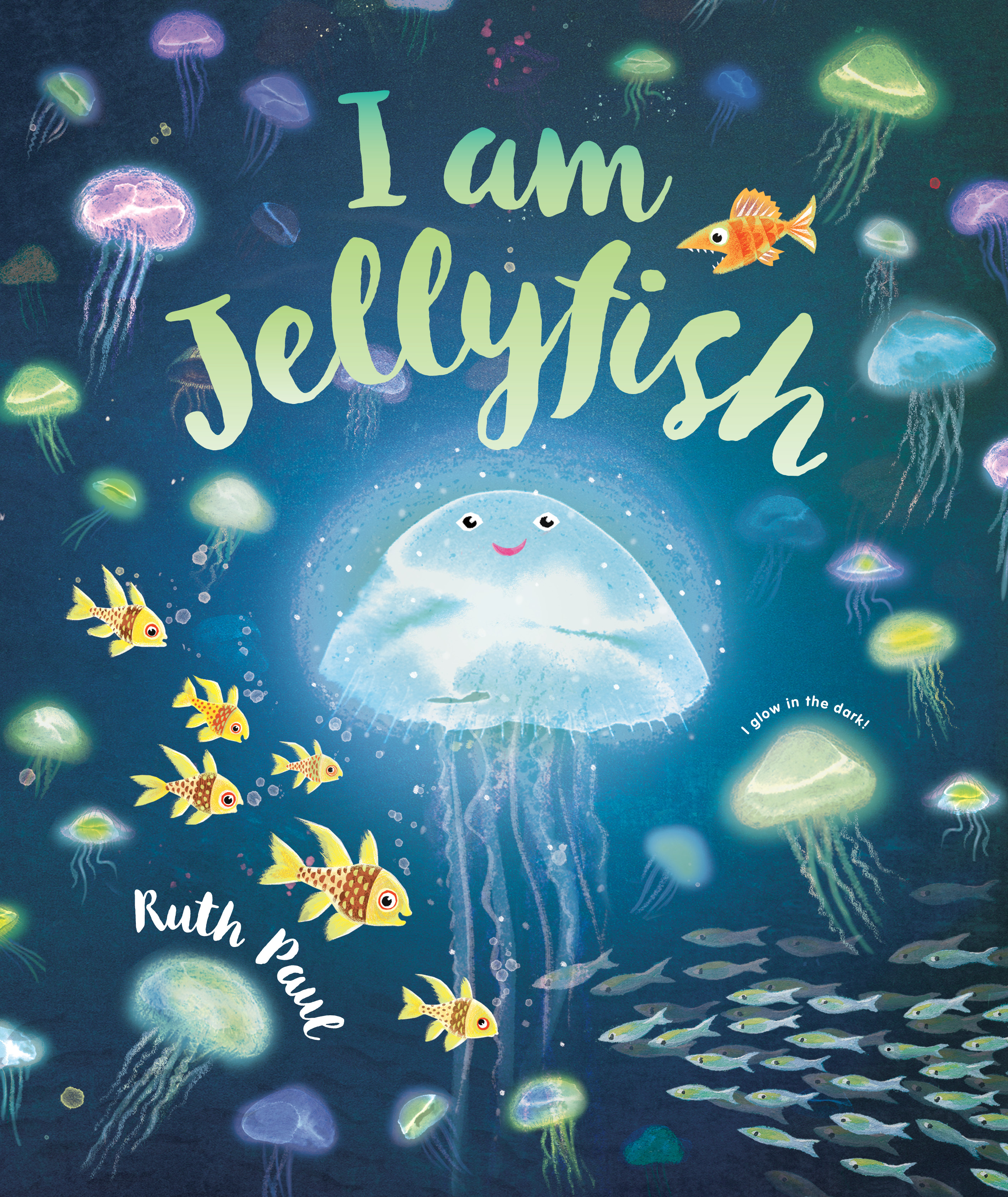
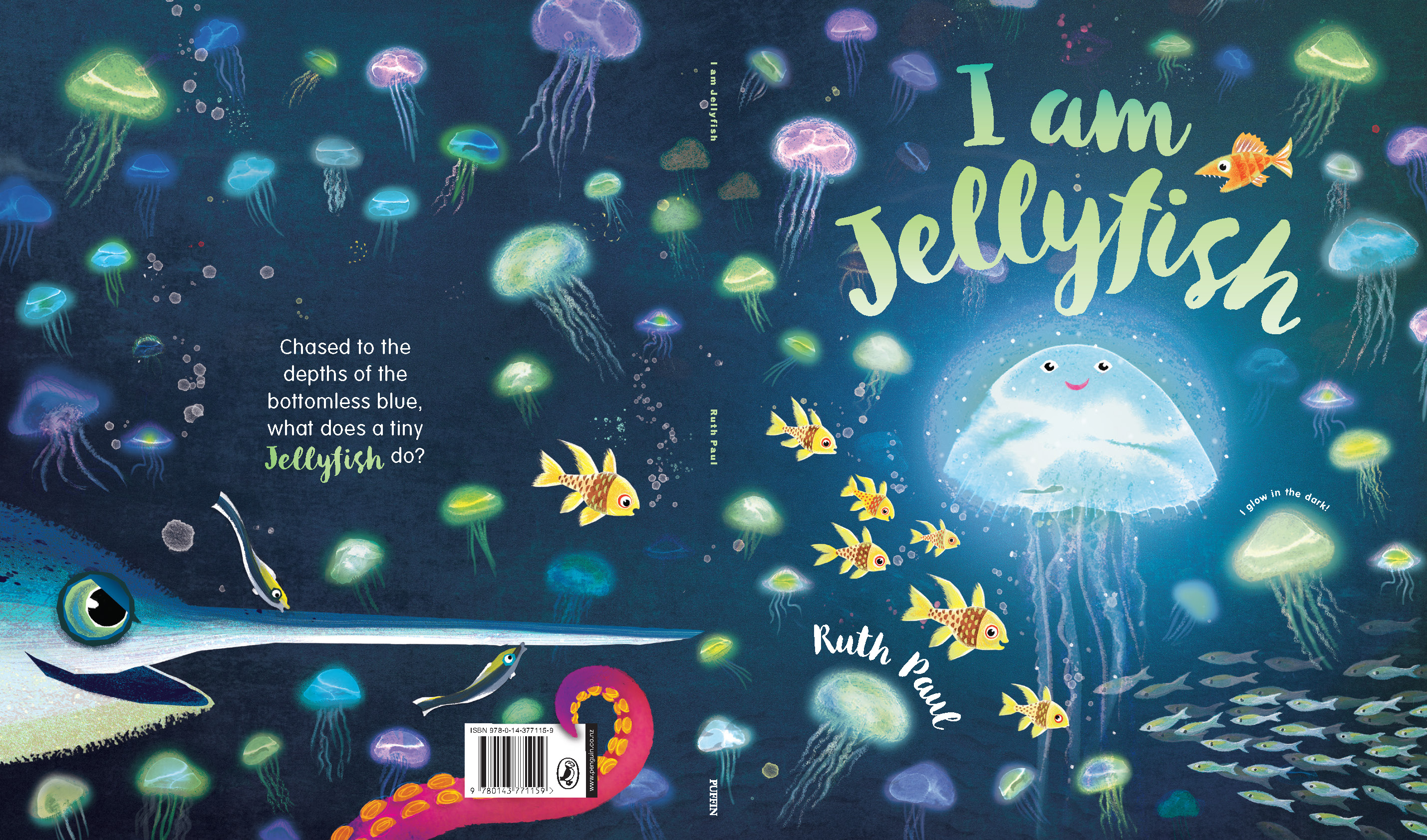
Designers: Rachel Clark with Ruth Paul
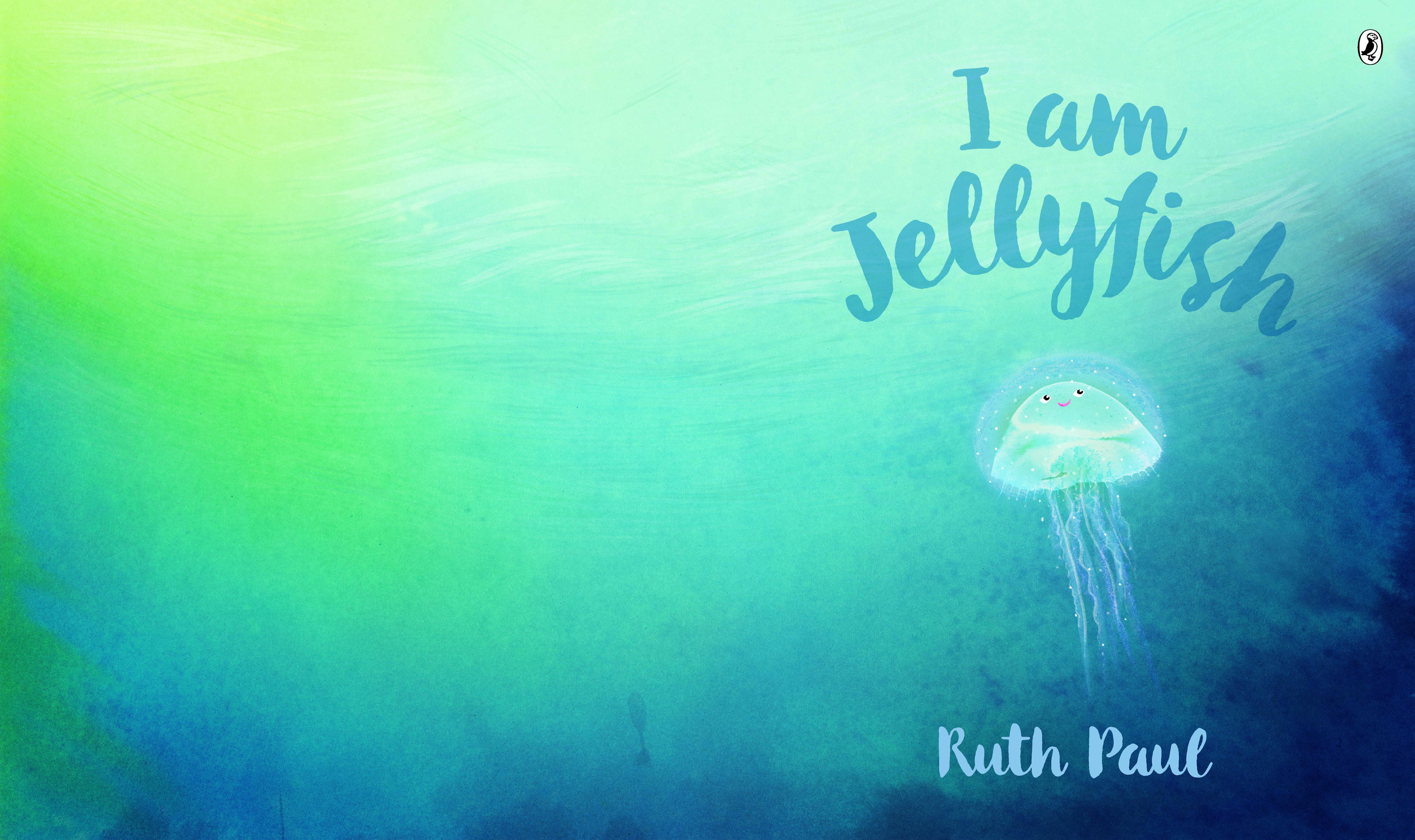
Title: I am Jellyfish
Publisher: Penguin Random House
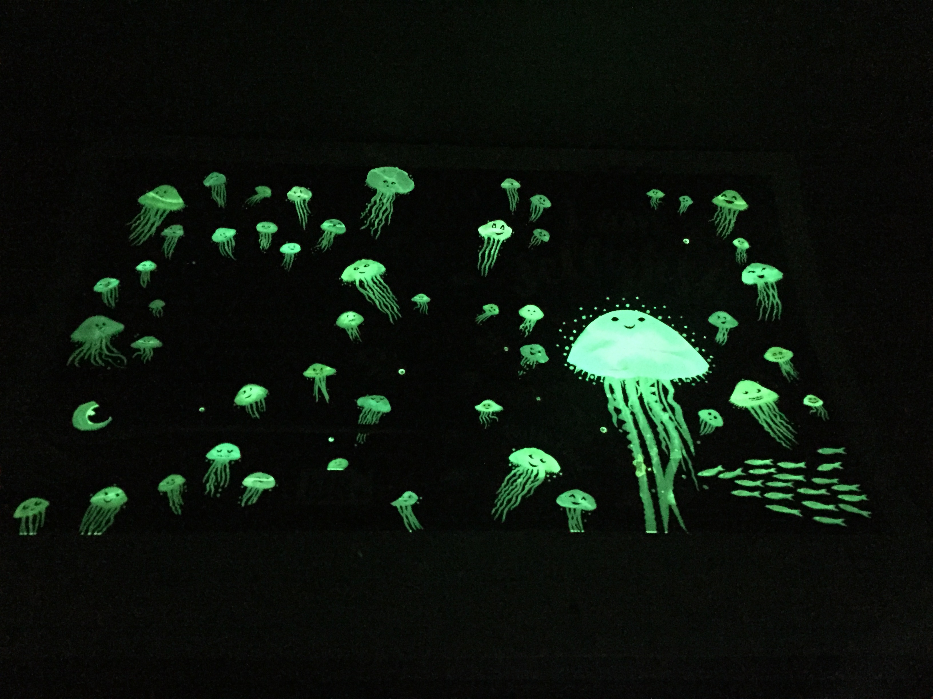
Format: 285 x 240mm, 32pp, paperback, section sewn. Text printed 4c x 4c on 157gsm matt art paper. Cover printed 4cx 1c on 350gsm 2-sided artcard with matt lamination and glow-in-the-dark spot UV.
Typography: Body font: Classic Grotesque. Title font: Botanica Script. Squid’s speech font: VAG Rounded.
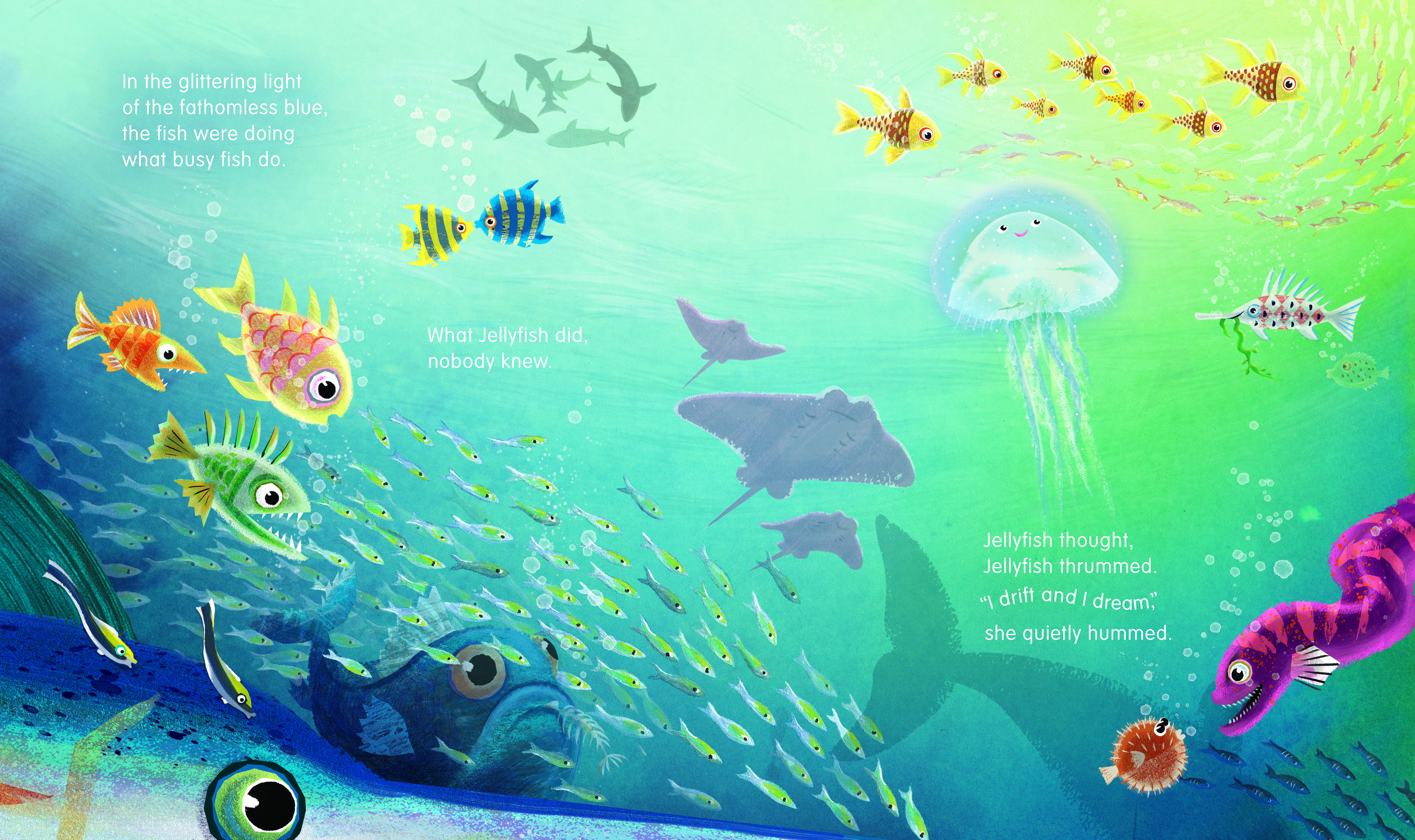
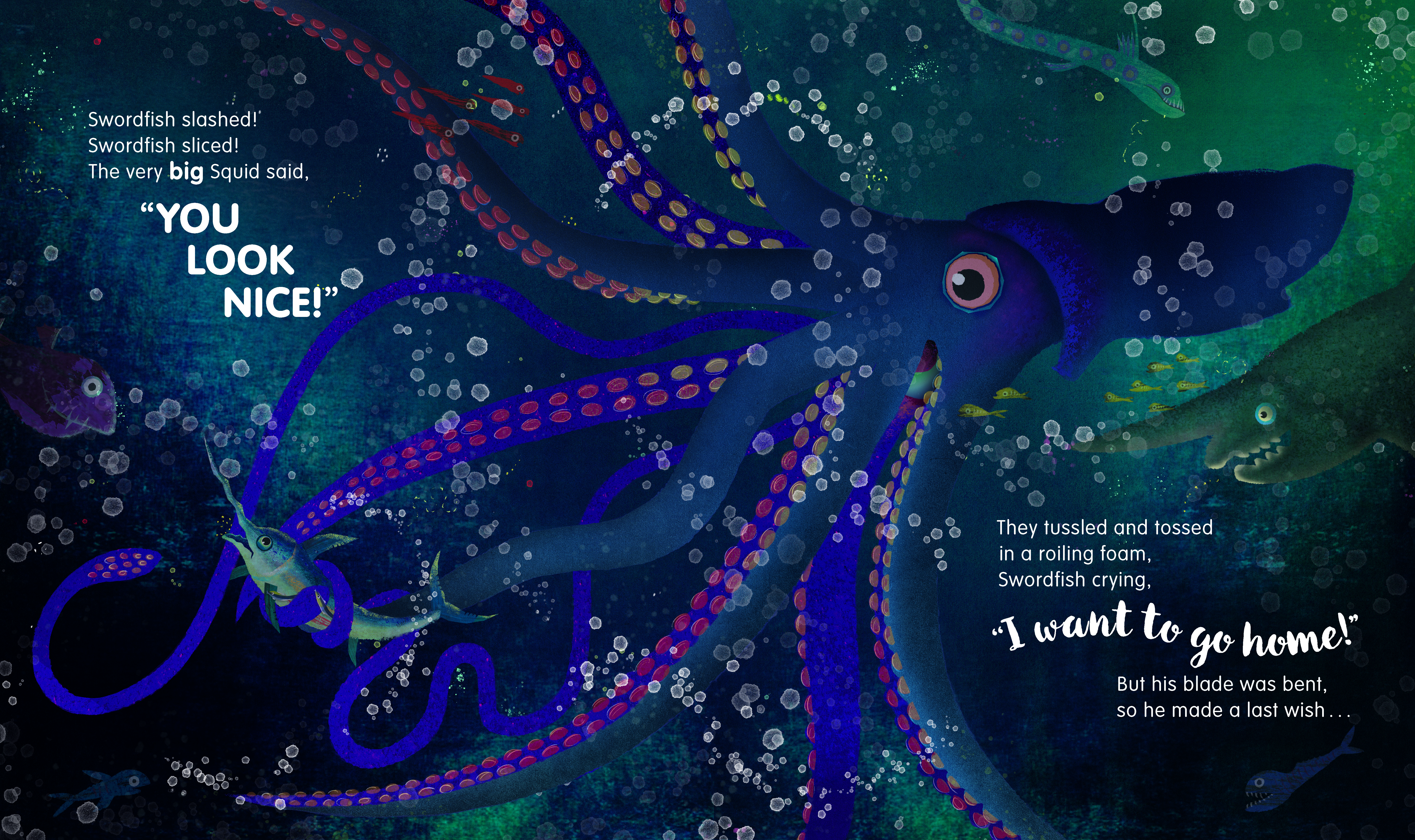
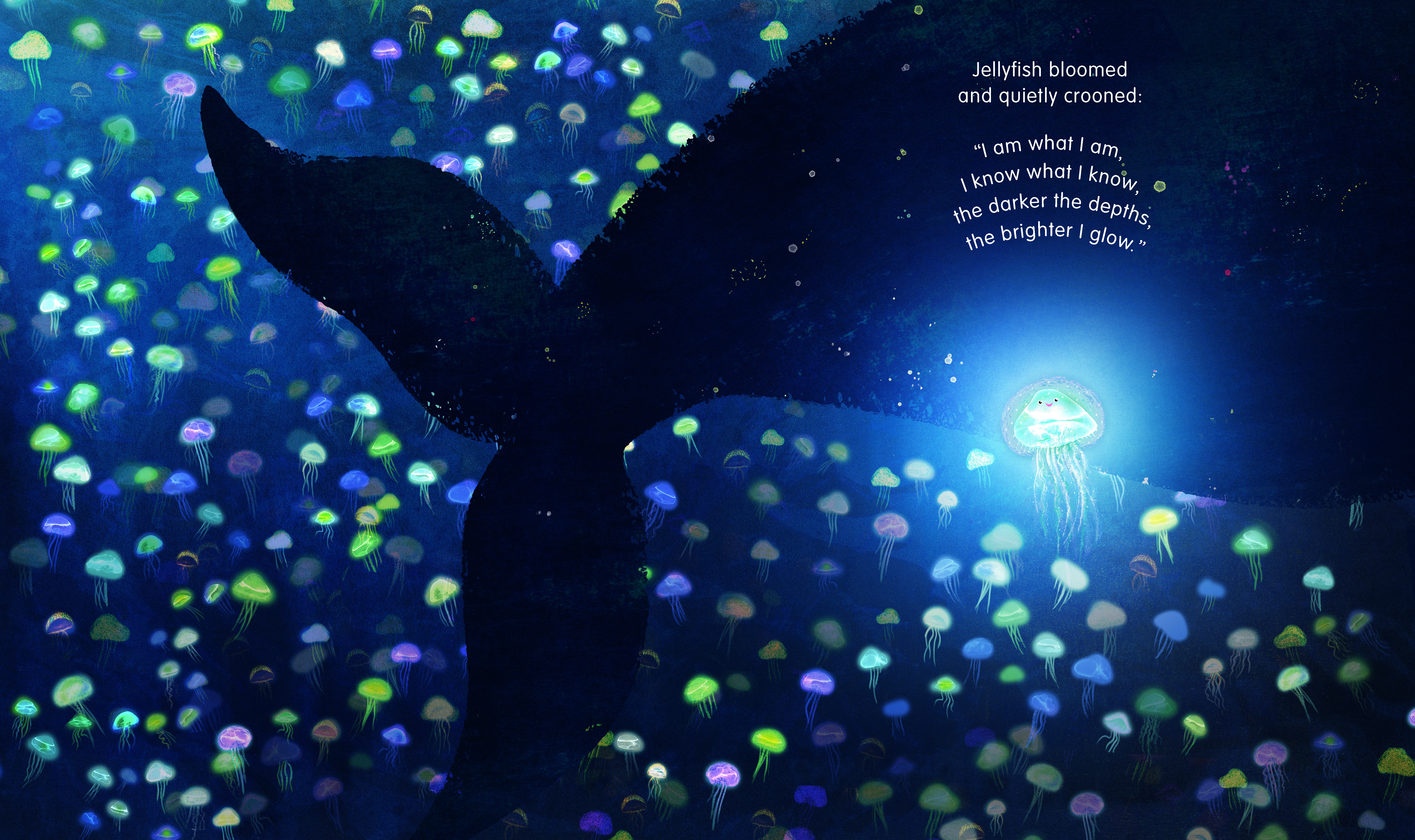
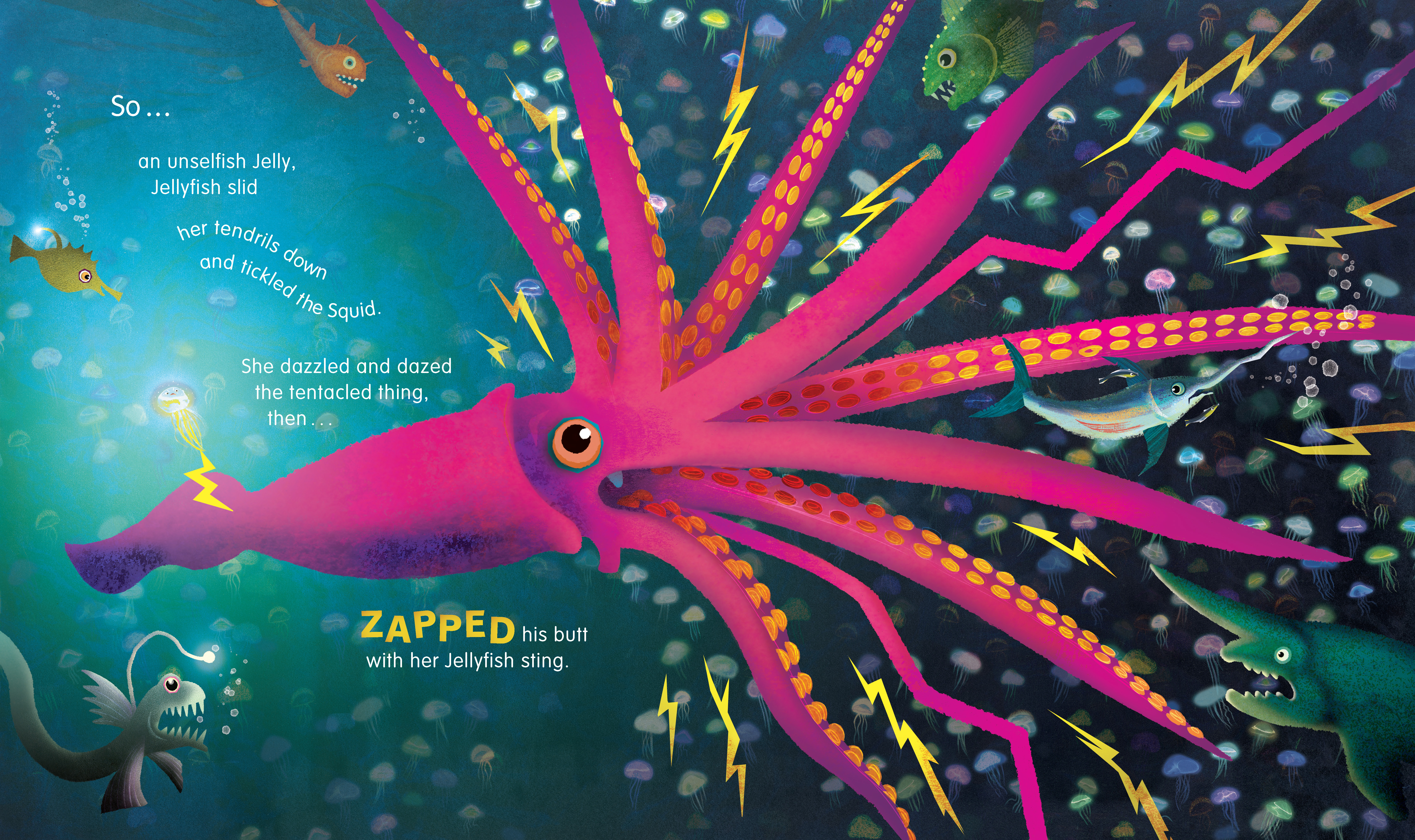
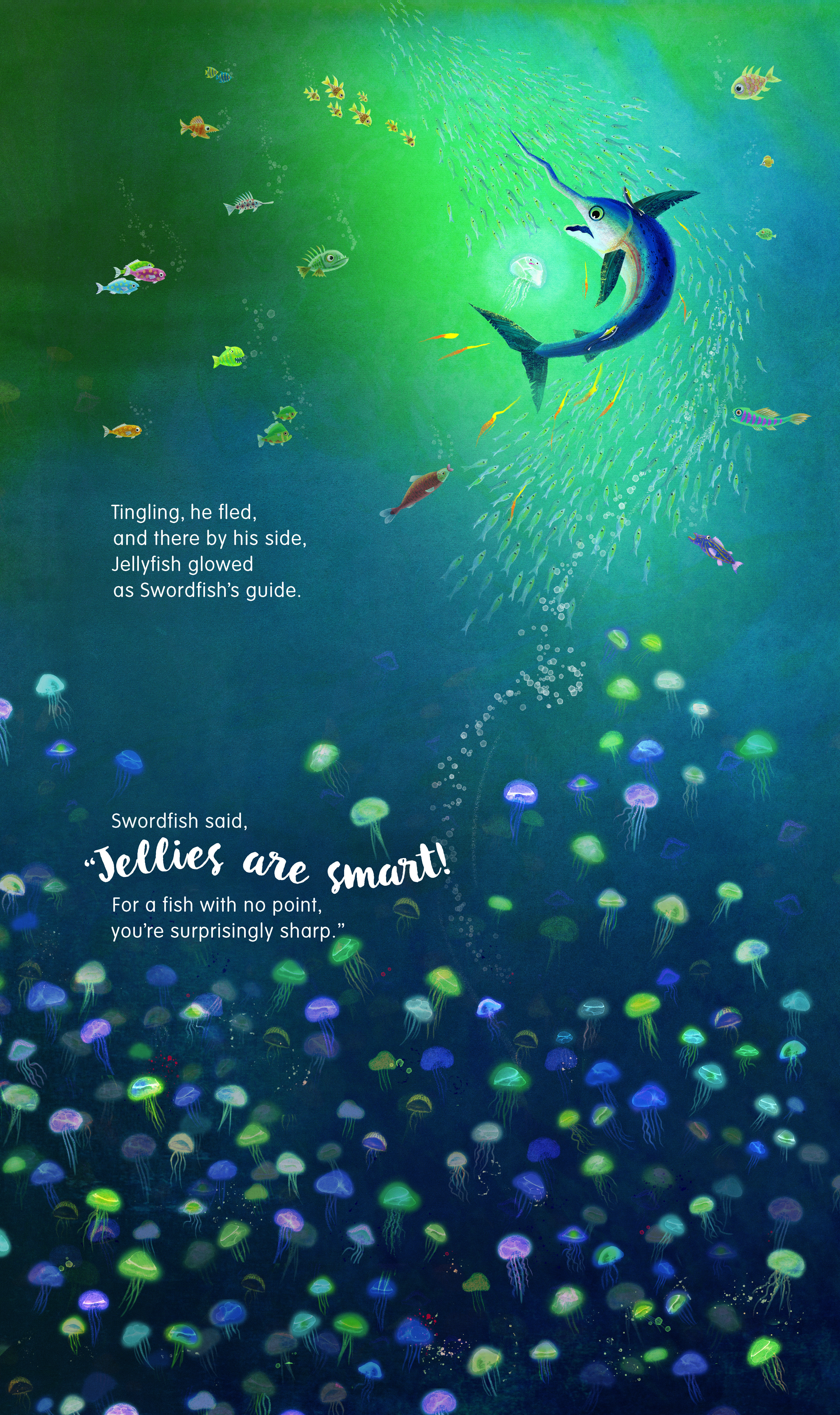
Judges’ comments: “A fun package, with clear, easy to read type that’s well integrated with the illustrations. Type is used for dramatic storytelling effect. The murky depths are captured well in the illustration, with an energetic palette illustrating the sea creatures. A nice touch of neon pastels for the jellyfish, and the added bonus of a glow in the dark cover is a lovely touch.”
“Lovely cover design with textural interest and the exciting little touch of the glow in the dark jellyfish. A dreamy muted colour palette of seafoam green. It has a very painterly quality. It is a unique story which has a nice flow and rhythm and atmosphere/mood. This has been extremely popular in the retail space.”
“Awesome cover with clever production detail and texture added. Lovely illustrations throughout and an age appropriate use of fonts, however, a few design decisions could’ve been simplified.”
“An Eric Carle-esque set of illustration textures. Delightful colours emerge from the depths of the ocean. Amidst the shoals of movement in the illustrations, the typography tries at times a little too hard for emphasis when words are s t r e t c h e d. It is age appropriate but feels like an unnecessary design touch. But on the whole great flow and nice to see a change of orientation to emphasise depths and discoveries to be made in the smallest of details in the illustrations.”