Penguin Random House New Zealand
Award for Best Illustrated Book 2021
Finalist
Designers: Jo Bailey & Anna Brown (Principal Designers), Toi Rauwharangi / College of Creative Arts Massey University.
Additional support: Richard Reddaway (images) and Sarah Hall (Tales from Elsewhere mini-book)
Title: It does no harm to wonder / the body of the work
Publisher: Aratoi Wairarapa Museum of Art & History
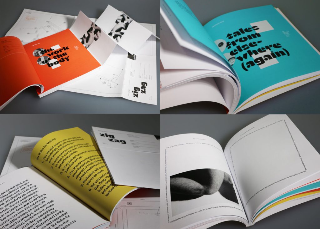
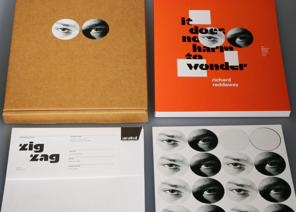
Format: 250 x 210mm,184pp, perfect bound, incorporating overgloss text on cover and offset printed pagefold; cardboard display box with die cut stickers, hand-applied rubber stamp; bespoke folded plan/poster; perfect bound mini book printed on Eco100 with Turquoise Colourplan cover.
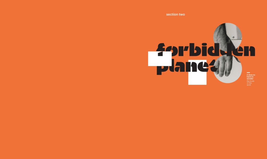
Typography: Cover lock up: Orientation by Commercial Type (with modifications)
Section headings: Orientation (Commercial Type)
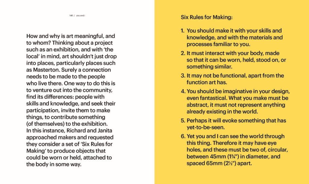
Essay headings: Graphik (Commercial Type) semibold + light 35pt on 39, -10 tracking
Section entry text: Graphik medium 21pt on 26, -20 tracking
Body text: Graphik regular 10pt on 13, -10 tracking
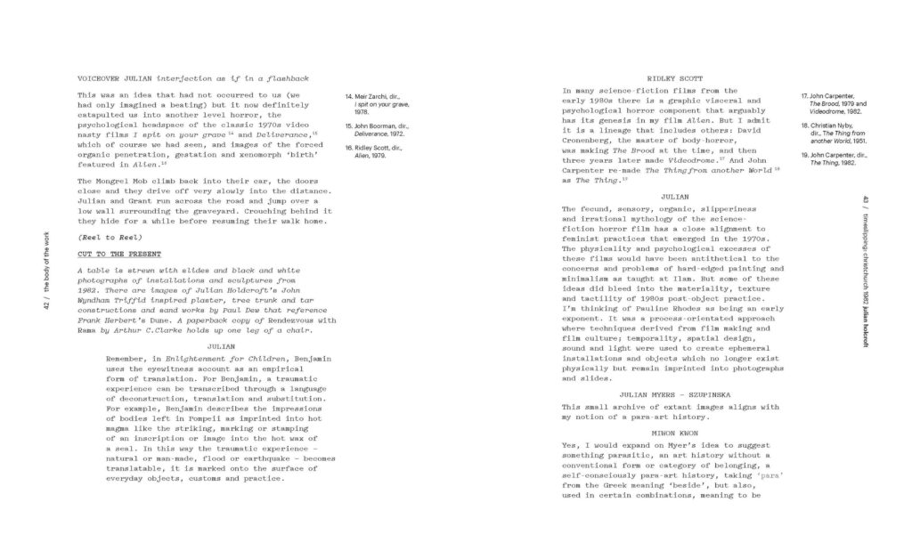
‘Script’ text: (pp.37-45) Pitch (Klim Type) medium 10pt on 13
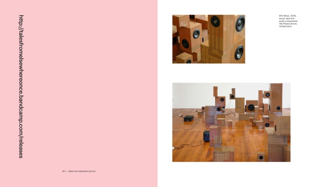
Tales from Elsewhere mini-book
Headings: Bluu Next (Velvetyne Type Foundry) bold 28pt on 32; Graphik regular 24pt on 28
Body: Quadraat (FontFont) regular 10.5pt on 14.5
For more details see https://fontsinuse.com/uses/35629/it-does-no-harm-to-wonder-the-body-of-the-wor
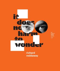
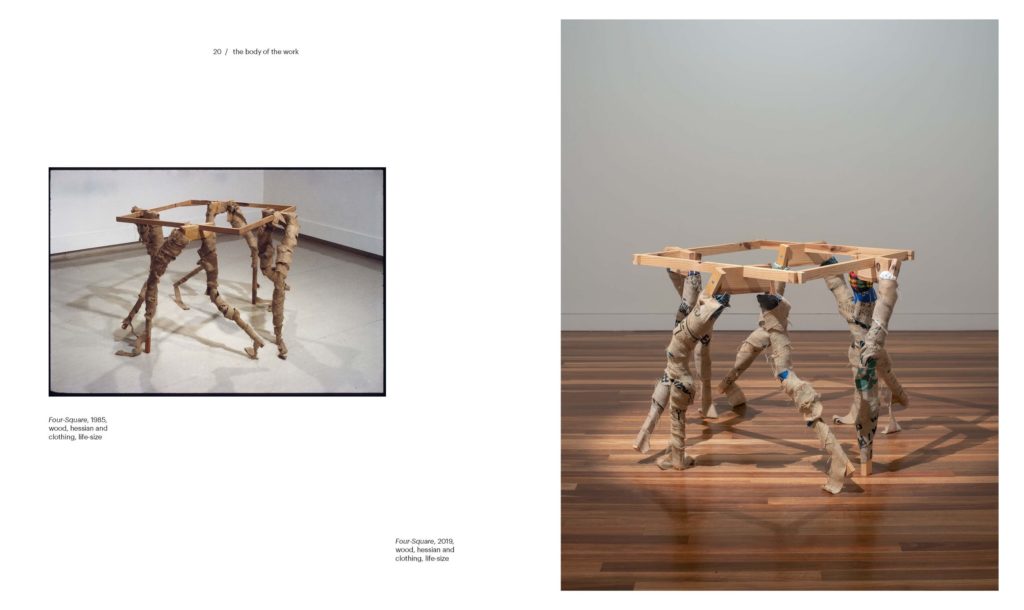
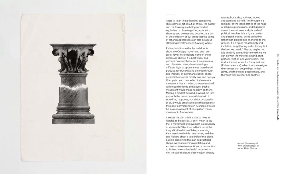
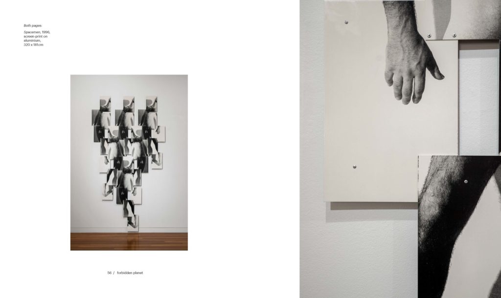
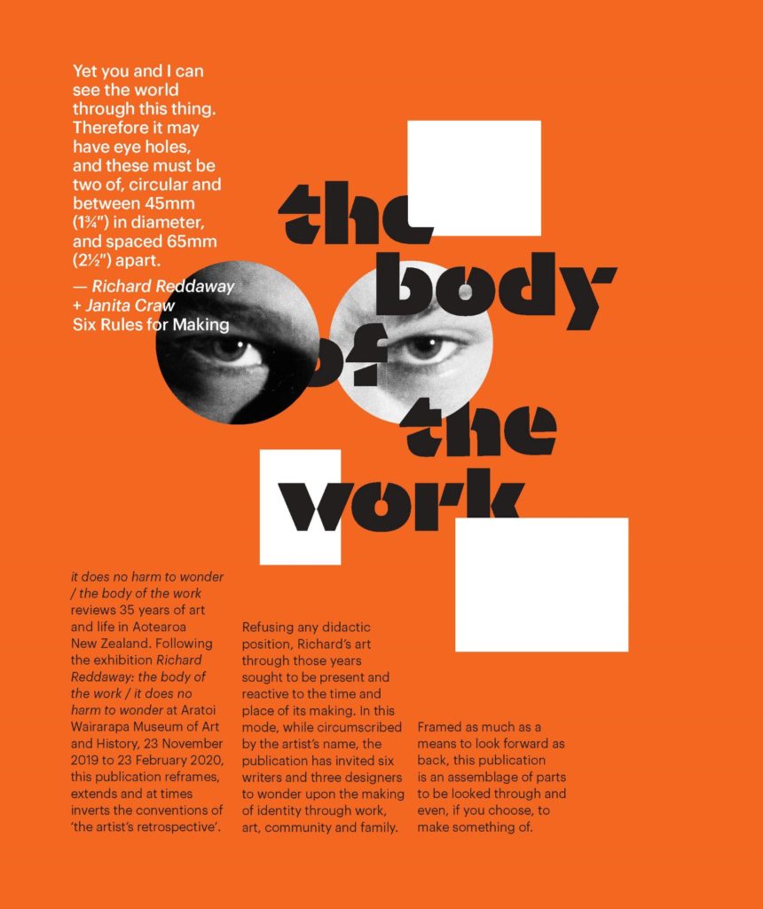
It does no harm to wonder / The body of the work’ surveys sculptor Richard Reddaway’s work from the 1980s to now, exploring enduring themes and tracking them in relation to the socio-political contexts in which they were made. The publication sought to capture Reddaway’s work in this context, as well as nod to movements he references in his practice. But, the brief was for a publication that should be a means to ‘look forward as well as back’, so it consciously adopts a style that does not typify any specific era of Reddaway’s oeuvre, becoming its own part of his ongoing practice.
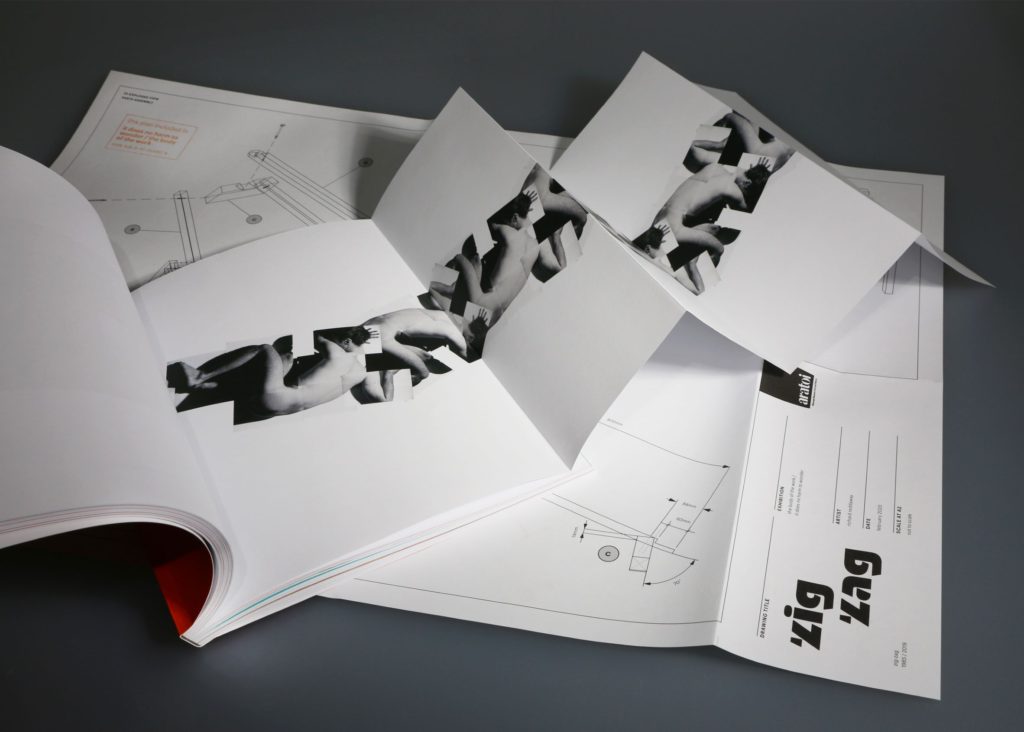
The publication is an assemblage of parts contained in a box with ‘eye holes’. We wanted to make an artist’s ‘book’ in the sense of capturing the art, but also extending the invitation for the audience to become enmeshed as a maker in their own right. A sticker sheet is included, as is a plan of Reddaway’s ‘Zig Zag’ sculpture, in a playful invitation to extend the interaction with DIY: ‘parts to be looked through and even, if you choose, to make something of’, as Reddaway describes it.
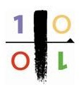
The book’s typographic system covers essay content, as well as scripts and experimental poetry. There is also a book of short stories produced in the tradition of classic paperbacks. We developed a visual identity that speaks to the ethos of Reddaway’s practice: the central lock-up device uses a modified version of Orientation by Commercial Type, which we chose because its angular stencil form lent itself to overlapping and slicing: a nod to literal and metaphorical aspects of his mahi. This is used on the cover, section openers, and also carried through the environmental graphics in the exhibition itself.
We pushed the budget as far as possible, customising standard elements like the box and plans with rubber stamping – adding our own hands to the ‘body of the work’. Reddaway individually hand-numbered each box, and we hand-folded the plans to allow for a more interesting bespoke fold. Fold-out sections in the book were carefully devised to maximise impact within standard material parameters.
We hope the overall package is a desirable collection in its own right, celebrating Reddaway’s work in the nondidactic maker-player mode of the artist himself.
Judges’ comments An art book that appears to be an artists’ multiple on first encounter: cardboard box, enigmatic eyes-on-stickers staring at you, opening to reveal book, booklet, poster and sticker sheet with more eyes (the two on the cover missing from said sheet, as if another reader, or maybe the artist himself, got there before you). The publication has an intriguing conceit, where rather than just being commissioned to design the book, the designer trio were invited alongside the writers to interpret the artist’s work: to literally wonder. A lively book results, where lines between artwork, prose, poetry and design are blurred, but everything is still held together in a pleasing tension with typography, form and material.

