Scholastic New Zealand Award
for Best Children’s Book 2019
Finalist
Designers: Kelvin Soh and Sam Wieck of DDMMYY; Grace McFarlane and Cait Kneller of Toitoi Media Ltd
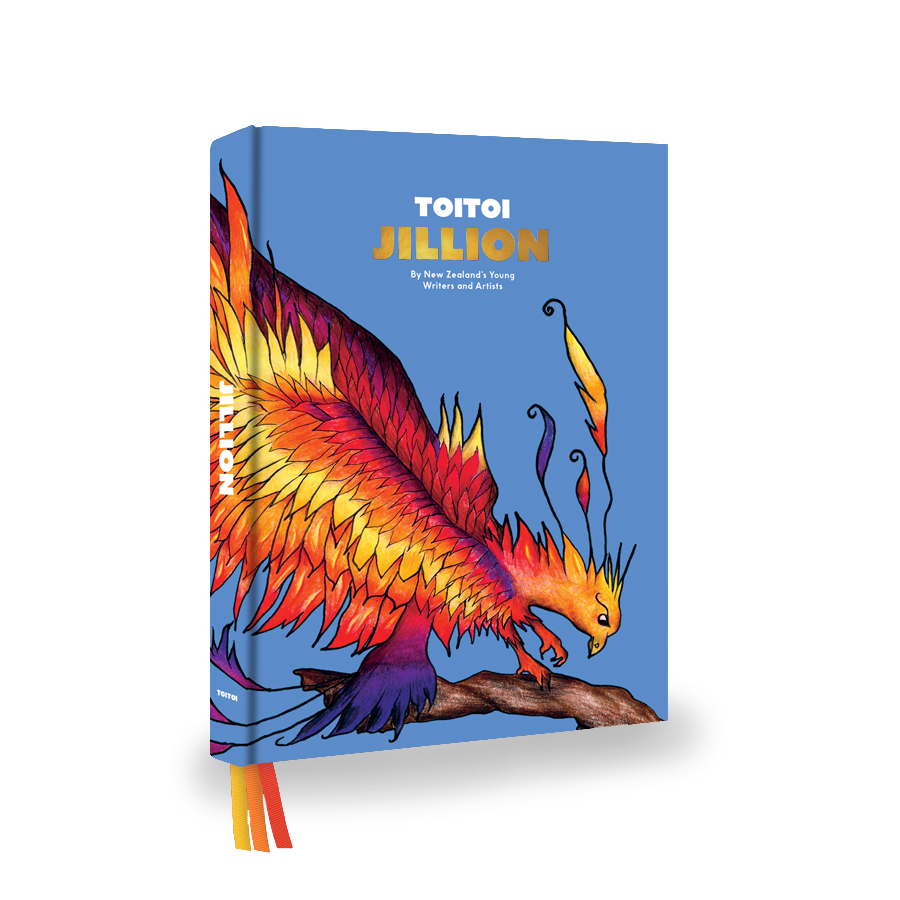
Title: Jillion: By New Zealand’s Young Writers and Artists
Publisher: Toitoi Media Ltd
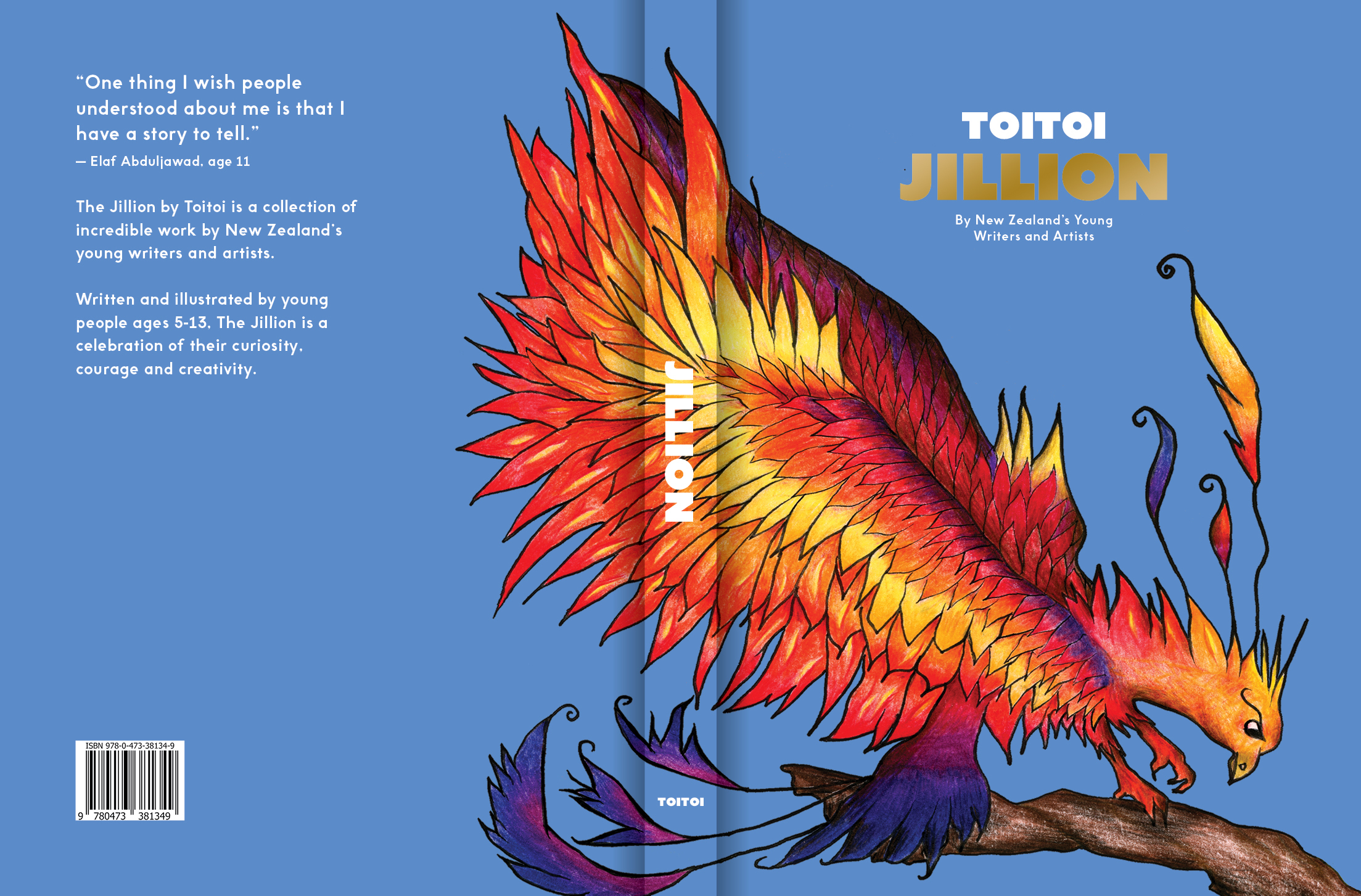
Format: 246 x 175mm, 304pp, hardback, section sewn. Case printed on 140gsm coated art paper over 3mm grey board with matt lamination, 208 gold foil for the title, head and tail bands (GF161 blue) and three 6mm ribbons in P750, P668 and P235. Text printed on 100gsm Thai uncoated white woodfree paper, endpapers 140gsm Thai uncoated white woodfree paper.
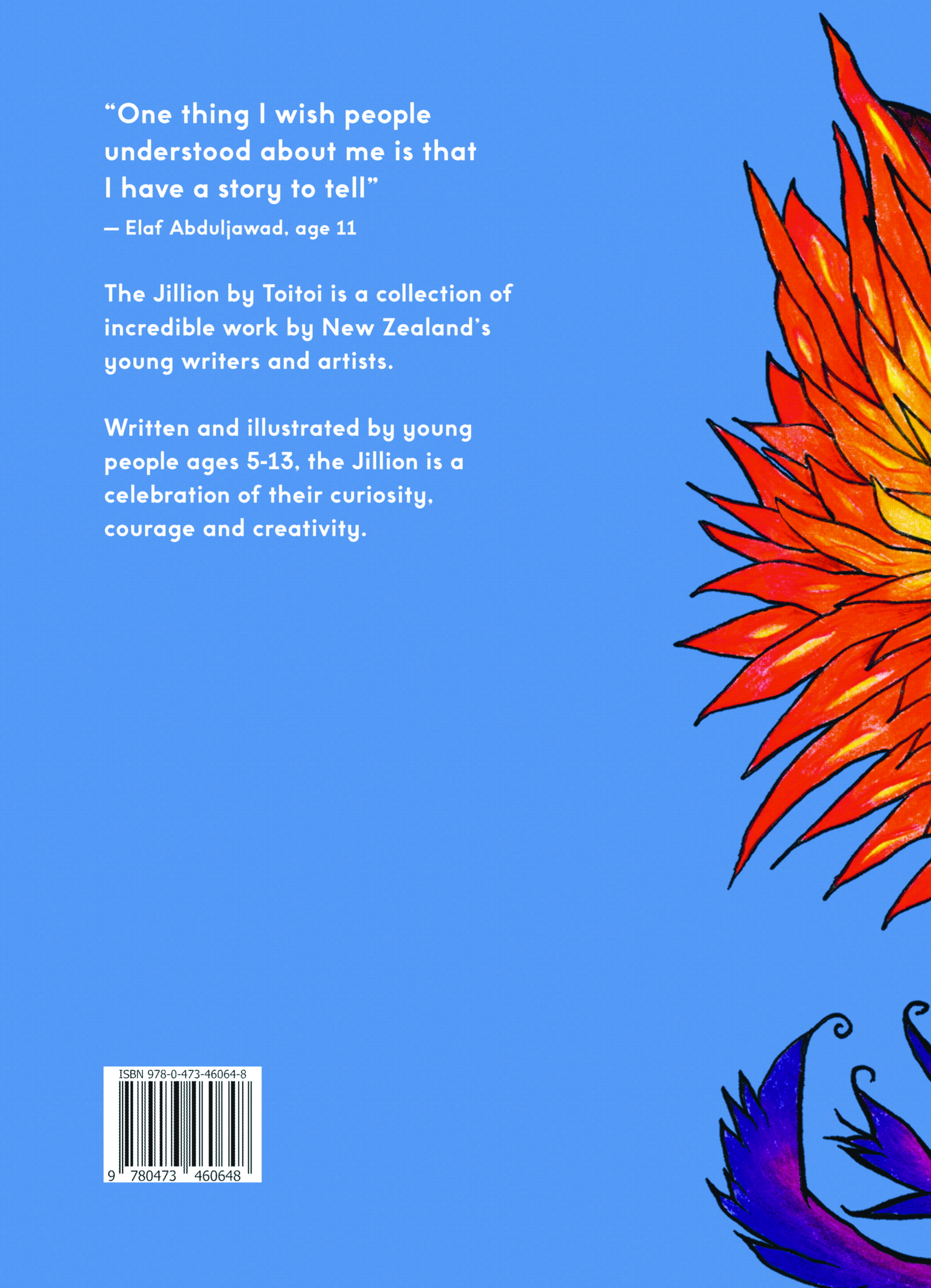
The Jillion is all about celebrating the curiosity, courage and creativity of young New Zealanders. The design team worked hard to create a framework and a platform that would allow the incredible talent of young Kiwi creatives to shine.
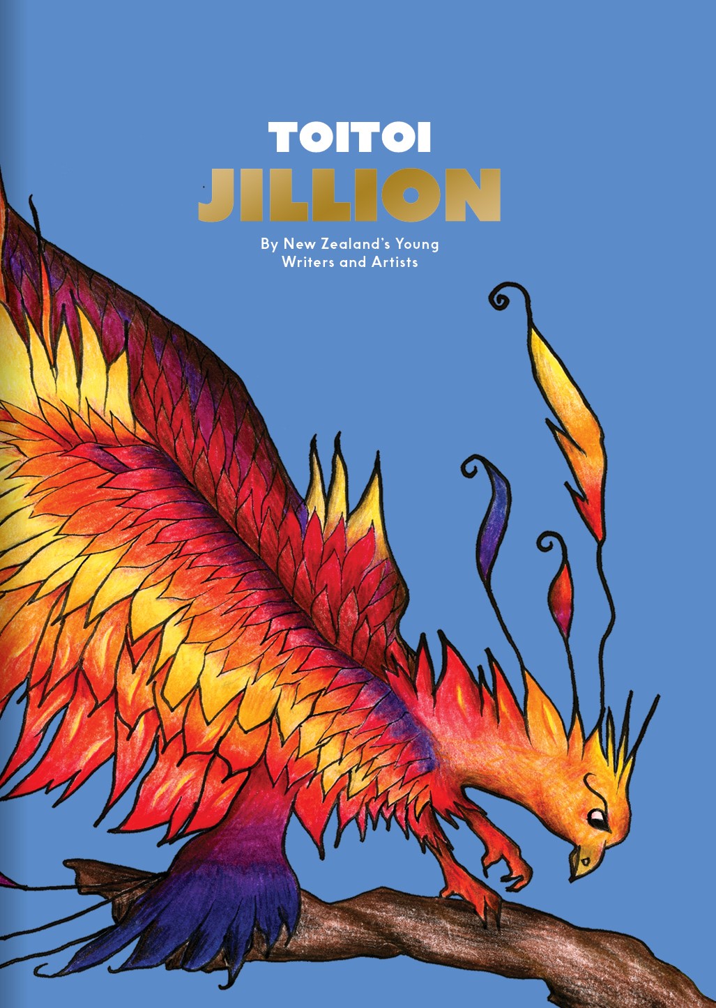
The majority of children’s books are written by adults and impose an adult world view on a young reader. The title – Jillion – which is defined as “a vast number or a great deal” was a deliberate attempt to escape this. On the cover, the title is foiled in gold above an incredible illustration by a nine-year-old artist to embrace the magic and wide-open creativity of childhood.
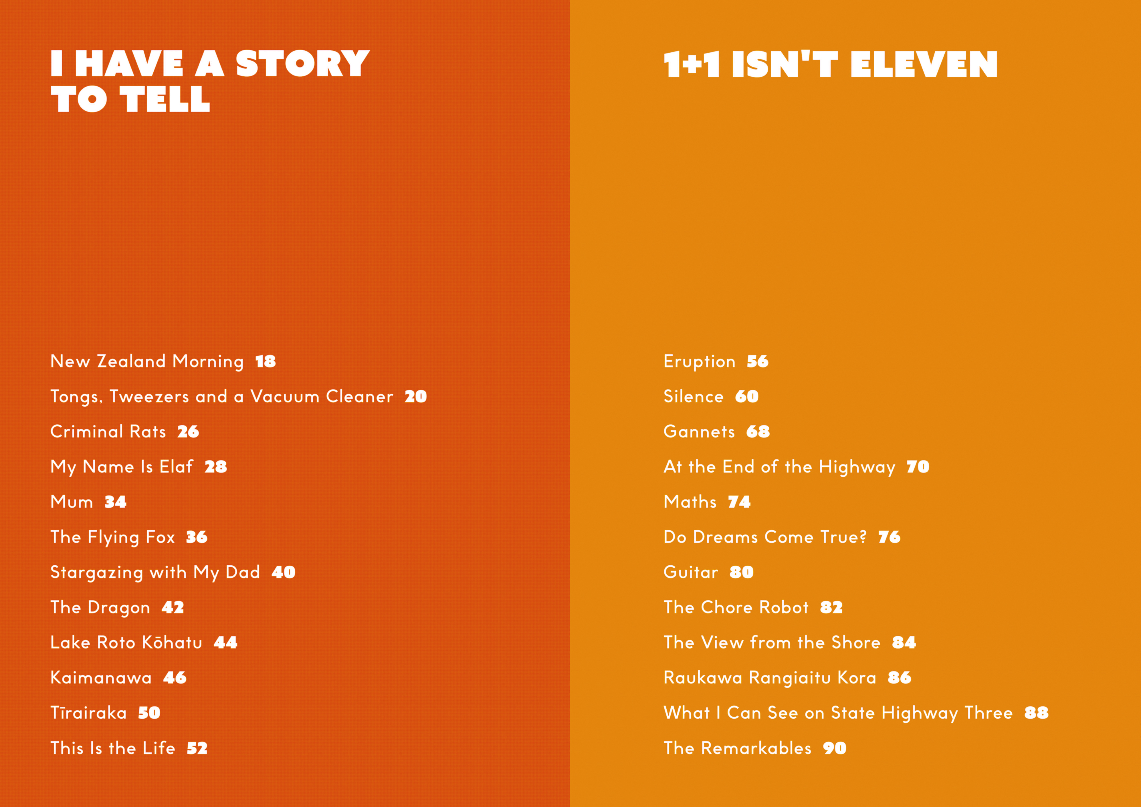
The section titles – “I Have a Story to Tell”, “Suck it up, Kathryn”, “Wings in Repose” and so on – all pay tribute to the original and authentic voice that Toitoi champions and each one speaks to a moment in Toitoi’s history. Colour, typography and paper stock were all chosen to invite and inspire families of readers – young and old – to jump into the Jillion and mark their place with a beautiful ribbon. Toitoi’s publisher and editor has three children, so there had to be three ribbons!
The design objective for this book is to honour Toitoi’s commitment to look young people in the eye, treat them with respect and produce a beautifully designed book that reflects how much we value and admire them.
Typography: Cover font Azo Sans Uber and Futwora; text Futwora 21/8 pt and Brown 10.5 pt.
Judges’ comments: “A fresh modern package, Jillion understands what the role of design is in an anthology like this – to be a vessel that lets the varied content within shine, whilst also tying it together as a unified singular piece. Bold pages of colour are used as markers through the book, and this divides the content up well. The typography is generously sized and approachable, through the use of a rounded sans serif. Using the subtle convention of poems on solid colour, and long form writing on white is a good design tool to differentiate the content.”
“This locally produced bind-up brings together a vast and varied range of stories and art by local young writers and illustrators from the journal Toitoi. The cover is not as strong as it could be but a very worthy publication and aim.”
“Inviting and age appropriate. Consistent, clear typography. Lovely palette, image use and crop throughout.”
“It is shame that in the editor’s letter New and Zealand break across one of the early lines of setting. The colour is a great aspect of the design. Drawing inspiration from the children’s illustrations colour carries so much of the strength and appeal of the book as a whole. The typeface choice hints at fridge magnet lettering. It is open and warm and welcomes reading.”