1010 Printing Award for Best Cookbook 2019
Finalist
Designer: Floor van Lierop, This is Them
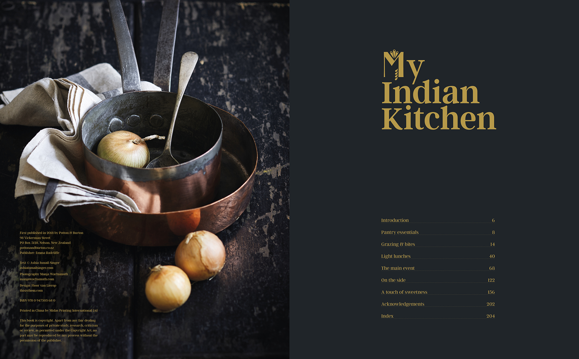
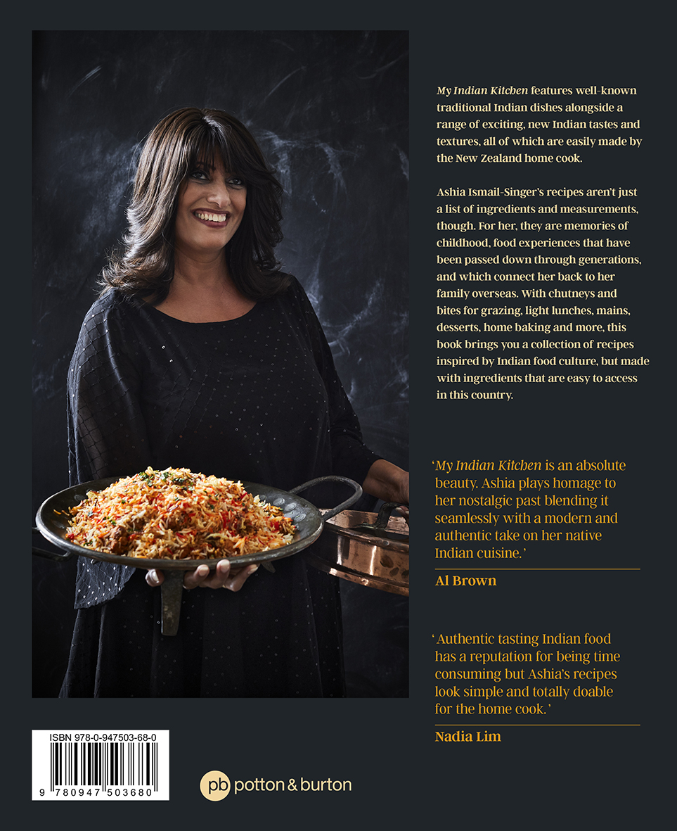
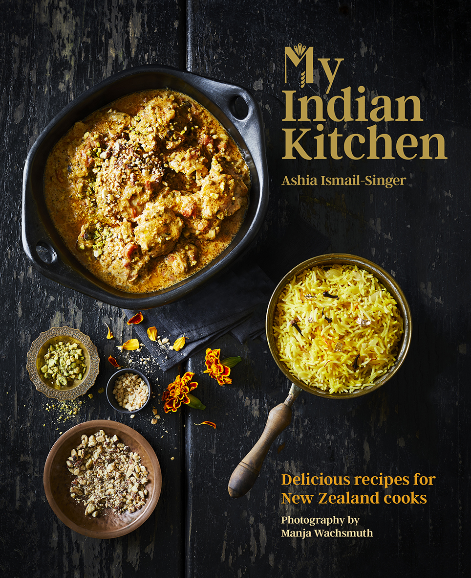
Title: My Indian Kitchen
Publisher: Potton & Burton
Format: 254 x 205mm, 208pp, PLC, hardback. A coated stock was chosen to make the moody, beautifully lit photos as vibrant as possible. For an extra feature, the book contains two ribbons, black and gold, to access two recipes at the same time. Gold foil was used for the title on the cover and the spine.
Typography: Titles: Argent CF regular, size 23, leading 24pt, and each initial letter of the title set in Darjeeling Regnaments regular.
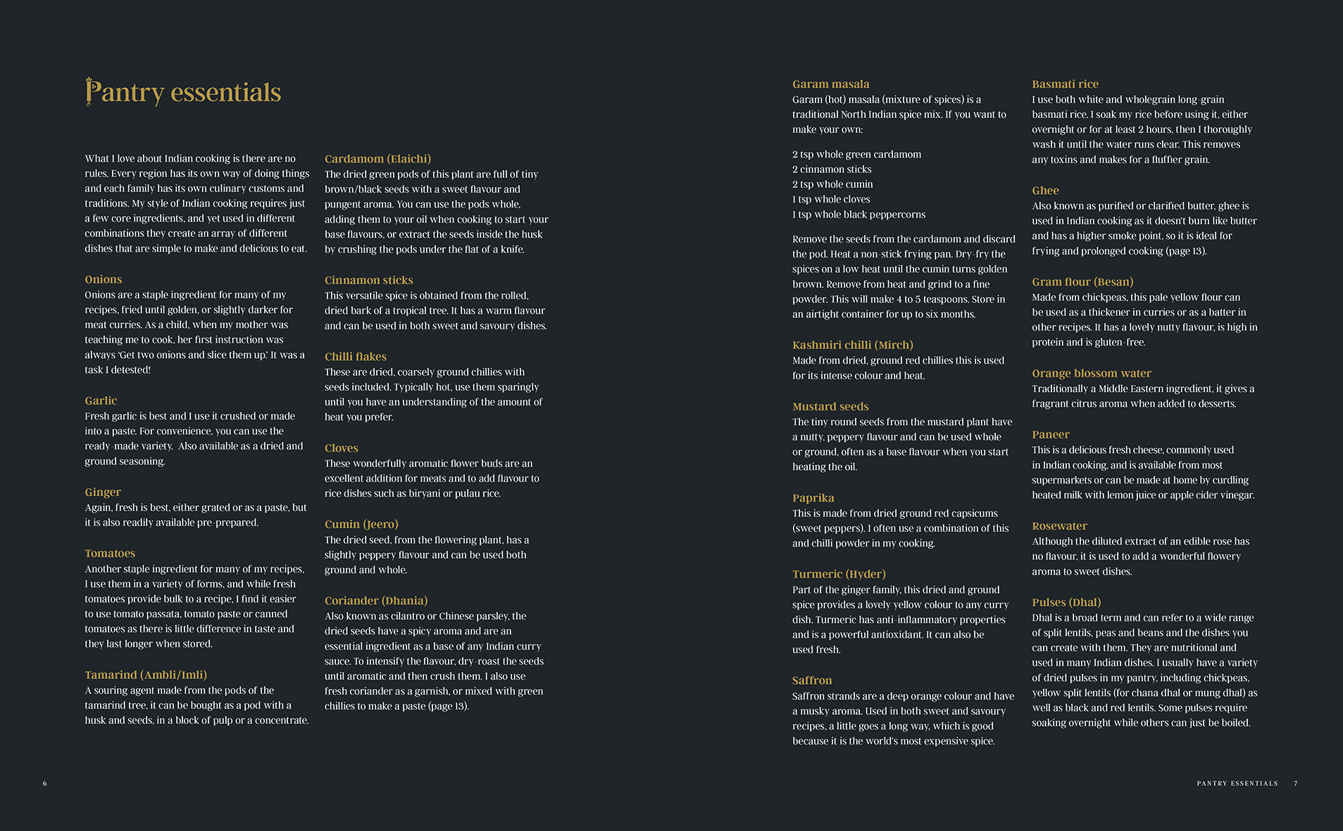
Bodytext: Argent CF light, size 9, leading 13, spaced.
Subheads: Argent CF demi bold, size 10, leading 13, spaced.
Section pages:
Titles: Argent CF regular, size 45, leading 36pt, and each initial letter of the title set in Darjeeling Regnaments regular.
Intro text: Argent CF regular, size 10, leading 13, spaced.
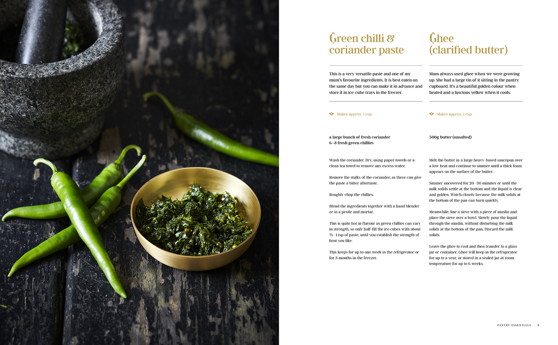
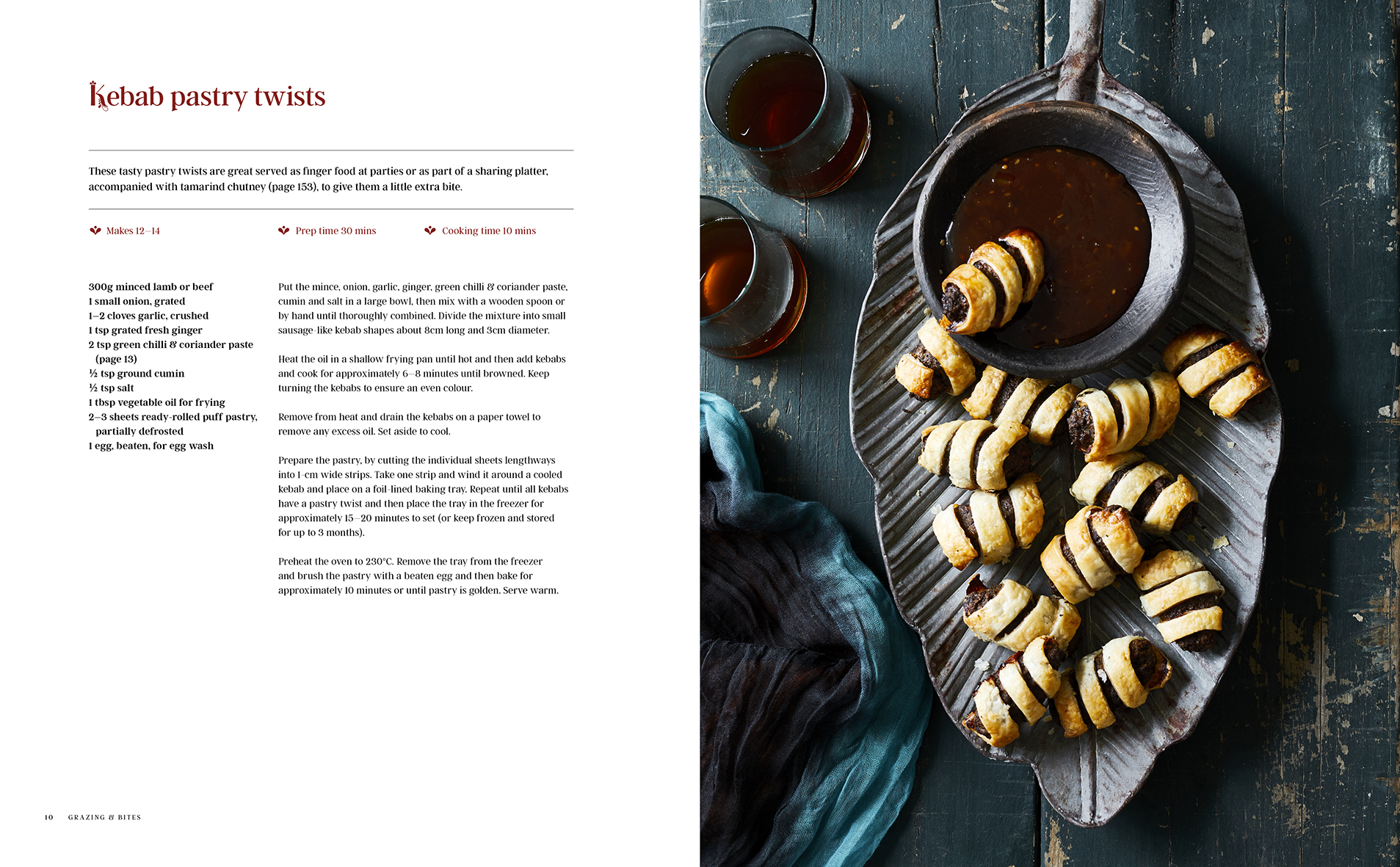
Recipe pages:
Titles: Argent CF regular, size 23pt, leading 24pt, and each initial letter of the title set in Darjeeling Regnaments regular.
Intro: Argent CF regular, size 9pt, leading 13, tracked.
Recipe facts (e.g ‘serves’): as bodytext, different colour.
Ingredients: Argent CF demi bold, size 8.5pt, leading 12, tracked. Sub headers set in demi bold italic.
Bodytext: Argent CF light, size 8.5pt, leading 12, tracked.
The ornamental typeface Darjeeling Regnaments was used only for the initial letter of titles throughout the book, lending a subtle Eastern twist. Argent CF, used for the rest of the title, was chosen for elegance and legibility. Using both typefaces creates an unusual yet subtle combination. Various glyphs of Darjeeling Ornaments are used as decorative ‘bullet points’ throughout the book.
Judges’ comments: “Nine times out of ten I’ll eat Indian food after dark so for me the dark settings of the majority of the food photography works very well and the vibrant colours of the food pop amidst the dark. The two ribbons talk of saffron and pan blackened roti or chilli.”
“Consistent design and information hierarchy. Fussy (yet appropriate) ornamental details. Great use of colour and beautiful rich imagery compliments the food style.”
“User friendly and practical. The black and gold (extended to the page marker ribbons) is luxurious and this cookbook has been hugely successful in the retail environment. The sections are practical. The cover however gets scuffed and feels unfinished without a dust jacket. An updated classic with a modern twist.”
“A moody elegance is prevalent throughout My Indian Kitchen, with the rich and evocative photography carrying elements of the gold and deep brown design palette. A good separation of recipe content through the use of white space.”