Scholastic New Zealand Award
for Best Children’s Book 2019
Finalist
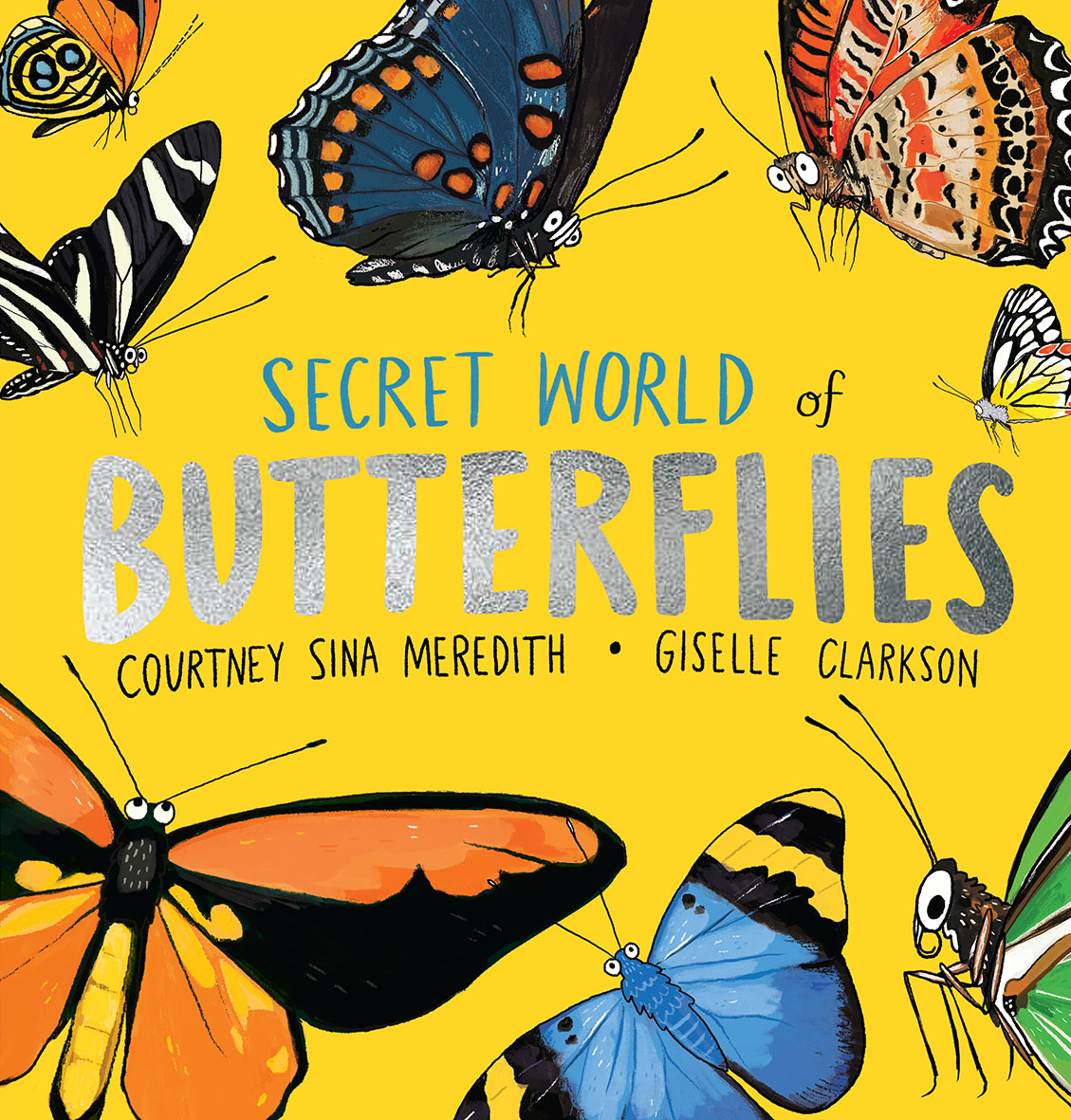
Designer: Kate Barraclough, Kate
Frances Design
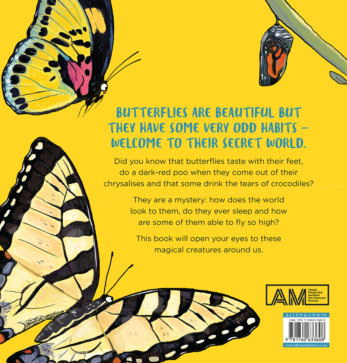
Title: Secret World of Butterflies
Publisher: Allen & Unwin in partnership with Auckland Museum
Format: 250 x 240mm, 32pp, limpbound, section sewn, cover drawn on and cut flush. Title hand-lettered with silver foil on one word.
Typography: Gotham Book 19pt/27pt.
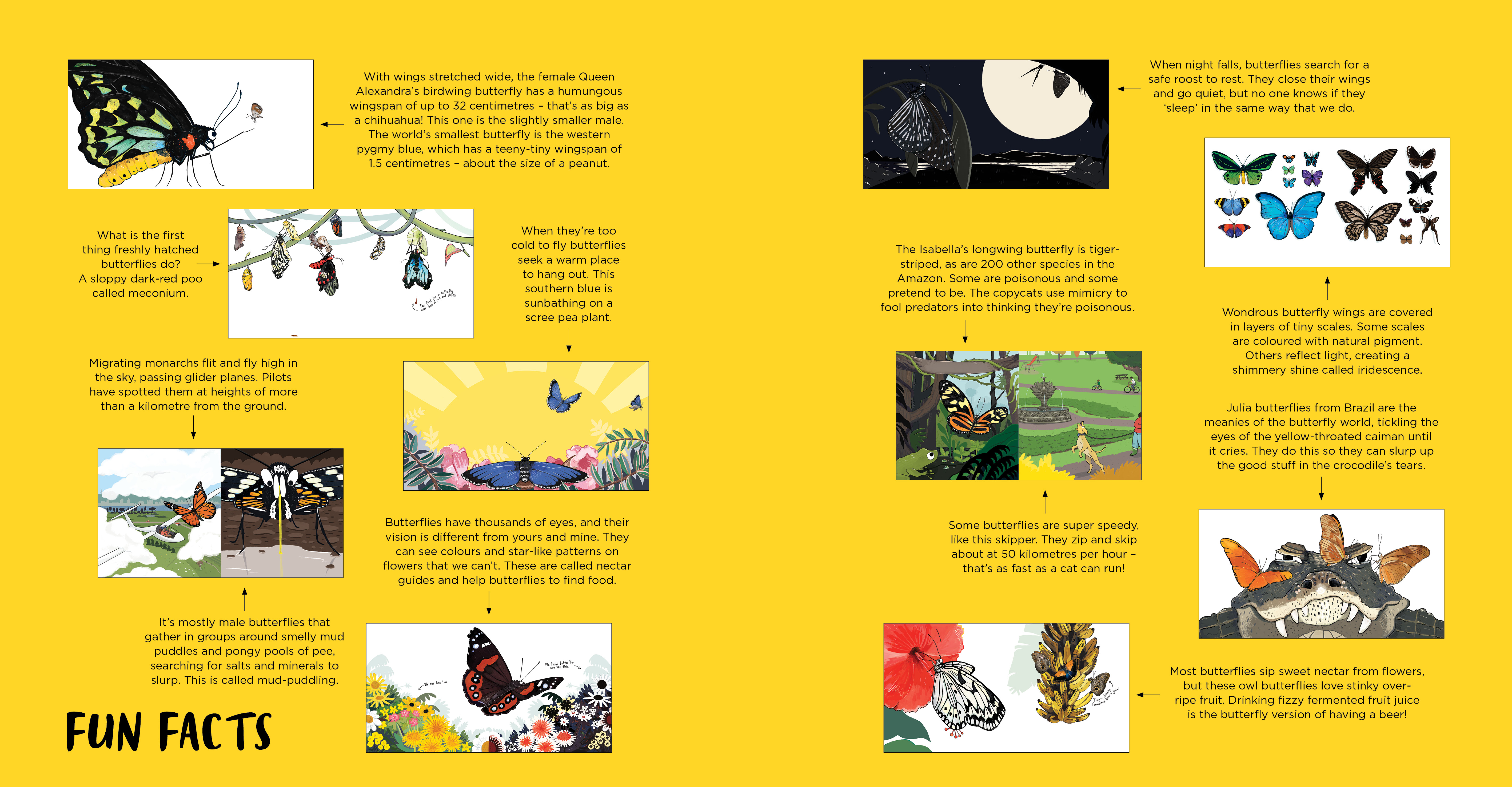
Judges’ comments: “The cover’s array of butterflies, paired with the warm yellow and foil type is an eye-catching invitation to the book. The simple open layout uses an approachable sans serif font, making the text clear and easy to follow for younger readers. Giselle’s illustrations, as always, are fun and playful – whilst still paying attention to rendering details accurately (give or take the eyes…). Interesting facts are brought to life in an informal fashion with the use of illustrator Giselle‘s handwriting. A nice bonus at the end of the book for older readers are the fun facts that bring further depth and detail.”
“Yellow as a colour works brilliantly for booksellers and punters alike! It pops on the shop floor making it stand out to browsers and making it easy for booksellers to find! It’s an irresistible book with dazzling illustrations.”
“Fantastic illustrations let down by the font selection throughout which could have been integrated and pushed harder.”
“Published to accompany a seductive Auckland Museum Shannon Butterfly Collection exhibition, which featured cases of stunning butterflies alongside a digital jungle to release visitors’ own butterfly designs, there is something very reassuringly analogue about this book. The viewpoints and focus on small details are well pitched for younger readers. Whilst the booggly eyes are not perhaps the key strength of the illustrated characters they would no doubt be alluring for the younger readers. The choice of Gotham font is one step away from the Auckland Museum brand font Gotham Narrow – so one assumes this was a requirement of the co-published work. It feels perhaps that it has restricted the design a little. Nevertheless, a fun book which also underplays colour in a controlled manner which seems authentic where it could have easily gone wild.”