Upstart Press Award for Best Non-Illustrated Book 2020
Finalist
Designer: Sally Greer, Beatnik Publishing
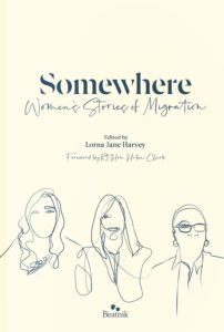
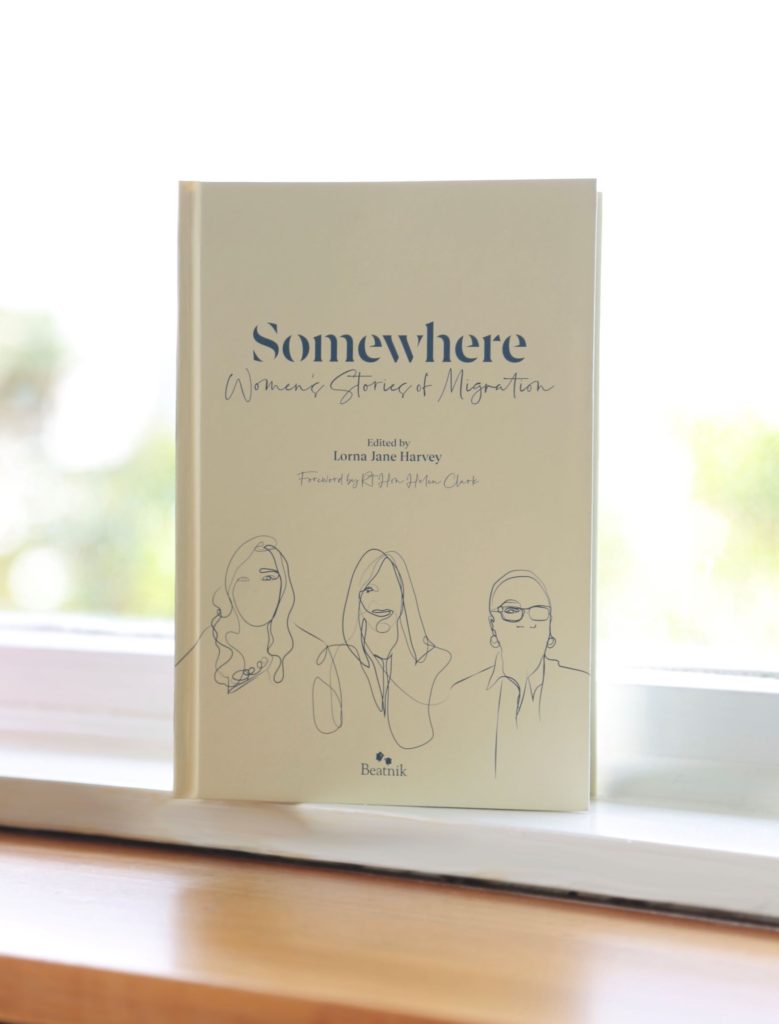
Title: Somewhere – Women’s Stories of Migration
Publisher: Beatnik Publishing
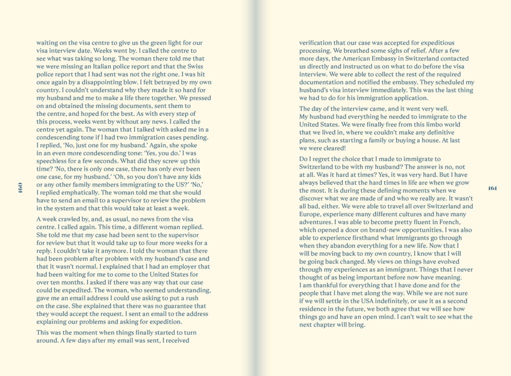
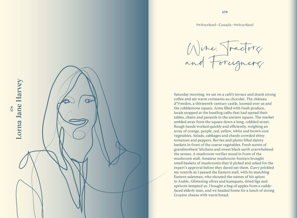
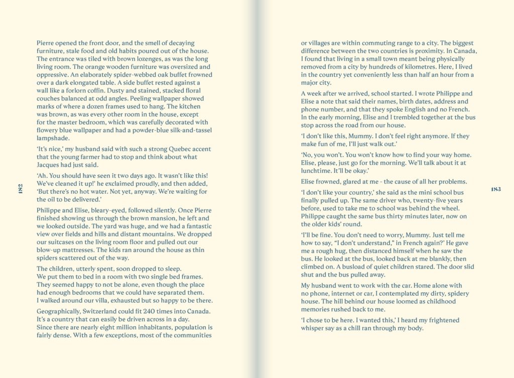
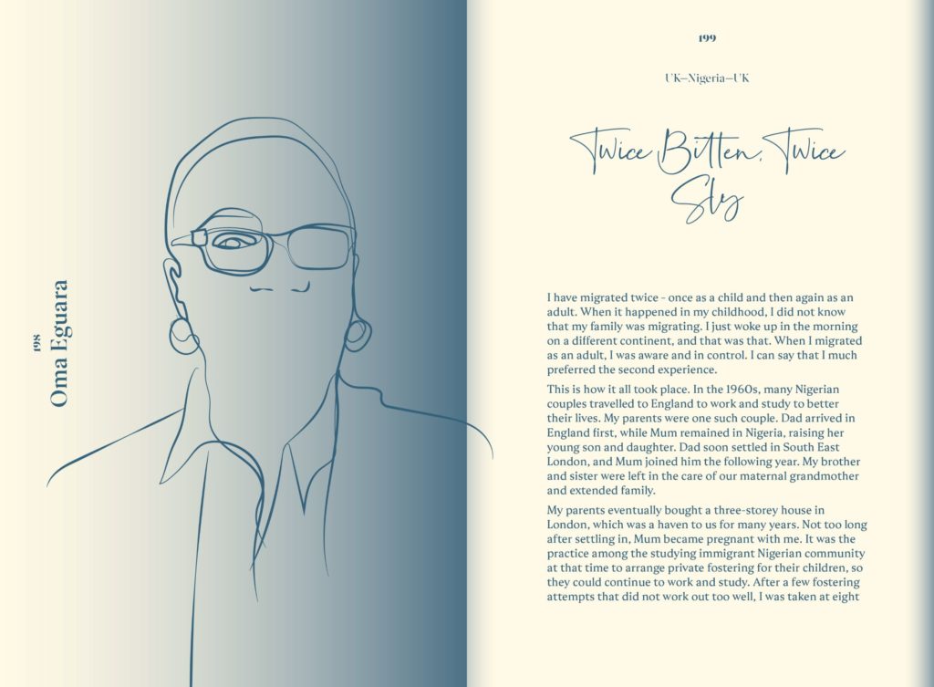
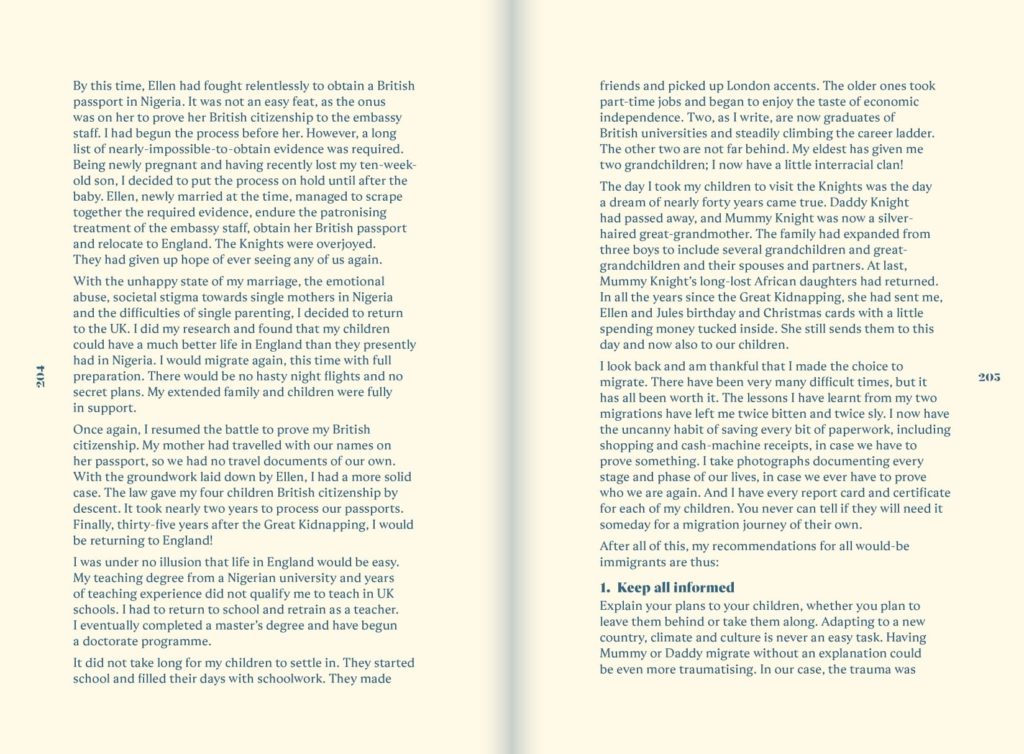
Format: 140 x 206mm, 208pp text, 8pp ends plus case. Hardcover, section sewn with end papers and head and tail bands matched to PMS 3025. Text printed one spot colour (PMS 3025) throughout on an FSC uncoated cream or buttermilk coloured paper stock.
Typography: Titles, heading and main copy: Ariata by Malou Verlomme
Script Headings: La Paloma by fikryal.
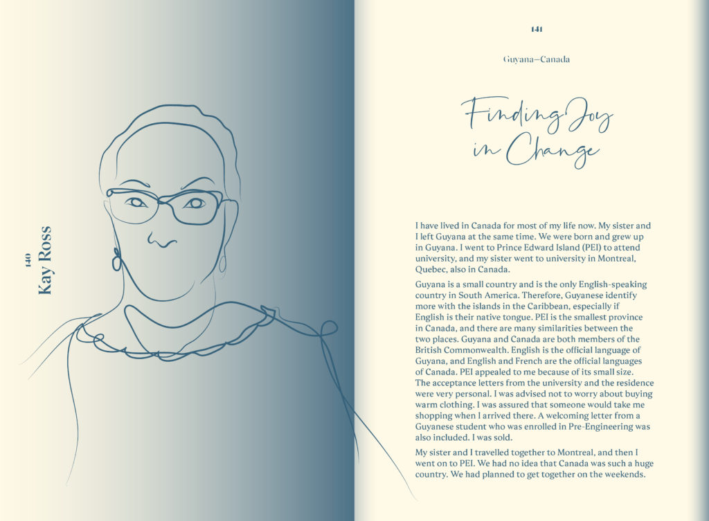
Font choice plays a key role in the overall design. The Ariata Stencil font used for the title is almost there, but not, and the sketchy nature of La Paloma again plays with the nature of fleeting and unsettled. This also plays out in the illustrations which are sometime simply one line that dances across the spread, at times almost disappearing but not completely.
And finally gradients were also used to play on the idea of being between spaces. Blue fades in from the ‘gutter’ of the spreads and over the illustrations. The illustrations sit half in the light and some get lost in the colour due to the nature of printing in one colour.
The overall effect of all the design elements should mimic the variety and diversity of the stories Some are harrowing and uncomfortable to read but others are light and fleeting. But everyone is moving and traveling and heading somewhere.
Judges’ comments A clever little package which uses a single colour and script typeface with flair. The use of a gradient emerging from the gutter and as a graphic device to help signal chapter breaks is very effective.

