Mary Egan Publishing Award for Best Typography 2019
Finalist
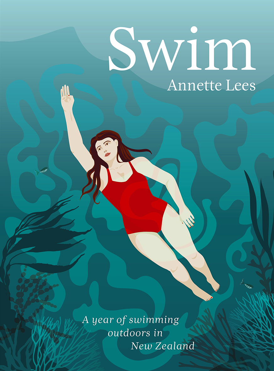
Designer: Floor van Lierop, This is Them
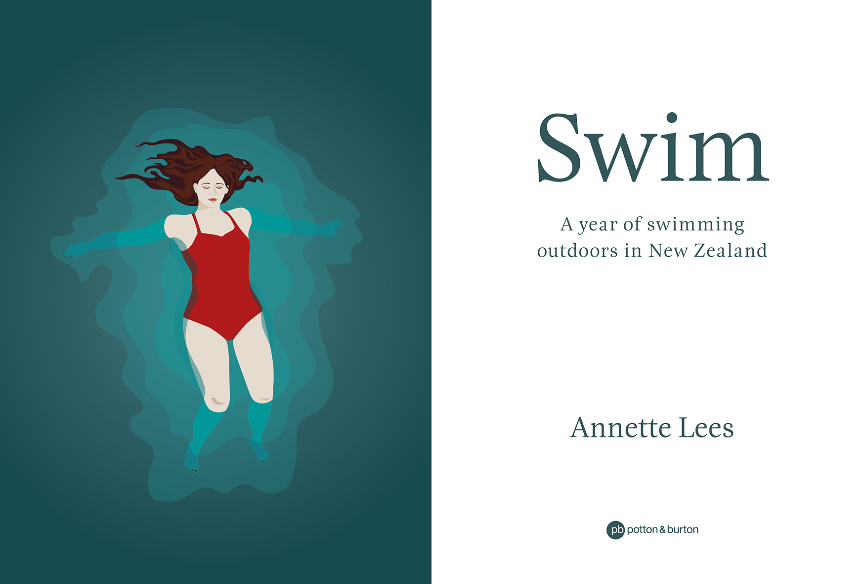
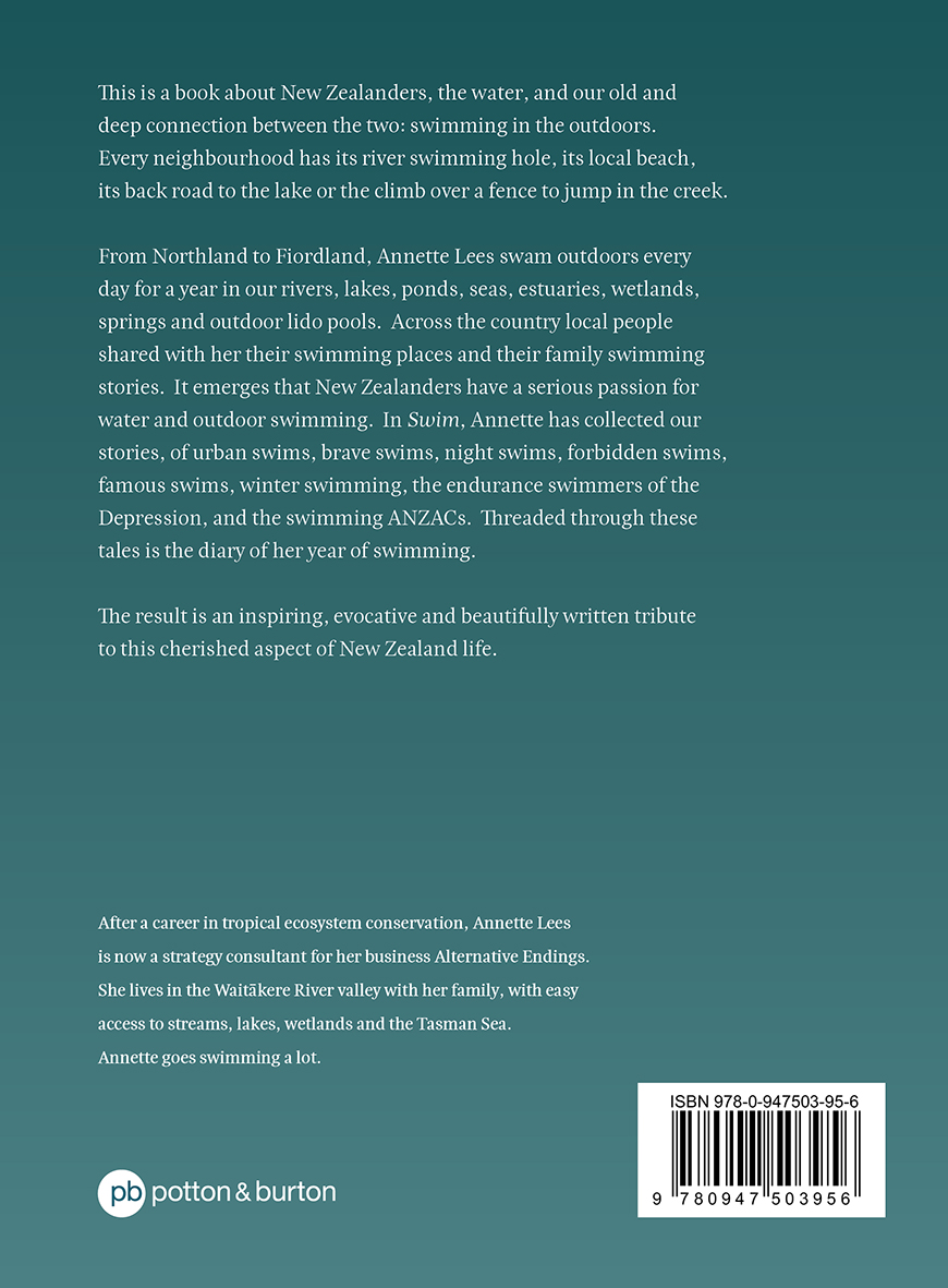
Title: Swim: A Year of Swimming Outdoors in New Zealand
Publisher: Potton & Burton
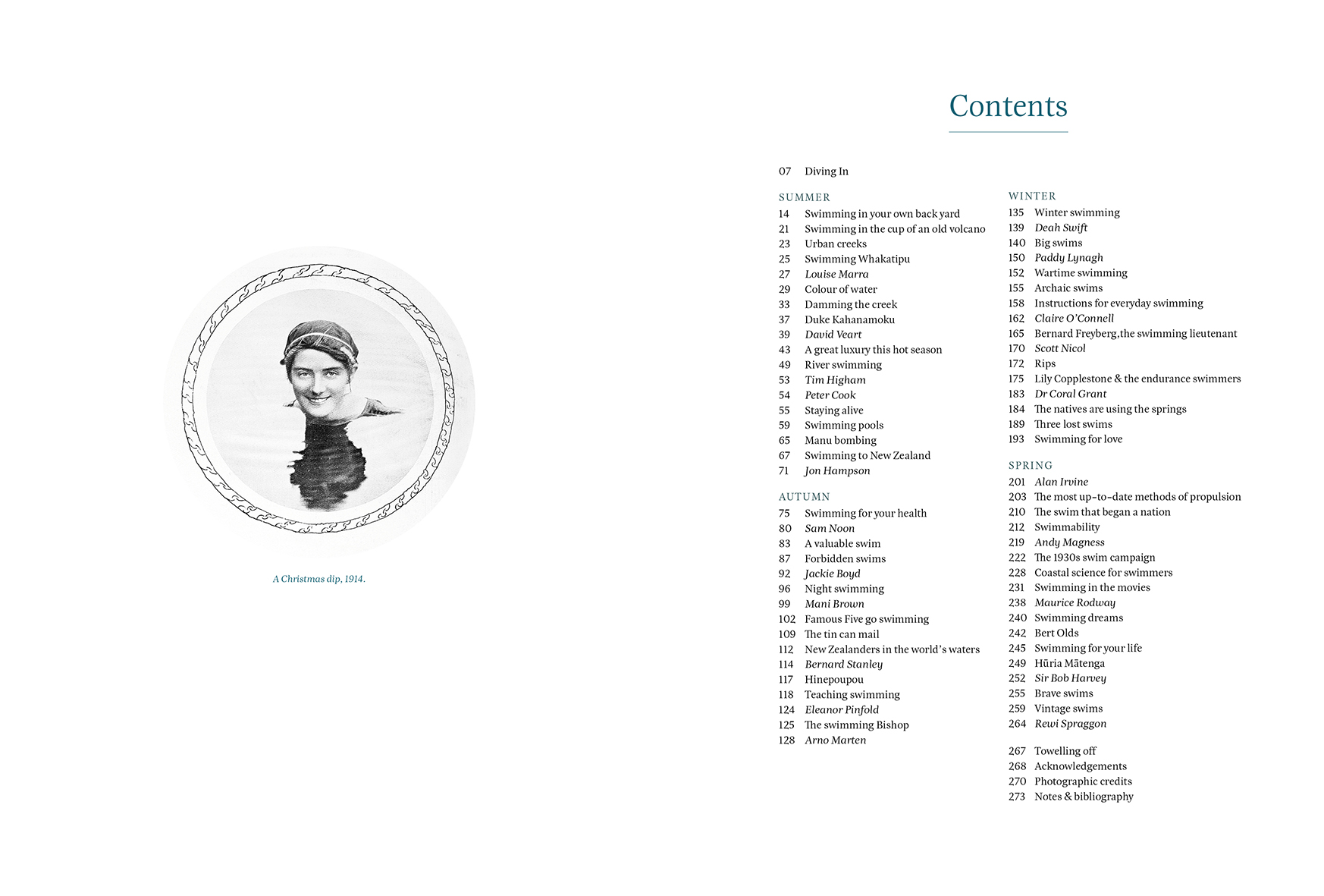
Format: 230 x 170mm, 284pp, limpbound.
Typography: Titles: Esta Pro regular 23pt, leading 25pt, centred, underlined.
Body text: Esta Pro regular 9.8pt, leading 14.5pt, justified, on baseline grid, slightly spaced (5).
Quotes within body text: Esta Pro regular 8.5pt, leading 14.5pt, left-aligned, on baseline grid, indented left and right.
Diary entries: as body text, but in colour. Dates/places Esta Pro bold.
Captions: Esta Pro italic 7pt, leading 9pt, left aligned.
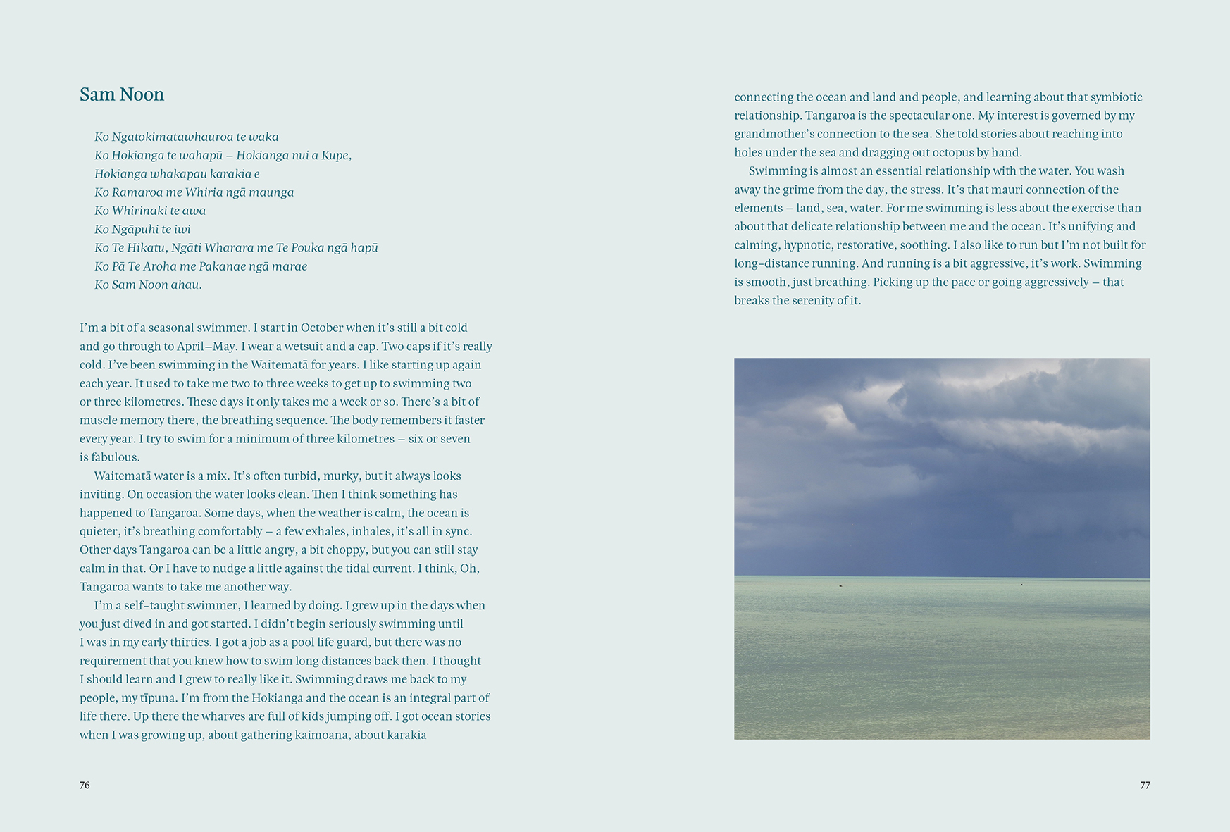
Interview pages: name of interviewee: Esta Pro bold 15pt, additional info Esta Pro italic 12pt, body same as elsewhere but in colour.
Header: Esta Pro regular 6, capitals, widely spaced (200).
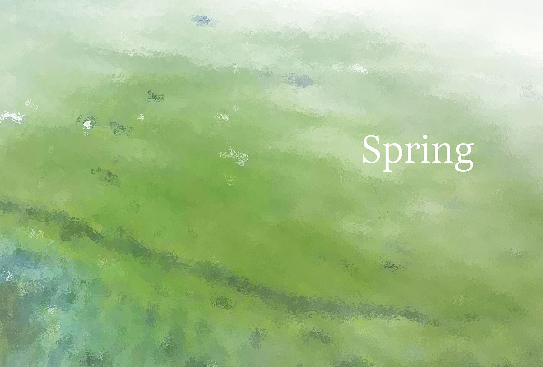
Section titles: Esta Pro regular 72pt, centred.
The layout of the book needed to accommodate three different types of texts within each chapter: the chapter text, the diary entries, and swimmer interviews. All three are clearly distinguished from one another using typography and colour. They are also separated by white-space, a hairline and/or illustrations without interrupting the flow of the chapter.
Cover illustration and section backgrounds also created by the designer.
Judges’ comments: “There’s a calm quietness to the typography of Swim; it takes some confidence to rely on one typeface throughout. Typographic differentiation is achieved solely through size weight and style, with pale teal backgrounds, deep turquoise type, and lightweight rules used as the typographic accents. The generous page borders give the book a light airiness, and much is achieved with a less is more approach.”
“Another title that looks unremarkable from the outside but wow, when you open it up it is a beauty. The cool, glacial calmness is in keeping with the watery subject matter. The inlaid photographs are sublime and the overall finish is like diving into clear, calm water. The type used throughout is elegant and simple and echoes the reflective tone of the book.”
“This works well across so many types of text, and colour is handled well in some of the typography. There are one or two instances where tracking has been squeezed just a little too much to make an easy read from one line to the next. But some good crafting throughout.”