Edify Award for Best Educational Book or Series – Secondary/Tertiary 2021
Finalist
Designers: Christine Ling and Te Kani Price, Huia Publishers
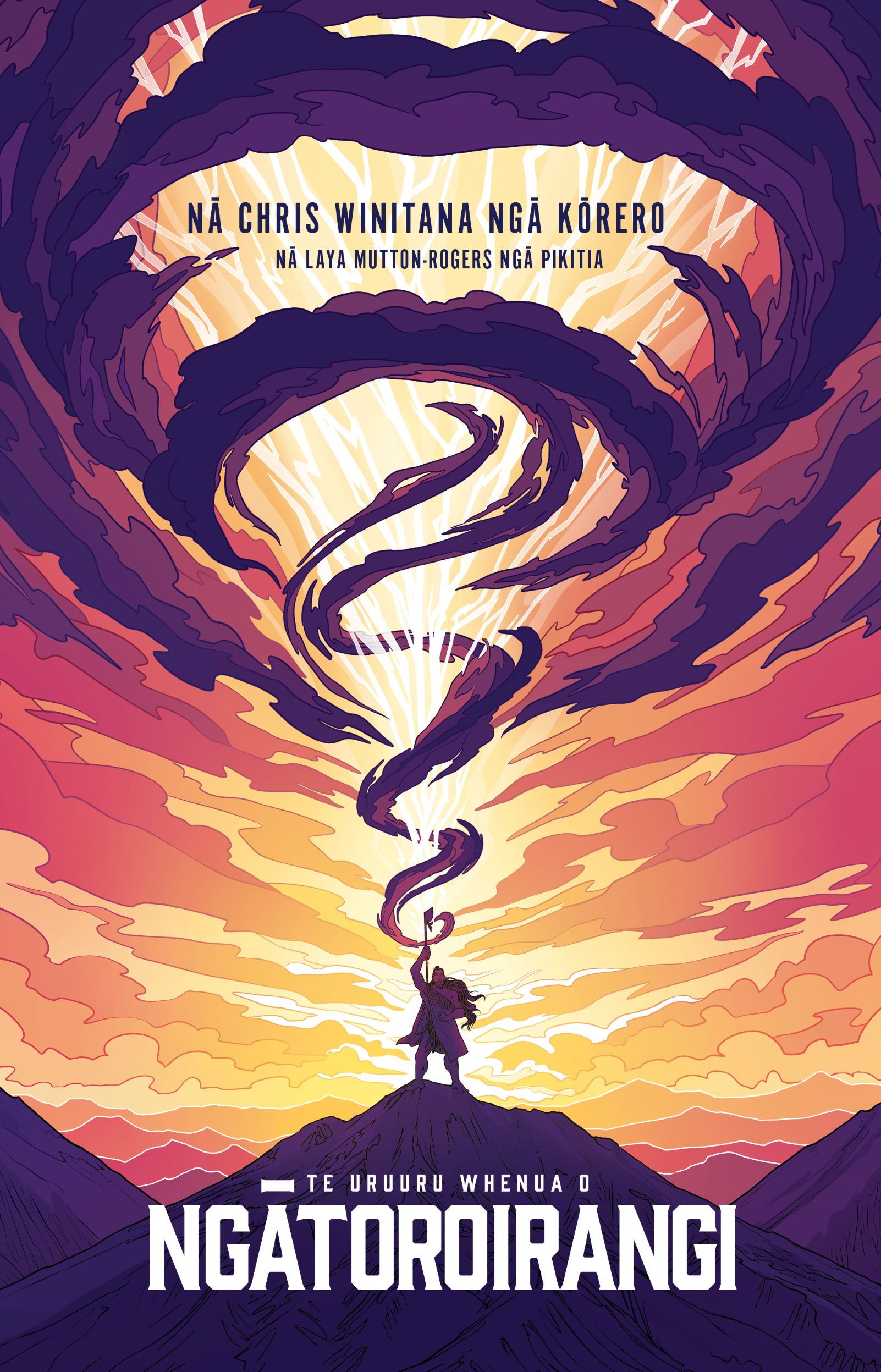
Title: Te Uruuru Whenua o Ngātoroirangi
Publisher: Huia Publishers in close collaboration with Ahorangi Vision Trust
Format: 280 x 200mm, 36pp plus 4pp cover, saddle-stitched.
Typography: Cover title: Gin, 60pt and 12pt; and Alternate Gothic No1, 24pt and 15pt.
Body text: FreightText Pro, Light, 10pt/14.5pt, tracking 50.
Feature body text 1: Tomarik, Poster, 11pt/15pt, tracking 110, all caps.
Feature body text 2: Fersken, Italic, 15pt/15pt, tracking 50, all caps.
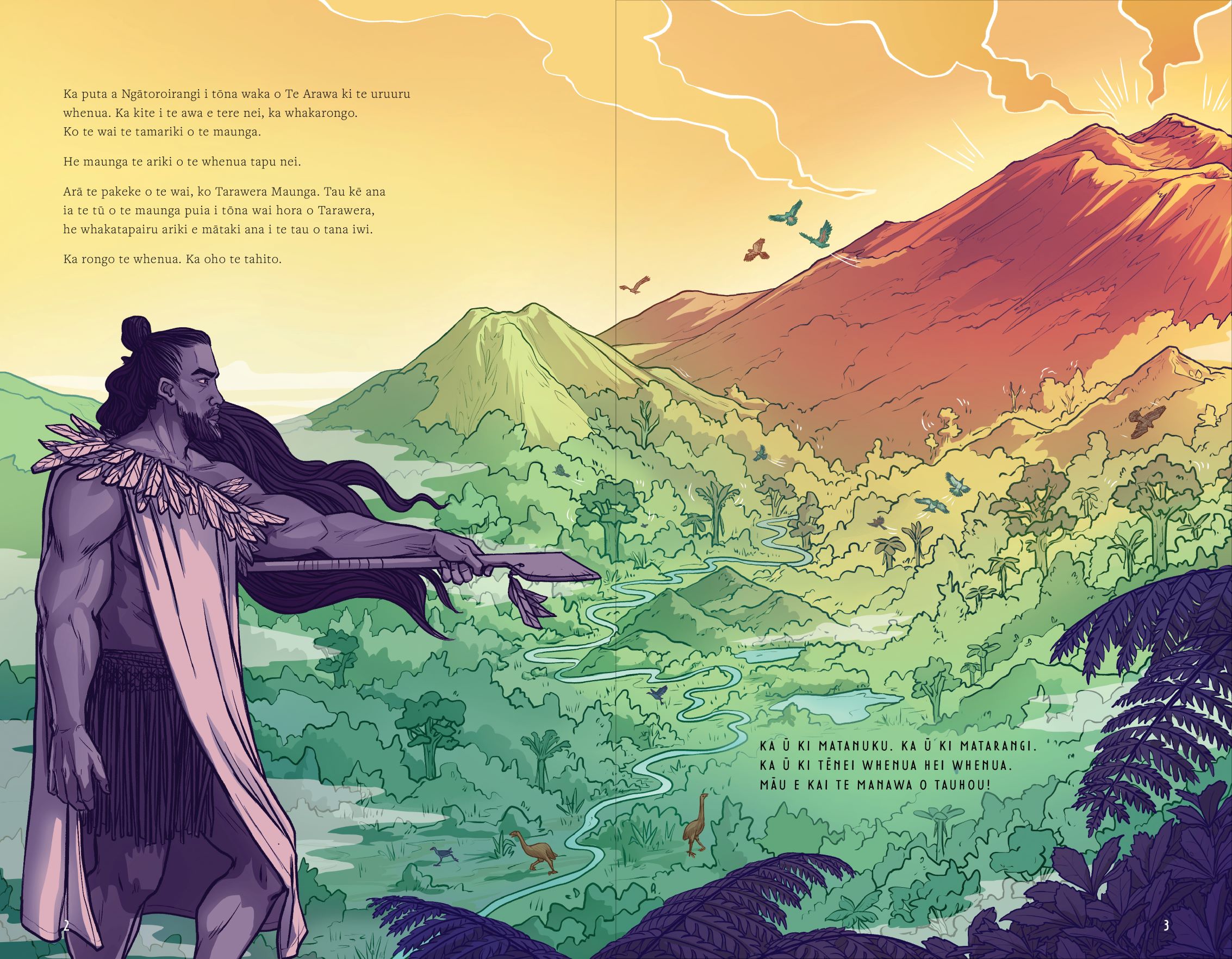
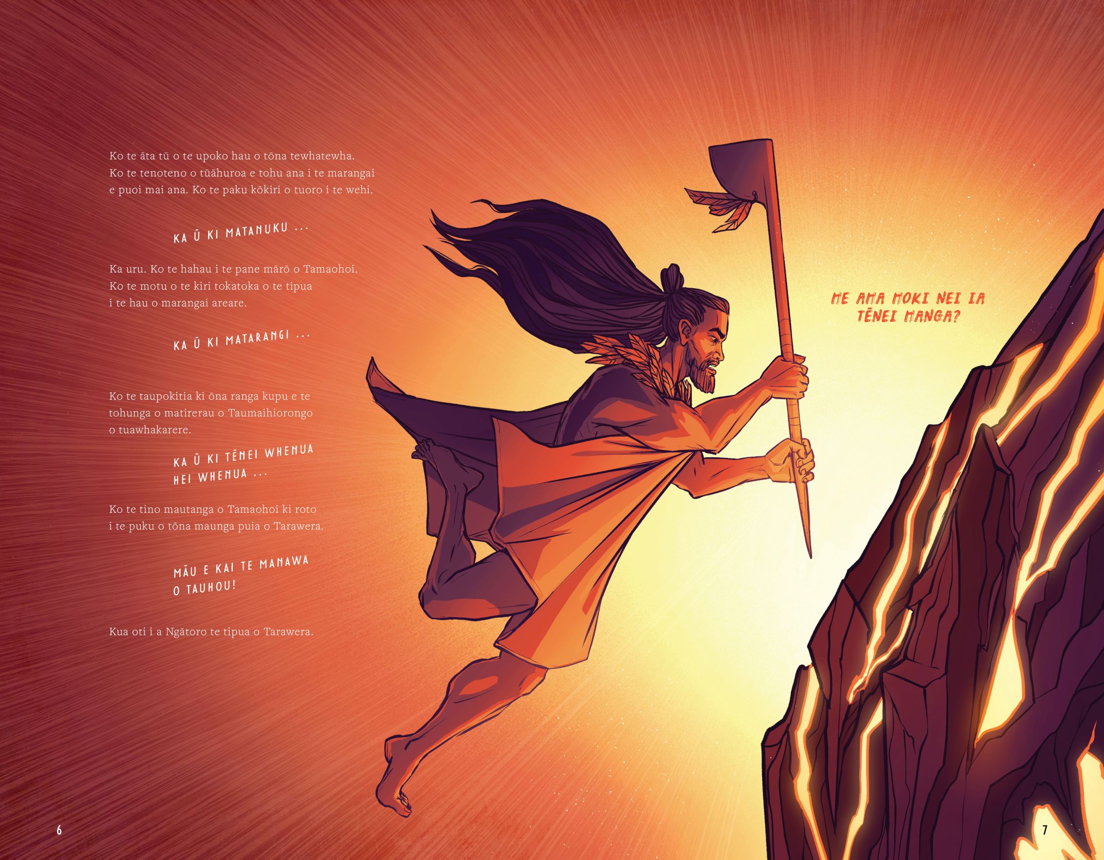
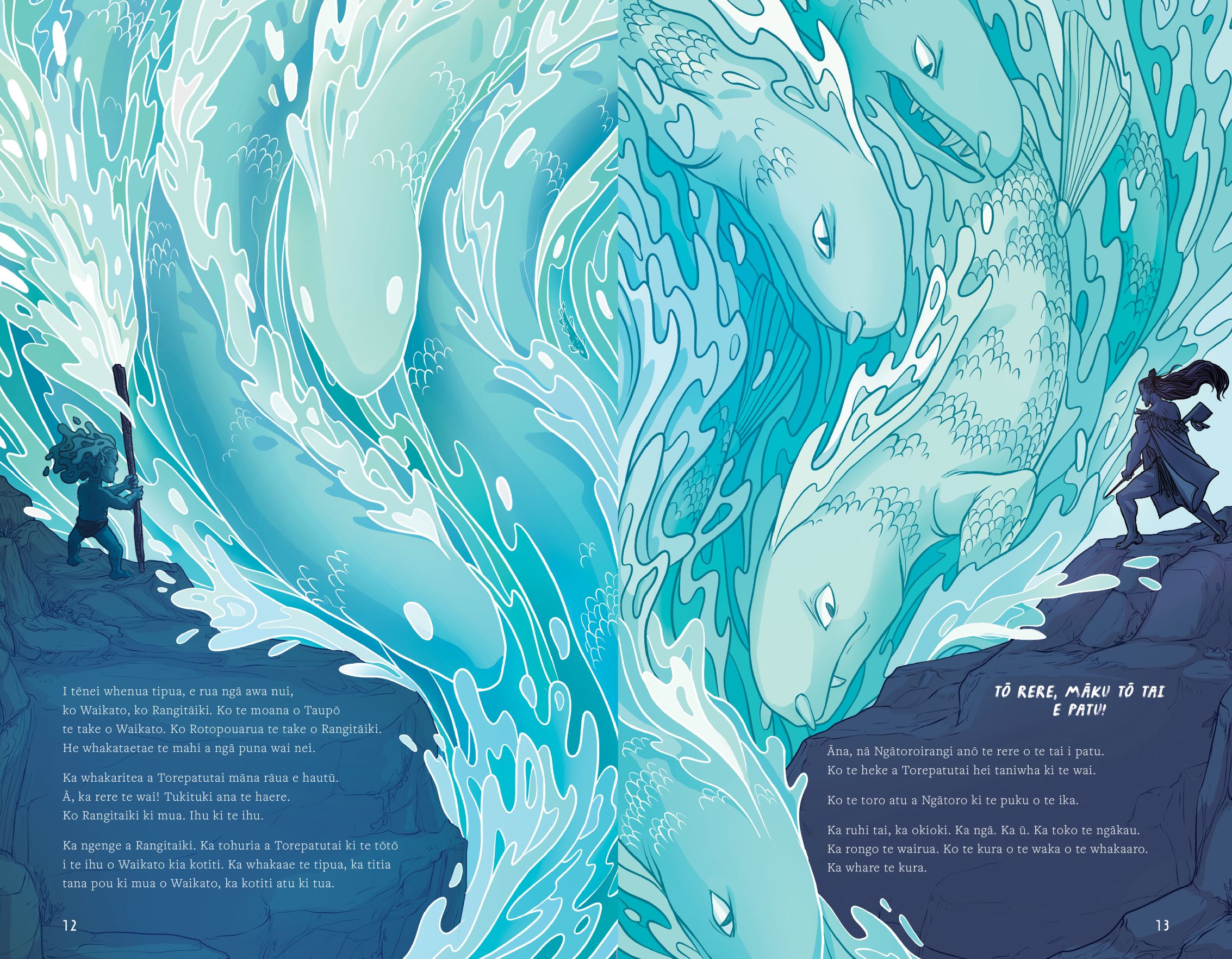
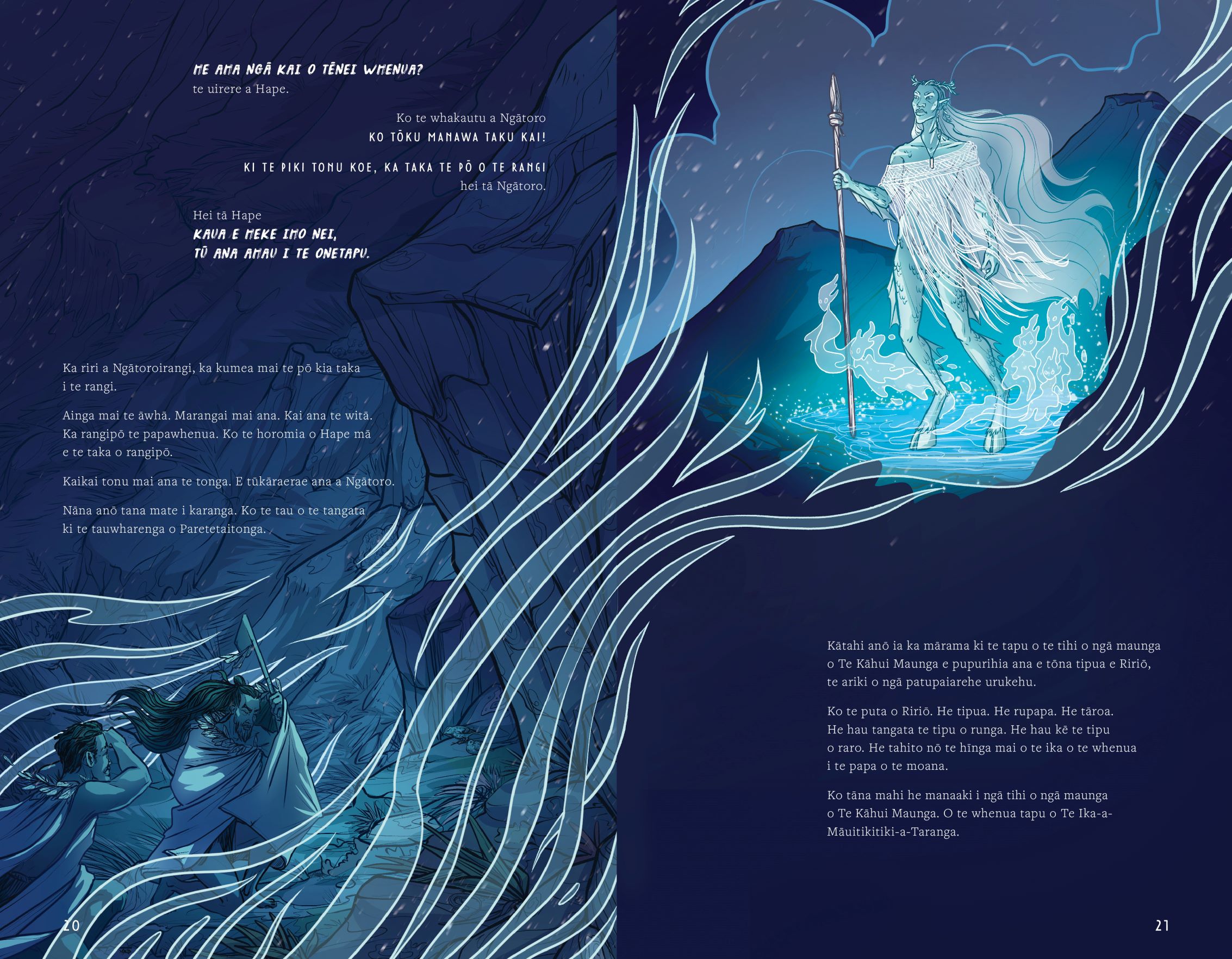
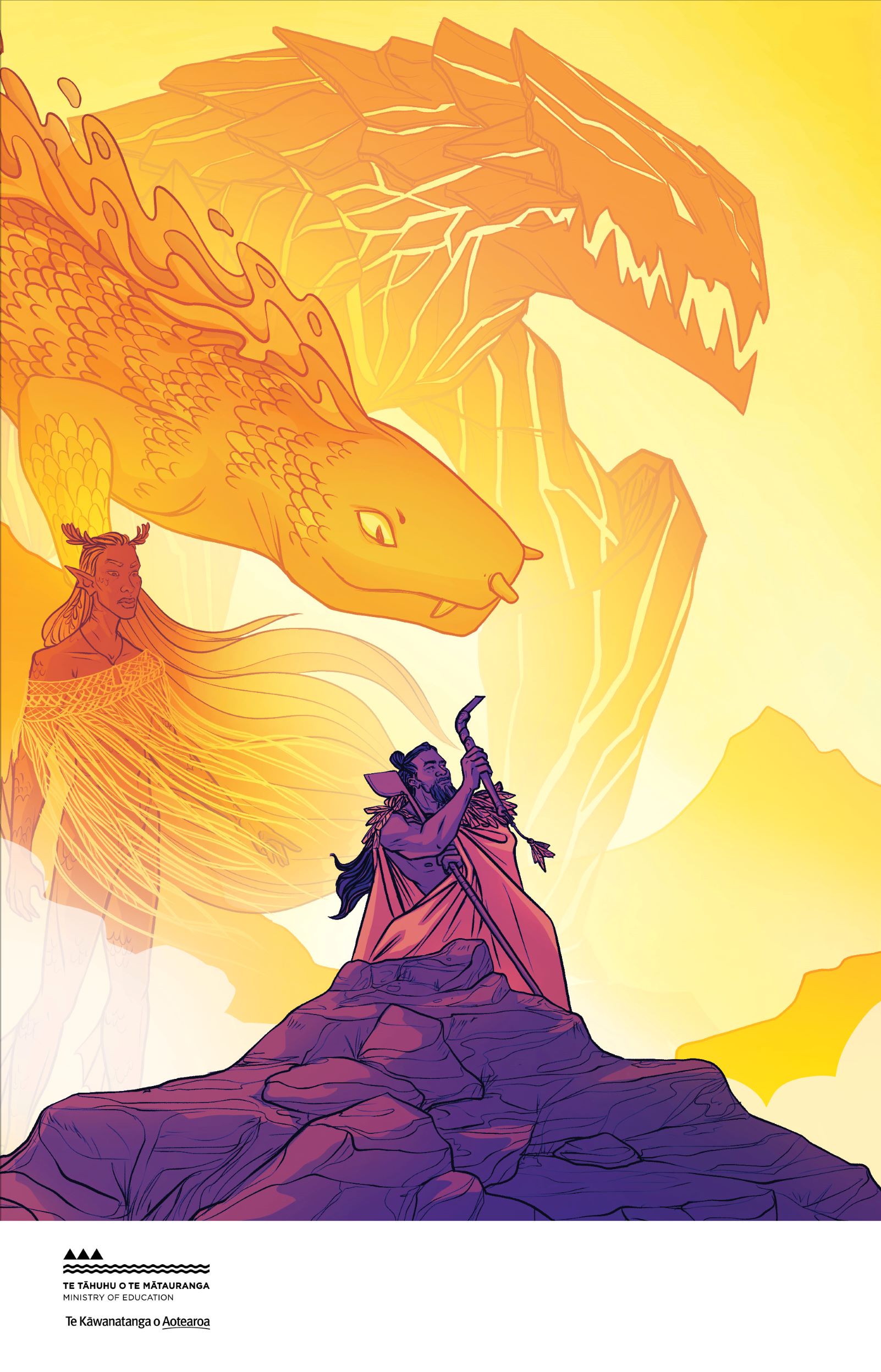
dialogue and narrative of key characters and scenes. The painterly, unfinished effect of Fersken was used for the monsters to represent the scale, intimidating presence of the creatures, if they were to be read aloud, the connotation would be the tone read is a deep low growl. Tomarik on the other hand contrasts Fersken. Ngātoroirangi in the same boldness, he has mana and strength, but he doesn’t have the sense of centuries and millennia of conflict, there is something new about him. The remaining storyline font chosen had to manage large blocks of text and compliment the expresssiveness of the 2 decorative fonts, while keeping to the standards of educational fonts in terms of legibility. For ākonga learning to read or reading aloud, this adds another visual cue for a tone change.
Judges’ comments Gorgeous illustrations by Laya Mutton Rogers really make this te reo reader sing. The cover’s cinematic approach, with its mysterious protagonist, dynamic use of scale and the rugged bold typography at the bottom, invites the teen audience in. Inside, it’s spread after spread of carefully considered pairings of illustration and type. The illustrations carry the dynamics of the book, with both moments of minimalism and space, as well as explosions of action. Throughout, the typography takes precedence, with an optimum line length always a consideration. A crisp, modern, evenly weighted font is used for the text, holding its own even in reversed-out situations. A lovely te reo Māori reader.