
HarperCollins Publishers Award for Best Cover 2019
Finalist
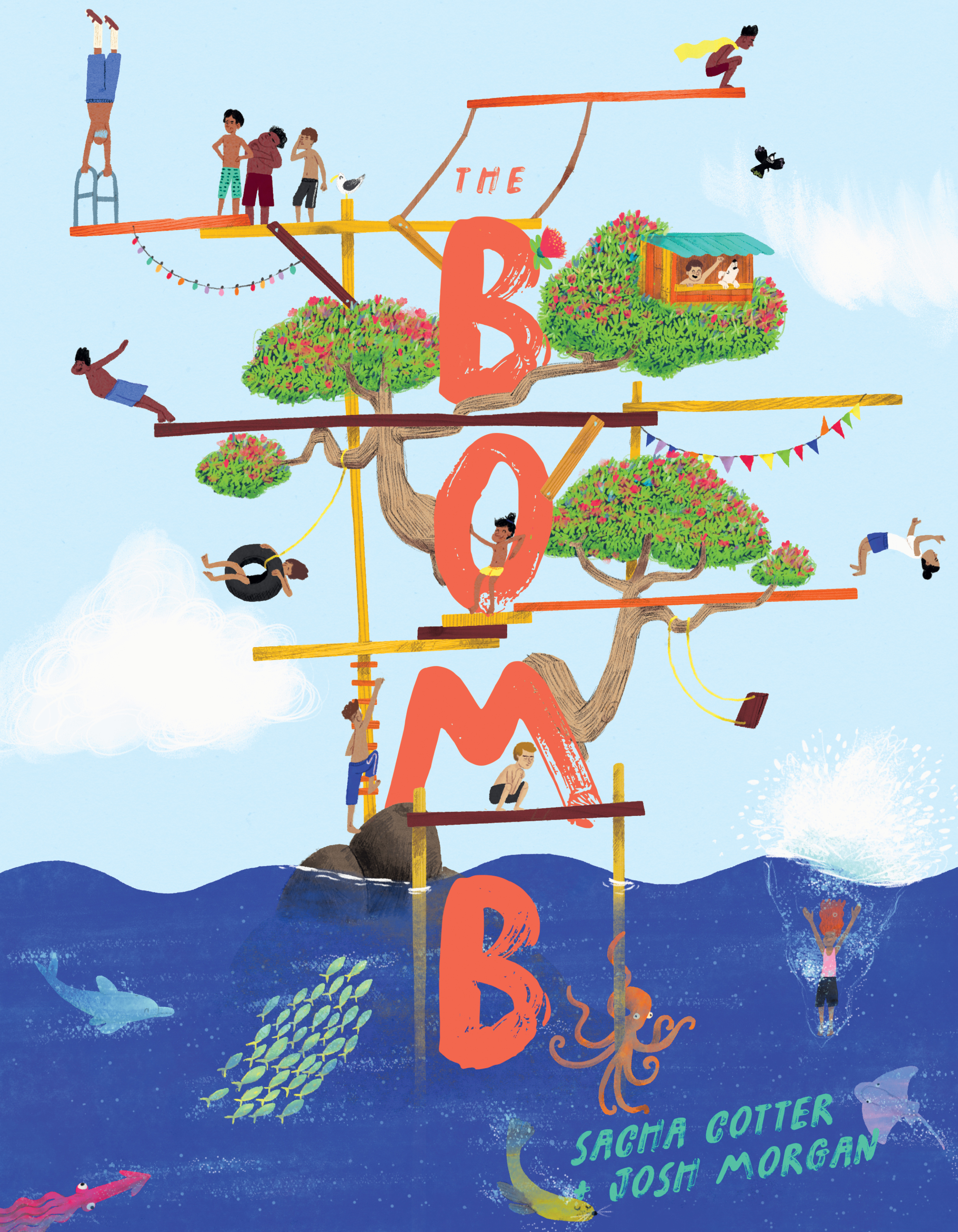
Designer: Te Kani Price
Title: The Bomb
Publisher: Huia Publishers
Format: 210 x 270mm, 36pp, limp bound, section sewn in 16pp with cover drawn on, cut flush. Spot gloss UV treatment used for the cover masthead.
Typography: Cover font: Fersken Regular – with tweaks for masthead. 13/15pt for spine.
Back cover font: Ammer Handwriting – 31/27pt.
Judges’ comments: “This is The Bomb! Stunning illustrations seamlessly integrated with title text/s. A fun and subtle addition of high-gloss UV helps promote author and illustrator – overall the design works successfully to bring these two together.”
“I love the idea of this cover. Hand drawn type charting the path of the action of taking momentary flight from on high and plummeting to the water below. The complexity of the illustration, full of details, allows many ways into understanding what fun the book and story contains. The vantage point gained high up in the branch of a tree on the back cover adds a neat angle. It feels though as if the relationships between back and front could have perhaps been made to work a little more. The change of scale form back to front covers also creates a slight tension where perhaps in the end the front has too many small elements — which works superbly well inside but perhaps some could have been left off the front for more of a reveal inside.”
“This just screams “fun” and invites us to dive right in. The back cover is a lovely continuation of the front, love the splashes of bold colour. A promise of what to expect when we jump into the book!”
“Full of energy – an immediate cover, with a real point of difference using vertical – yet easy to read – typography. The illustration also invites repeated exploration, through the little stories being told by all the jumpers involved. Extra points for the different colour way for te reo edition Te Pohu”

