Mary Egan Publishing Award for Best Typography 2019
Finalist
Designer: Aaron McKirdy with typesetting by Kate Barraclough
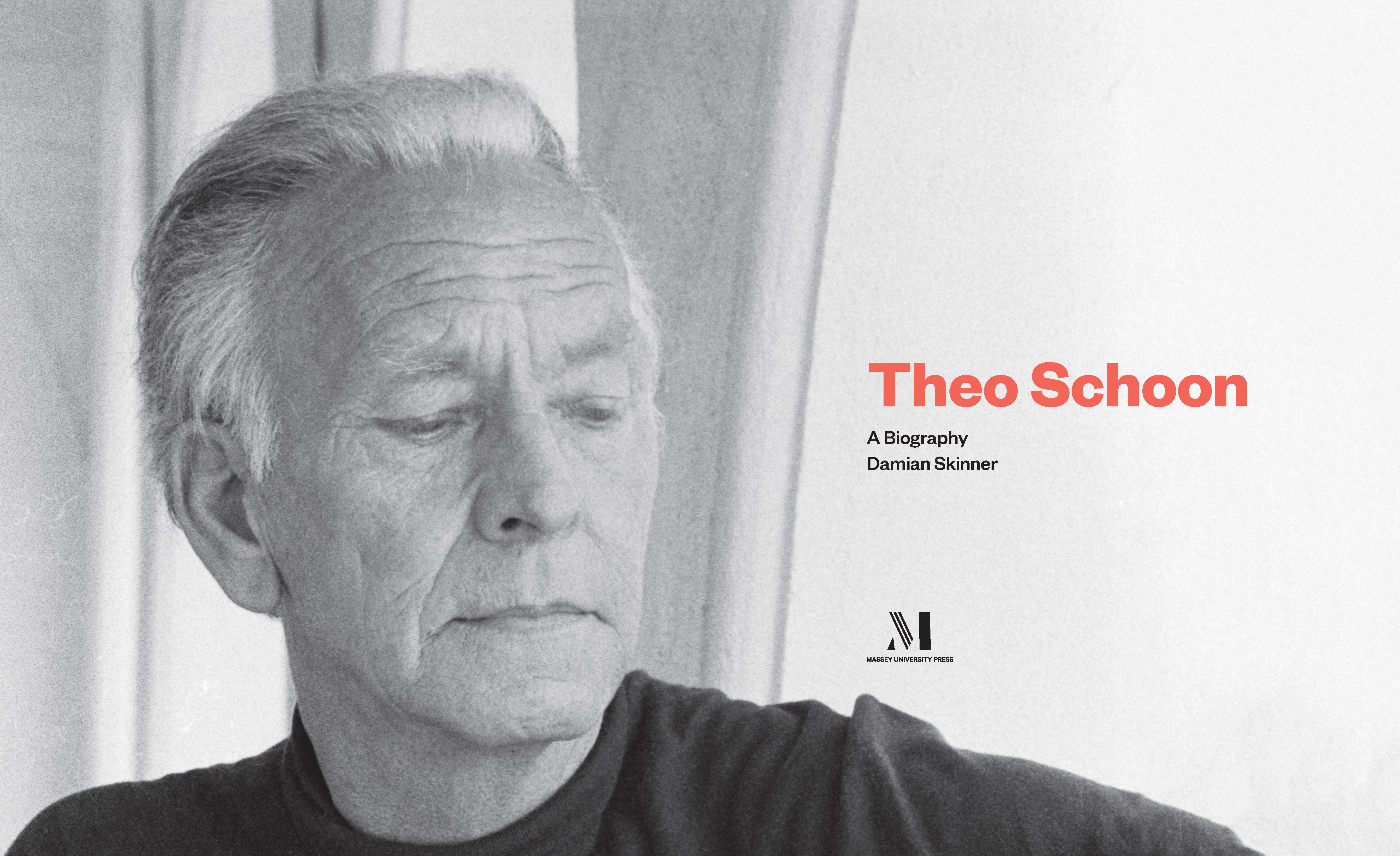
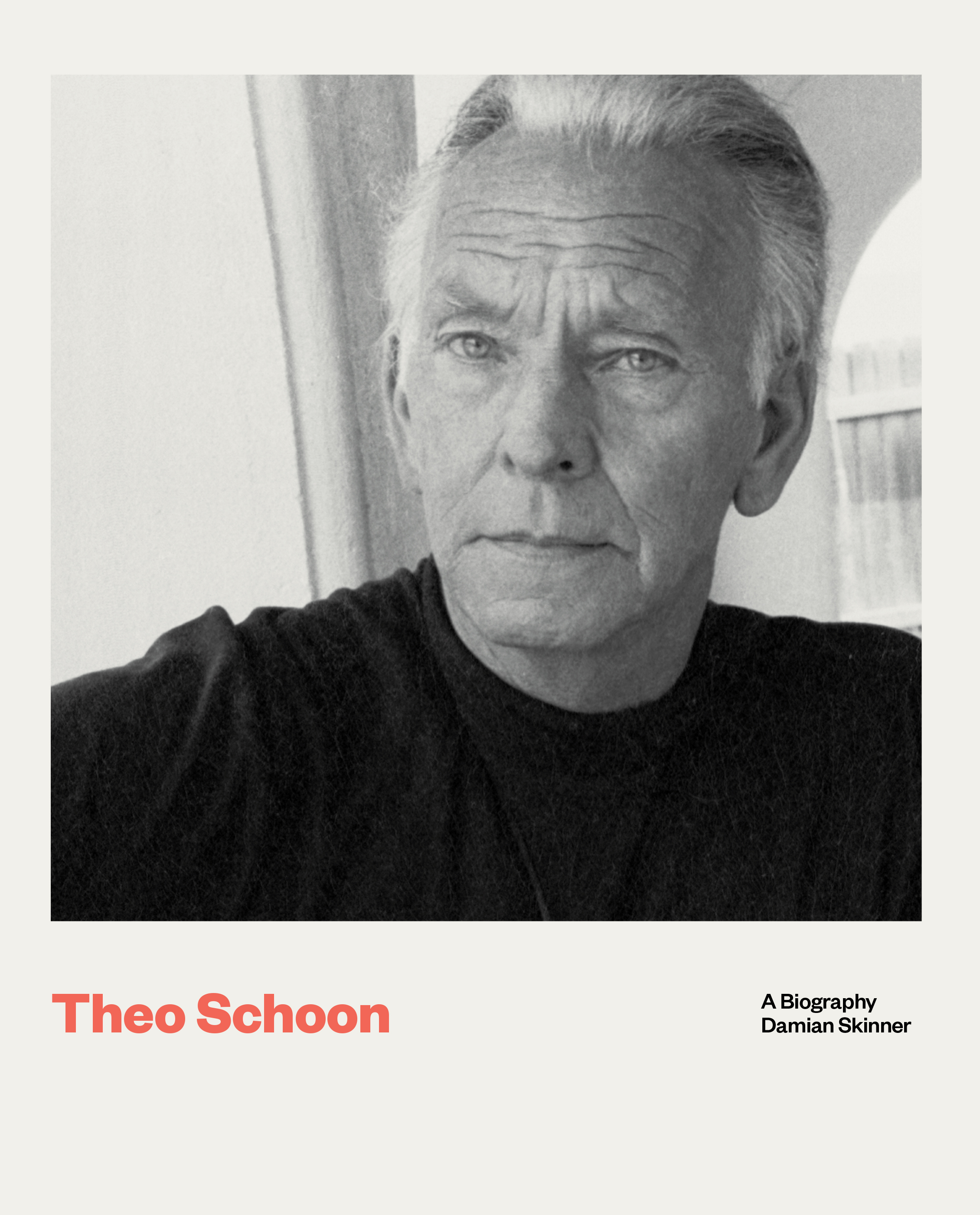
Title: Theo Schoon: A Biography
Publisher: Massey University Press
Format: 230 x 190mm, 336 pp, flexibound plus jacket. Printed on 120gsm Sun Woodfree paper.
Typography: Body font: Domaine Text light, 9.5pt; title/display for chapter headings: Founders Grotesk bold, 40pt; pull quotes; Founders Grotesk light, 15pt.
Judges’ comments: “A minimal, modernist approach to the design of Theo Schoon: A Biography is given personality through the pairing of fonts from Klim Type Foundry. The use of colour signposting for each section is successful, with the bold weight easily carrying the colour for the sprinkling of superscript footnote numbering through, as well as in the corresponding notes sections. In contrast, the chapter openers are a bold splash of colour, with the same type choice punching out. The imagery is illuminating, and placed with respect on the page.”
“The type inside is very thoughtful and effective with little coded pops of colour for each category in the book which is echoed throughout.”
“Intriguing content, lovely images respectfully presented on the page. A good, consistent information hierarchy throughout but paragraphs are too wide and leading is too tight.”
“Crisp and certain typography punctuated with the smallest touches of controlled colour. The line length and slightly tight leading do at times cause the eye a slight effort to locate the next line start, but there is a cohesive design style apparent with the typography throughout.”