Penguin Random House New Zealand
Award for Best Illustrated Book 2019
Finalist
Designer: Aaron Beehre
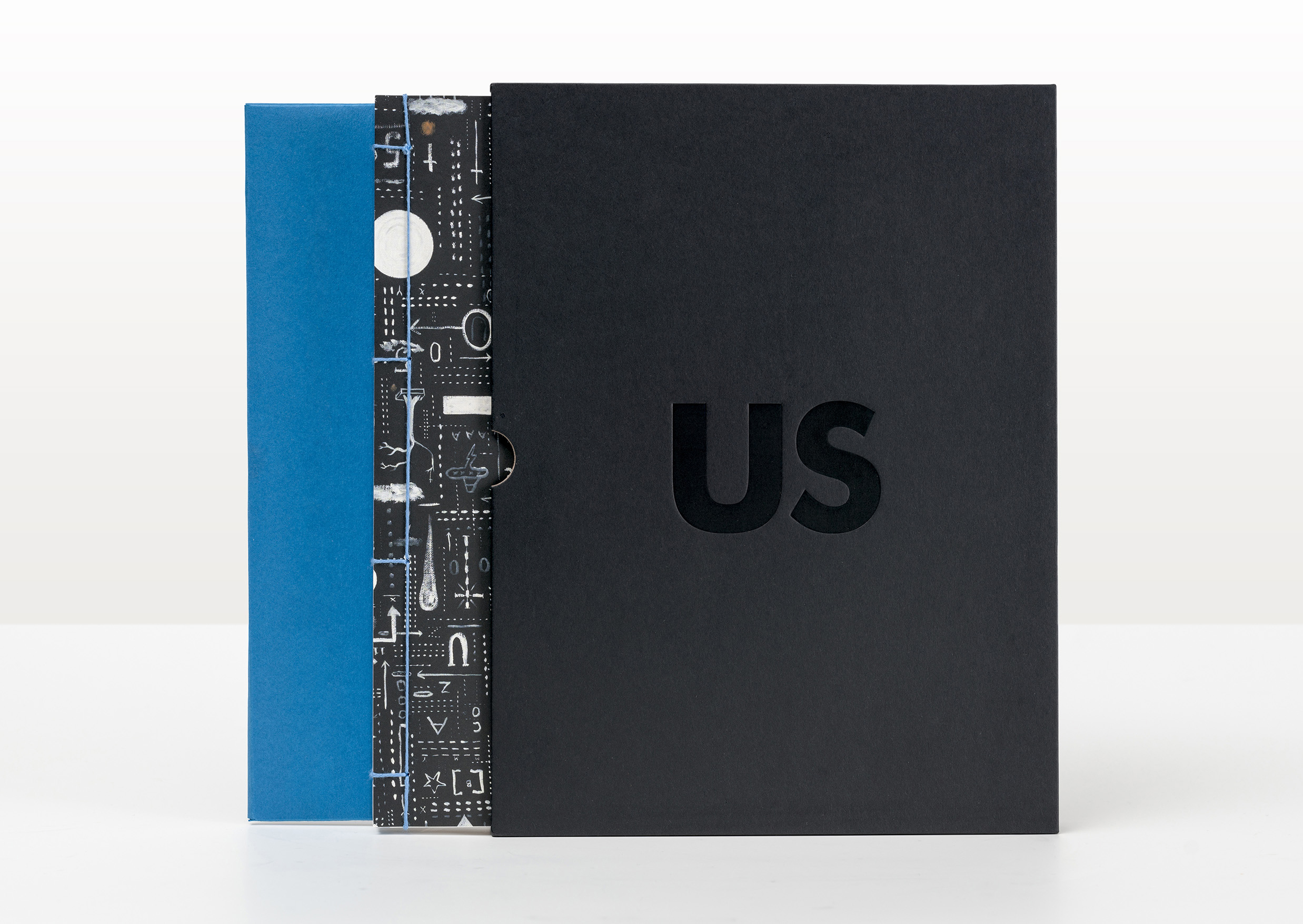
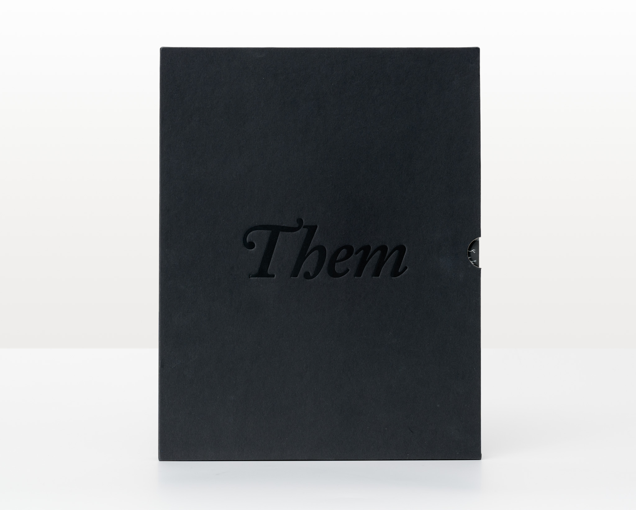
Title: Us v Them: Tony de Lautour (collector’s edition)
Publisher: Christchurch Art Gallery Te Puna o Waiwhetū
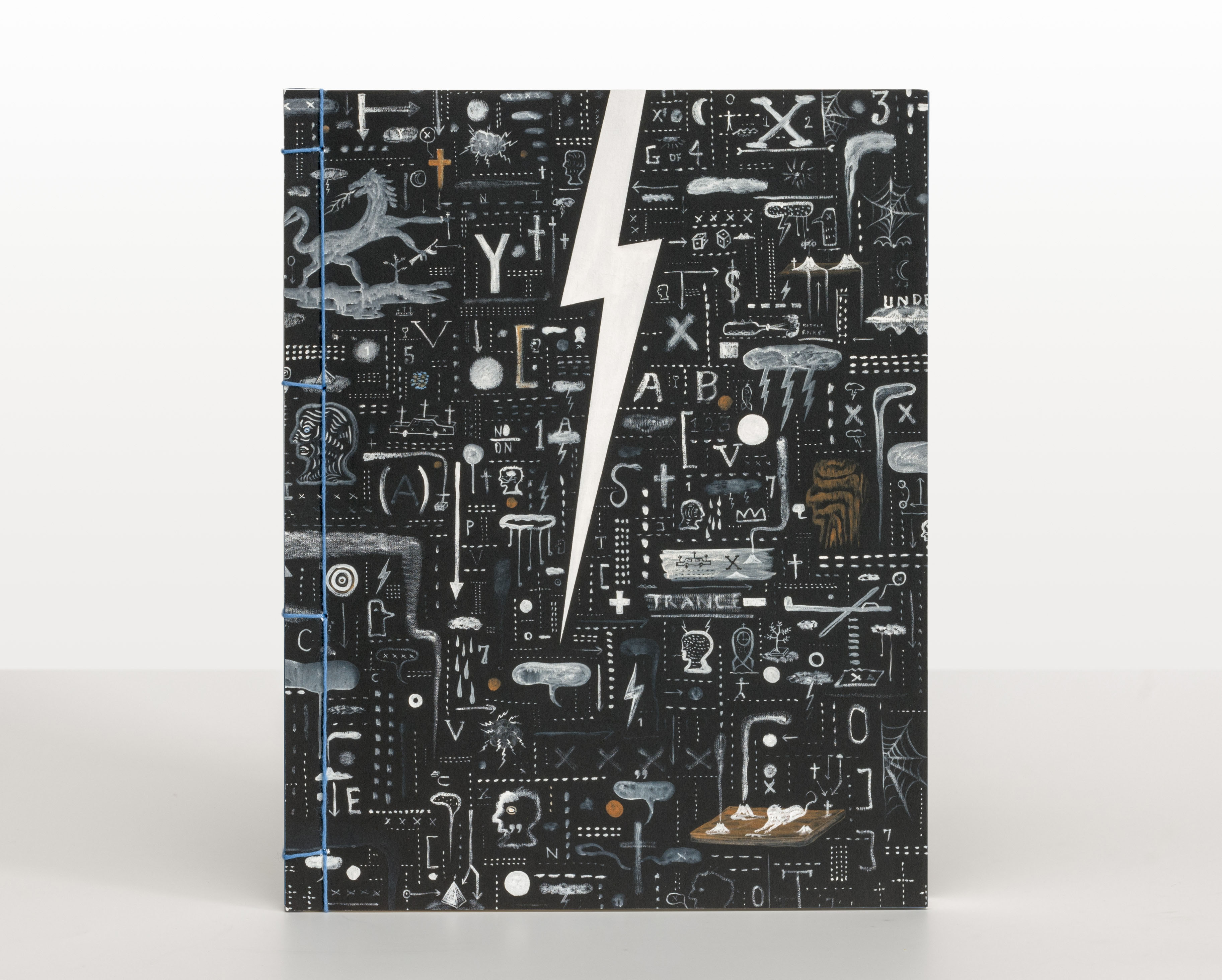
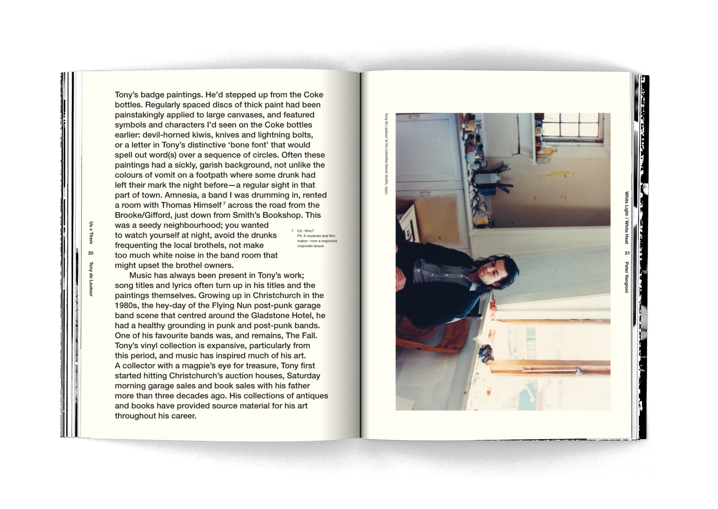
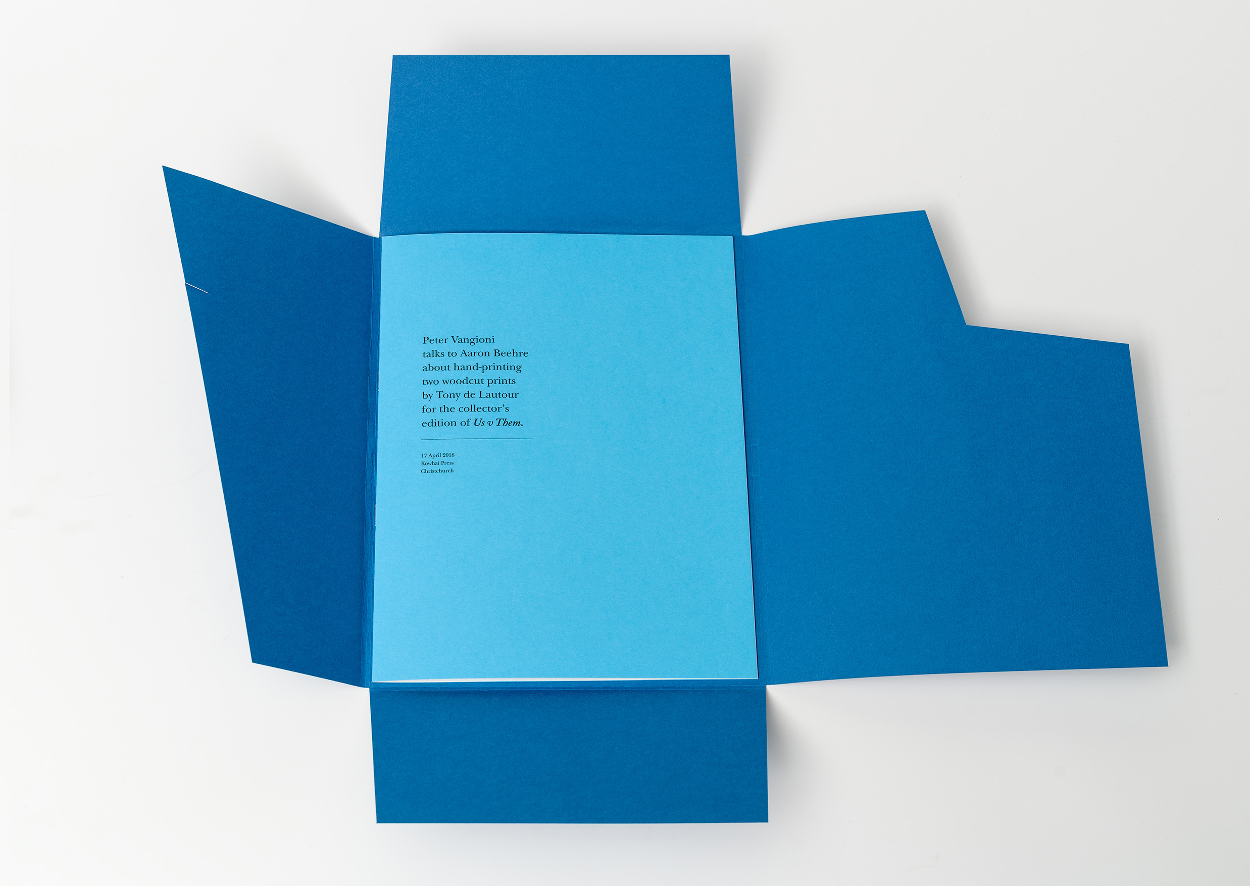
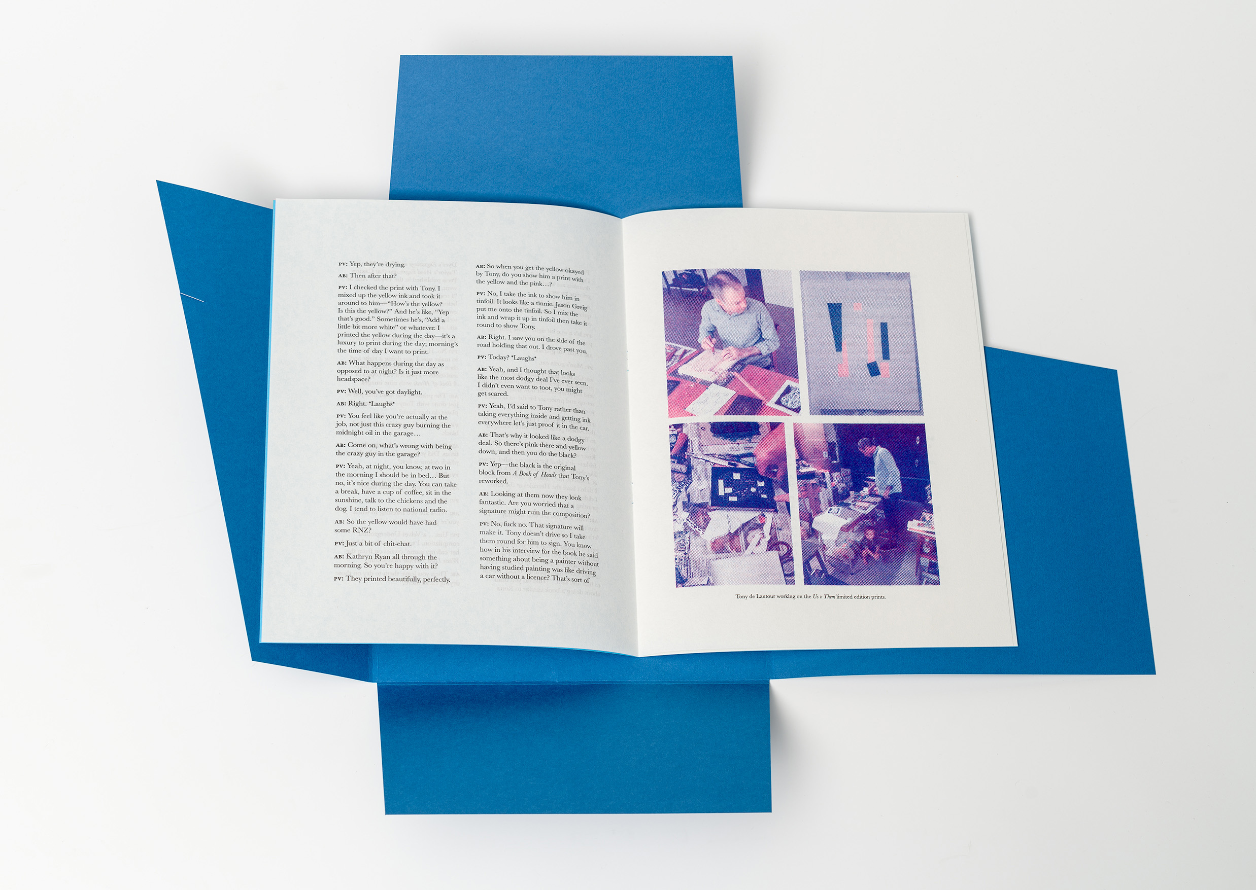
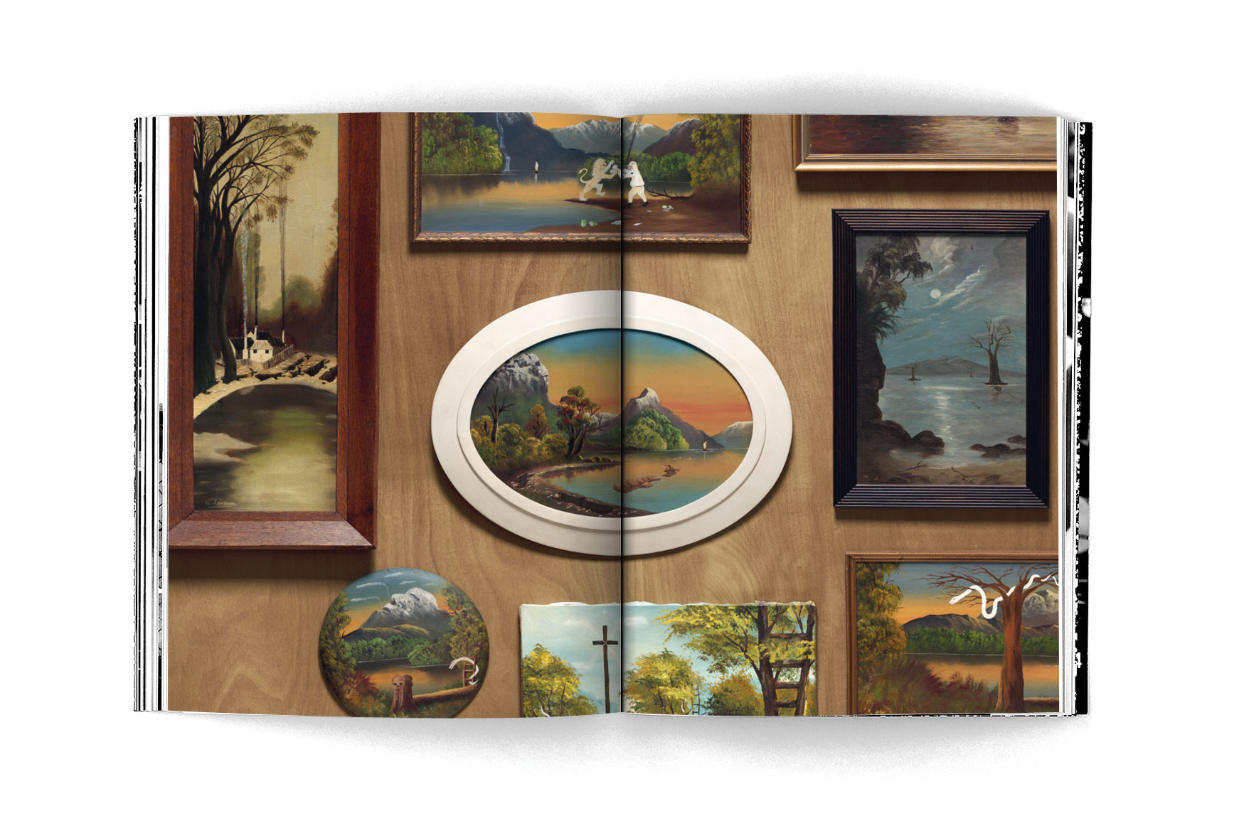
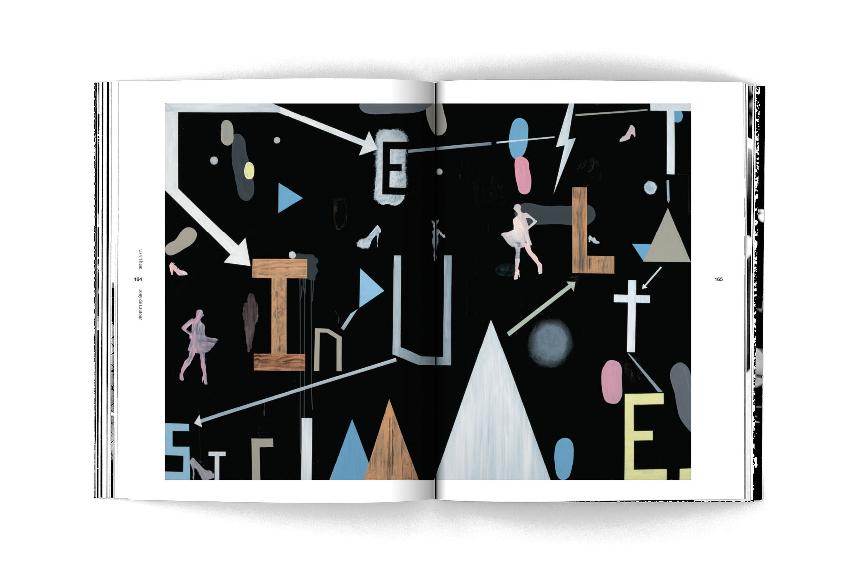
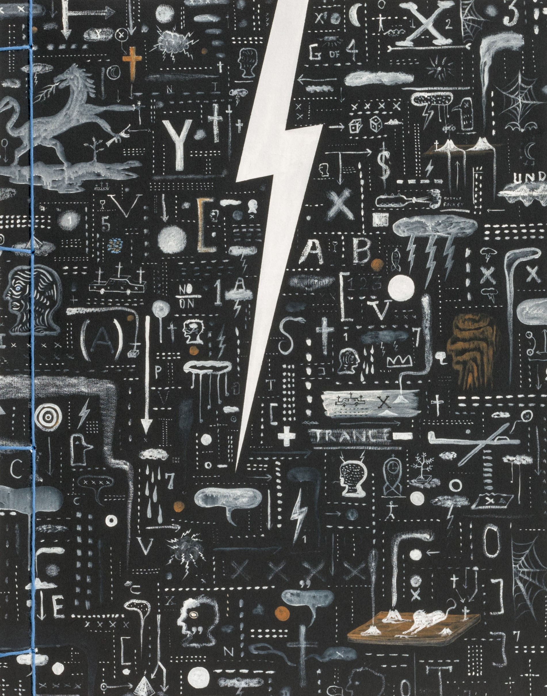
Format: 270 x 212mm, 224pp with two gatefolds, soft cover with Japanese-style stab-binding. Uncoated paperstock was used in the first half of the book to suit the grunginess of Tony de Lautour’s early practice. Smooth art paper in the second half gave serious weight to the artist’s later, more formal canvases.
The cover is the same uncoated stock used on the inside, but folded over for added strength.
The book is held together with pale blue cotton thread – intended as a careful, elegant feature that contrasts with the textured, chaotic cover and creates a sense of a lifetime’s folio of works collected together.
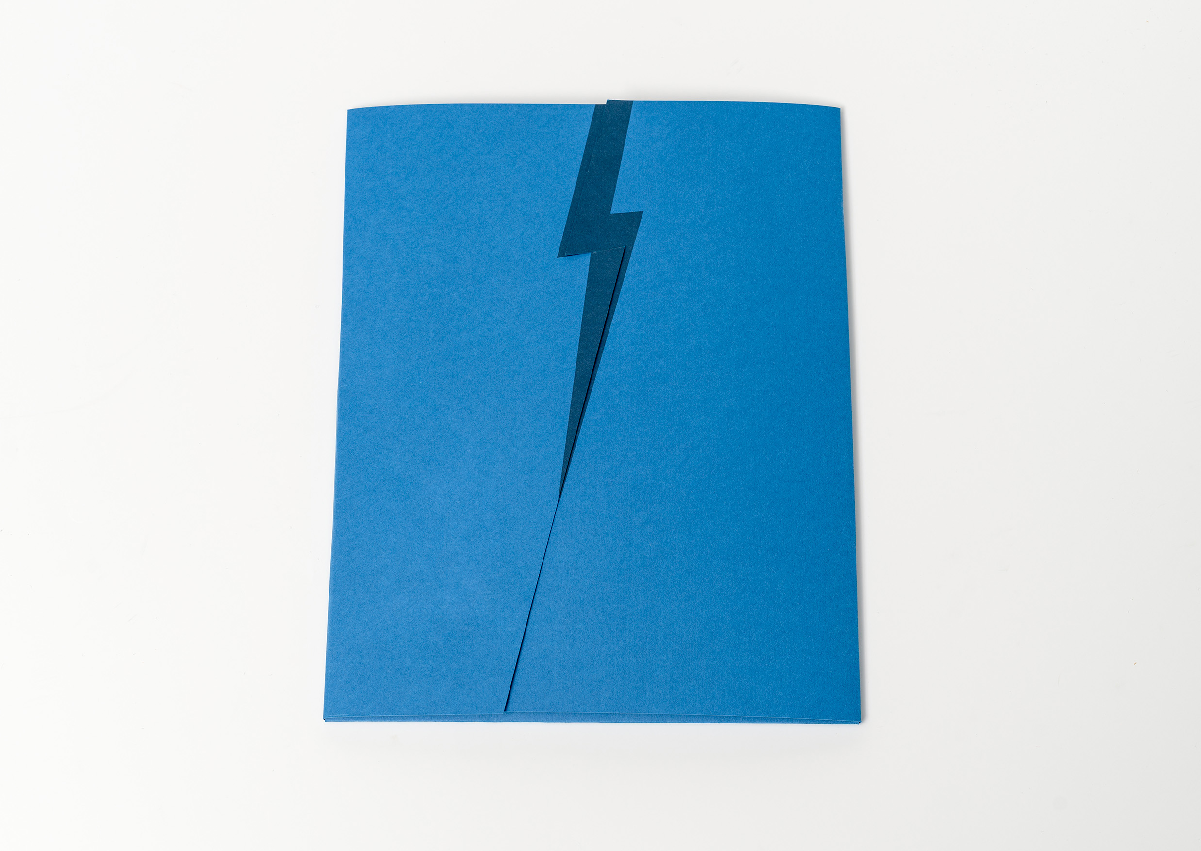
The exposed edges of the book block reveal the artist’s name and his signature lightning bolt emblem along the spine.
Typography: National and Newzald in various sizes and leading. The publication begins with a text set in a bold oversized treatment of Helvetica to present a visceral and personal account of the content, followed by a more elegant treatment of the final essays set in Newzald. The large captions and quotes set in both italic serif and sans-serif take their cue from de Lautour’s artwork which is photographed in two quite distinct styles within the publication.
Judges’ comments: “As a collector’s edition, this is a beauty as an object. But as a book to physically engage with, it’s a bit daunting and exhausting to tackle, It’s cumbersome. However, lovely attention to detail, paper stock, smart typography. Some of the layout of the photos don’t do the image justice – gets lost in the middle. A product like this gets lost on the shop floor. People won’t know what it is and are more likely to walk past it and they are reluctant to engage with fiddly slipcases but this is the special slip cased edition, not the standard edition you are likely to see in retail space beyond a gallery shop.”
“Perhaps the binding choice ‘just slightly’ conceals some of the inner most displayed details of the work. The typography creates strong tones of voice at different parts. The interlocking typographic components echo the interlocking elements of artworks.”
“A unique design and collated delivery. High production values, paper stocks and image crops strongly align with content. Lovely large-bold texts alongside relevant and detailed design additions.”
“A bold, challenging package, that is a piece of art in itself, from the slipcase, to the binding, and ways the art itself is cropped and placed on the page. The design approach embodies the work of the artist. The use of take no prisoners typography continues this. An objective san serif is stark, bold on the page, with the footnotes not hidden away at back. Then there’s the shift to a more reflective design in the latter half of the book, reflecting the artists change in practice.”