Edify Award for Best Educational Book 2019
Winner
Designer: Kate Barraclough, Kate Frances Design
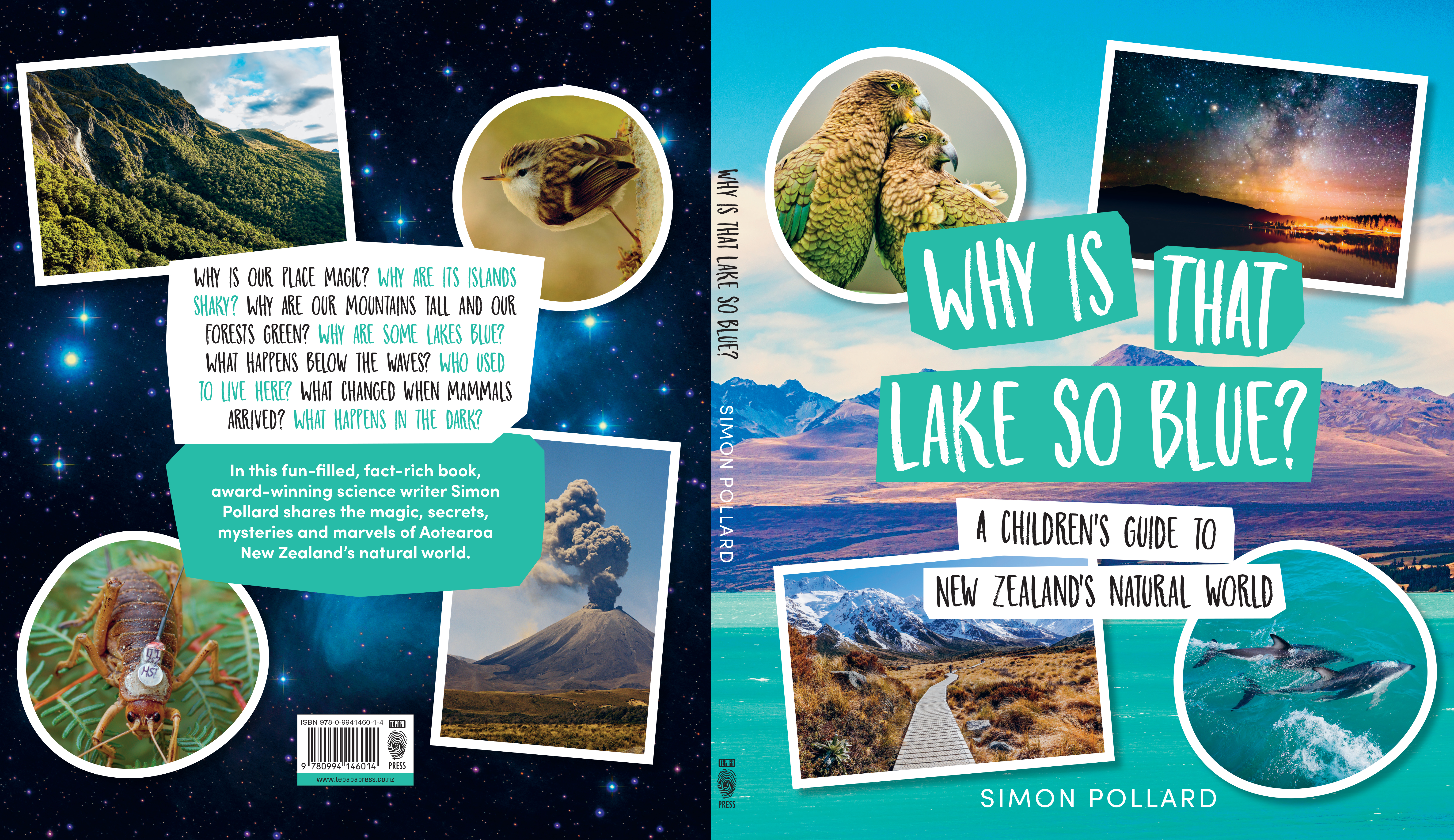
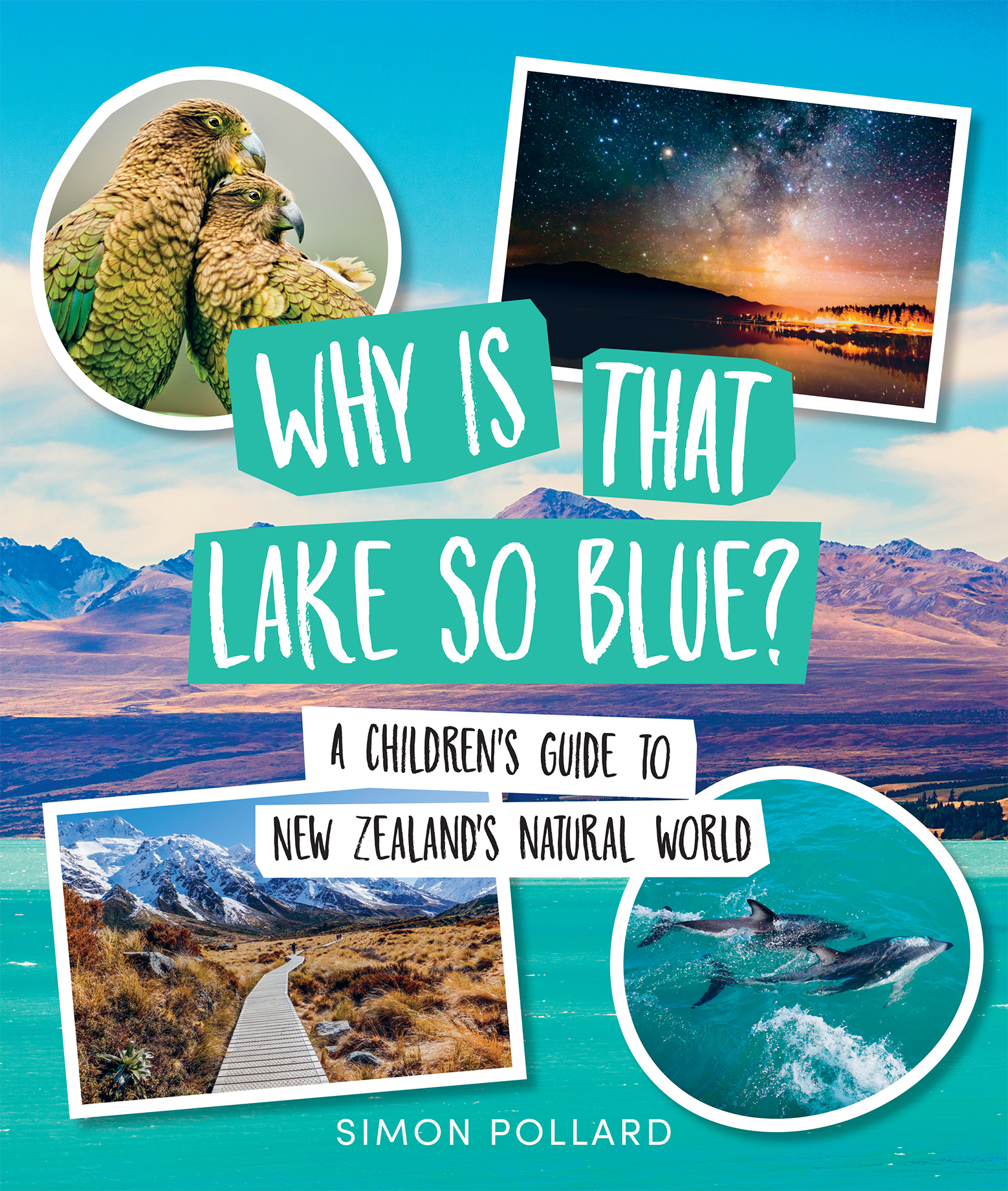
Title: Why is That Lake So Blue? A Children’s Guide to New Zealand’s Natural World
Publisher: Massey University Press
Format: 260 x 220mm, 112pp, limpbound.
Typography: Display font: Market Square Thin, in a variety of sizes and leadings. Body text: Sofia Pro. Viva Beautiful has been used for page numbers on title page and chapter numbers.
Judges’ Comments “A lovely energy to the book. The hand lettered heading choice gives it a relaxed and approachable feel. A clear and open sans serif text is used for the body font, and the accompanying serif text is even weighted and holds up well in the reversed out “sidebar” situations. Each section has its own accent colour. Open questions as chapter titles & headings is a great way to engage young minds
“Originally submitted to the Best Children’s Book category, this book really stood out next to the other non-fiction options in that category. So crisp, clean and fresh – just like our natural world!”
“The design successfully brings energy to a potentially boring topic. Great stock choice and a lovely fresh colour palette.”
“The washed-out colour on the cover really belies the qualities inside. The great changes of scale of full bleed photography alongside inset pictures makes for a good change of pace. The exercise book lined and gridded paper faintly used as a back drop in parts firmly says ‘learning’. Production values inside include some strong print reproduction on uncoated stock and reward far more than the glossy cover. BUT this book champions engaging design to stimulate education of young minds. It is reminiscent of text books of old but has such strong production qualities to elevate it above the run of the mill.”