1010 Printing Award for Best Cookbook 2023
Finalist
 Designer: Tonia Shuttleworth, Koa Press
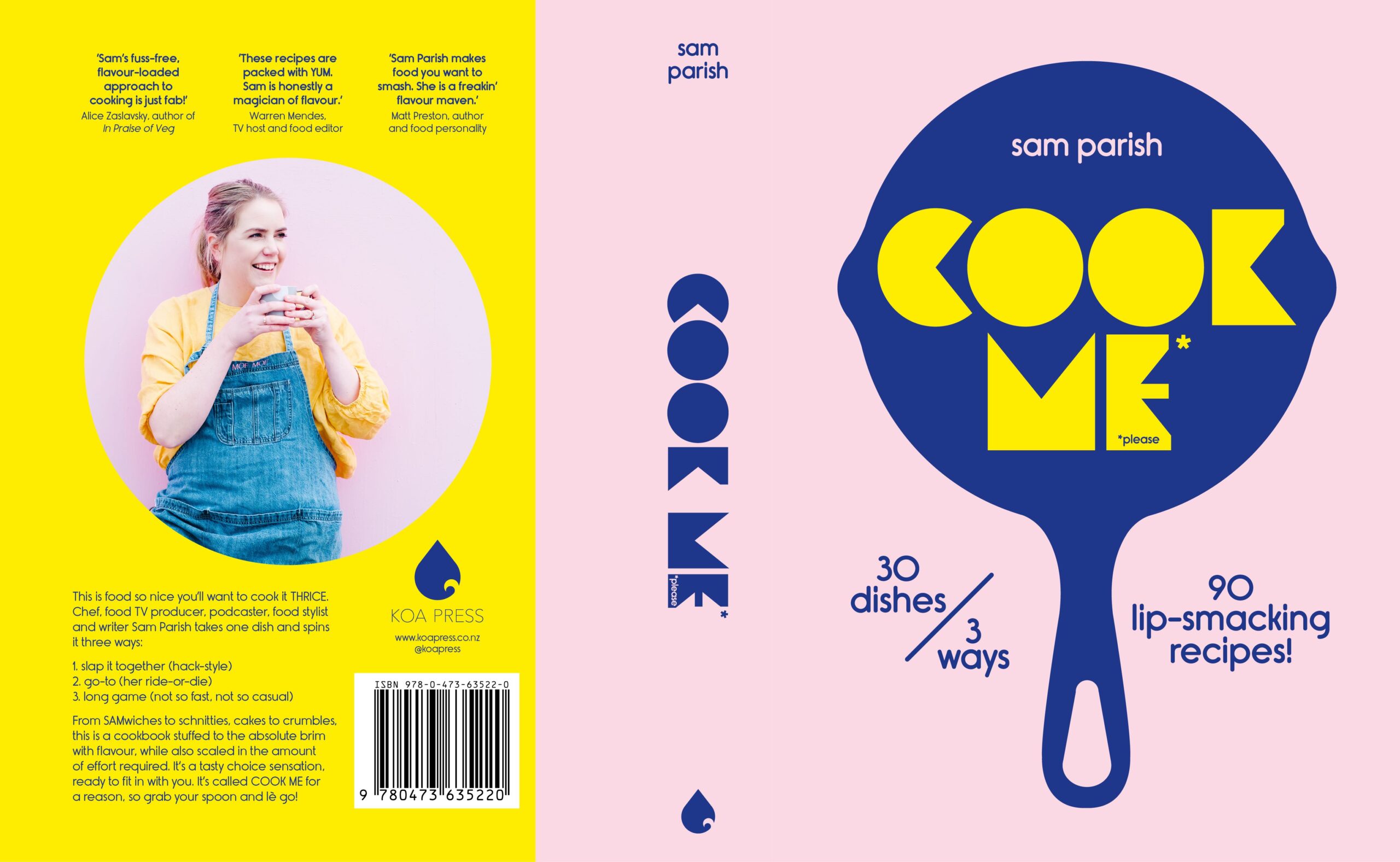
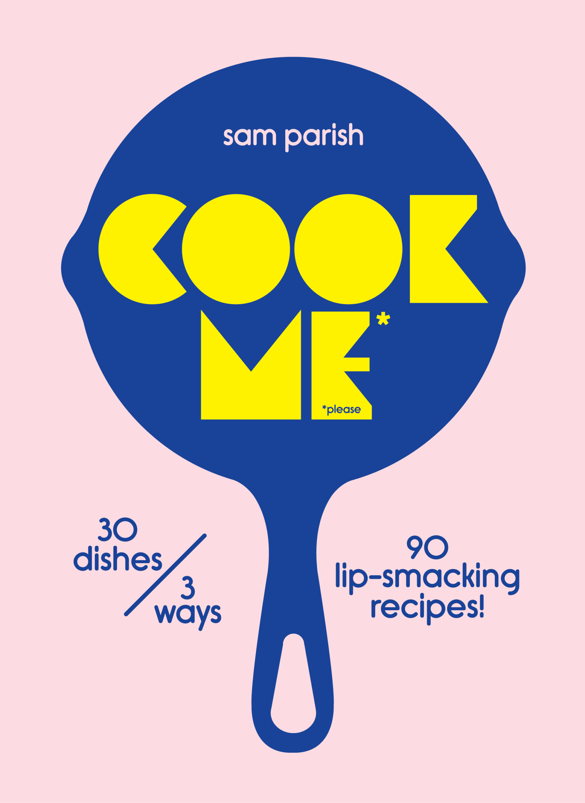
Title: Cook Me
Publisher: Koa Press
Format: 240 x 175mm, 304pp. Casebound, section sewn in 16pp, separate ends, fully cased with PLC over board.
The finishes are an integral part of the cover design. A vibrant blue foil stamp/block for the pan graphic which is also debossed adds depth and increases the tactile quality of the cover design (and also protects the foil block). Debossing the pan graphic means the book title, COOK ME is raised, so the simple, bold cover design is not just a flat graphic and achieves a three-dimensional look.
"The overall brief for Cook Me is to give the reader the freedom to choose. The author offers up 30 dishes cooked 3 ways, giving you 90 lip-smacking recipes. We wanted to achieve this message by using simple yet colourful, impactful photography.
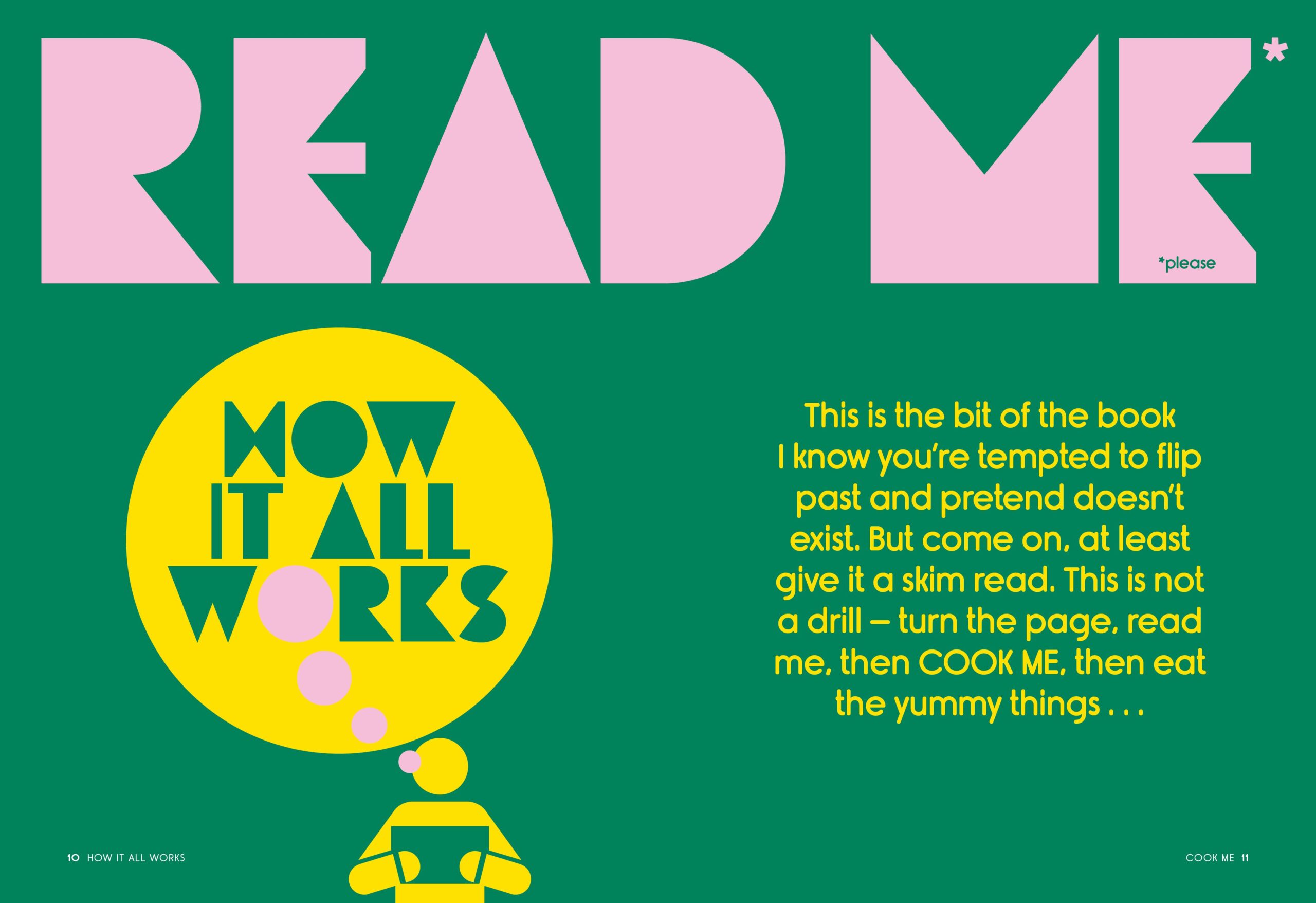
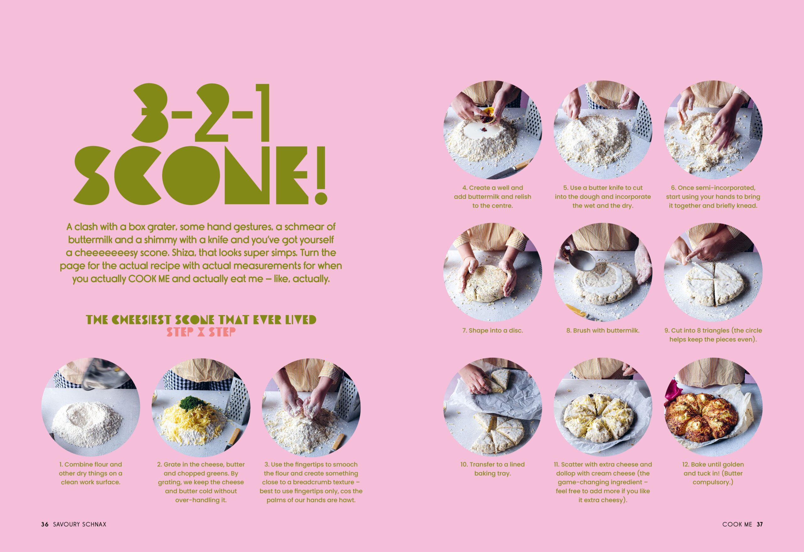
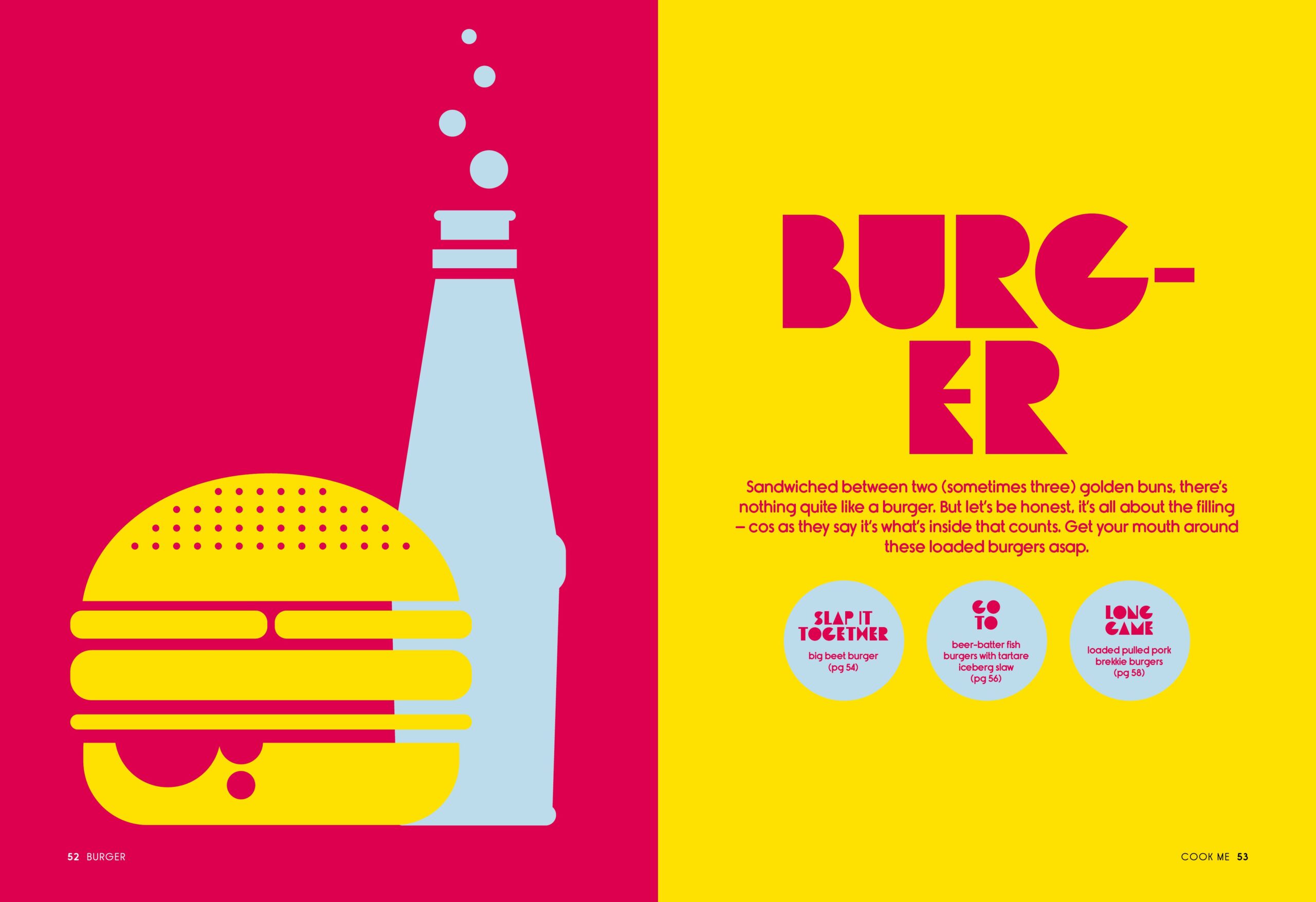
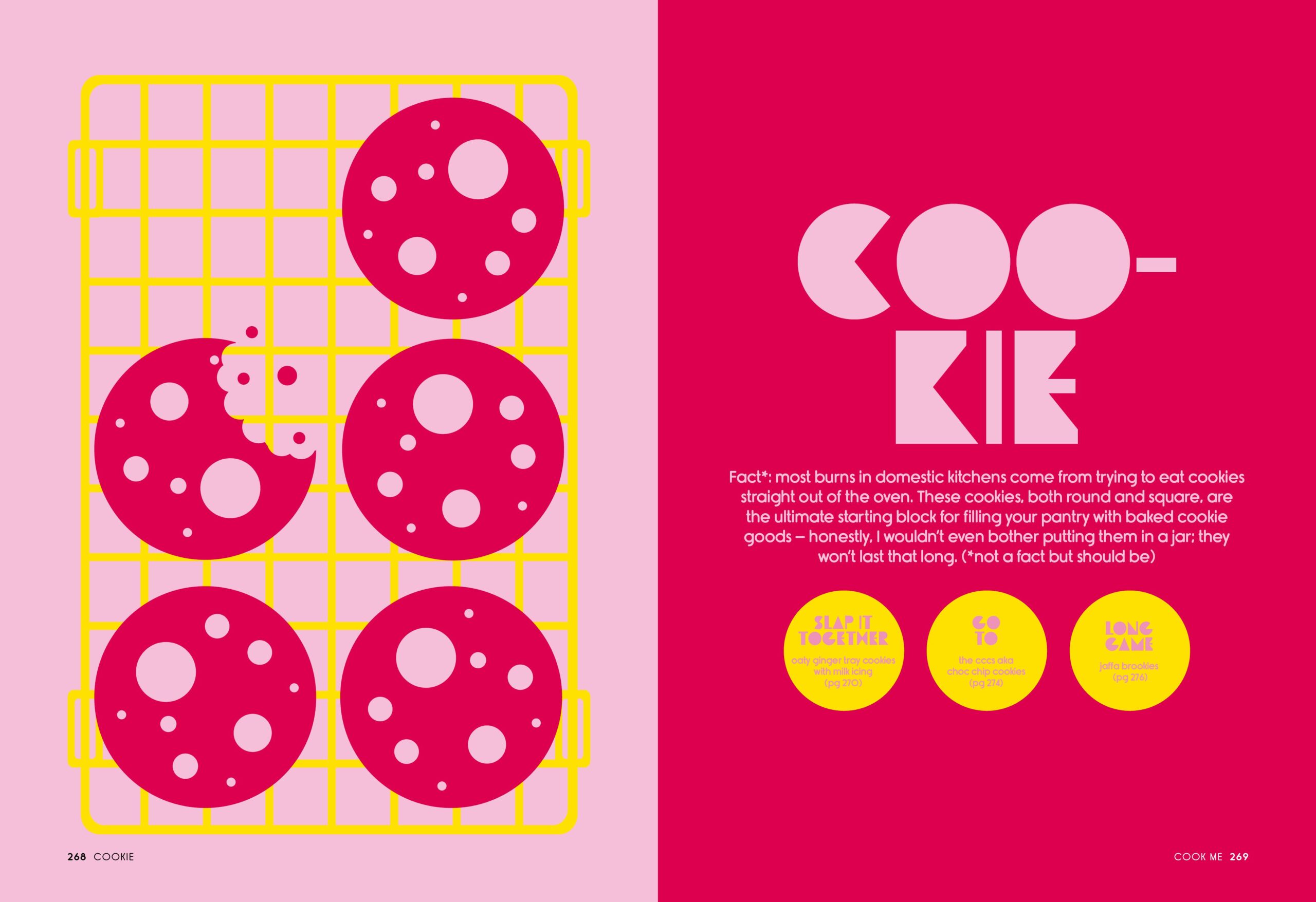
It was a conscious decision to use solid, block-style illustrations on the cover and throughout the book. The overall design is vibrant and bold, reflecting the style of the simple yet delicious content.
The colour palette was carefully chosen to reflect the lively, flavour-packed content, including rich greens, bright blues and vibrant yellows."
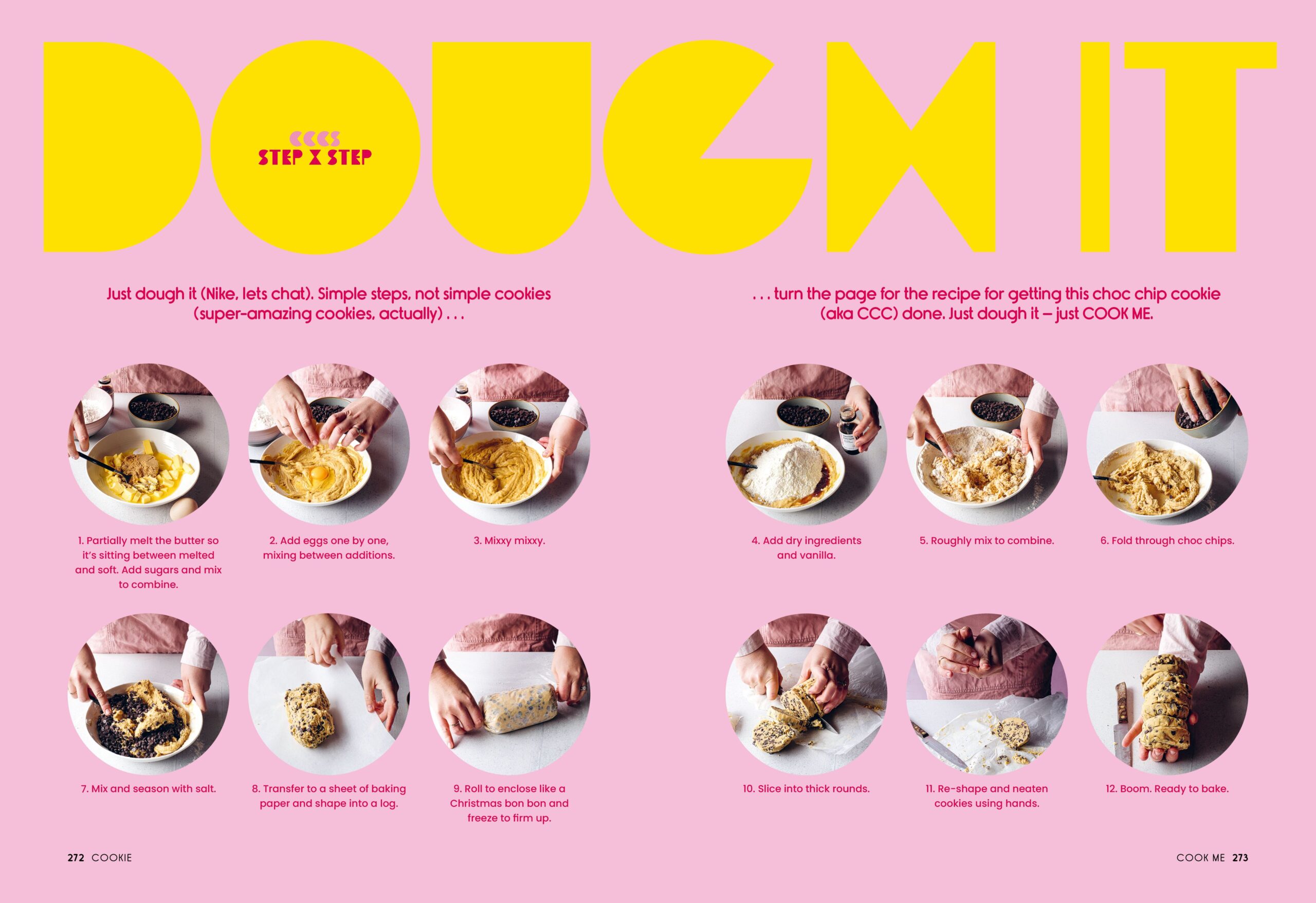
Judges’ comments The design here delivers layers of foiled fun and energy, punchy citrus acid yellow cover type and end papers joyfully draw the reader straight in. The plead in title is barely necessary. Solid colour vector illustration and bold headline type. Did the Chef's knife create sharp angles and portions of letterforms? All strongly signal chapters and ingredients with attitude and approachable recipes. The typography for recipes is reliably controlled amidst high-energy and full-on colour. The circular icons work hard to pinpoint key steps and information, perhaps there is a slight sense that one or two of the design tactics could have been sparingly deployed, but with so much fun to be had in trying these recipes it will no doubt appeal to and encourage a generation into gaining confidence giving it a go in the kitchen.
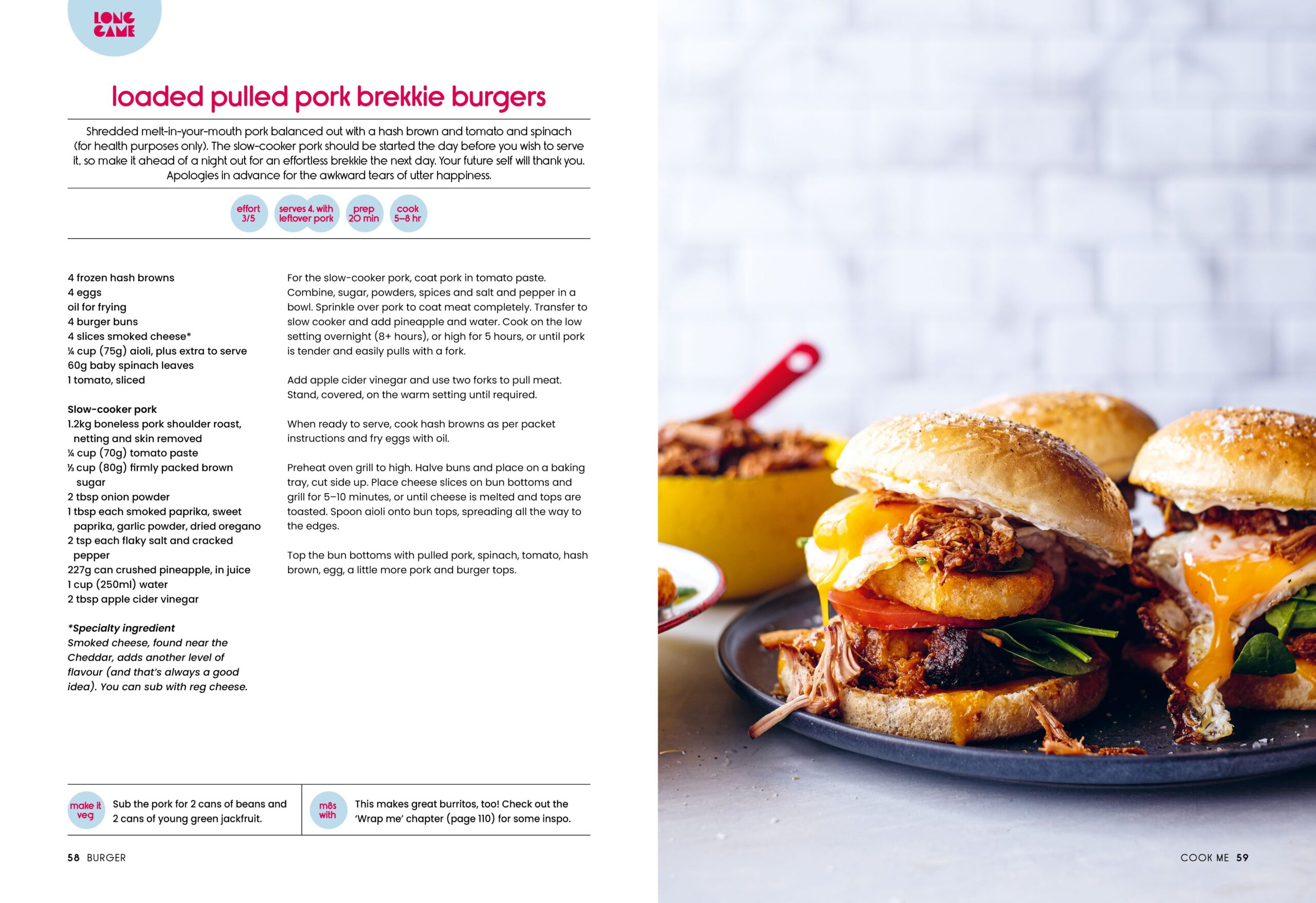
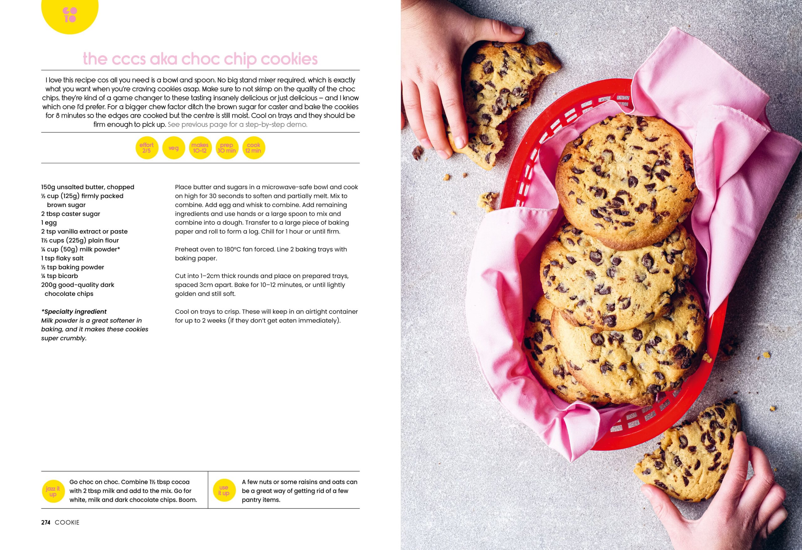
This is a vibrant, fun and inventive cookbook. I was immediately taken with the cover with its chunky title type punched out of the metallic-foiled pan. The colours are a treat, mixing pastels with brights in all possible combinations. The page layouts are fun and inventive, combining illustrations and shapes with the chunky title type and lively typography. The photography is often a ‘top-shot’ to maximise the geometry of the cookware, complimenting the facing page designs.