HarperCollins Publishers Award for Best Cover 2017
Finalist
Designer: Arch MacDonnell, Toby Curnow, Sarah Gladwell & Oliver Worsfold, Inhouse Design
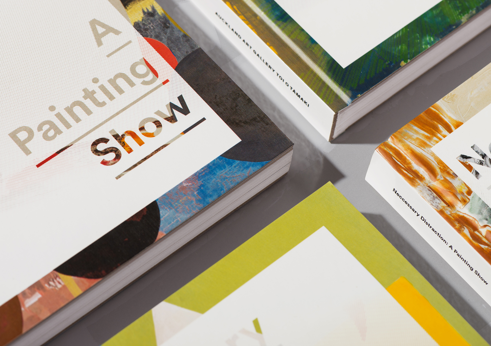
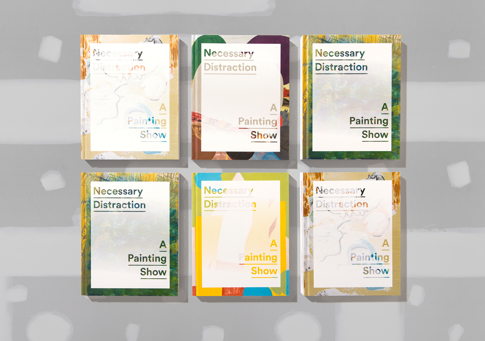
Title: Necessary Distraction: A Painting Show
Publisher: Auckland Art Gallery Toi o Tāmaki
Format: 220 x 172mm, hardback, section sewn. Floating spine. Four different covers.
Typography: LL Circular, set at 8.5pt on 12pt leading throughout. A single type family, LL Circular was used throughout the publication and was set at one point size and leading throughout the entire publication (8.5pt/12pt — the type designer’s optimum setting). White space then became the critical element in achieving information hierarchy.
Judges’ Comments An approachable and conceptually clever production. It teases, but acknowledges the intelligence of the contemporary art viewer. The judges loved the texture given by the white halftone screen. With four different covers to choose from, each showcasing a different artwork, it effectively captures the range of works in the exhibition.