
HarperCollins Publishers Award for Best Cover 2023
Finalist
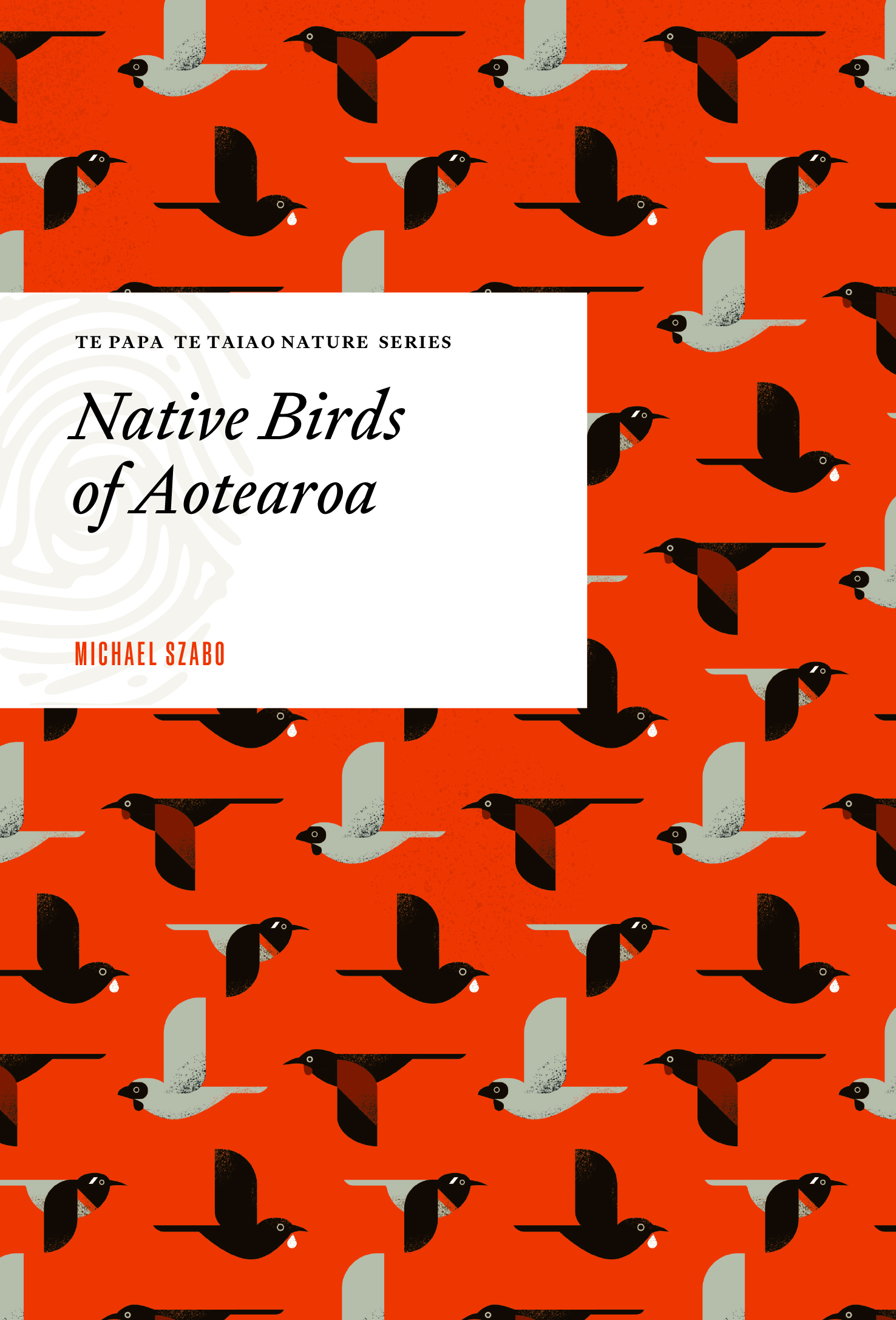
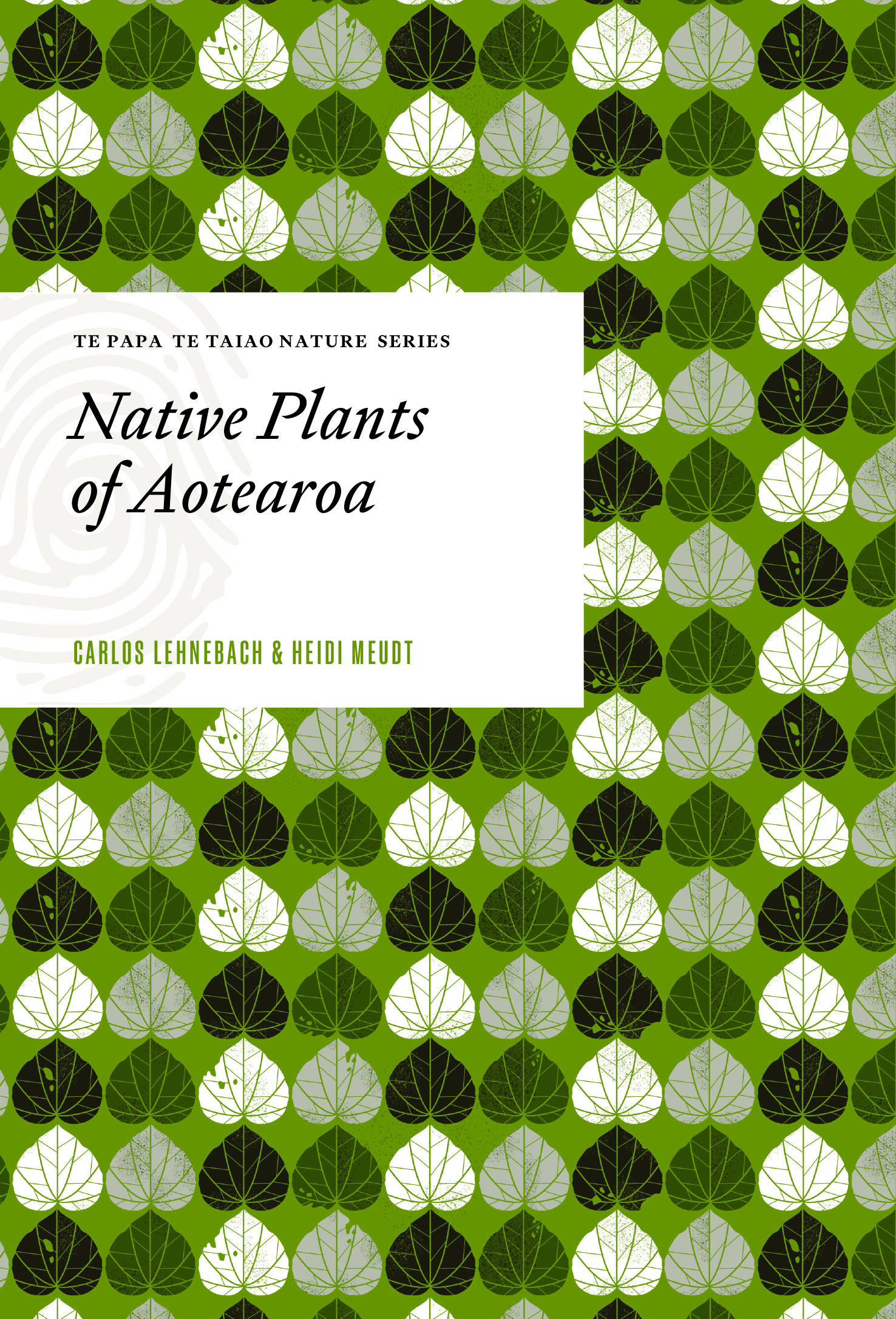 Designer: Tim Denee
Title: Te Papa Te Taiao Nature Series: Native Birds of Aotearoa / Native Plants of Aotearoa
Publisher: Te Papa Press
Format: 184 x 125mm, 144pp (Birds) & 132pp (Plants), hardback.
Typography: Given that this series is about the native flora and fauna of Aotearoa, we made a conscious decision to stick with NZ-made typefaces (all from Klim). The series was partly inspired by the Reed nature books from the 50s and 60s, so the typographic details are trying to evoke the feeling of those books without (hopefully) being a pastiche. So, the paperstock, the type size, the type detailing includes nods to the way those books were designed. Tiempos chosen to be a robust, legible typeface that doesn’t draw too much attention to itself and could work well at the sizes required. Geograph chosen for various associations – National Geographic, obviously, but also the history of Futura from which it is inspired (Futura evoking mid-century science textbooks). Gently nostalgic but firmly modern.
“An accessible, clearly branded series of short, handsomely designed books detailing groups of natural life found in New Zealand, to appeal cross-generationally to nature lovers and general visitors alike. Gift-able, 1950s design-inspired that gives an impression of the content without the title. We like the wallpaper-y approach of the classic Reed books. A consistent series design with adaptation through the colour scheme or other aspect of the design. As this series will be added to (indefinitely, if successful), it’ll need a scheme that allows for this. Clearly Te Papa books – to differentiate them from something other non-fiction publishers could produce.”
Judges’ comments This set of book covers for Te Papa have a vintage feel with a contemporary twist. The graphic style works nicely with the size of the book, feeling like a small treasure in the hand. The repeated pattern illustrations and retro colours enable the work of different illustrators to successfully sit alongside each other. The illustrations themselves are beautiful, and perfectly pitched. A branded tab wraps from front to back, effectively framing the cover type. The typography combines an intriguing serif, which feels both traditional and new, with a widely tracked sans, providing a contemporary freshness to the design.


