Te Herenga Waka University Press
Award for Best Typography 2023
Finalist
Designer: Aaron Beehre
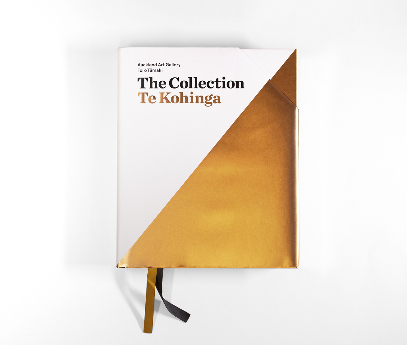
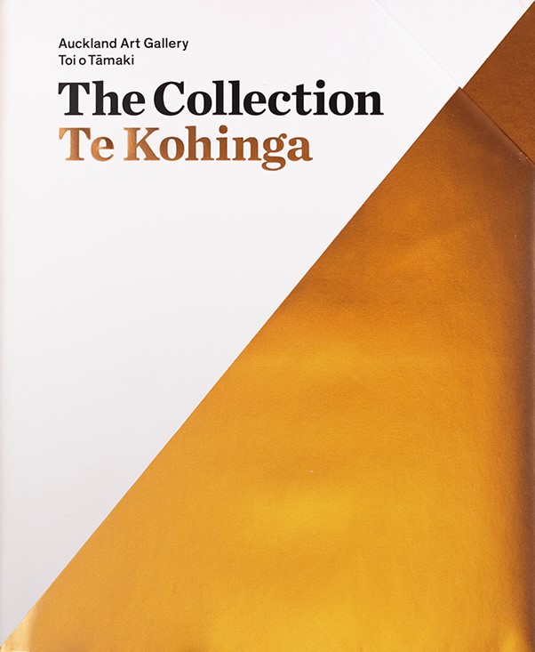
Title: The Collection | Te Kohinga
Publisher: Auckland Art Gallery Toi o Tāmaki
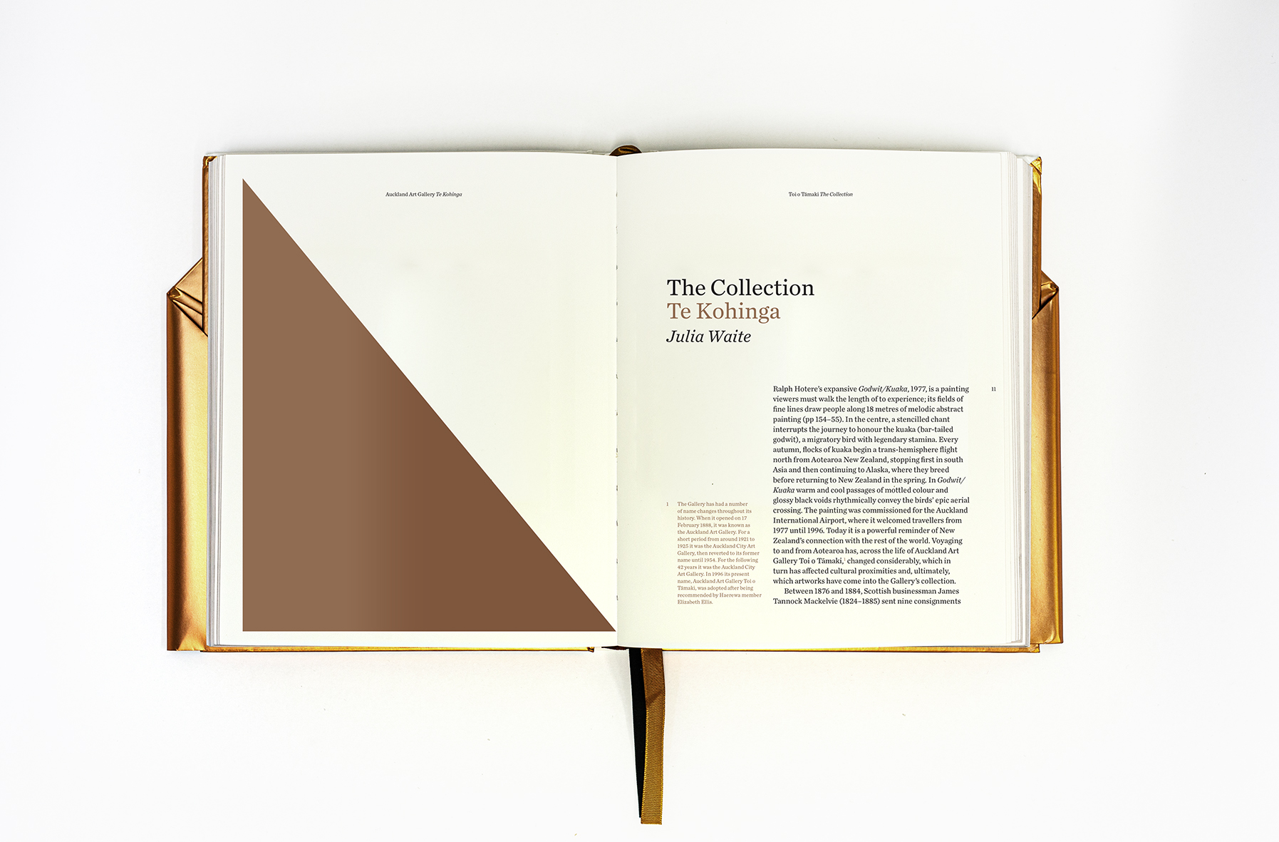
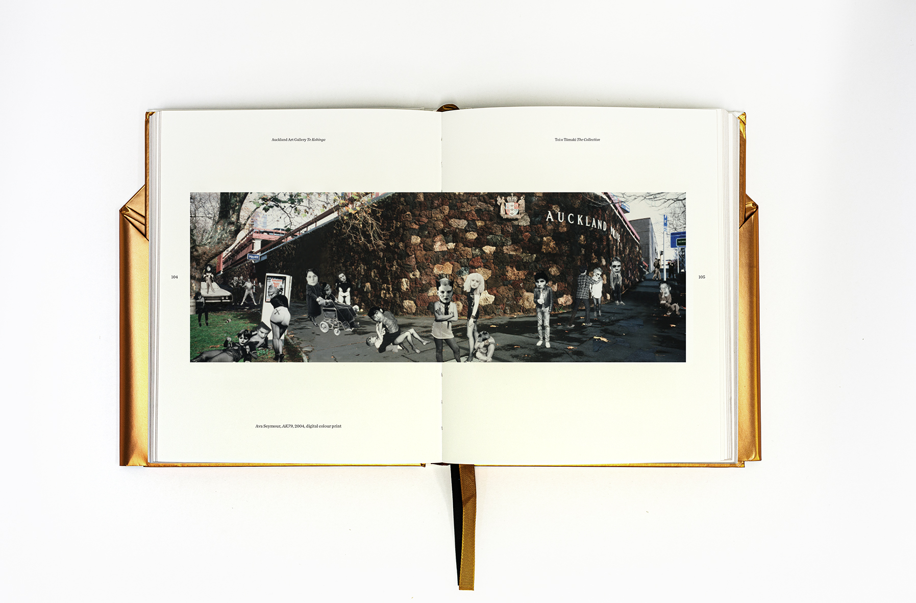
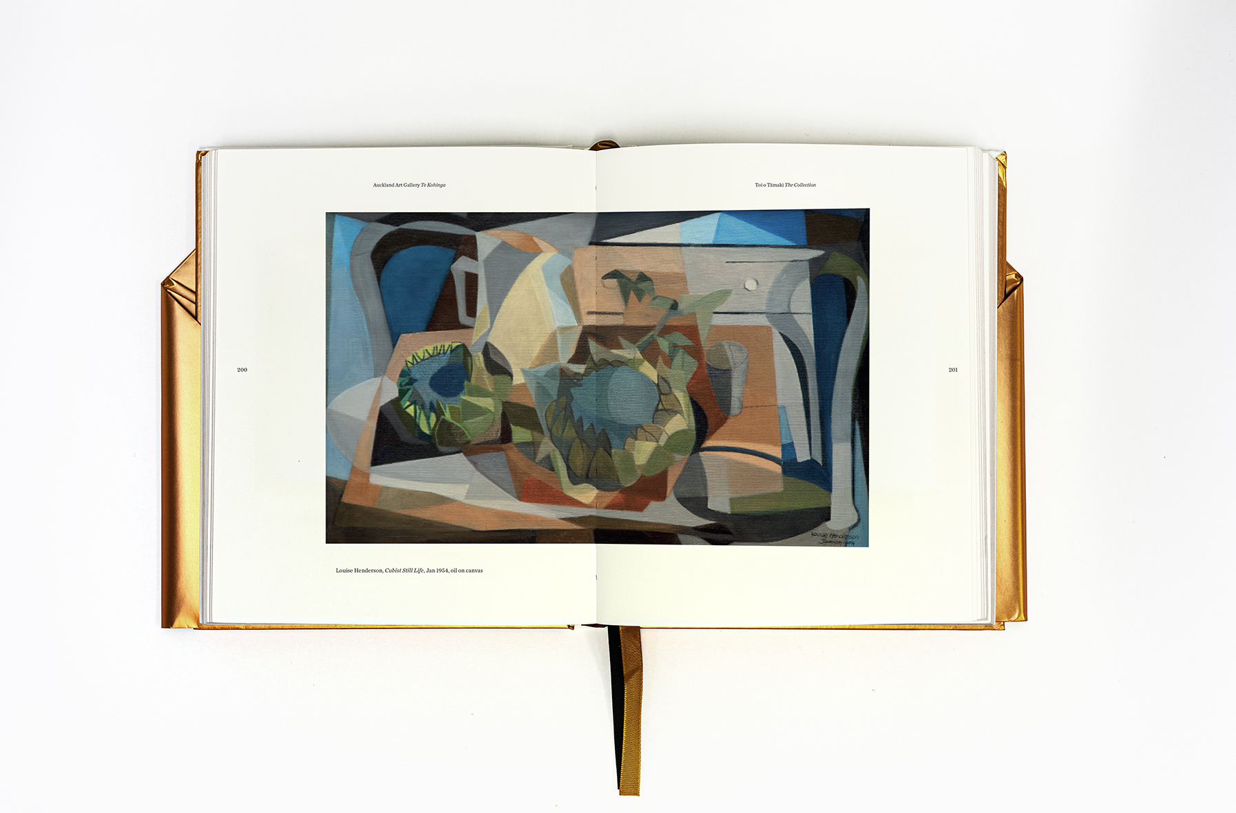
Format: 220 x 180mm, 348pp, hardback, section sewn, with folded dustjacket and two ribbons.
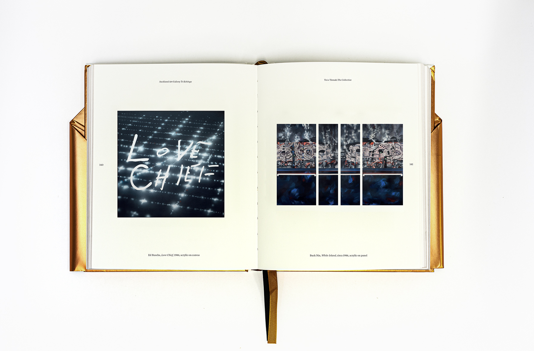
Typography: The Collection | Te Kohinga is set in Jonathan Hoefler and Tobias Frere-Jones typeface Chronicle. The publication’s just-off square format is framed by the page navigation of running header, folio numbers and artwork details creating an almost compass like reading of a spread. The introductory essay and foreword are set in a spacious 10 on 13pt layout with footnotes (inked in bronze) hugging the gutter tramway. The foiled page edges, case and dust jacket create a dipped treasure of a book and the elegant Chronicle typeface reflects this visual treatment.
“The Collection | Te Kohinga is the Gallery’s first collection book featuring works from the International and New Zealand collections since 2001. It should feel contemporary and timeless, and speak to Aotearoa’s biculturalism and internationalism. An important readership for the book are tourists, so it needs to feel like a treasure/taonga and a generous sample of artworks while also being portable. The main essay traces the Gallery’s history, tracing back to 1888, therefore a sense of history and of Tāmaki Makaurau Auckland should also come though, along with the redeveloped building’s architectural elements, including the kauri pods at the entry.”
Judges’ comments The Collection Te Kohinga takes an elegant, refined and traditional typographic approach to an art museum publication. The system suits the book’s size perfectly, and makes for a comfortable and approachable reading experience. The serif typeface is set with great care with the titles, body, captions and running heads all perfectly balanced against each other. The internal grid system provides good white space on the page, and an effective, readable line length. The spot metallic ink provides a point of difference for the Te Reo title and footnotes.