Te Herenga Waka University Press
Award for Best Typography 2023
Finalist
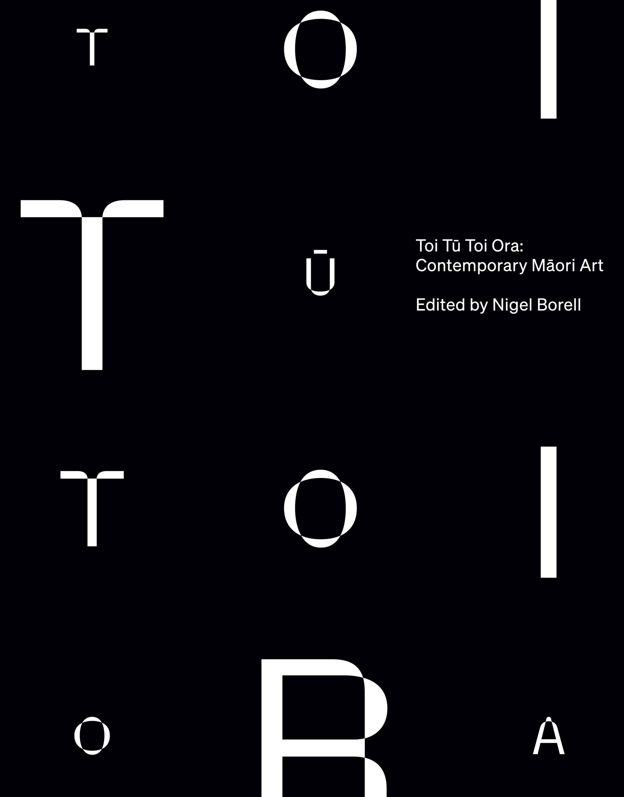
Designer: Tyrone Ohia, Extended Whanau (cover & art direction) & Katrina Duncan (layout and typography)
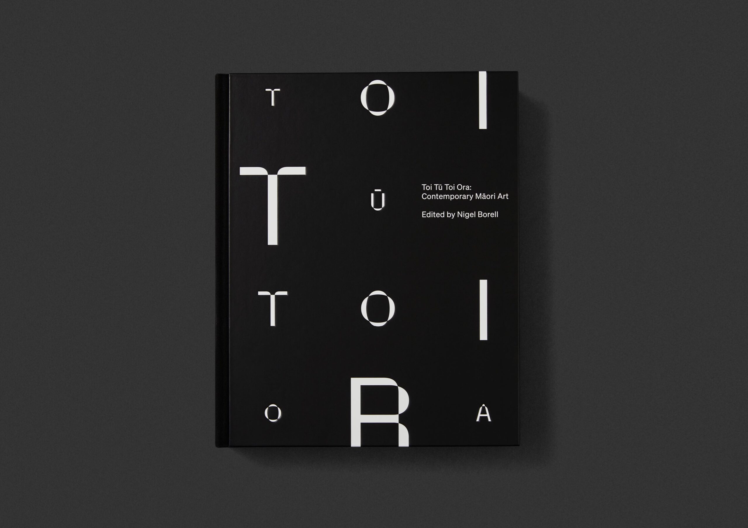
Title: Toi Tū Toi Ora: Contemporary Māori Art
Publisher: Penguin Random House NZ in association with Auckland Art Gallery Toi o Tāmaki
Format: 300 x 240 mm, 392pp, 3-piece case, black cloth to spine plus white foil, debossing to front and back case. Most of the book printed on matte art; 88pp black-and-white pages printed on 120gsm woodfree; machine gloss varnish to all images throughout.
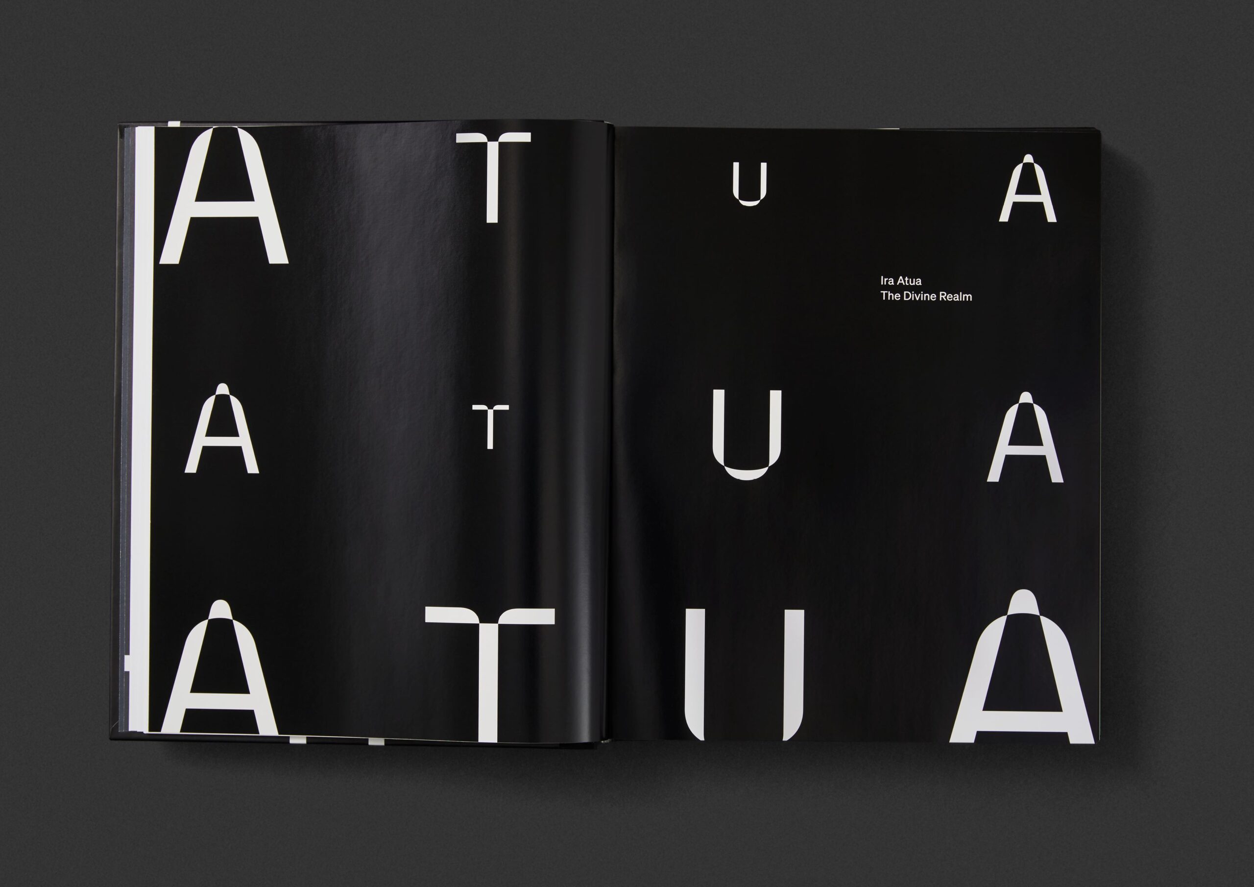
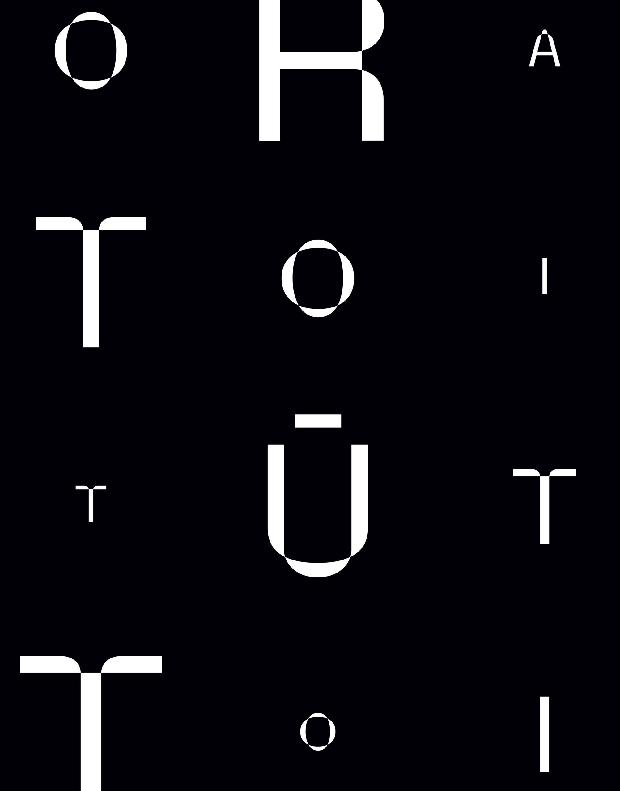
Typography: Cover and divider – Parabole; used as a pattern with each letter a different size. Söhne Buch, essays 11.4/15pt, captions 8.5/12pt. The book’s design is a continuation of the exhibition’s identity. Strong typographic patterning creates an instantly recognisable cover and the typesetting within expands on the exhibition type styles for extended reading across multiple content types.
“We asked the design team to balance some complex demands…:
- A statement; a kaupapa; a major resource on toi Māori for future generations
- Reflective, immersive, generous, ‘deep’ and uplifting
- Strong, clear, and contemporary; classic rather than historical or nostalgic or ‘street’; confidently of the here-and-now
- Lively and varied in its treatment of the 200+ works, their cadence and scale with no cropping or overprinting
- Equally functional and beautiful for te reo Māori and English (the book is bilingual in some places).
- Meeting tight cost parameters to enable an accessible low price point of $60 for diverse audiences while achieving a high level of design
Our design team responded powerfully to this brief.”
Judges’ comments The cover might be the typographic hook, with its graphic use of Parabole set simply and playfully, but it was the internal system, that delivers on multiple levels, which really won over the panel. It is the ‘invisible hero’ of the book. The system handles bilingual content in an unfussy way. The grid is versatile across content types with well-handled differentiation. The text is comfortable to read with spot-on line lengths. Each typographic element is perfectly balanced against the others in scale and weight. The images are enhanced and honoured with a page and text structure that supports them. The design notes stated that the brief was for ‘Strong, clear, and contemporary’, and the typography nails this in a way that eschews transient trendiness to produce a book that will endure as a good piece of design across time.